CSS
JS
CAT. 1
Circle of Hieronymus Bosch
Netherlandish, ca. 1450 – 1516
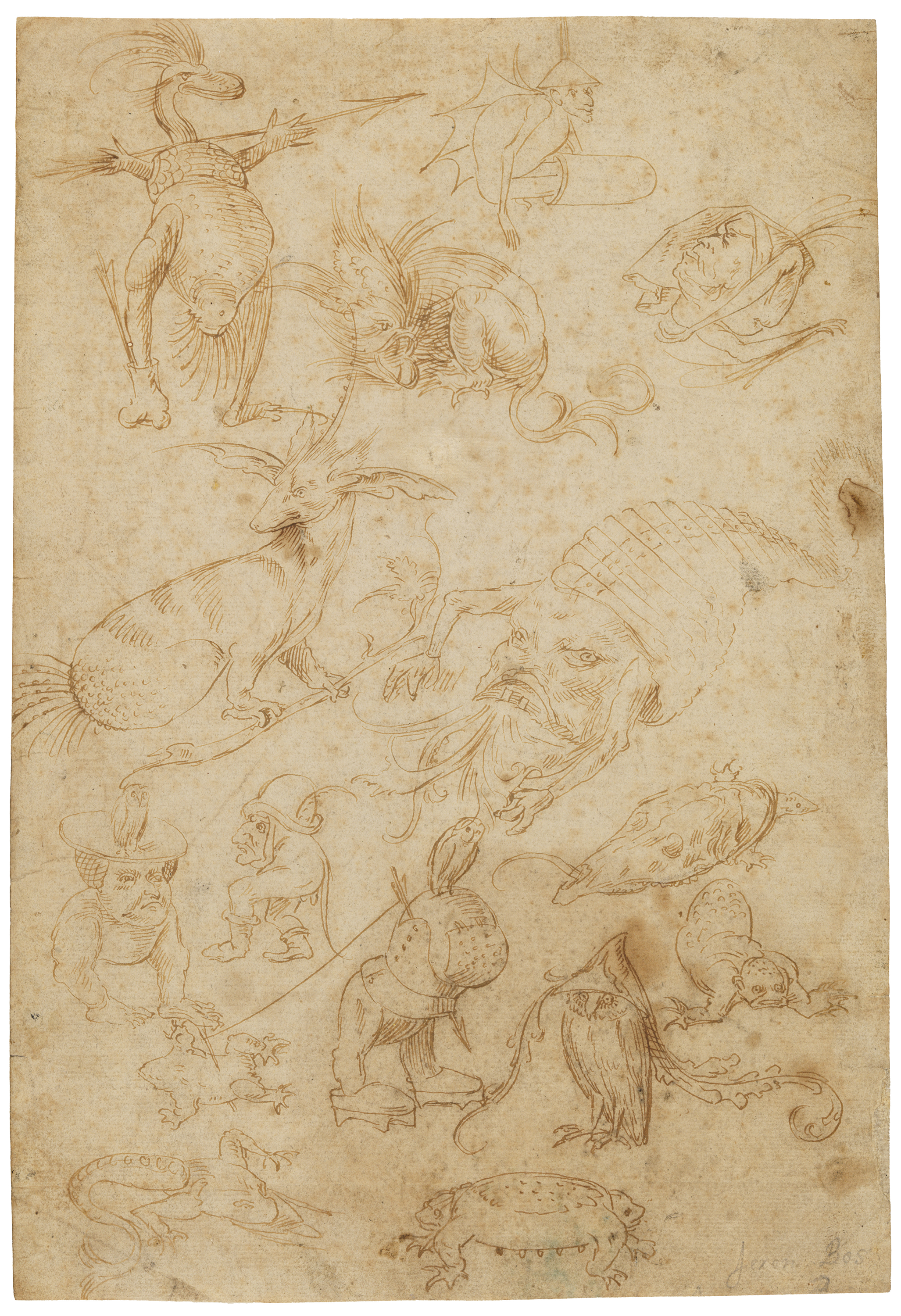
Model Sheet with Monsters
ca. 1510
Pen and ink on laid paper
31.1 x 21.3 cm (12 5/16 x 8 3/8 inches)
Gift of Mrs. Murray S. Danforth in memory of her father, Stephen O. Metcalf 51.069
This delicate pen drawing, populated by monsters and fantastical hybrid creatures, is one of the earliest included in this exhibition, executed at a time when sketching with pen and ink on paper was still a relatively new development in northern Europe. Previously, ephemeral supports such as wax tablets scored with a stylus would have been the most accessible material for practicing and sketching. Parchment was expensive, and ink on parchment was reserved for important or highly finished drawings that were meant to last. When paper started to become more common and affordable in northern Europe around the mid-1400s, erasable metalpoint on a surface prepared with a gesso-like coating became a common means of artistic training and was used for drafting preparatory studies as well as developed compositions.
Drawn with a quill pen, the motley assemblage of bizarre creatures in this sheet was delineated with clear, unbroken outlines, as seen in the bat-winged figure wearing a funnel as a hat at the top of the sheet. Areas of short parallel hatching are found in the crouching fish-faced monster below, with minimal additions of dots or fish-scale patterns. Crosshatching was used here with extreme restraint. The monsters are visionary combinations of existing forms sampled from human anatomy, from the animal and natural kingdoms, and from man-made objects, such as the helmet and clogs worn by the armless creature in the lower center.
When he briefly mentioned the Netherlandish artist Hieronymus Bosch in his Lives, Giorgio Vasari evocatively described the images he created as “reveries, eccentricities, dreams, and imaginations.” 1 A member of Bosch’s workshop probably made this drawing as a training exercise or as a way to replicate and preserve Bosch’s original designs. It appears to be a valuable record of lost inventions: four of its fifteen monsters are faithful copies derived from a double-sided drawing (Figs. 1a and 1b), now in Berlin, widely accepted as a Bosch autograph. The swan-headed hybrid creature in the upper left corner and the fish-faced monster next to it were copied from the recto of the Berlin sheet, although not in the same respective position; the bat-winged figure with a funnel and the turtle whose shell is a horse skull (lower right) are derived from the verso. Richer in detail and exhibiting a greater tonal range (due to the varying pressure on the nib of the pen), the Berlin sketches certainly came before the RISD drawing, whose relative tonal flatness and unresolved details are clear signs of copying. The figures in the RISD sheet are repositioned on the page in new arrangements, suggesting the student had access to numerous Bosch drawings and selectively copied from different sheets on the same page. The nine remaining figures are unknown in extant works, so it is likely they are the only remaining evidence of drawings by Bosch that are now lost.
Image
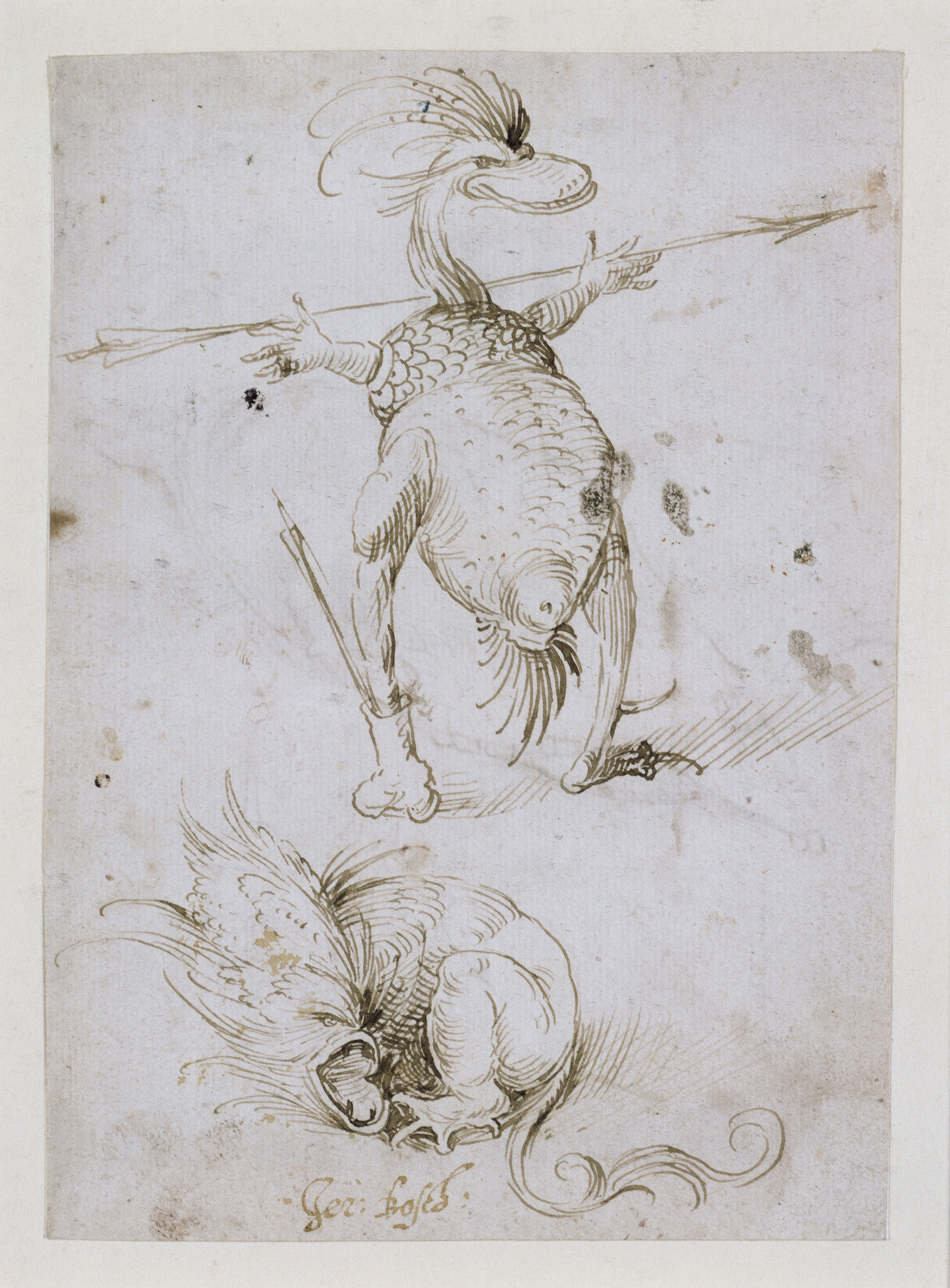
Fig. 1a
Hieronymus Bosch, Two Fantastical Creatures, n.d. Pen and brown ink on paper; 16.3 x 11.7 cm (6.7/16 x 4 5/8 inches). Kupferstichkabinett, Staatliche Museen, Berlin Germany KdZ 547 recto. Photo: Jörg P.Anders. bpk Bildagentur / Kupferstichkabinett, Staatliche Museen / Art resource, NY
Image
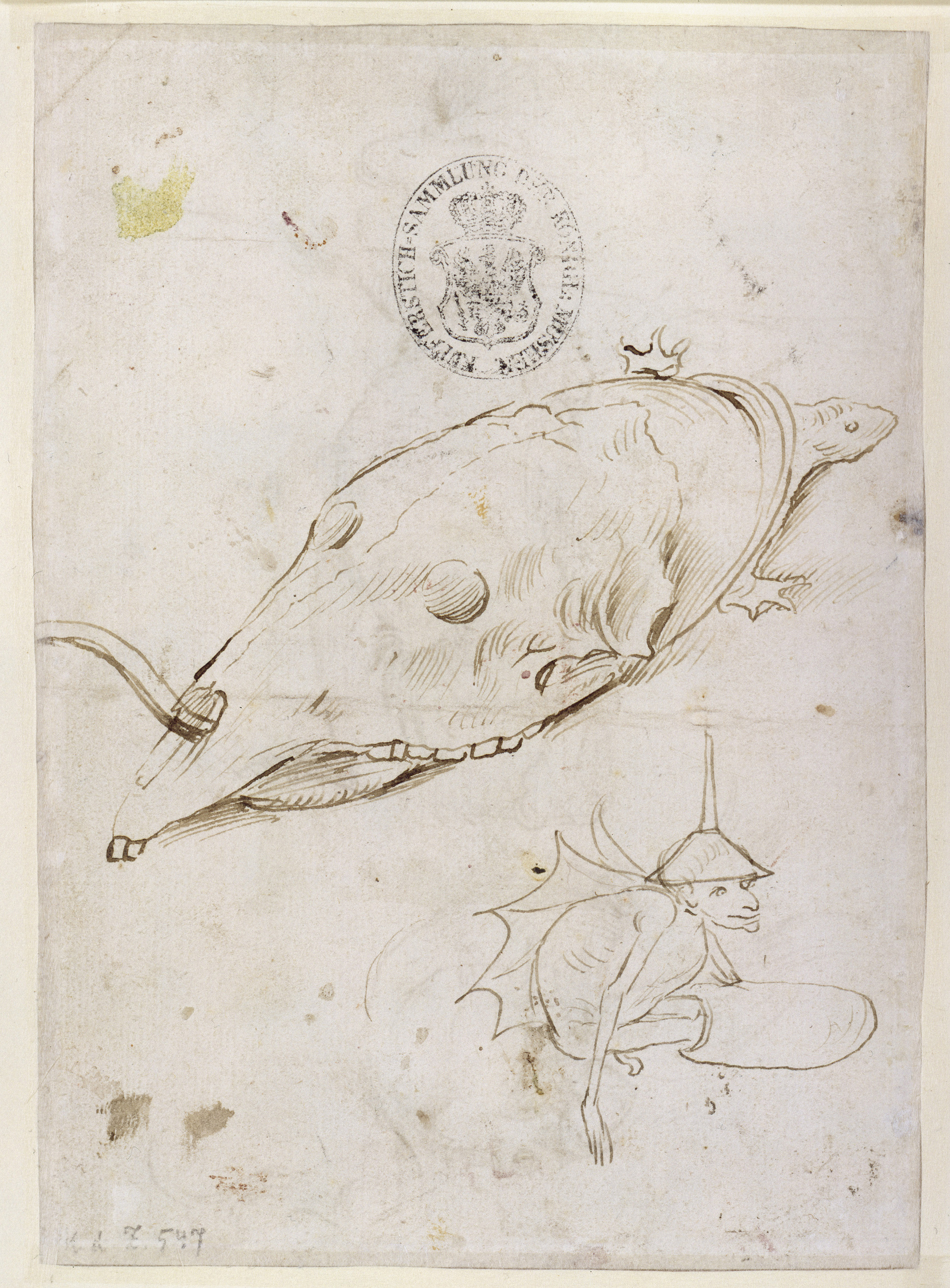
Fig. 1a
Hieronymus Bosch, Two Fantastical Creatures, n.d. Pen and brown ink on paper; 16.3 x 11.7 cm (6.7/16 x 4 5/8 inches). Kupferstichkabinett, Staatliche Museen, Berlin Germany KdZ 547 verso. Photo: Jörg P.Anders. bpk Bildagentur / Kupferstichkabinett, Staatliche Museen / Art resource, NY
Collections of unrelated sketches, sometimes referred to as model sheets, served important functions in the workshop by allowing students to assimilate the style of the master and serving as repositories of ideas to be used in paintings or other designs. Mostly known for his visionary, intricate paintings of hellscapes and apocalyptic scenes filled with tormented souls, demons, and nightmarish monsters, Bosch is one of the first Netherlandish artists with a relatively large number of drawings to have survived. Even though only around twenty examples are safely attributed to him, that number is many times more than what survives by his contemporaries.2 While a vast number of early Netherlandish drawings were lost, the fact that we have so many by Bosch may suggest both that he was particularly prolific in this medium, and that drawing played a crucial role in his highly imaginative creative process. | JG
- Giorgio Vasari, Le vite de’ più eccellenti pittori, scultori, e architettori (Florence: Giunti, 1568), 858: “Francesco Mostaret, che valse assai in fare paesi a olio, fantasticherie, bizzarrie, sogni, & imaginazioni. Girolamo Hertoglien Bos e Pietro Bruveghel di Breda furono imitatori di costui.” Vasari, getting his chronology and identities mixed up, erroneously thought that Bosch was an imitator, rather than the originator of paintings teeming with terrifying, surreal creatures.
- Matthijs Ilsink and Jos Koldeweij, Hieronymus Bosch: Visions of Genius (Brussels: Mercatorfonds, 2016), 75.
Cite catalogue entry as
Chicago Style
MLA Style
Guide ↘
Drawing Closer
Drawing Closer
Four Hundred Years of Drawing from the RISD Museum
Introduction
Catalogue Entries by Chapter
Pen and Ink
▼
Wash
▼
Observing
▼
Chalk
▼
Diversion
▼
Making
▼
Color
▼
Sort Entries by
Artists
Chronology
Nationality
Mythology
Religion
Landscape
Preparatory Drawings
Watercolor
Human Figure
Costume
Acknowledgments
Credits
Introduction
Drawing(s) at RISD: Foundations and Beyond
“In the beginning there was drawing.” Though tongue-in-cheek, this biblical riff encapsulates a core concept in the history and theory of western European art—one that continues to inform artistic pedagogy and academic training to this day. In the first century CE, the Roman author Pliny the Elder claimed that while the origins of painting were uncertain, “all agree that it began with tracing an outline around a person’s shadow,” thus describing line-drawing as the foundational pictorial act.1 Many centuries later, the Florentine painter Cennino Cennini compiled his Libro dell’arte (Treatise on Art) around 1400, a time when drawing on paper was becoming widespread. He stated that “the foundation of art, and the starting point of all these works of the hand, is drawing and coloring.” 2 Still later, in the 1560s, the painter and biographer Giorgio Vasari (1511–1574)—who inspired the founding of the Accademia delle Arti del Disegno (Academy of the Arts of Drawing), an ancestor of modern art schools—reiterated that “drawing [is] the father of our three arts: architecture, sculpture, and painting.” 3 In his understanding, the meaning of the Italian word disegno encompassed both the manual act of drafting and the intellectual activities of conception and design.
Western European art theory was grounded in the assumptions that drawing came first chronologically and was also the first conceptual step in most artistic creations. The correlative belief was that drawing should be the gateway to artistic training in any medium. This pedagogical conviction, embedded in the curricula of art schools for centuries, began to be questioned only in the latter part of the twentieth century. At RISD, drawing is still upheld as an artistic foundation: drawing is a focus of first-year studio classes, and students in any area can elect to pursue a drawing concentration beyond their freshman year. While the foundational view of drawing generally holds true in Western art—particularly in the traditional models of workshop practice and academic training—drawings have always served a broad range of purposes with varying degrees of connection to other media. Drawing is a tool for learning and planning, but also close-looking, visual thinking, communicating, entertaining, and simply provoking intellectual and aesthetic pleasure. The first four hundred years of drawing on paper also witnessed the growth of the medium into an independent artistic activity. Drawing has always been more than a prelude.
Drawing Closer, the exhibition and this accompanying digital catalog, is an invitation to look at drawings from multiple perspectives with a focus on what drawings were made of, why they were made, and what they look like. Seven interwoven sections highlight the most common drawing materials and techniques employed by artists during the early modern period (roughly between 1400 and 1800) and some of the purposes drawings served in both the artist’s studio and the world outside it. The four sections on pen and ink, brush and wash, chalk, and color explore the distinctive characteristics of each medium and the range of effects they produced when handled by different practitioners. Videos by Andrew Raftery further demonstrate the properties and characteristics of these different media and the steps involved in the creation of a drawing—from planning to execution. Sections on observation, process, and humor explore the making or function of particular drawings rather than grouping them by medium. Internal and external links facilitate interactive encounters with the works and information about them.
These drawings are dense, multi-layered creations, and many of them could easily be placed in a different section, changing the viewer’s perspective of the drawing’s significance in that new context. For this reason, both in the exhibition and publication, traditional sorting principles such as chronology or nationality have been eschewed in favor of material, aesthetic, or functional affinities. The seven chapters serve as an introduction to some of the many ways these drawings can be accessed, analyzed, and organized. But the physical installation and digital platform also encourage nonlinear exploration, iterative reinterpretation, and the discovery of resonant associations across categories. Drawing Closer aims to empower viewers to get closer to works that might otherwise feel distant or unfamiliar.
The traditional term “old master drawings,” which broadly refers to European drawings made between the 1400s and the 1800s, reveals long-standing biases that have shaped art instruction, production, and collecting for centuries. RISD’s collection of European drawings reflects nineteenth- and early twentieth-century collecting priorities, skewing towards revered names in the art-historical canon, whose protagonists—in the eyes of historians and collectors of the time—were predominantly formally trained male artists from western Europe. The effects of this limited purview endure to this day in art-historical scholarship and museum collections. As a result of centuries of restrictions placed on women to pursue an education and a career in art, there were undoubtedly many fewer professional female artists in the early modern period—and consequently fewer drawings by these artists on the market. The RISD Museum acquired its first drawing by an early modern woman, Elisabetta Sirani, only in 2018 (see Cat. 13). Though not unusual for American institutions, this statistic may seem particularly surprising for RISD, because the core of its drawings collection was shaped in important ways by women, chiefly Eliza Greene Radeke (née Metcalf), who served as president of the Board of Trustees between 1913 and 1931, and Helen Metcalf Danforth, who succeeded her as president from 1931 to 1965.4
Through the efforts and generosity of collectors Eliza Greene Radeke, Helen Metcalf Danforth, and a third important donor, Ellen Dexter Sharpe, the RISD Museum acquired some of its most cherished works on paper. Their choices and priorities were guided not only by what was available but also by what was generally considered “important,” both as a worthy example for art students to emulate, and as the bedrock of graphic arts holdings that could compare to authoritative institutions. Their ambitious purchases and gifts established a drawings collection of high caliber, but with a specific focus. Among others included in the exhibition, the dramatic black chalk study by Anthony van Dyck (Cat. 35) and the superb red chalk portrait by Edme Bouchardon (Cat. 24) were gifts of Radeke and Danforth respectively. From Ellen Dexter Sharpe, who served on RISD’s board between 1894 and 1900, the museum received an exceptional group of works on paper, including Luca Cambiaso’s Descent from the Cross (Cat. 15).
In addition to this foundational, canonical core, however, RISD’s collection of early works on paper is also rich in drawings by lesser-known or still-unidentified artists that are particularly interesting in terms of process, aesthetic and material qualities, and function. Intriguing examples include Antonio Gionima’s compositional sketch jotted on the back of a letter (Cat. 58) and a painstaking preparatory design for printed fabric (Cat. 57) acquired by the museum in 1936.
All these holdings are central to the mission of a museum founded within the heart of a school of art and design. The collection remains a living, developing resource used to teach and inspire the next generations of artists and makers. In a classroom context, European drawings at the RISD Museum are often closely examined through the lenses of materials and making, always keeping in mind how these two forces come together in creating form and meaning. As a collection, they continue to be a powerful source of instruction, inspiration, and wonder. This publication and the exhibition it accompanies attempt to enable further intimate, observation-driven encounters with these works for students and visitors in our galleries and a broader, worldwide public. | JG
- Pliny, Naturalis historia 35:5, http://www.perseus.tufts.edu/hopper/text?doc=Perseus:text:1999.02.0137:book=35:chapter=5.
- “El fondamento dell’arte, e di tutti questi lavorii di mano principio, è il disegno e ’l colorire.” Cennino Cennini, Libro dell’arte (ca. 1400), chapt. 4.
- “[I]l Disegno, padre delle tre Arti nostre, Architettura, Scultura, e Pittura.” Giorgio Vasari, Le vite de’ più eccellenti pittori, scultori, e architettori, vol. 1 (Florence: Giunti, 1568), 43; https://www.google.com/books/edition/Le_vite_de_piu_eccellenti_pittori_sculto/EYgl-hIAf0sC?hl=en&gbpv=1&dq=vasari%20vite%201568&pg=PA43&printsec=frontcover&bsq=vasari%20vite%201568.
- See Jan Howard, “‘Varied Functions and Pleasures’: Drawings at the Museum of Art, Rhode Island School of Design,” Master Drawings 42, no. 2 (2004): 160–72.
Pen and Ink
The Primacy of Line
Preface
Line, a graphic mark interrupting the blank expanse of paper, is one of the basic elements of the visual vocabulary of drawing. Until the nineteenth century, the principal tools of linear drawing in Europe were the reed pen, used since antiquity, and the quill pen, a versatile instrument made from a bird feather. In the early modern period, drawing inks were water-based liquids colored either by suspended pigments (such as carbon particles or wood soot) or by natural chemical properties (such as the tannic acid of oak trees in iron-gall ink or the dried ink sacs of cuttlefish in sepia).
Lines drawn in pen and ink vary in thickness and intensity according to the width of the nib, the pressure applied, and the amount of ink in the quill. Once dry, ink marks are stable, durable, and—unlike marks made in chalk or graphite—cannot be smudged. By the same token, ink is impossible to erase and difficult to correct, making pen and ink perhaps the most technically demanding drawing medium of all.
From the 1400s, when ink drawing on paper became common, there was a progression toward ever more complex uses of the pen. These ranged from simple outlines to hatching (parallel shading) and cross-hatching (crisscrossed shading) to more personal forms of mark making. Akin to handwriting, drawing in pen and ink came to be perceived as inextricably linked with the “hand” and the identity of a singular artist. During the period in which the drawings in this section were made, the display of bravura and individuality using pen and ink increasingly became an end in itself, and the quality of line took on its own aesthetic valence.
Wash
The Beauty of Monochrome
Preface
To increase both the tonal richness and plasticity of their drawings, early modern artists often brushed on ink diluted in water to create fields of tone in a variety of subtly different shades. While hard to control, the application of liquid washes on paper provided a swifter way of shading than the laborious construction of shadows with parallel lines or cross-hatching.
As artists became more interested in the convincing depiction of three-dimensional volumes, wash also proved to be an effective medium for the continuous modeling of form, with the fluid medium mimicking the appearance of real shadows pooling around curved forms. In more ambitious compositions, skillfully applied wash also enhanced the illusion of a coherent space by suggesting unified lighting. A small number of artists even used wash independently of pen marks to create entire compositions that were striking for their monochromatic painterliness.
As the drawings in this section show, the visual qualities and effects of wash can vary dramatically depending on the color of the inks employed, the degree of dilution, the combination or superimposition of different shades, and whether they were applied with a wet brush or a dry brush. Underlying all of these approaches, however, is their potential to mimic and visualize the ephemeral, seductive interplay of light and form.
Observing
Portraits, Academies, Nature Studies
Preface
The faithful imitation of nature has not always been an aim for visual artists. In fifteenth-century Europe, however, artists began to prioritize the ability to depict three-dimensional spaces, human and non-human animals, and even light in ways that would cause viewers to suspend disbelief and think of the picture in front of them as an extension of the world they inhabited. With few notable exceptions, the importance of the mimetic Renaissance tradition went virtually unquestioned until the late 1800s, particularly in the context of academic training.
Drawing on paper was a catalyst of this artistic shift, and observation from nature its principal strategy. Drawing and observing are intertwined in complex ways. The greater availability of paper—a light, durable, relatively affordable, and replaceable support compared to its predecessors (parchment or waxed tablets)—enabled artists to both sketch and experiment more and to gain greater facility at transcribing what they saw. Striving toward ever more effective graphic strategies to reproduce the thing seen, artists explored different materials, including ink, chalk, graphite, and watercolor, thereby expanding the visual and aesthetic range of the drawing medium.
The effects of this process went far beyond the purely aesthetic. Accurate depictions of natural specimens and artifacts sparked wonder for nature and human ingenuity while also enabling the visual exchange of knowledge that is at the basis of modern sciences. More faithful portraits fed and buttressed a more individualized sense of identity, which in turn increased the cultural importance of self-fashioning and self-presentation. In different ways, all the drawings in this section are related to observation: they range from academic exercises to documents of precise, intimate moments to painstaking and staggering displays of illusionistic prowess.
Chalk
Between Line and Tone
Preface
Chalk, a term encompassing a variety of colored earths, was one of the most common drawing media in the early modern period. A dry, friable material whose particles are rubbed off by the texture of the paper, chalk was particularly appreciated in the early modern era for its versatility. When sharpened to a point, it could be used for detailed linear drawing; a blunter tip would convey broader, blurrier strokes; and when rubbed with a finger or a stump, it created continuous, modulated areas of tone. These material qualities, which enabled seamless transitions between line and tone, made chalk an ideal material for the exploration and graphic rendition of three-dimensional volumes and the effects of light on complex surfaces such as faces, muscles, or draperies.
Until the late 1700s, the most common hues of chalk, frequently used in combination, were black, red, and white. Black chalk, a natural stone formed of clay and carbon, was used by the Italian painter Cennino Cennini around 1400 and became a more common drawing tool by the late 1400s. Normally used for drawings that demanded strong tonal contrast, it could also be easily erased, which made it a popular choice for delicate preliminary underdrawings.
Red chalk, sometimes called sanguine, is a mixture of clay and hematite (red iron oxide). Known since antiquity, it became a common drawing medium in the 1500s, with Leonardo da Vinci being one of the first artists to use it extensively. As opposed to black chalk, red chalk cannot be erased with ease, and its marks are more prone to smudging and offsetting (a quality that enabled counterproofing)—all factors that make its handling more challenging. When wet with a brush, it could be turned into a bright red wash. Its variety of warm tones and great chromatic strength made it a popular choice for the depiction of human flesh. In the 1700s, it became the favored medium in drawing academies, to the point where all natural sources of the material were exhausted by the end of that century. All modern red chalks are manufactured synthetically.
Usually applied in combination with black and red, white chalk, made primarily of calcium, is distinguished by both its brilliant white tonality and its softness. It was most frequently employed to add white highlights on toned papers or colored drawings.
Diversion
Humor, Caricature, Society
Preface
For professional artists, the act of drawing is often synonymous with exacting practice and serious work, but it can also be a fertile source of diversion and relaxation. This selection of works places the spotlight on drawings that were made for fun: from sketches made for individual pleasure to those meant to elicit laughter to works parodying or decrying the foibles of society. Because of its intimate, informal nature, drawing has traditionally been the medium of choice for the exploration of humor in its many forms.
In the early modern period, paper, while relatively affordable, was by no means a cheap material, so it is perhaps somewhat surprising that a remarkable number of drawings survive that seem to have no other function than the amusement of their maker. Envisaging a somewhat wider audience, humorous drawings such as caricatures often served sophisticated social functions, such as strengthening bonds between members of the same community or political group. A double-edged sword, caricature is also inextricably linked to the sometimes-merciless cruelty with which it attacks its targets. Just as the boundaries between the informal depiction of human types and the caricature of specific individuals are porous and difficult to define, so the line between amusement and abuse is often labile or hard to draw.
The humorous core of more complex compositions showing multiple figures—whether obviously caricatured or not—often lies in class parody, moral and social commentary, or biting political criticism. The drawings in this section showcase some of the most common humorous strategies: the insertion of “low” scatological details (frequently related to bodily functions or excesses), the juxtaposition of perceived opposites (class, age, sex), or the scrambling of traditional categories (human vs. animal, real vs. imaginary) for comedic effect. In the most accomplished examples, humorous drawings not only deploy complex communication strategies, but also provide a source of escapist relief that, centuries later, continues to attract, amuse, and delight.
Making
Process and Purpose
Preface
Whether highly finished or barely sketched out, all the drawings in this eclectic selection constituted but one stage in a longer creative unfolding. Some provide insights into their makers’ processes while others feature unusual materials or techniques. Many were clearly models made in preparation for a painting, a print, a stage set, or a printed textile. In the period covered by this exhibition, drawings created as finished, independent works of art represent a small fraction of the number of sheets artists drew to practice their hands, to record what they saw, to invent compositions, to work out solutions, or to communicate and collaborate with other makers.
Since the early Renaissance, art theorists have traditionally discussed drawing as the foundation of the visual and plastic arts—the unifying activity and principle behind artistic creation in all media. In Italian, the language in which early European theories of art were formulated, the term for drawing—disegno—encompasses a variety of nuances absent from its English equivalent. At the most basic level, disegno refers to a drawn sheet of paper, but it also encompasses the meaning of design, both in its acceptation of plan or blueprint and its more abstract sense of idea or conception. Fittingly, for the works selected, disegno can also mean aim, intention, or purpose.
In the often-messy generative journey from invention to realization, drawings were manipulated in a striking variety of ways. They were left unfinished, painstakingly completed, or impatiently reworked; cut up or patched up; handled, annotated, or developed by different people; passed through a press, copied, and traced; and even folded up, sealed, and sent as letters. The examples shown here celebrate both the versatility of the medium and the protean ingenuity of their makers.
Color
Painterly Drawings
Preface
The use of color has often been thought of as separate, if not antithetical, to “pure” drawing, strictly defined as a graphic (i.e., linear) and monochromatic medium. A lingering trace of this narrow understanding can be detected in the habit of discussing watercolors as a slightly different category from other drawings. While the extensive use of multiple colors was a relatively late development in the history of European drawing, graphic artists have always made use of color to fulfill their heuristic and aesthetic aims.
The increase in the use and variety of colors in drawing is the result of multiple factors, such as changes in taste, the availability of new materials—for instance, commercially produced pastels and watercolor boxes or wove papers better suited to the application of watercolor —and the rise of the category of the finished drawing as an independent work of art. Although oil paint was occasionally used on paper, most drawings in color (and all the ones in this section) were executed with either colored pastels or watercolor. Pastels are fabricated colored crayons composed of pigments and a binder. Once mixed into a paste, molded into sticks, and dried, they could be sharpened and used exactly like a piece of chalk. Known since at least the 1400s, pastels were occasionally used during the sixteenth century, but much more commonly employed during the eighteenth and nineteenth centuries.
As its name suggests, watercolor is a medium consisting of pigments suspended in water and colorless colloid substances (such as gum arabic or egg white) that cause the medium to adhere to paper when applied with a wet brush. Depending on its composition, watercolor can be transparent or opaque. Transparent watercolor allows light to shine through the medium and reflect off the white of the underlying paper, producing delicate, glowing chromatic effects. The addition of lead white or chalk to the solution produces opaque watercolor (also called gouache or bodycolor), which evenly covers the paper and does not allow light to reflect through, approaching the saturated visual qualities of tempera. Whether small sketches or highly finished works, watercolor drawings are distinguished by a radiance and luminosity that vies with, and often surpasses, that of paintings.
Artists
- 8 Giovanni Battista Bertani
- 65 William Blake
- 52 Louis-Simon Boizot
- 1 Circle of Hieronymus Bosch
- 24 Edme Bouchardon
- 34 François Boucher
- 19 Louis de Boullogne the Younger
- 6 Rodolphe Bresdin
- 38 Edward Burne-Jones
- 15 Luca Cambiaso
- 32 Giuseppe Cesari
- 59 George Chinnery
- 3 Hendrik de Clerck
- 63 David Cox the Elder
- 5 Donato Creti
- 49 Eugène Delacroix
- 56 Jules Pierre Michel Diéterle
- 20 Henry Fuseli
- 33 Thomas Gainsborough
- 12 Ubaldo Gandolfi
- 45 Jean-Louis-André-Théodore Géricault
- 42 Pier Leone Ghezzi
- 11 James Gillray
- 58 Antonio Gionima
- 41 J. J. Grandville (Jean-Ignace-Isidore Gérard)
- 18 François-Marius Granet
- 48 Jean-Baptiste Greuze
- 60 Thomas Groves
- 39 Giovanni Francesco Barbieri (Il Guercino)
- 51 Franz Xaver Habermann
- 40 Tony Johannot
- 57 Attributed to Jean-Jacques Karpff
- 23 Gérard de Lairesse
- 22 Ottavio Leoni
- 28 Anton Løvenberg
- 10 Carlo Maratti
- 17 John Martin
- 50 Jean Louis Ernest Meissonier
- 67 Jean-François Millet
- 4 Marco Tullio Montagna
- 61 Gustave Moreau
- 7 John Hamilton Mortimer
- 25 Jane Ogden
- 46 Bartolomeo Pinelli
- 9 Giovanni Battista Piranesi
- 55 Pieter Jansz. Pourbus
- 21 Willem Robart
- 16 George Romney
- 47 Thomas Rowlandson
- 30 John Ruskin
- 36 Cornelis Saftleven
- 13 Elisabetta Sirani
- 27 Giovanni Battista Tiepolo
- 14 & 44 Giovanni Domenico Tiepolo
- 54 Louis Rolland Trinquesse
- 66 Joseph Mallord William Turner
- 53 Abraham Jansz. van Diepenbeeck
- 35 Anthony van Dyck
- 37 Jan Josephsz van Goyen
- 2 Maarten van Heemskerck
- 31 Carle van Loo
- 29 Willem van Mieris
- 64 Wilhelm von Kobell
- 62 Hugh William "Grecian" Williams
- 26 Pieter Withoos
- 43 George Moutard Woodward
Chronology
1500s
- 1 Circle of Hieronymus Bosch
- 55 Pieter Jansz. Pourbus
- 8 Giovanni Battista Bertani
- 2 Maarten van Heemskerck
- 15 Luca Cambiaso
1600s
- 32 Giuseppe Cesari
- 3 Hendrik de Clerck
- 35 Anthony van Dyck
- 22 Ottavio Leoni
- 4 Marco Tullio Montagna
- 39 Giovanni Francesco Barbieri (Il Guercino)
- 36 Cornelis Saftleven
- 53 Abraham Jansz. van Diepenbeeck
- 37 Jan Josephsz van Goyen
- 23 Gérard de Lairesse
- 13 Elisabetta Sirani
- 10 Carlo Maratti
- 26 Pieter Withoos
- 29 Willem van Mieris
1700s
- 5 Donato Creti
- 19 Louis de Boullogne the Younger
- 42 Pier Leone Ghezzi
- 58 Antonio Gionima
- 24 Edme Bouchardon
- 34 François Boucher
- 27 Giovanni Battista Tiepolo
- 31 Carle van Loo
- 33 Thomas Gainsborough
- 51 Franz Xaver Habermann
- 12 Ubaldo Gandolfi
- 48 Jean-Baptiste Greuze
- 54 Louis Rolland Trinquesse
- 9 Giovanni Battista Piranesi
- 21 Willem Robart
- 7 John Hamilton Mortimer
- 60 Thomas Groves
- 16 George Romney
- 14 Giovanni Domenico Tiepolo
- 43 George Moutard Woodward
- 64 Wilhelm von Kobell
- 52 Louis-Simon Boizot
- 44 Giovanni Domenico Tiepolo
- 47 Thomas Rowlandson
1800s
- 20 Henry Fuseli
- 18 François-Marius Granet
- 65 William Blake
- 59 George Chinnery
- 11 James Gillray
- 57 Attributed to Jean-Jacques Karpff
- 62 Hugh William "Grecian" Williams
- 49 Eugène Delacroix
- 45 Jean-Louis-André-Théodore Géricault
- 46 Bartolomeo Pinelli
- 17 John Martin
- 40 Tony Johannot
- 63 David Cox the Elder
- 66 Joseph Mallord William Turner
- 50 Jean Louis Ernest Meissonier
- 56 Jules Pierre Michel Diéterle
- 28 Anton Løvenberg
- 41 J. J. Grandville (Jean-Ignace-Isidore Gérard)
- 30 John Ruskin
- 6 Rodolphe Bresdin
- 67 Jean-François Millet
- 38 Edward Burne-Jones
- 25 Jane Ogden
- 61 Gustave Moreau
Nationality
Italian
- 4 Marco Tullio Montagna
- 5 Donato Creti
- 8 Giovanni Battista Bertani
- 9 Giovanni Battista Piranesi
- 10 Carlo Maratti
- 12 Ubaldo Gandolfi
- 13 Elisabetta Sirani
- 14 Giovanni Domenico Tiepolo
- 15 Luca Cambiaso
- 22 Ottavio Leoni
- 27 Giovanni Battista Tiepolo
- 32 Giuseppe Cesari
- 39 Giovanni Francesco Barbieri (Il Guercino)
- 42 Pier Leone Ghezzi
- 44 Giovanni Domenico Tiepolo
- 46 Bartolomeo Pinelli
- 58 Antonio Gionima
Netherlandish
- 1 Circle of Hieronymus Bosch
- 2 Maarten van Heemskerck
- 3 Hendrik de Clerck
- 21 Willem Robart
- 23 Gérard de Lairesse
- 26 Pieter Withoos
- 29 Willem van Mieris
- 35 Anthony van Dyck
- 36 Cornelis Saftleven
- 37 Jan Josephsz van Goyen
- 53 Abraham Jansz. van Diepenbeeck
- 55 Pieter Jansz. Pourbus
French
- 6 Rodolphe Bresdin
- 18 François-Marius Granet
- 19 Louis de Boullogne the Younger
- 24 Edme Bouchardon
- 31 Carle van Loo
- 34 François Boucher
- 40 Tony Johannot
- 41 J. J. Grandville (Jean-Ignace-Isidore Gérard)
- 45 Jean-Louis-André-Théodore Géricault
- 48 Jean-Baptiste Greuze
- 49 Eugène Delacroix
- 50 Jean Louis Ernest Meissonier
- 52 Louis-Simon Boizot
- 54 Louis Rolland Trinquesse
- 56 Jules Pierre Michel Diéterle
- 57 Attributed to Jean-Jacques Karpff
- 61 Gustave Moreau
- 67 Jean-François Millet
British
- 7 John Hamilton Mortimer
- 11 James Gillray
- 16 George Romney
- 17 John Martin
- 20 Henry Fuseli
- 25 Jane Ogden
- 30 John Ruskin
- 33 Thomas Gainsborough
- 38 Edward Burne-Jones
- 43 George Moutard Woodward
- 47 Thomas Rowlandson
- 59 George Chinnery
- 60 Thomas Groves
- 62 Hugh William "Grecian" Williams
- 63 David Cox the elder
- 65 William Blake
- 66 Joseph Mallord William Turner
German & Danish
Mythology
- 8 Giovanni Battista Bertani
- 10 Carlo Maratti
- 29 Willem van Mieris
- 32 Giuseppe Cesari
- 34 François Boucher
- 38 Edward Burne-Jones
- 53 Abraham Jansz. van Diepenbeeck
- 61 Gustave Moreau
Religion
- 2 Maarten van Heemskerck
- 3 Hendrik de Clerck
- 4 Marco Tullio Montagna
- 5 Donato Creti
- 12 Ubaldo Gandolfi
- 15 Luca Cambiaso
- 18 François-Marius Granet
- 35 Anthony van Dyck
- 49 Eugène Delacroix
- 55 Pieter Jansz. Pourbus
- 58 Antonio Gionima
- 65 William Blake
- 67 Jean-François Millet
Landscape
- 6 Rodolphe Bresdin
- 17 John Martin
- 25 Jane Ogden
- 33 Thomas Gainsborough
- 37 Jan Josephsz van Goyen
- 50 Jean Louis Ernest Meissonier
- 59 George Chinnery
- 60 Thomas Groves
- 62 Hugh William "Grecian" Williams
- 63 David Cox the Elder
- 66 Joseph Mallord William Turner
Preparatory Drawings
- 2 Maarten van Heemskerck
- 4 Marco Tullio Montagna
- 8 Giovanni Battista Bertani
- 9 Giovanni Battista Piranesi
- 11 James Gillray
- 13 Elisabetta Sirani
- 16 George Romney
- 35 Anthony van Dyck
- 41 J. J. Grandville (Jean-Ignace-Isidore Gérard)
- 43 George Moutard Woodward
- 51 Franz Xaver Habermann
- 52 Louis-Simon Boizot
- 53 Abraham Jansz. van Diepenbeeck
- 55 Pieter Jansz. Pourbus
- 56 Jules Pierre Michel Diéterle
- 57 Attributed to Jean-Jacques Karpff
- 58 Antonio Gionima
- 66 Joseph Mallord William Turner
Watercolor
- 21 Willem Robart
- 25 Jane Ogden
- 26 Pieter Withoos
- 30 John Ruskin
- 43 George Moutard Woodward
- 47 Thomas Rowlandson
- 50 Jean Louis Ernest Meissonier
- 52 Louis-Simon Boizot
- 59 George Chinnery
- 60 Thomas Groves
- 61 Gustave Moreau
- 62 Hugh William "Grecian" Williams
- 63 David Cox the Elder
- 64 Wilhelm von Kobell
- 65 William Blake
- 66 Joseph Mallord William Turner
Human Figure
- 8 Giovanni Battista Bertani
- 15 Luca Cambiaso
- 16 George Romney
- 19 Louis de Boullogne the Younger
- 20 Henry Fuseli
- 22 Ottavio Leoni
- 23 Gérard de Lairesse
- 24 Edme Bouchardon
- 27 Giovanni Battista Tiepolo
- 28 Anton Løvenberg
- 29 Willem van Mieris
- 31 Carle van Loo
- 35 Anthony van Dyck
- 36 Cornelis Saftleven
- 38 Edward Burne-Jones
- 39 Giovanni Francesco Barbieri (Il Guercino)
- 40 Tony Johannot
- 42 Pier Leone Ghezzi
- 43 George Moutard Woodward
- 45 Jean-Louis-André-Théodore Géricault
- 48 Jean-Baptiste Greuze
- 49 Eugène Delacroix
- 52 Louis-Simon Boizot
- 53 Abraham Jansz. van Diepenbeeck
- 54 Louis Rolland Trinquesse
- 55 Pieter Jansz. Pourbus
- 58 Antonio Gionima
- 61 Gustave Moreau
- 64 Wilhelm von Kobell
- 65 William Blake
- 67 Jean-François Millet
Costume
- 2 Maarten van Heemskerck
- 7 John Hamilton Mortimer
- 14 Giovanni Domenico Tiepolo
- 16 George Romney
- 22 Ottavio Leoni
- 23 Gérard de Lairesse
- 24 Edme Bouchardon
- 29 Willem van Mieris
- 36 Cornelis Saftleven
- 39 Giovanni Francesco Barbieri (Il Guercino)
- 41 J. J. Grandville (Jean-Ignace-Isidore Gérard)
- 42 Pier Leone Ghezzi
- 43 George Moutard Woodward
- 44 Giovanni Domenico Tiepolo
- 45 Jean-Louis-André-Théodore Géricault
- 52 Louis-Simon Boizot
- 54 Louis Rolland Trinquesse
- 64 Wilhelm von Kobell
Acknowledgments
It is customary, in prefatory remarks, to rightly emphasize the deeply collaborative effort required to bring about a publication of this kind. In this particular case, and at this particular time, it feels especially important to gratefully highlight the team-spirited generosity and support of a number of people and institutions without which Drawing Closer simply could not have happened. The process of writing the catalogue texts and producing and collecting its many illustrations began in March 2020, just as museums and libraries all over the world were closing due to the COVID-19 pandemic. For many months, access to collections and scholarly sources and services was significantly curtailed, if not entirely suspended. The fact that research could continue and the project could advance in these extraordinary circumstances is solely due to the help and ingenuity of individuals across a number of institutions. It was moving to see how, at a time of enforced physical separation, colleagues came together virtually with renewed determination, resilience, and kindness.
I would firstly like to thank John W. Smith, former director of the RISD Museum; Jan Howard, Houghton P. Metcalf Jr. Curator of Prints, Drawings, and Photographs; and Sarah Ganz Blythe, deputy director of exhibitions, education, and programs and the museum’s current interim director, for giving me the opportunity to organize an exhibition at RISD and for supporting the idea of a show and publication focused on the museum’s collection of early modern drawings. Their professional guidance and wise advice laid the foundations of the project and shaped its focus and direction in ways I found extremely helpful.
The exhibition and digital publication received a catalyzing impulse in the form of a transformative grant from the Getty Foundation, within the framework of their Paper Project initiative. Early conversations with Heather MacDonald and Julie Butash at the Getty Foundation helped me clarify my ideas about the aims of the exhibition and about the exciting possibilities offered by a digital publication. At the RISD Museum, Amee Spondike, deputy director of development and external affairs, and Lauren Faria, assistant director of institutional giving and evaluation, enthusiastically supported the idea of applying for the grant and expertly oversaw the research, drafting, and submission process.
Preliminary research for the exhibition involved a survey and reevaluation of the RISD Museum’s holdings of European drawings made before around 1870. In this process, which occupied the better part of two years, I benefited greatly from the industrious assistance of Dominic Bate, a Brown University graduate proctor in the museum’s Prints, Drawings, and Photographs Department, who uncovered a great deal of new information about the drawings and wrote a number of entries for this publication. The catalogue is also greatly enriched by contributions from colleagues in other departments at the RISD Museum who generously brought their special expertise and viewpoints to works outside their curatorial purview. I am very grateful to Emily Banas, assistant curator of decorative arts and design; Gina Borromeo, chief curator and curator of ancient art; Wai Yee Chiong, associate curator of Asian Art; Jan Howard; Maureen C. O’Brien, curator of painting and sculpture; and Elizabeth Williams, David and Peggy Rockefeller Curator of Decorative Arts and Design, for adding multifocal perspectives to the catalogue and demonstrating that European drawings are intimately connected to all aspects of human creativity in its multiplicitous forms. During my tenure at the RISD Museum I learned a great deal from Andrew Raftery, professor of printmaking, whose insights and sensibility influenced my curatorial approach and who kindly offered to demonstrate the traditional materials and techniques discussed in the catalogue in forthcoming videos, whose production has been delayed by physical-distancing requirements.
Amy Pickworth, assistant director of museum publications and senior editor, and MJ Robinson, assistant editor of museum publications, have been a formidable, and formidably patient, team of editors. They not only provided thoughtful suggestions that improved the style and content of the texts, but also came up with innovative editorial solutions to the unexpected issues arising from limited access to library materials, the heavy reliance on digital sources, and the natively digital format of the publication. A true expert of all things digital, Sionan Guenther, associate registrar of digital resources, oversaw the collection and organization of the numerous images that enrich this catalogue with impressive efficiency and good humor, and Erik Gould, museum photographer, sensitively documented all the drawings included in the exhibition.
Jeremy Radtke, assistant director of digital initiatives, and Carson Evans, digital media fellow, assisted by RISD MFA student Kit Son Lee, helped me conceive and seemingly magically built this handsome digital platform, which, while inspired by the experience of reading a physical book, encourages non-linear exploration, is enhanced by a profusion of multimedia resources, and elegantly insists on giving prominence to the works of art discussed therein.
Heartfelt thanks are also due to Linda Catano, former associate conservator, and Christin Fitzgerald, paper preservation specialist and preparator, who generously shared their expertise on drawing media and techniques, judiciously advised on conservation needs, and assisted with the technical examination of a number of drawings that led to new insights and exciting discoveries.
There are many more people who, through stimulating conversations, shrewd suggestions, and practical assistance, helped me refine my thinking and writing about these drawings. Foremost among them are Edina Adam, Conor Moynihan, Laura Giles, Suzanne Scanlan (whose course on the history of drawing informed this project in numerous ways), Evelyn Lincoln, Leslie Hirst, Jonathan Bober, Meg Grasselli, Alvin L. Clark Jr., Frances Middendorf, Gwen van den Eijnde, and Jacques Khalip.
While my research was still underway, in February 2020 I joined the Art Institute of Chicago as Prince Trust Associate Curator. I would like to thank my colleagues in Prints and Drawings there, chiefly Kevin Salatino, department chair and the Anne Vogt Fuller and Marion Titus Searle Curator, for granting me the time and support required to bring this project to completion. Of crucial importance toward this end was Autumn L. Mather, director of the Ryerson and Burnham Libraries, and all her staff, who graciously strove to provide access to books and essential research materials under extraordinarily challenging circumstances. It is to librarians, to keepers of art collections, and to all those who work to make knowledge more accessible that this catalogue is gratefully dedicated. | JG
Credits
General Editor
Jamie Gabbarelli
Contributors
Emily Banas, Dominic Bate, Gina Borromeo, Wai Yee Chiong, Jamie Gabbarelli, Jan Howard, Maureen C. O'Brien, Elizabeth A. Williams
RISD Museum Interim Director and Deputy Director of Exhibitions, Education, and Programs
Sarah Ganz Blythe
Editor, Museum Publications
Amy Pickworth
Assistant Editor, Museum Publications
MJ Robinson
Assistant Director, Digital Initiatives
Jeremy Radtke
Digital Media Fellow
Carson Evans
Graduate Assistant, Digital Initiatives
Yingxi Ji
Web Development
Oomph, Inc.
Publication Design
Kit Son Lee & Carson Evans
Exhibition Identity
Kit Son Lee, Carson Evans & Derek Schusterbauer
Photography
Erik Gould
Video Production
Yuan Li Elizabeth Xu
Typefaces
Prophet & Diatype by Dinamo
Designed by Johannes Breyer, Fabian Harb, Erkin Karamemet, & Elias Hanzer
Drawing Closer was created using Ziggurat, an open-source publishing tool. Ziggurat was built by the RISD Museum in collaboration with Oomph, Inc.
This publication accompanies the exhibition Drawing Closer: Four Hundred Years of Drawing from the RISD Museum, on view at the RISD Museum March 12 - September 3, 2022. This project is made possible by a lead grant from the Getty Foundation.
RISD Museum is supported by a grant from the Rhode Island State Council on the Arts, through an appropriation by the Rhode Island General Assembly and a grant from the National Endowment for the Arts, and with the generous partnership of the Rhode Island School of Design, its Board of Trustees, and Museum Governors.
ISBN 978-0-9856189-4-0
All content including images, text, audio, video, and interactive media in this publication are available under CC0 1.0 Universal (CC0 1.0), Public Domain Dedication, unless otherwise noted.
Drawing Closer was published online in April 2021 by the RISD Museum.
Errors will be corrected in subsequent editions.