ABSTRACT
Textual punctuation — those common marks that pace a text — are rarely static. They allow a message to flow, providing space and also emphasis. While words hold the stage, humble commas and periods coax the message.
This thesis urges another orientation to these tools, with the graphic designer assuming the role of one who principally punctuates. In Parentheses Asterisk Ellipses, punctuation becomes the primary driver of meaning — a perfect technology for rich associative networks of history, type, and the social. Tracing the grain of these forms, Parentheses Asterisk Ellipses offers a close reading of the three marks in its title. By examining this visual grammar, I hope to expose the marginal operations of graphic design and propose interrogative devices for a developing formal practice.
Image
Parentheticals
Print
2018
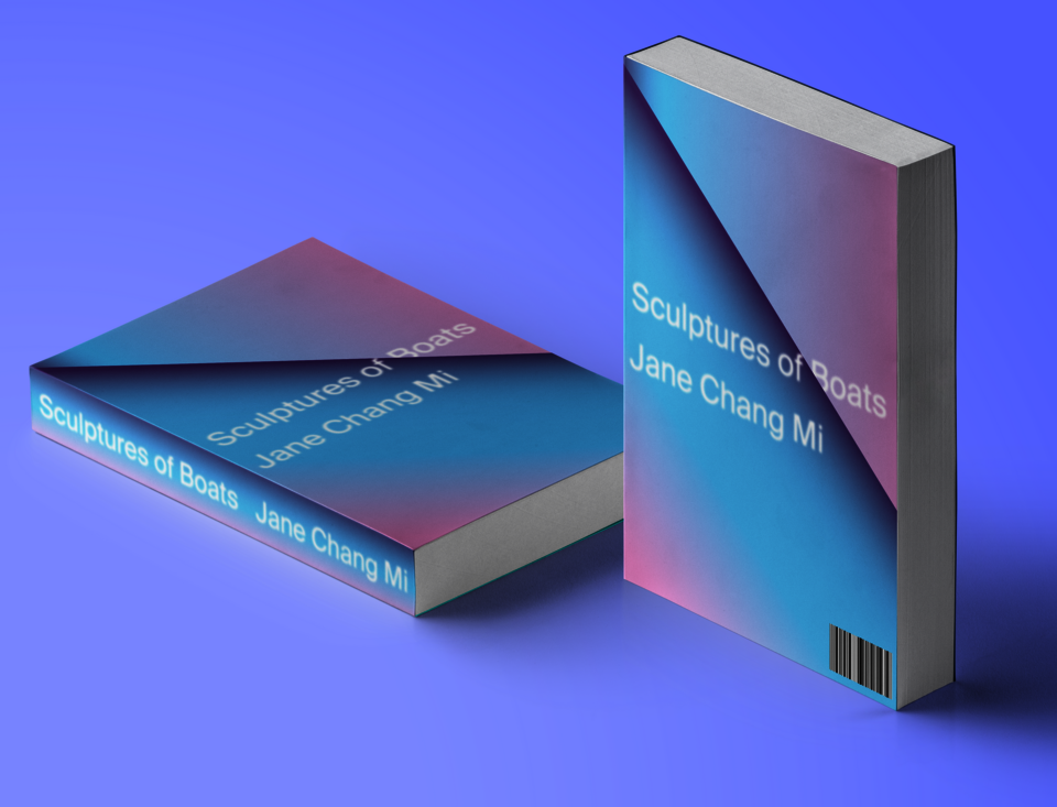
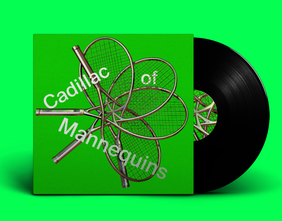
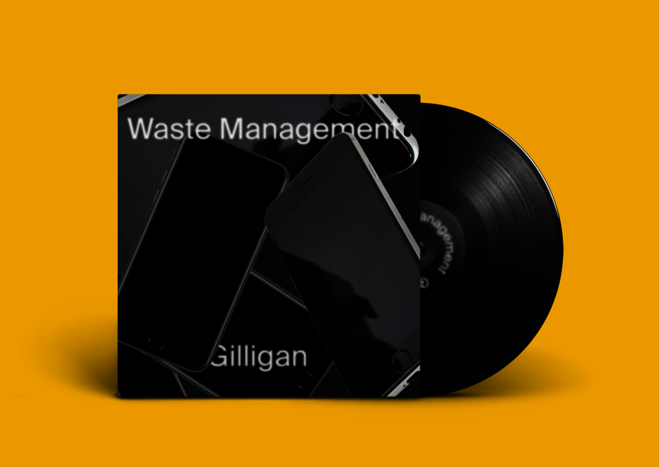
Daily form experiments invited me to consider the containers of graphic design, specifically the book, poster, and record cover. By limiting myself to a Form Matrix and 20 total minutes of experimentation (with only 5 minutes of brainstorming), I learned to intuit the aesthetics that I gravitate towards. This set of experiments also got me to notice the invisible character of the designed object. I made sure to include my original matrix below, so that I might return to this practice in the future to recognize what 2019 looked like for me.

Mastaba
Typeface
2020
It felt natural to build a typeface to celebrate Christo's work—its bulk, its dimensionality, its drapery. The final variable form includes not only a weight axis, but a perspective axis as well. The web specimen allows the option to explode the cover, to test the dimensional. It also place the bandy regular weight in conversation with the extreme ink traps of the display. In this spaces, I had the letterform fold inwards to evoke the character of Christo's wrapped works.
Image
Zenith Typeface
Typeface
2021
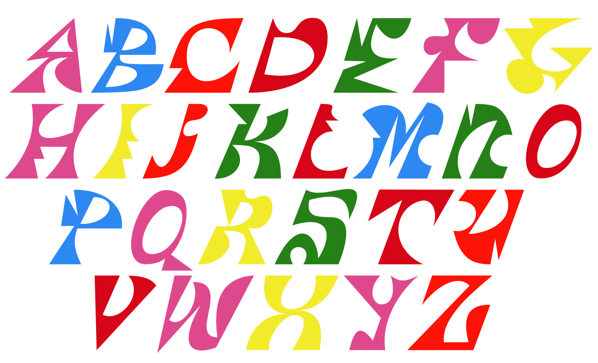
A typeface always exists in a tradition, in a historical genus. That said...what if it didn't? What if it radiated from a dislocated point, just pure form and fun. Granting that even this typeface has precedents (Necj Prah and Bendik Kalterborn spring to mind), I tried to design these letterforms quickly and with pure intuition, building shapes without heeding their referents. Essentially, I wanted to pursue the obverse of Kris Sowersby's process.
The Discreet Life of the Emoji
Website
2020
This website traces a single emoji backwards, through the screen, through its code, to the mines of the Atacama Desert. It offers a materialist critique of a symbol, exposing the mechanics behind a glyph. Using Leaflet, a mapping API, I was able to make a live map of this supply chain. The write-up similarly uses a set of adjunctives to trace my practice's complicity. It reads: I’m speechless as I type emojis → from quarantine on a Macbook → built out of copper and lithium → mined and transported by precariat laborers → using wi-fi transmitted along fiber-optic cables → gradually superheated by an increasingly diseased climate → entering an insecure profession → in a country that helped destabilize the global south → such that I could type these words in the first place.