Dotan Appelbaum
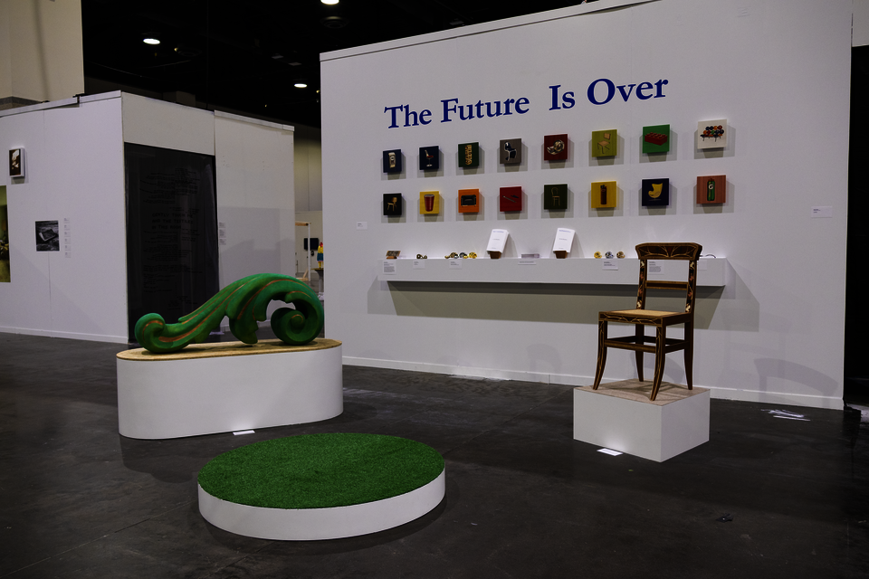
The Future Is Over
Design is implicated in the worst the world has to offer because design is implicated in everything the world has to offer. Design is present in the bombs that rain down on civilians and it is present in the infrastructure they destroy. Being an artist myself in a design program, all the goals I had for my work have coalesced into an attempt to cope with the present.
This project gives special attention to categories of time. The realm of history is unstable. It is organized and manufactured. We move through the present understanding it to be unique. The conditions of today are never wholly new. The future is inseparable from the past and the present. For centuries the future has been understood through narratives of progress.
The promises of futurity are gone. All we have is what we have. What do we do with it?
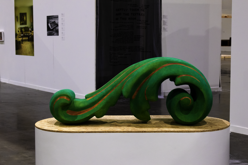
The acanthus leaf is among the most ubiquitous ornamental forms in Western decorative arts. As such, it is a generative starting point for an exploration of decoration through design. Prior to the 20th century, ornamentation was abundant because it made objects more pleasing. The logics of industry and modernism changed the priorities of design to favor overall form above decorated surface. Big Leaf asks, “What if we input the acanthus leaf into the modernist calculus of form?” This object takes an acanthus form found in relief carvings decorating wood furniture and interior trim, mirrors the relief into a full-round stand-alone object, and blows it up to the scale of furniture. The decorative illustration becomes the form of the furniture itself.
Image
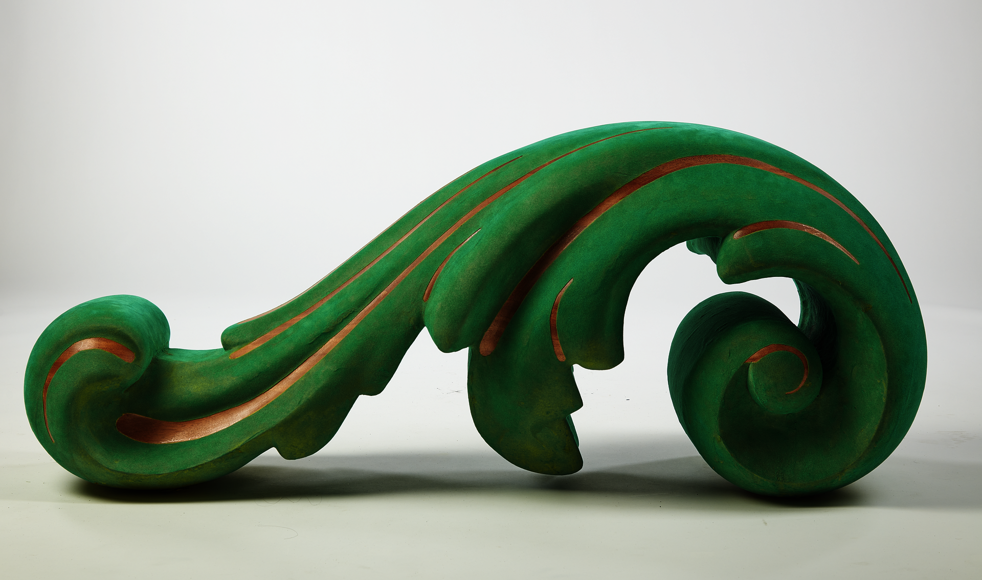
Big Leaf
african mahogany, green rayon flocking
20 x 48 x 20 in.
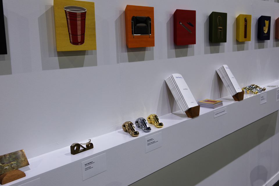
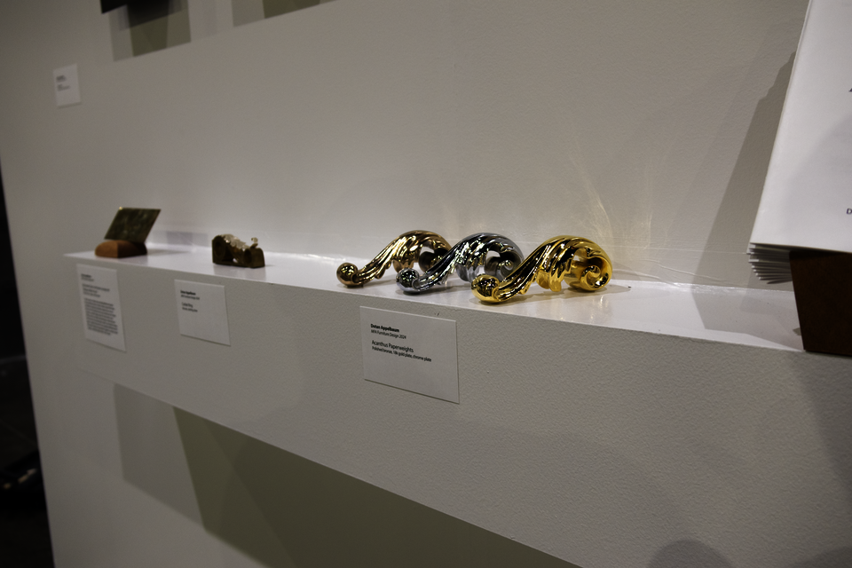
The Acanthus Paperweights are the next step in the neo-post-modern-esque exploration of the abstracted acanthus form. Taking the same form as Big Leaf, they are cast in solid bronze with additional carved detailing and buffed to a high finish. They come in three finish options: classic polished bronze, lavish 18 karat gold plating, and modernist bright chrome plating. These forms are sleek, corporate luxury. If your life still includes stacks of paper, you may as well hold them down sumptuously.
Image
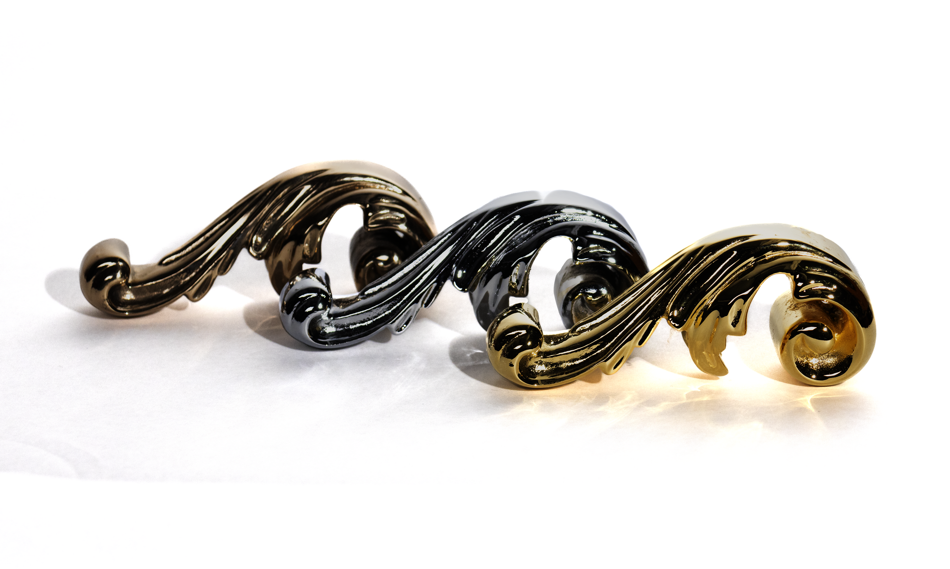
Acanthus Paperweights
polished bronze, gold plating, chrome plating
5.5 x 1.5 x 1.5 in.
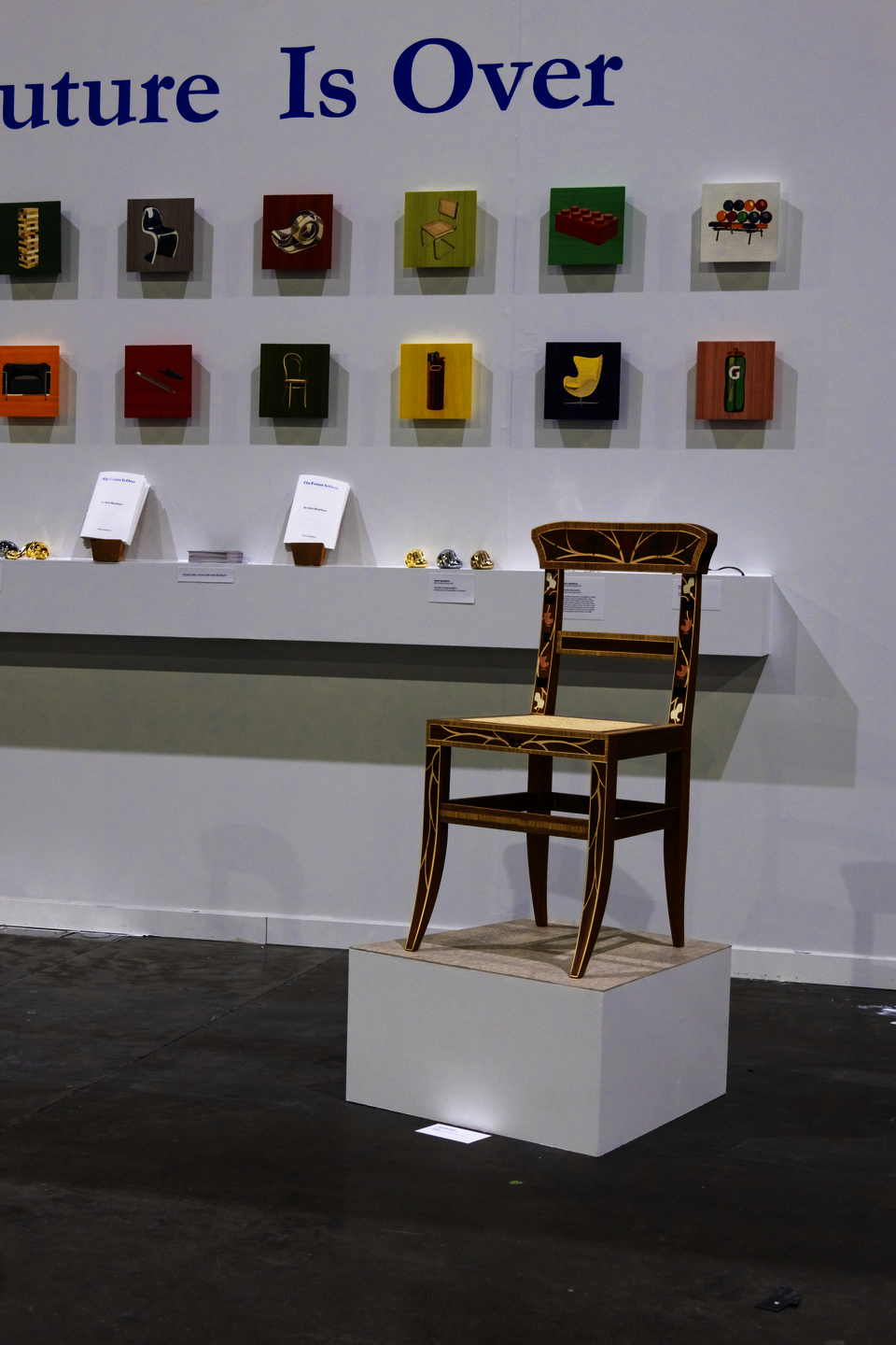
Chairs is an exercise in generative pastiche. This chair is almost entirely a reproduction of a Regency Era chair from 1830’s England. The original is a fine example of ornamentation, craftsmanship, and luxury furniture from a period where industrial production was still coming into being—and before it had come to impact the design of furniture. The marquetry ornamentation is exemplary in that it includes the most conventional depictions of ornamentation in the West at that time: griffins, shields, acanthus leaves, and scrollwork.
I reproduced this chair, produced two decades prior to the formation of design as a discipline, with one key contemporary intervention. Early in the 20th century, form superseded depiction or decoration. Meditating on this shift, I substituted the depictions of conventional ornament with depictions of the most iconic forms of the 20th century: mid-century chairs.
Image
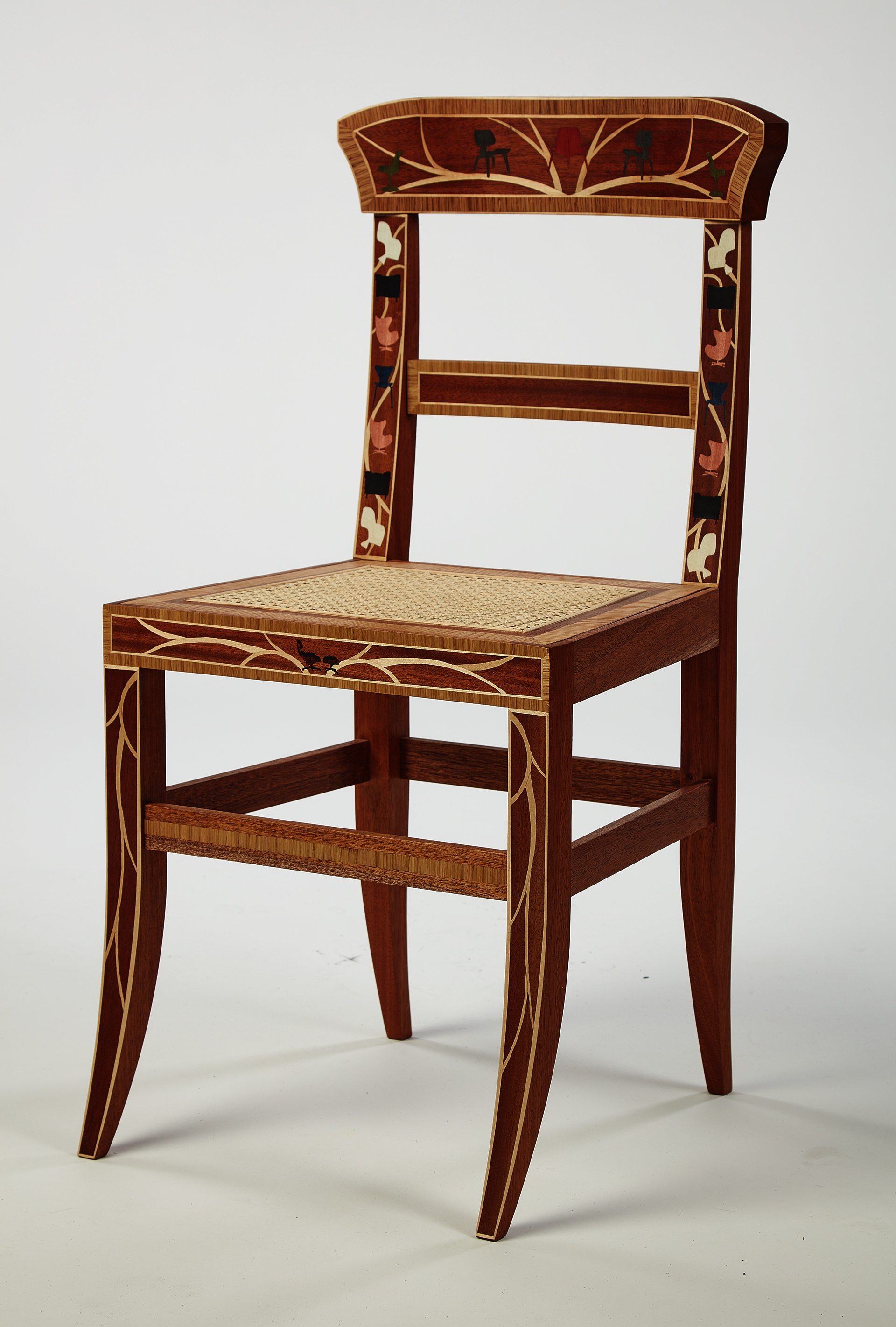
Chairs
mahogany, assorted wood veneers, cane
17 x 16 x 30 in.
The card scraper is a simple, cheap, and highly effective tool used in fine woodworking to clean or smooth a surface. A piece of thin sheet steel is filed on its edge and burnished to produce a bur on one or both corners. This bur gently removes a very small amount of material and leaves a near finish-quality surface.
I felt that delicate and decorative marquetry depictions of chairs required an equally decorative and delicate card scraper. My card scraper was made using the same techniques as marquetry. With both the lack of spring in the bronze background and the image made of precious and semi-precious metals, My Favorite Chair Is the Eames Lounge and Ottoman, What’s Yours? forces the user to scrape gently lest they scrape right through that precious depiction.
Image
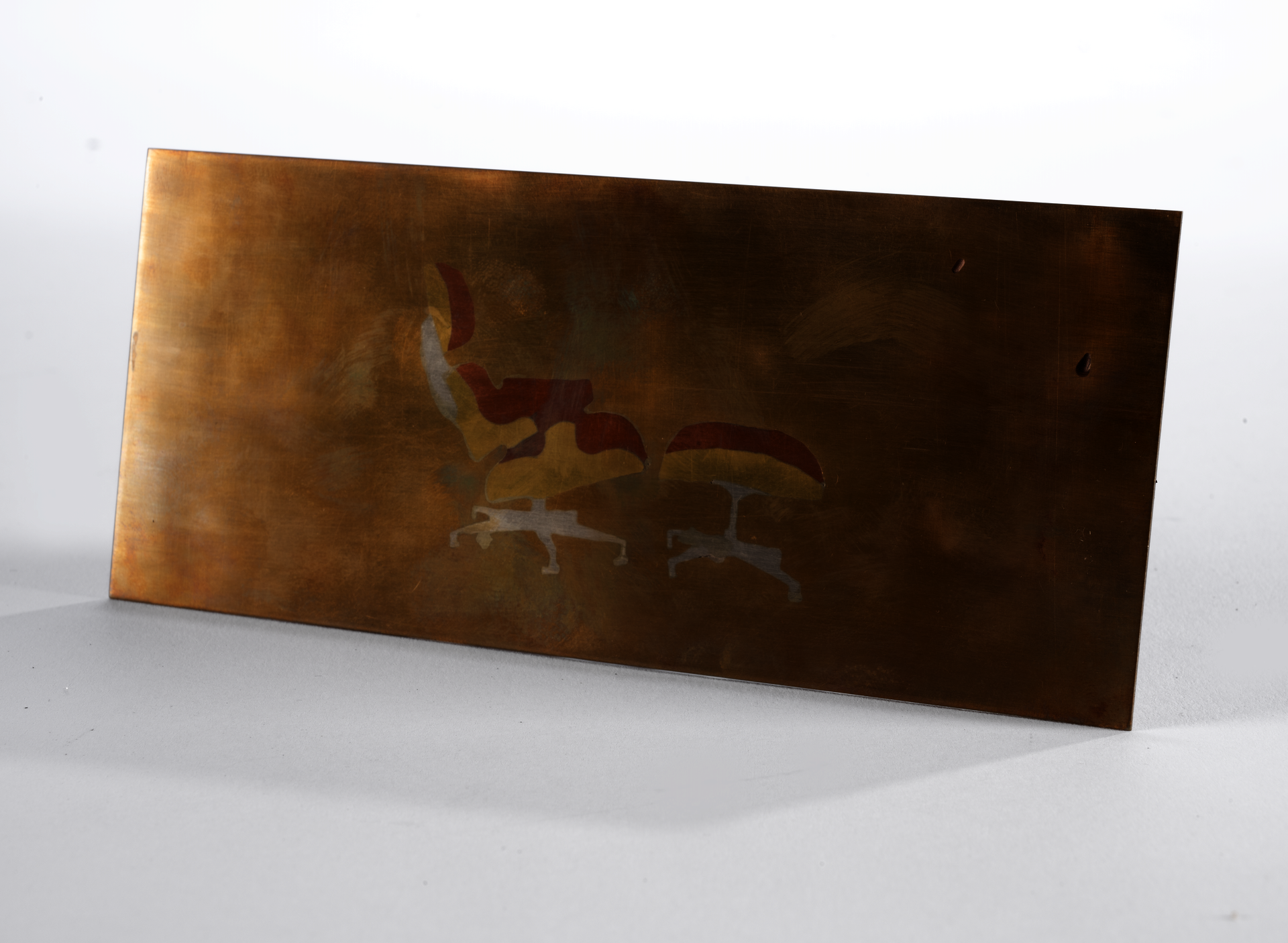
My Favorite Chair Is the Eames Lounge and Ottoman, What’s Your’s?
bronze, brass, copper, sterling silver
3 x 6 x 0.04 in.
People love chairs. People love to have favorite chairs. People love to love design. And they love to be known for loving design.
It (design) is not that serious. Except for the design of cheap, ubiquitous objects produced in the millions or billions. That is serious. Without such products, our lives would be far more tedious, messy, and boring.
Devotions is a series of laser-cut marquetry panels depicting these icons in devoted, obsessive detail. These are not illustrations, they are paintings made with wood veneer, capturing not only the forms and colors of the designed objects, but their worldly qualities and the way that light hits them.
Devotions are objects of contemplation. With their veneered back-bevel, they float towards the viewer, emitting a soft reflective glow of color on the wall like a halo. One is rewarded by staring at the detail they might not otherwise notice
Image
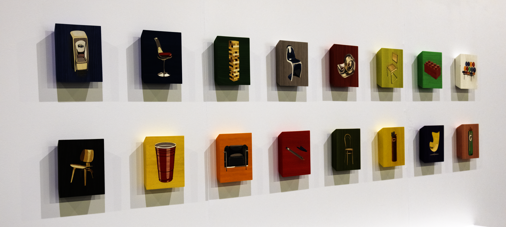
Devotions
Plywood, assorted wood veneers
16 panels, 8 x 8 x 1.5 in. each
These screen-agers are ADDICTED to their devices. Trying to get them to stop scrolling and swiping is a fool’s -errand. Oh, but what will they do when they can’t see what’s right in front of them anymore after staring at a screen for too many hours? How will they read when it comes to that? More technology won’t fix this problem. We’ve gotta go back in time for this one.
The earliest known form of eyeglasses—riveted spectacles—dates to medieval times. They consisted of two simple circular frames with handles riveted together at their ends. These frames were made primarily of metal or wood and held magnifying glasses. The user would open the frames to cover both eyes, and hold the spectacles to their face by one handle.
Oh it would be so lovely, two magnifying glasses held in sterling silver acanthus leaf frames. Get off your phone and read a book.
Image

Riveted Spectacles
Sterling silver, glass lens
3.5 x 4 x 0.1 in.
Sometimes ornamentation is just strange. Sure, furniture has historically been anthropomorphised in form and terminology. We talk of feet, legs, aprons, skirts, chests, shoulders, fingers … But what compelled the cabinetmakers of the West to actually carve realistic claws on the feet of furniture? As the story goes, claw-and-ball feet were first produced by the Dutch, inspired by Chinese depictions of dragon talons clutching pearls or precious stones on imported goods. 18th-century English cabinetmakers, enamored by the Dutch contribution, developed the idea into the form of a bird’s talons gripping a smooth sphere (Charles Sutton, “Furniture Design: Ball & Claw Motif,” Bienenstock Furniture Library).
Claw-and-Ball Spoon translates the convention into a handheld utensil that brings ornament and decoration into acts of sustenance. The talon protectively grips the bowl of the spoon, cradling precious food into your mouth.
Image
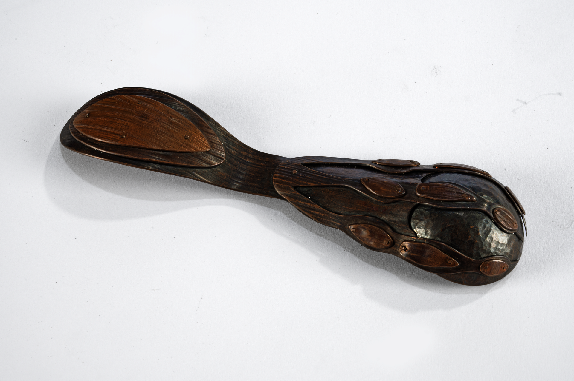
Claw-and-Ball Spoon
copper
2 x 9 x 1.25 in.
Corbel’s are architectural details: a type of bracket of solid wood or metal jutting out from a wall to support the weight of an overhanging component. The exterior corbels of Providence contain a profound amount of acanthus leaves.
A synthesis of the many acanthus corbels of Providence, the ring takes the circular ends of the corbel’s curve as the rings for the pointer and pinky fingers. The flat silver leaf of the ring, along with the diagonal curve, make room for the middle and ring fingers.
This object decorates that part of us which holds. Corbel Ring amplifies the strength of the hand. What makes us human very well may be our ability to manipulate the world around us—to hold our tools. This ring, then, is our bracket of support. Or perhaps, in a pinch, it’s just an overdecorated set of brass knuckles.
Image
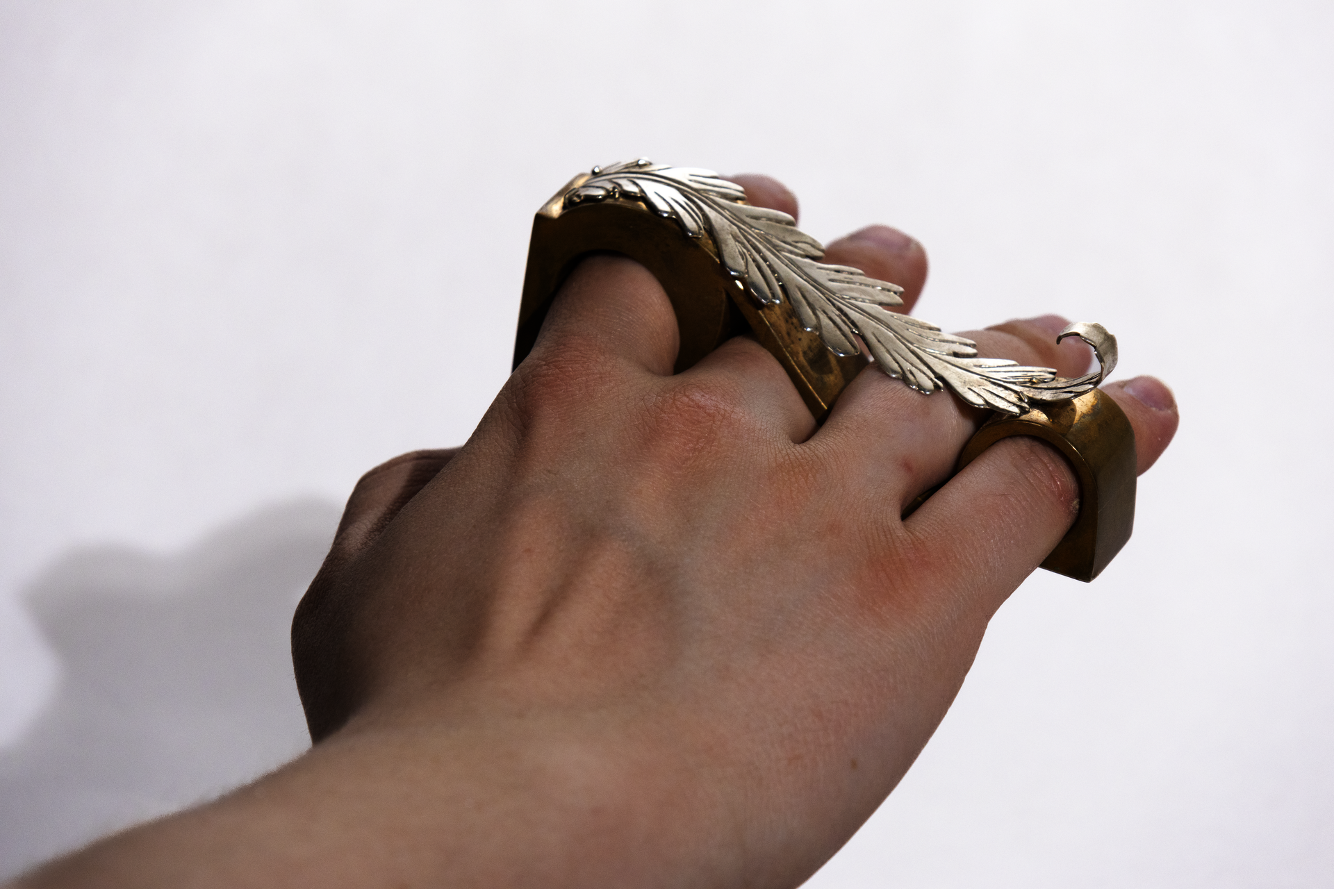
Corbel Ring
bronze, sterling silver
4 x 0.75 x 1.25 in.
EXHIBITION IMAGES
