ABSTRACT
The distance required to slow this pandemic created a need for Zoom technology in maintaining our economies of mental production and social closeness. Just like scientists examined the COVID-19 virus globally in its petri under the electron microscope, Zoom exposed our domestic interiors. This platform stitched together our personal existence into an infinite interior. To some extent this places Zoom attendees into a new space of vulnerability where the platform turns passive observers into active participants in a hyper self-aware virtual world where all are forced to share their fragile environments of everyday life.
While videotelephony software thankfully facilitated communication beyond just language, we lost the connectedness of a myriad of stereo sensations such as time, touch, gesture, and context... Using the architectural tools of drawings, scans, probes, and models at varying scales, one may better connect spatially their own space and empathize with other distant rooms.
This thesis proposes an addendum to the architectural discipline’s forms of representation and language in the framework of this past year’s spaciotemporal condition. A reexamination of vocabulary and representation
may provide a model of how to curate our spaces for more empathetic connectedness.
Image

“What I like about science fiction and dystopian kind of stuff is their apocalyptic nature, and I take the meaning of that word to be important. Apocalypse is not the end times or end of the world, but actually means “revealing,” a great revealing. Apocalypse is that time in which the truth is shown and revealed. And so I think that a lot of dystopian work is interesting because it says if there’s some kind of crisis or disaster, that something true about the world or ourselves comes out in a way that is normally covered over.
Orosco, Joseph
Science fiction attempts to predict the future, yet always does a better job of describing the present. It reveals the limits of human creativity in all the most exciting and laughable ways. If we can look back, and recognize the resilience of humankind, we can have some consideration of how we got here in a way that helps ground us in the conditions of our present. The continuation of this essay traces the trajectory of videotelephony in cinema and asserts a few nuances these films reveal about the technology and its authorship today.
These examples parallel potential uses of technology, methods for making remote communication more tactile, and warning signs of potential misuse.
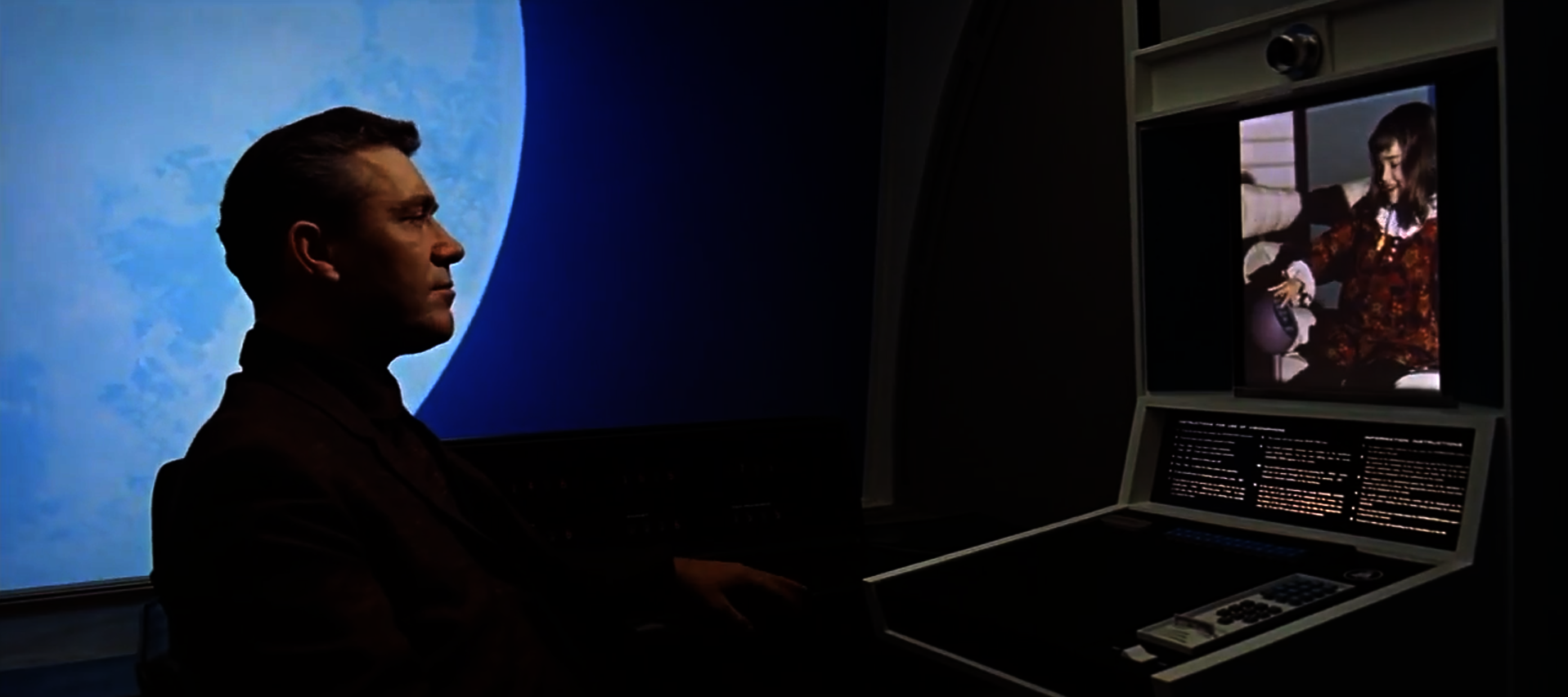
Picturephones of Space Station V are architecturally like a pay phone except there exists a chair and the dialing interface is much like a desk. While I see the window and glass door as unimaginative artifacts of the payphone, it is amusing to see the comparison of this to our home-offices. The picturephone is a room with a single program, but the design of the door as sliding, floor-to-ceiling glass, which Floyd never touches, makes it almost immaterial.This softens the boundary between the public gathering room and the personal communication room. Like the rarely blank zoom room, the window is a reminder of context and distraction. Floyd starts the call by inserting a card (likely a pay phone credit card), and punches in a few digits likely to be a phone number. I like to think of the number pad as being a passcode to prevent zoom bombing. The ensuing conversation with his daughter is especially boring.
Video Telephony and Control
Fritz Lang’s Metropolis,1927, gave the world the first example (I have found) of videotelephony in cinema. The scene is set in the home of Joh Fredersen, the stern master of the vast, futuristic, titular industrial city of 2026. In order to best rule all he surveys — and to complete the image of a 20th-century dystopia — he lives high above the infernal roil of Metropolis, safely ensconced in one of its vertiginous towers and equipped with the latest hulking, wall-mounted, inexplicably paper-spouting video phone technology.
Fredersen, writes Joe Malia in his notes on video phones in film, “appears to use four separate dials to arrive at the correct frequency for the call. Two assign the correct call location and two smaller ones provide fine video tuning. He then picks up a phone receiver with one hand and uses the other to tap a rhythm on a panel that is relayed to the other phone and displayed as flashes of light to attract attention.”(3) I see the paper trail as today's email chain artifacts of zoom and the tuning of a machine to the on screen windows to check internet connection, audio input source, etc.
This system allows the Master of Metropolis to oversee production and send orders from his cultured utopia down to the bleak underworld populated by, in large, mistreated workers.
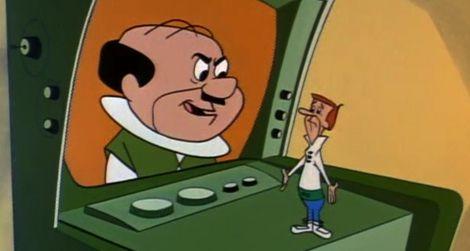
Similarly, George Jetson’s boss, Cosmo Spacely, uses his technology to oversee employee productivity without leaving his desk. In this scene Spacely checks in on the office watercooler to find Jetson goofing off with coworkers. He reprimands him through the device, and demands he come to his office (by pneumatic tube) to scold him in-person immediately. Clearly, this video screen was not a tool for Spacely to communicate across a complex environment, but exists to maintain his capitalist position of control and production.
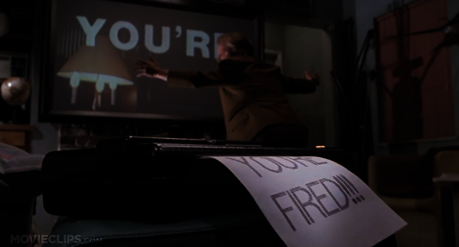
This last example, from Back to the Future, I include not for redundancy, but to emphasize how the film uses the technology a bit differently. The size of the videoscreen in the Jetsons was relatively small because that was the average size of TV’s then. In 1989, the bigger the TV, the closer you were to achieving the American Dream. Marty McFly’s boss takes up nearly a whole wall! It sits mounted above the fireplace, an element previously foundational to the American home as a place for cooking, warmth, and congregation. Furnaces, ovens, and microwaves confused American homes with no recommendation for how to repurpose this nostalgic gathering place. Here, it is the backdrop to McFly’s professional existence.
Maybe more interesting is this example is the text in the scene, giving it the rhetorical strength of a meme. Text, an abstraction of human communication, paired with syntax of video compound to drive the point home; YOU’RE FIRED. If that wasn’t enough, the fax made the message physical. He made the message into matter. Now, McFly knows he has lost the gig through sight, sound, and touch.
When the stay at home orders first began, Trekkies sprung at the opportunity to download Zoom backgrounds of the bridge of the USS Enterprise so they could sit as Captain Kirk or Piccard, looking at their lame computer as if it were the main viewscreen of the ship. 2021’s monitors are not lame by any means, but they pale in comparison to the capacity of the Star Trek Universe’s viewscreens. While a monitor displays a two dimensional raster image, the viewscreens can look in any direction around the ship, zoom in, and show any and all sensor data and communications signals. To be explicit, the viewscreen (especially those with the blue frame in The Original Series) are not two dimensional screens, but provide a three dimensional, mostly immersive space. Considering posture and gaze, through contemporary media, others see us through channels outside our optical control. That means that for the contemporary subject the gaze of the other remains unidentifiable; it is constituted only through an assumption, through a suspicion. Imagine the connectivity we could have if we knew our blood cameras(pipilotti rist) were looking at each other or at the same coordinate?
Beyond our sedentary existence on zoom, when characters meet through main viewer, it happens in times of great conflict. The distant person(s) appear often with their full bodies on screen. While sometimes move their hands, I see this framing as more of a framing of honesty. By capturing almost the entire body there is little to hide. To be extreme, this contrasts the zoom faceplan which is almost like a western movie’s poker player; concealed fisticuffs under the table, ready to strike. The ability to communicate in a crisis with the nuance of expression and full body vulnerability is one of exposure, diplomacy, and assertiveness. Of course, to be kind, the more one crops out of their zoom frame, the less there is to have to control and curate.
Regarding the view out of the ship, the viewscreen grants a nearly stereo view without the lens distortion of panoramic photography as we know it today. From the interior, the mainviewer is at the technological disposal of the officers of the bridge as an extreme stereo sensory extension of the body.
One of my favorite scenes in The Next Generation is from S1E18, Heart of Glory, 1988, when
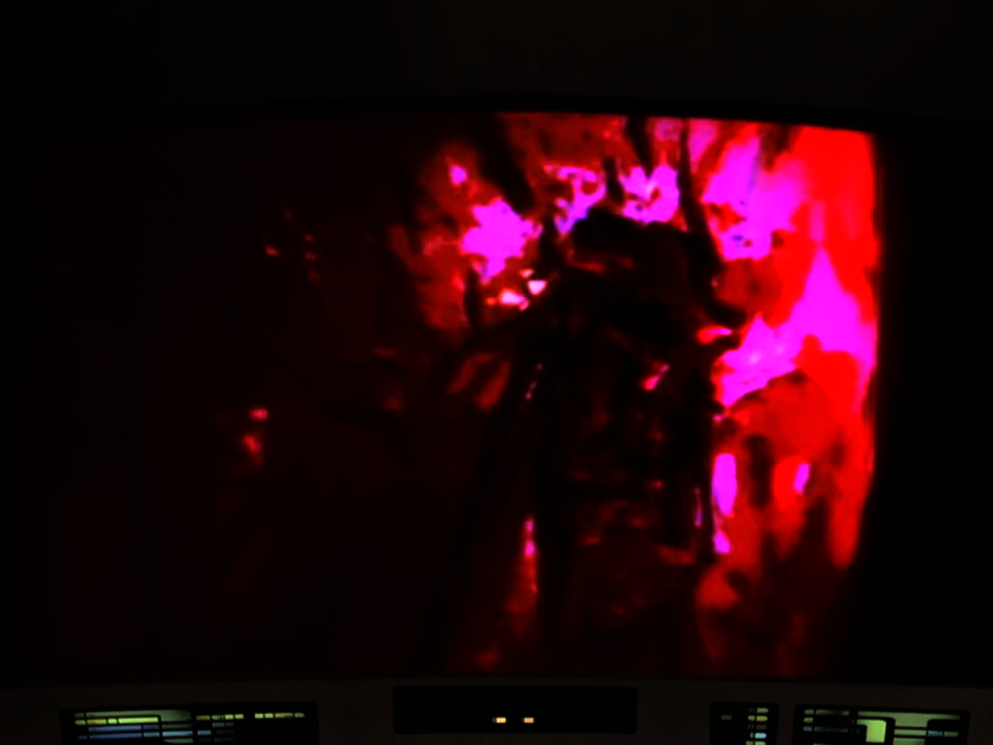
the bridge and viewers at home finally get a glimpse of what Geordi La Forge sees through his visor. For background, we learned earlier in the season that La Forge’s visor is actually a VISOR (an acronym for Visual Instrument and Sensory Organ Replacement), a medical device used in the Federation to aid patients who suffered loss of eyesight or who were born blind. Instead of giving standard vision of the visible light spectrum, Le Forge can, "see much of the electro magnetic spectrum, ranging from simple heat and infrared through radio waves, etcetera, etcetera…” – Beverly Crusher and Geordi La Forge
Using the visual acuity transmitter, the Enterprise’s bridge sees the first-person VISOR view on the main viewer. Data explains, “the information from Geordi’s VISOR is so complex it is difficult to encode. Therefore, the signal breaks down easily.” The following scene show’s a derivative of La Forge’s technicolor world with frequent clarifying questions from Piccard on the bridge:
Picard: can you filter out the extraneous information?
La Forge: No. I get it all simultaneously
Picard: But it’s just a jumble. . . How do you make head or tail of that?
La Forge: I select what I want and then disregard the rest.
Picard: But how is that possible?
La Forge: Well, how in a noisy room can you select one specific voice or sound?
Picard: Of course, something you learn . . .
This brief glimpse through his VISOR gives us immediate access to his egocentric view, and also warrants respect for the attention and filtering he is capable of. Considering the unique qualities each crew member possesses, this makes us realize the perceptual differences this crew may hold. Just being different is not exactly important here, but thinking about the collective benefit the crew gains by seeing and understanding the perceptual capacity of La Forge’s world. By seeing the material stress in the damaged hull, La Forge saves the five lives on the ship. As a recurring theme, by employing different characters’ perceptual and cognitive abilities aboard the ship, they are unbelievably strong problem solvers who experience vastly complex emotional situations.
For a painfully boring comparison, this scene reminds me of zoom screen sharing and the request remote control feature. Almost always, someone needs clarification as we step into someone else’s frame that they’ve already been watching and are accustomed to. These moments are also brief glimpses into the attention capabilities of others. How can you keep track of so many tabs? Let’s stop this comparison here before I ruin a good piece of cinema any further.
Regarding the main viewscreen throughout all of Star Trek, I do not believe that the audience is ever told what the material of the viewscreen is. A scene from First Contact prompts this question. The bridge’s crew is staring at a wall which flashes into a holographic projection when Piccard says, “on-screen.” Any other time in the saga, hero ships’ main veiwscreen shows a generic starfield. This is all conjecture here, but this gives a default view of looking forwards, with the command "on-screen" otherwise suggesting a re-focusing, or re-orienting, towards a specific goal. This may involve panning or zooming.
It makes sense that the bridge should exist in the middle of the ship for safety purposes, but what an abysmal existence-- sitting in a permanently stressed room with no windows in the middle of space. Based on the clip, I can just assume the bridge crew never lets their eyes leave that blank wall. Since they never showed this style of main viewer again, we can assume the writers also realized how weird this was. While possibly an error, it is valuable to this discussion.
Monitors and screens have a wasteful existence in our lives while they are dormant, not flashing information. We wish they would disappear from view like all the best houses on shows like MTV Cribs. Remember when celebrities pressed some button and a plasma screen rose sexually from the fish tank, fireplace, jacuzzi, dresser, concrete, or whatever else that was clearly not previously a TV.
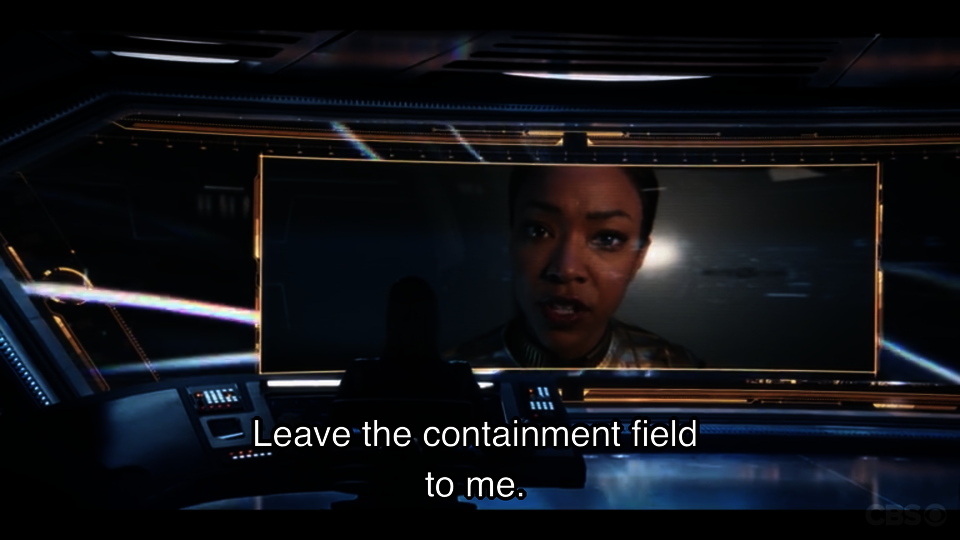
For the majority of ships in Star Trek, the default view is a star field, and the screen is always on. It’s supposed to function as a window would until activated. It may even be a window. We know for sure that the Enterprise of JJ Abrams’s universe actually is just a window; it's very thick glass, and from the bridge, we can actually see the saucer hull (which is different from all of the previous portrayals of the main viewer). Images are superimposed onto the glass. Across this massively wide main viewscreen, images appear poorly cropped in front of a starfield. Each time characters pop onto the screen, the cropping of their picture mimics the overcropped frames of people today on webcams. Whereas characters before stood in the open for their call to the Enterprise, Abrams’s characters are most likely sitting in front of a computer. This doesn’t say much other than society’s physical posturing with technology and our subsequent dialogic posturing across technology.
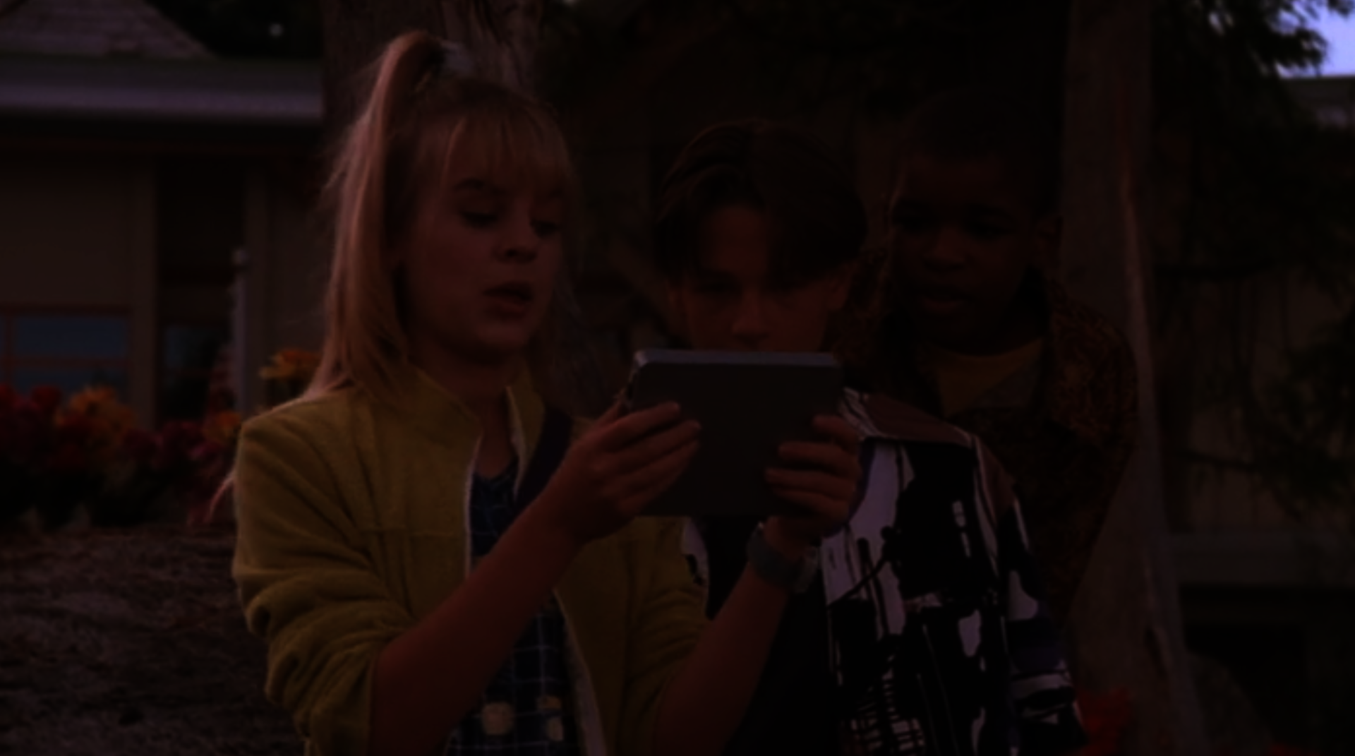
In contrast, characters calling between Earth and the Space Station in the Disney Channel Original Movie, Zenon: Girl of the 21st Century, show a more cinematographically speculative posture with video-telephones. The iPad-like Zap Pad is a personal tablet characters use when their email and phone calls are not communicative enough for the urgent emotional, or rhetorical demand of a message. Director Kenneth Johnson intentionally framed all Zap Pad scenes over the shoulder of the character. The audience is able to join in the directional gaze of the character. Watching with is a novel comparison to watching at (see faceplan in glossary). This dialogic framing keeps the viewer in a situation where we can join in the situation alongside them. Johnson reinforces this framing by having the characters use the Zap Pad with each other the same way. As half of Zap calls involve multiple people, Johnson’s use of this tool almost makes the audience another character, temporarily existing in the scene. Cinematographically, this also means that the audience gets a completed front and rear facing view of the scene.
PADD
(see viewscreen; page 38)
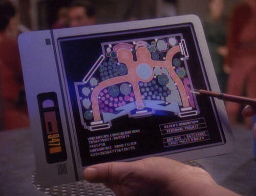
Not too distant from Zap Pads are Star Trek’s Person Access Display Devices (PADD).
These devices are hand held communication and data devices, powered by sarium krellide power cells (this probably makes as much sense to some as the term lithium-ion battery). PADDs often display schematics, or subspace transmissions, and are capable of wireless computer networking as well as playing movies, recording logs, and audio playback. Crewmembers are seen a few times “reading” from them in their downtime in the mess hall. I don’t mean to linger on this as it’s similarities to phone and tablet computers is blinding. What does need mention is that there is not a universal PADD design. In fact, PADDs vary based upon the species of their manufacturer or user which means that not only do they look different, but they all function a bit differently. The authorship and intended usership affect its functionality which affects the content and perceptual quality of its functioning. One cannot blindly accept an interface's output considering how much the medium is the message when it comes to technology.
The red alert is somewhat like the emergency text messages the U.S. government currently uses. It’s possible these PADDs are maybe just devices distributed for government to civilian emergency communication, but I would like to think these are simply civilian PADDs which the government can access.
This PADD as an object still had some physicality to it (I wish it didn’t), but that physicality is simply that of a computer and projector. The interface (the part we care about) is an immaterial, holographic screen. Once again, it’s content but not matter (let’s not talk about photons).
Tricorder
I see Star Trek’s Tricorder as the mascot of this whole study.
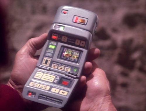
This spall device senses, analyzes, and records. It is used as an environmental scanner, and a medical scanner when an attachment is added. Characters frequently call it a scanner which is really cutting it short. As it draws data, it analyzes it based upon how it was programmed, and rapidly publishes its findings e.g. there’s life - there’s no life. For the away teams (groups who leave the ship to go explore often dangerous environments), the tricorder is a must-have as it quickly informs them if lifeforms exist nearby. It’s dead wrong far too often though. Why? It was designed by a lifeform who does not know what ALL signs of life are! This is as of yet the most obvious example of witness bias and authorship error in trusted technology. It doesn’t take a genius to realize that Starfleet should let the Tricorder remain as a medical device for humanoids, but find something new for the away team right away.
What separates the Tricorder from the smartphone of today is its interface. One can see all of the buttons of the Tricorder. It makes obvious all of its functions and reveals its innards. Sure, its sinews and algorithms for processing are packaged in its case, but it's functionally is discernible, material, and tactile, unlike the magical capabilities and processes our devices are doing presently. Clarity in this way brings with it some honesty and trustworthiness which may be the reason Starfleet continues using it. Theoretically that would make sense. In recognizing that Star Trek is just a show, the Tricorder’s errors just make for a great plot device.
Transporter room or holodeck
As our future bends toward the greater capabilities and implementation of virtual reality and augmented reality, this review concludes at Star Trek’s transporter room and holodeck.
The transporter room moves lifeforms and objects to and from the ship to anywhere else in near proximity. This speeds up the plot, but is a tool to get crew members in and out of danger in an instant (should the operator be able to lock onto them). Immediate action takes place as the transporter beams crew members down, and it often removes them from the physical consequences of a situation with the blink of an eye. As this thesis seeks to understand the implications of remote connectedness, I find the transporter room fascinating as placing crew into an alien environment and reporting to the bridge is often the most accurate and telling information the bridge may obtain. Digital communication and main viewscreen calls rarely handle diplomatic situations as effectively as the meatspace conversations only achievable with the transporter room. Spatially, the transportation requires the room. I do not believe one may beam from one location to another without returning to the transporter room first. One space anchors (rather frangibly) this teleportation.
Inversely, the holodeck creates a virtual environment for crew members to visit. Starfleet installs holodecks aboard starships, space stations, and at Starfleet institutions for use in entertainment, training, and investigative purposes. Holo- from the greek holos, means “whole” or “entire’ which is an accurate naming of the completely immersive environments it creates. Aside from touching a keypad, people have no contact with the sliding doors as they walk right into an entirely alien world and time.
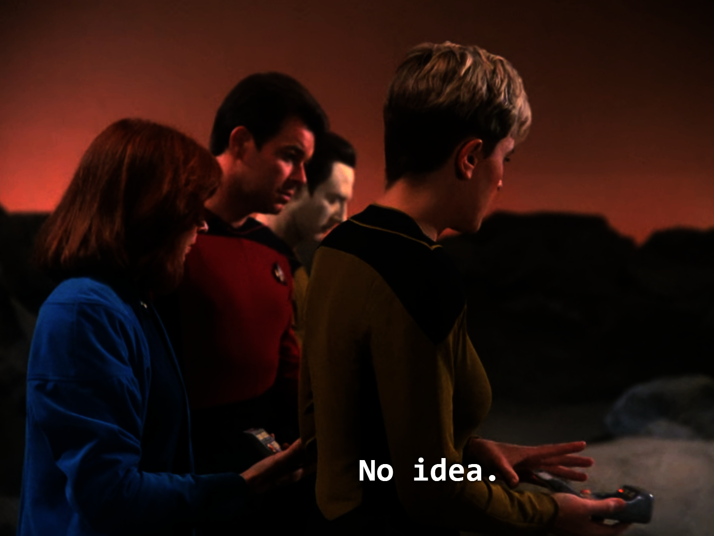
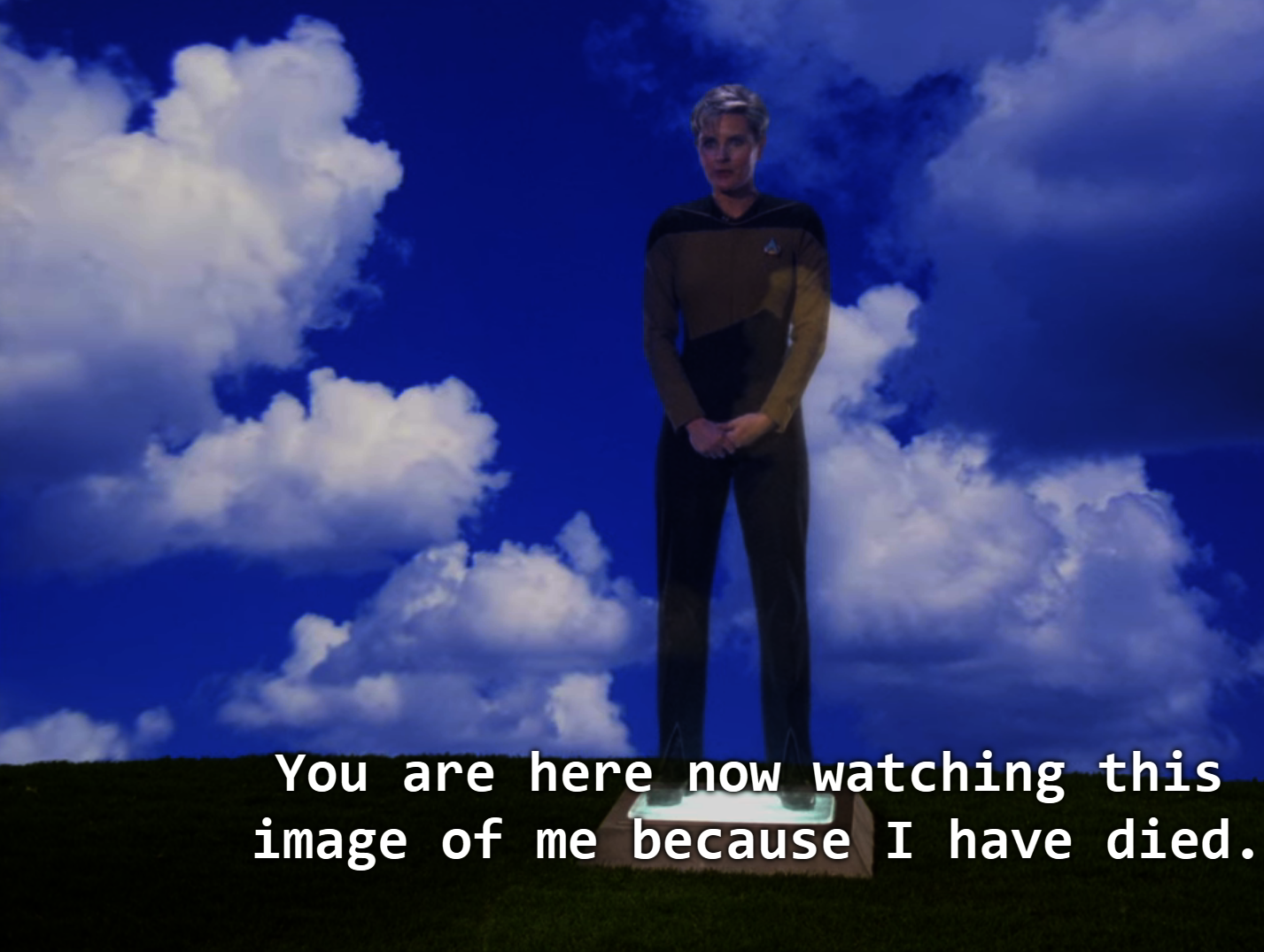
When Lieutenant Tasha Yar dies on an away trip, a scene at the end of the episode shows the crew holding a funeral for her on the holodeck. It gets weirder. Lieutenant Yar is speaking at her own funeral on the holodeck. The space projects a pastoral scene (looking like Bliss, 1996), and a prerecorded postmortem address by Yar apperates. This moment brings the entire crew, including Lieutenant Commander Data to an emotional goodbye. Is it pre-recorded though? It would make more sense that this is some sad and early forecast of deepfake technology. Maybe it is only me; I don’t think I want a deep fake of my friend to eulogize herself at her funeral. This disassociation would only mean that the digital soul may exist independent from one’s physical existence, and emotions are quantifiable.
While there exist numerous themes from these examples of science fiction, they press the importance of maintaining some facture of real space and real sensations as we continually evolve as a society in our dual, digital existence.
My favorite PADD is from the recent Star Trek: Short Treks series. We see a holographic display on pocket-sized PADDs in 2385. By 2385, a pocket sized version was available to civilians on Earth. It has a pop-up, holographic display and a lip-stick sized physical interface. In this episode, a group of rogue synth attack Mars. The Federation News Network's red alert caused the device's display to automatically activate, flashing red.
Image
Image
Image
Image
Video file
Image
Image
Image
Image
Image
Image
Image
Image
Image
Image
Image
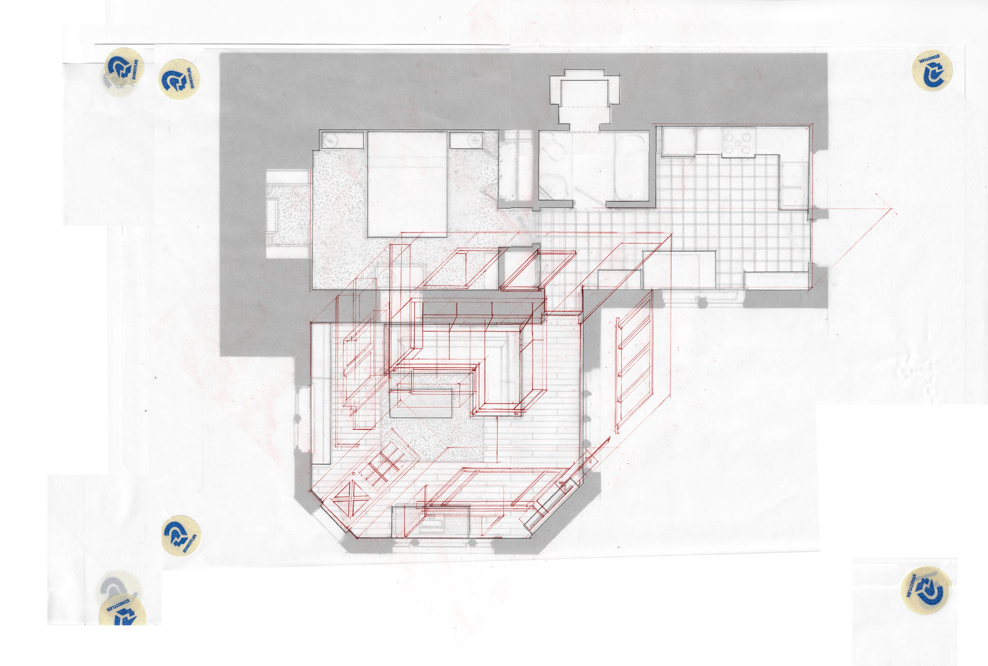
Orthographic drawing in general is a projection waiting for the metaphysical inputs such as light, smell, touch, and time. It is valuable to recognize this condition of translation from orthography to lived experience lacks perfect quantitative substantiation. This is also a western condition where we want numbers for natural
phenomena instead of allowing for a certain je ne sais quoi.
Architects most often draft plan drawings to illustrate overall layout in order to communicate the amount of space allotted to each program. They also show wall thicknesses and openings. As plans are most often employed for a construction document set, rarely would an architect include the geometry a future occupant would consume (unless it is for proof of
accessibility). To be explicit, plans are most often drawn before a space exists, not after it exists.
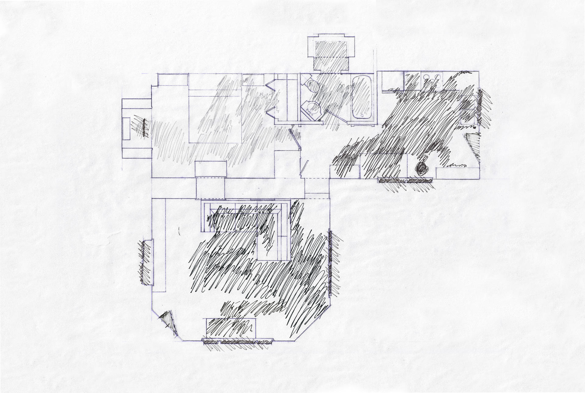
The first image (Fig. 1) shows a plan of my home in a way to only show the walls as perimeters of rooms, and the shading represents the area I use as
I live in the space.This drawing is not intended to mean that the negative spaces are unnecessary. It is merely an exercise to illustrate my spatial, habitual existence as not entirely the same volume as my home space. However, it does not show how I use it, give information regarding its depth, or any environmental context.
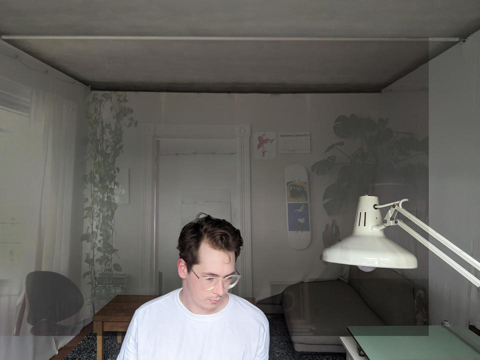
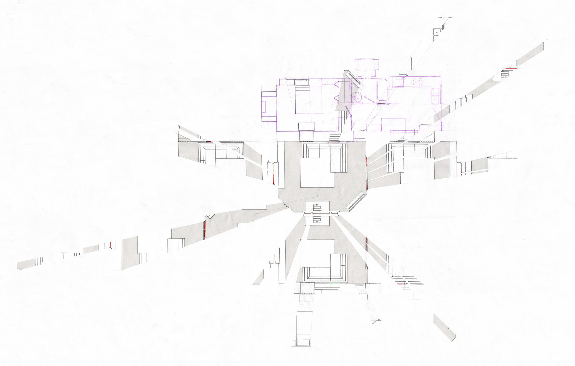
The second image (Fig. 2) draws (in plan) the visible boundary of my home in the evening as my windows turn into mirrors as light reflects back on only one side of the glass. Again, this image would not be used for construction, but illustrates the heterotopic space of my home as Foucault would describe it. Since a plan typically delineates occupiable from non-occupiable space, this plays off that reading as being the mentally occupiable space the mirror reflects beyond the physical threshold. It is worth noting here that this drawing is time sensitive (nighttime with the lights on), and egocentric (the view radiates from the position of my eyes at my desk). Information from this image was best suited to help me comprehend my home further, and communicate to other viewers the heterotopic area my home may make.
4’33”—Isometric Drawing
Others’ Spaces
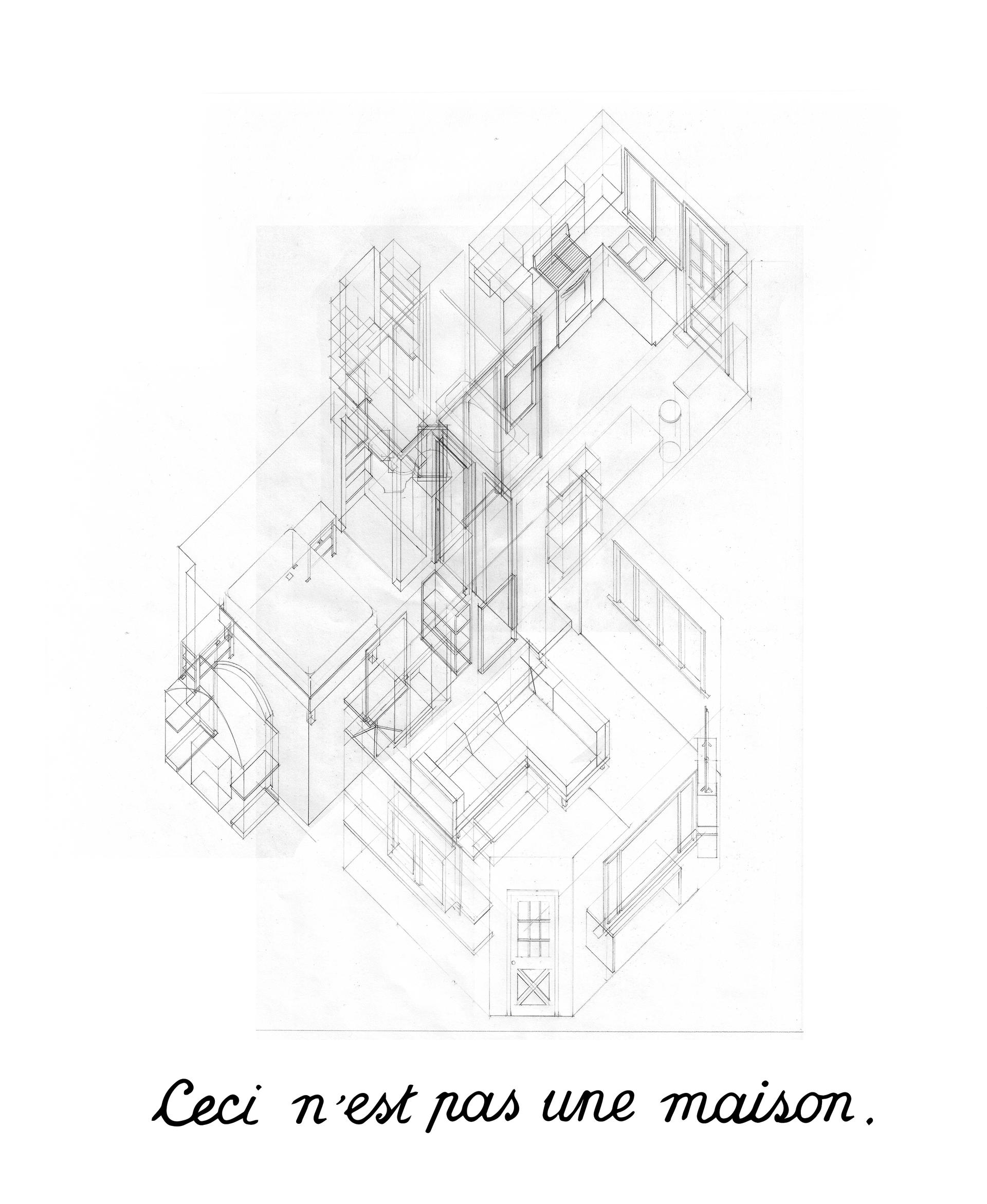
The nine square grid here relates to the video, titled 4’33”. This process is a heuristic of the mental world building and spatial closure the brain forms specifically as we create some context while looking at cropped perspectival zoom views. Webcams record analog space as a series of digital frames per second (the number of frames depends upon the specific hardware one’s computer has). Zoom then compresses and publishes the video to the
meeting.
For this video, I sequentially drew (in analog) my mental image of others’ rooms which evolve as I received new information about their space. These drawings were scanned digitally, and animated through a timeline, rasterizing them just like the participants’
existence was.
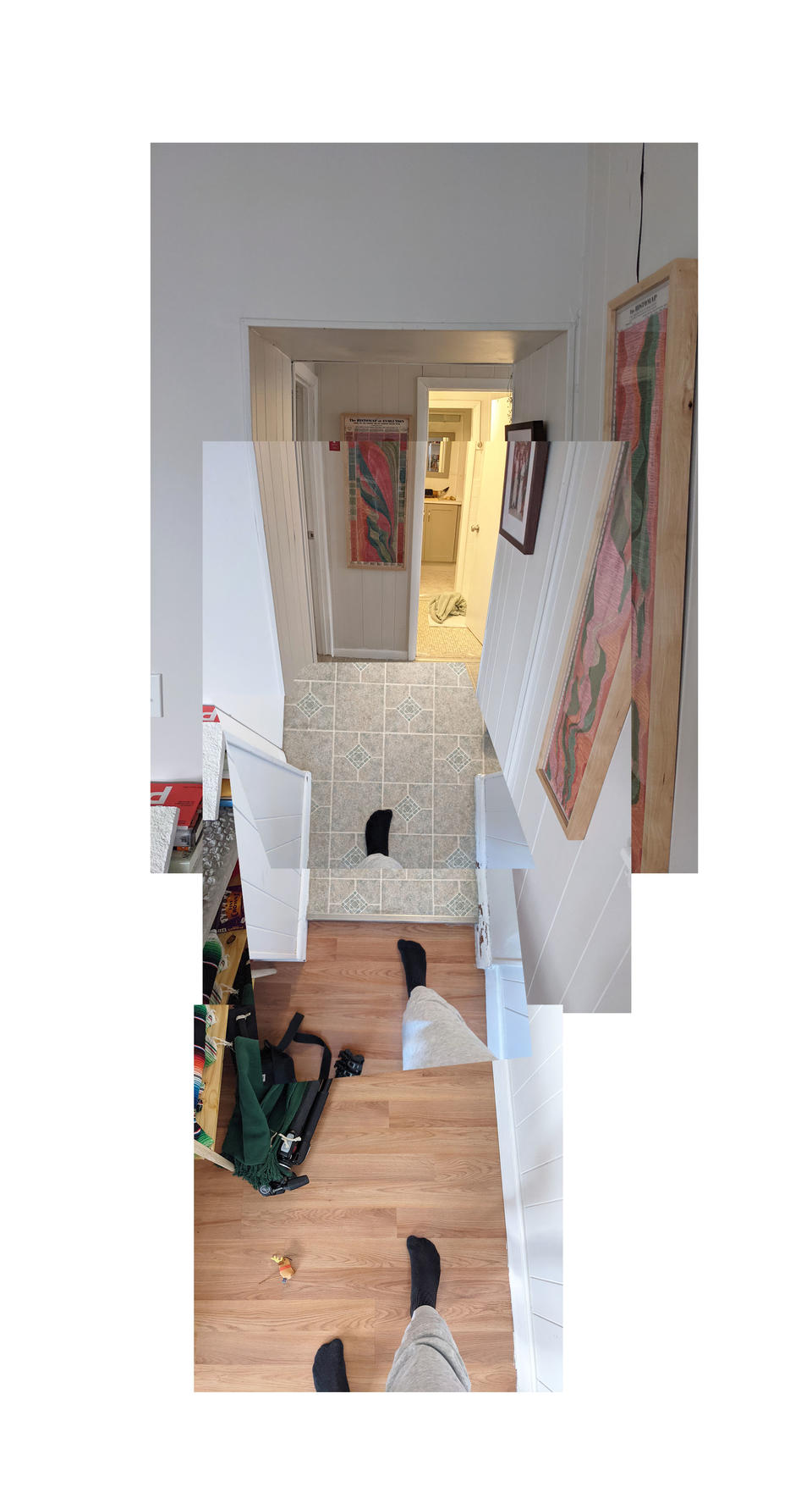
Regarding the type of projection employed, isometric drawing plots two axes orthogonally to the picture plane and makes third other axis (going into the picture plane) oblique. This distortion prioritizes an orientation-in this case the axis of the shoulders in the zoom video. Orthographic drawing in this style is a projection of innocence, lacking metaphysical animation. This technique is also highly cartesian which helps in identifying where things are relative to each other but now how they are relative to each other.
Drawing in this way turned the zoom attendees’ existence into a spatial object, alluding to the objectification a frame does to a scene.
Image

Image
Joiner
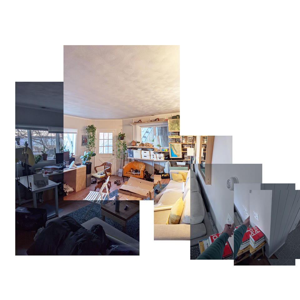
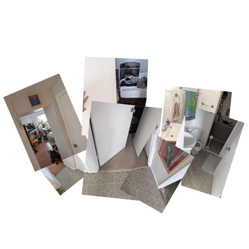
Hockney commented that, “Photography is all right if you don’t mind looking at the world from the point of view of a paralyzed cyclops-for a split second.” His tough opinion, however, changed when in February 1982 a curator visiting his house in the Hollywood Hills forgot some Polaroid film and Hockney started to experiment with it, trying to capture the three dimensions of surrounding reality.
Another important element is time, which according to Hockney is best conveyed by Yet instead of simply documenting the landscapes, Hockney depicted depth, trying to overcome the limit of eye-vision. He viewed his collages as combinations of painting and photography; by showing multiple perspectives at the same moment, he makes it
clear that there is never a single true and privileged perspective that we should blindly accept.
As we try desperately to control our zoom space to prevent unwanted guests e.g. pets, roommates, and heaven only knows from distracting the meeting, this curation can cause a degree of mistrust. Think of the censored public personas of celebrities and politicians. The public responds to surfaces with suspicion and conspiracy theories. Thus, to make politicians look trustworthy, one must create a moment of disclosure—a chance to peer through the surface to say, “Oh, this politician or media star is as bad as I always supposed him or her to be.” With this disclosure, trust in the system is restored through a ritual of symbolic sacrifice and self-sacrifice, stabilizing the celebrity system by confirming the suspicion to which it is necessarily already subjected. Joiners, when used as a zoom background, could be considered as a method for controlling and flattening your virtual space, all while maintaining some honesty by allowing others into your visual and temporal existence.
As a disclaimer, this only works in theory. Zoom over compresses and minimizes complex backgrounds.
Casts
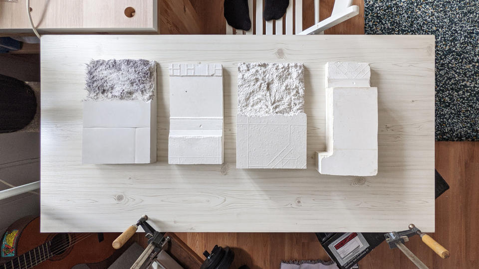
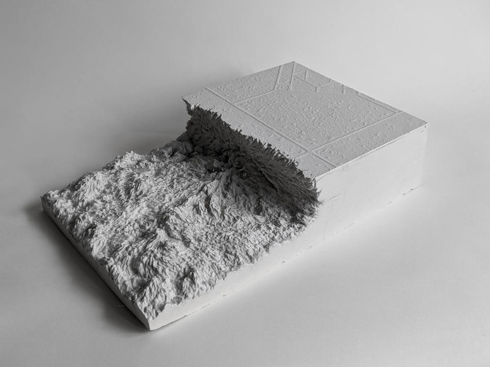
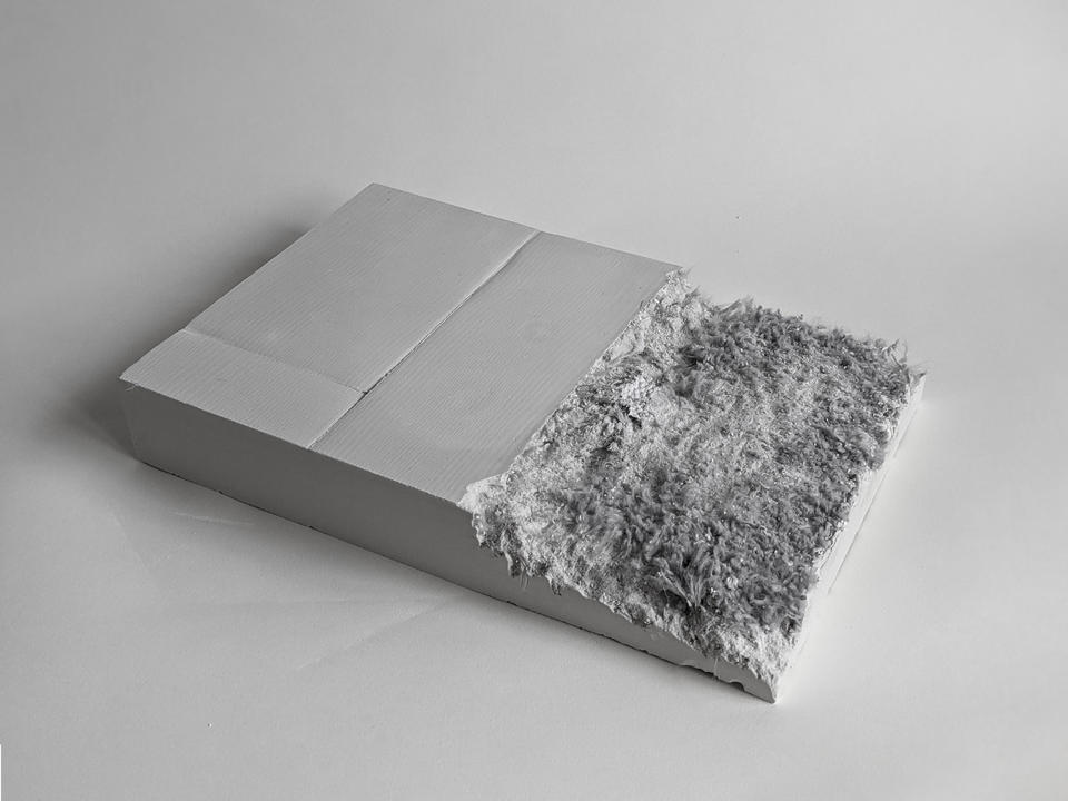
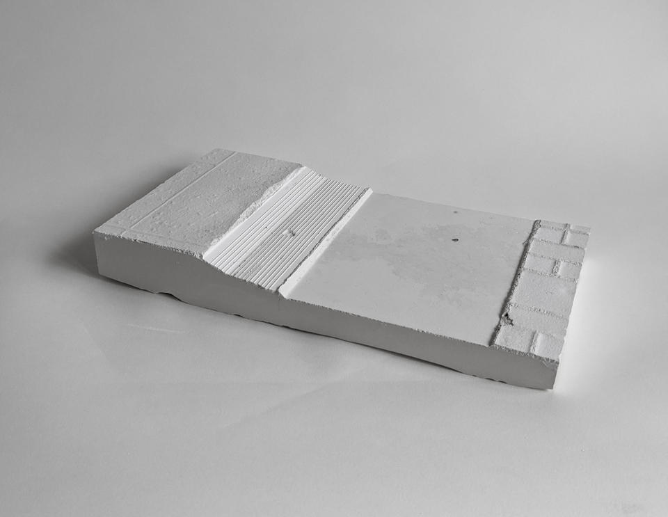
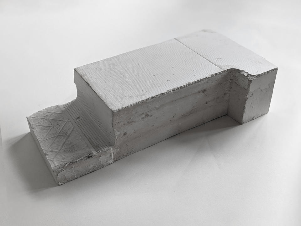
I cast a series of thresholds of my home with the intent to make volumes of these surfaces and abstract those materials archivally into their bump textures. These objects imply interstitial space, allowing the viewer to insert themselves between them, completing the space with their memories and assumptions of how the space may exist.
Theoretically one could remove these from the home, and they would still connote a fragment of its character. However, I’m the only one who could touch these casts. Considering the obvious fact that these plaster bricks must exist digitally in order for me to show them to you, they would be nearly the same here if I digitally manufactured them. If you can trust that these actually are plaster though, these objects emphasize their physical existence as products of the architectural thresholds of my home. Translating the materiality of the floor to a volume for touching and holding asserts the tactility of the physical programmatic transitions I contend with. These objects preface and intentionally contrast the probes (discussed later), which make physical the new immaterial boundaries of my home.
Image
Image
Probe 1
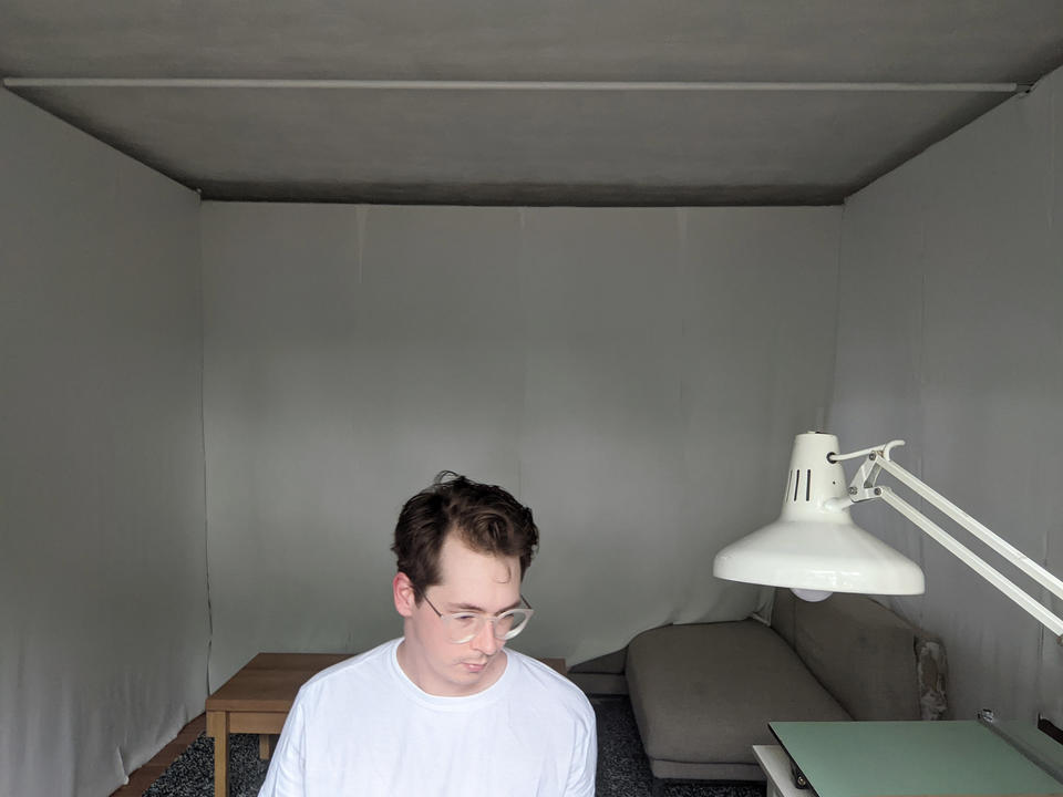
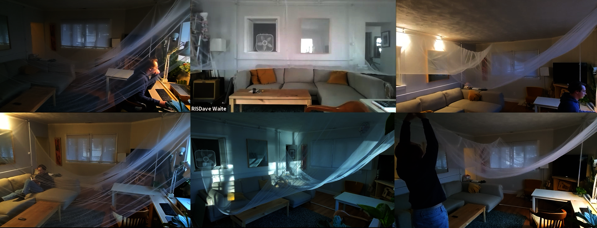
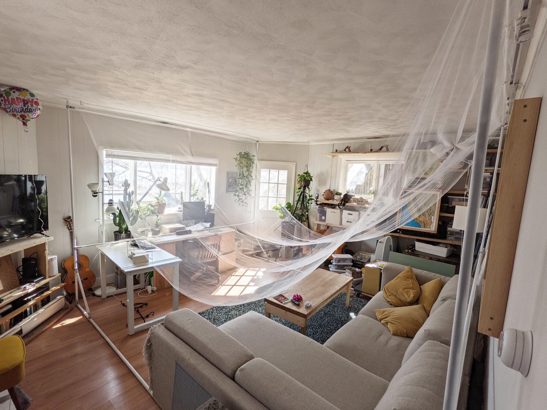
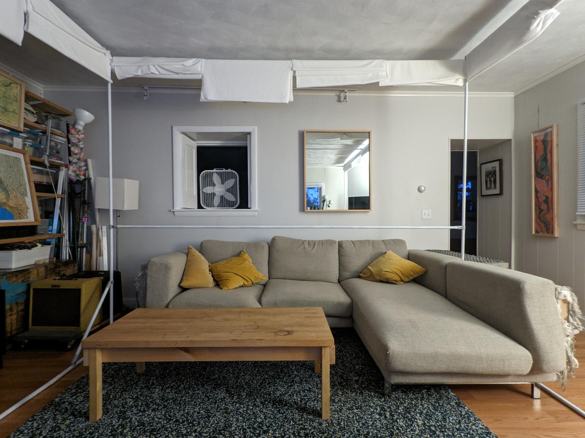
Using hardware from Maker Pipe, 3⁄4” electrical-metallic-tube conduit, and tule, this first probe made physical the new mental threshold of programmatic hybridity. This contrasts the plaster castings of physical thresholds. This catenary screen existed as a hybrid element by acting as a wall, ceiling, window, and door between the leisure space of my couch and my productive desk space. Most architectural design tools work to either propose or to represent analysis, but a 1:1 scale probe intends to study and prove a concept.
Acting on this soft wall/ceiling/screen, I moved to work or rest in one space or the other. To my surprise, its existence in the room was quite grounding. It helped me stay in one space without the guilt or desire to go into the other. As I lived with the probe, it became something I kept editing to be more functional. While this drape may describe to you how my home changed, it is still an object tied to my home and does not connect us together.
Image
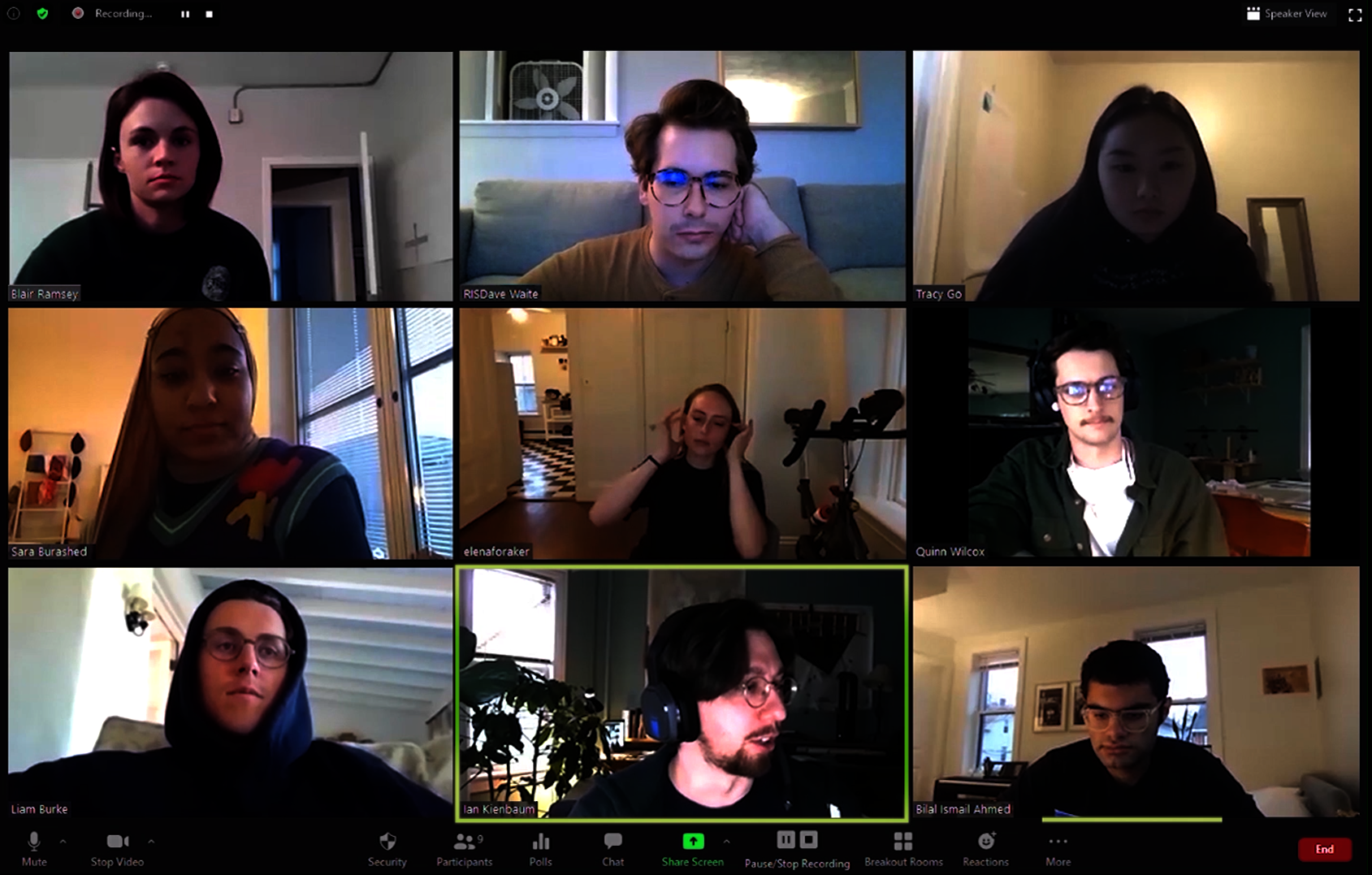
Methods for Connecting to Each Other
4’33”—Recording
Early in the COVID-19 lockdown, society witnessed a bizarrely vacant public world. As we learned that disease filled the volume between us, the distance between us grew dramatically empty. Hyper stimulation, stress, and fear filled our lonely lives as we dwelled in our homes, waiting for the next meeting, delivery, or horrific news. The radical emptiness reminded me of John Cage’s 4’33”. Its forced silence made way for the uncontrollable existing sounds of an environment. 4’33” is novel because people around the world still perform it, and the number of performers is wildly variable. The only important components are the space and being there to experience the performance. Given the novelty of the current situation, I zoomed eight of my peers for 4 minutes and 33 seconds of silence; cameras on, unmuted.
Ambient bits of audio and video brought themselves to our meeting. We have an almost drunken lack of control over this platform which only records and publishes compressed video and audio data. As each bit of data arrives, they compound, giving the viewer more clues to the character of their distant environment.
LiDAR Scan
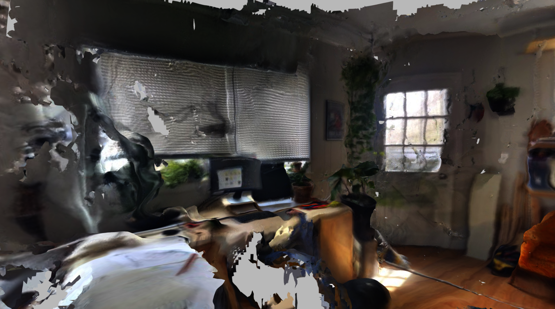
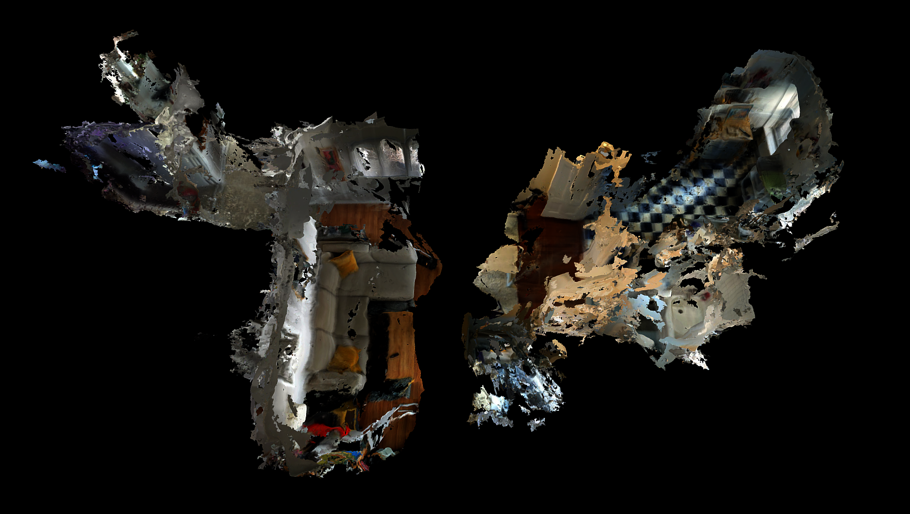
Beyond the spatial sensing of geolocation, smart phones are now capable of using LiDAR technology to record the geometry and imagery of space. Light Detection and Ranging, is a remote sensing method that uses light in the form of a pulsed laser to measure distance between the emitter and sensor. With a free LiDAR scanning app running as I attached my phone to my hat, I spent periods of time in my home doing different tasks such as working at my desk or watching TV from my couch. In what felt like hours, but was actually second, my Google Pixel 6 spat
out a sexy spinning digital model of what looked like either a plane crash or my living room.
I explicitly state here to take no authorship of the models and images this software created. A great deal of authorship goes to the programmers who wrote the code for how my phone records, synthesizes, and displays its data. It interests me how the digitization of my room space flattens objects into triangulated skins. My frangible existence in a digital public space is like that of a poached egg; lacking a structural boundary. As only a skin without thickness, this representation has no consideration of poché in the traditional sense. As a poché was previously measurable, this new poche may represent a the thickness between us as we meet virtually. For the sake of representational play, we could conceive of our interiors connecting now at the fourth wall (image below). It is not necessarily the drawing of these half shells which is important, but a contemplation of what is maintained and lost through this joining.
Image
Image
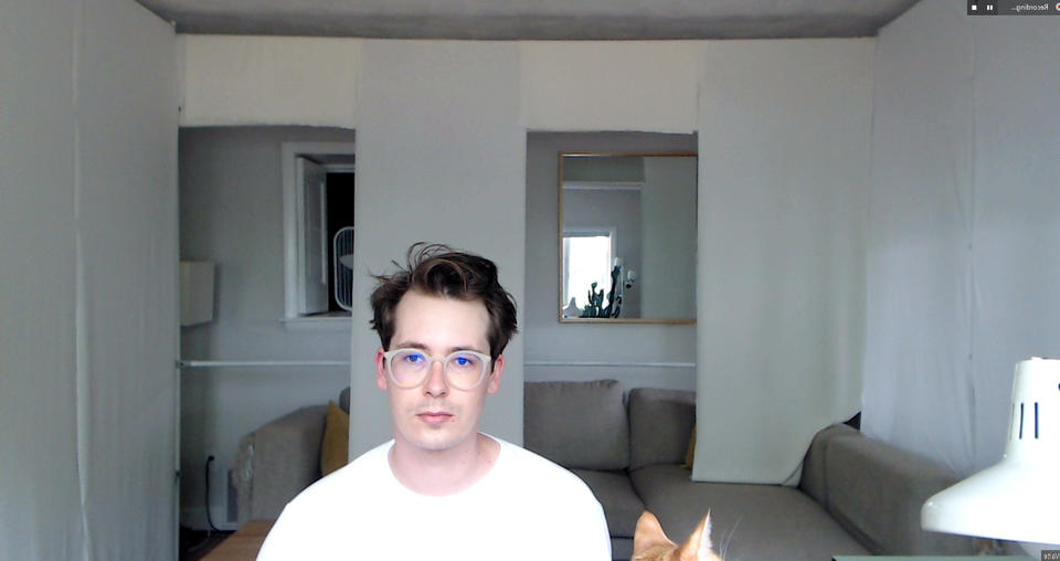
The final probe in this series questions a spatial connectedness by making my workspace quickly responsive to whomever I’m meeting with. Vito Acconci’s Instant House heuristically inspired me as it transformed the geopolitical plane into a rapidly contrasting container.
How could I experience my spatial existence as dual with someone else’s? I turned my room into a series of planes using favric panels which could raise and drop to mimic the wall openings of others. After reading someone else’s space behind them, I articulated my fabric panels to mirror theirs. Doors, windows, and walls all contribute to the defensible nature of a space, as well as directions of attention and distraction. Seeing an apartment’s front door behind someone implies the circulation of the room. Maybe there’s a bird nesting in the window to the right. Although minor, these nuances of wall openings compile to affect dialogic space. Fabric’s flexibility makes this proposal possible, but of course it still lacks the important traits of gravity,
mass, thickness, and depth. Using more tools like projectors, this probe may work more effectively in dancing between two worlds, but I think it would be just as important to see the projection as well as the source projector in this situation.
Virtual reality and augmented reality are getting ever closer to fooling the mind into thinking the body is in another place over there, but that was never what this project was about. I believe
there is a loss of sanity when the mind loses its footing from the body’s physical, geographic existence. This period of hyper remoteness made me yearn for emotional and intellectual closeness. As human existence abstracts ever strangely through our digital dystopia, architects must come to engage with the physicality, hapticity, and present paranoia of digital public space by retooling. The radical loss of sanity and human life this last year showed me the necessity for architecture to ground people in the environment they occupy as well.
Image
Glossary
Image
“Architecture does not exist without drawing, in the same way that architecture does not exist without texts... Buildings have been erected without drawings, in the same way that architecture itself goes beyond the mere process of building. The complex cultural, social, and philosophical demands developed slowly over centuries have made architecture a form of knowledge in and of itself. Just as all forms of knowledge use different modes of discourse, so there are key architectural statements that though not necessarily built, nevertheless inform us about the state of architecture — it’s concerns and its polemics — more precisely than the actual buildings of their time.”
—Tschumi, Bernard. Architecture and Disjunction. MIT Press, 1996, pp. 102.
The full glossary is viewable in the thesis book link at the top of this page

