Breadcrumb
Seth Eiseman, Samantha Ho, Ashley Yoojung Kim, Lilly Nguyen, & Rohan Upadhyayula
In a post-pandemic world, the line between living and traveling is blurring – more flexibility in work, as well as pent up demand from the time we’ve spent staying at home due to the pandemic, mean people are shifting away from the mindset that traveling is a series of one-off trips and instead of a lifestyle where you can spend time in different places of the world throughout the year. If people are traveling more frequently, that also means there should be a change in how people document and share their travels.
One of the main pain points that travelers experience while on vacation is they can't truly unplug – when our phones keep us constantly connected, it makes it hard not to check work emails or fall into doom scrolling, which means we take the stress of everyday life with us on vacation. Furthermore, standard trip planning platforms such as Yelp and Tripadvisor can be overwhelming, and most travelers would agree that recommendations from friends and family who have more context about both the trip and the traveler’s preferences add a level of personability and comfort not found on a stale website. Yet, when you're the person sharing those recommendations, it can be a pain to jog your memory of your favorite spots from a trip you took years ago. And even if you’re in the habit of saving locations, often these are presented without the story behind the save, and thus are inadequate for sharing.
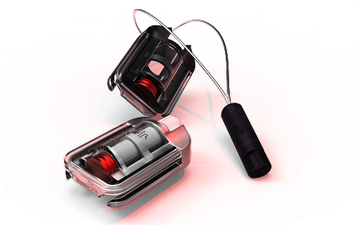
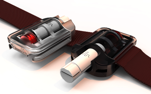
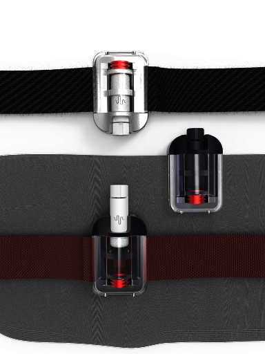
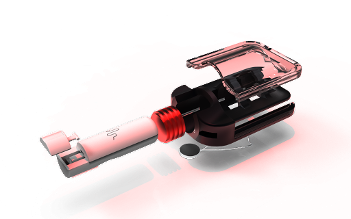
It doesn’t have to be this way. This team of design engineers would like to introduce Breadcrumb, a logging device that allows travelers to seamlessly document their journeys by capturing location and audio-based memories for personal reflection or sharing. Breadcrumb is a wearable device that pairs with an app. To use Breadcrumb, you can choose to either wear it as a pendant, clip it to your clothing, or on your wrist using the band. Users click once to log a location and hold down the button to record location-based ‘crumbs’ and sound ‘bites’. Experiences can be saved without looking at a screen, and later can be played back and shared in its partner app. The app borrows the popular social media concept of ‘stories’ and allows users to easily parse through friends’ published crumbs. As a whole, Breadcrumb’s mission is to enable travelers to document and share their experiences without the burden of their phones. The interdisciplinary nature of the team was the key driver behind this project. It is what led to the inception of a new product with a unique user experience that spans across both hardware and software, aiming to re-imagine the traveling experience. Throughout this project, the team employed an iterative design process, building looks-like prototypes to emphasize the form factor and user interactions and works-like prototypes that explore the technology and test the idea's validity.
Image

Breadcrumb Animated Logo
Hardware Product Protoype
The final physical hardware prototype is based on three rounds of user testing and synthesis. The team got mixed feedback on preference for a wrist attachment or a necklace, thus leading us to design a product that could act as both. Additionally, lots of users expressed concern of the device being too large and calling too much attention to itself, thus leading to a design on the smaller side. And finally, because users were worried about losing pieces if it were detachable, the pendant was designed to magnetically clip inside the dock for security.
Image
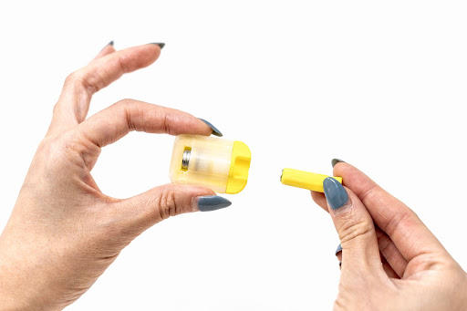
Physical hardware protoype 3D print
Breadcrumb App
The Breadcrumb physical device pairs with its very own mobile app. Some key features are highlighted here where you can view ‘stories’ of your friends' published crumbs through vertical scrolling, you can group crumbs by location. There is also the ability to transcribe spoken and narrative crumbs to tie metadata like links, definitions, directions, and other relevant information together, and lastly, a map view for easy viewing of all the places you and your friends have been.
Image
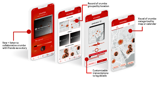
Breadcrumb mobile app
Product Demonstration
The team wanted to run a usability test with a potential user. The goal was to uncover potential problems with the system and design, discover opportunities, and learn more about the target user's behaviors. The goal was to set up a scenario that was as close to the idealized vision of the user experience as possible. This meant allowing the user access to the prototype over a longer time period (because we envision this product working best on trips or experiences), and no need for a phone to enable the pinging action. A small hardware device was constructed that is a scaled up version of the looks-like prototype. The physical model is a roughly 40 times enlarged version of our looks like model, thus keeping the visual language of the product consistent in testing. The device was given to one target user who is familiar with the idea of the product for 24 hours and minimal instruction other than to use the product however she imagined. The team then analyzed the data for patterns and tested the overall user experience of dropping crumbs. The hardware device pairs with the phone via bluetooth and is used to actually simulate dropping crumbs. The process is easy: simply press the button on the side of the prototype, look for the LED to flash to show a successful ping, and watch your crumb appear on the app at the right spot. The app both logs the location on a map and in a list with the address of the crumb and a time stamp.
Image
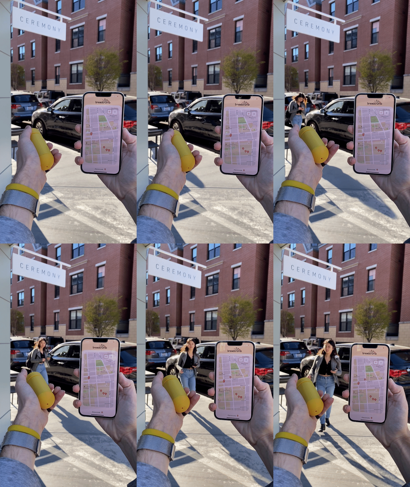
Demonstration of pinging a location
Final Product Renderings
- Architecture
- Ceramics
- Design Engineering
- Digital + Media
- Furniture Design
- Global Arts and Cultures
- Glass
- Graphic Design
- Industrial Design
- Interior Architecture
- Jewelry + Metalsmithing
- Landscape Architecture
- Nature-Culture-Sustainability Studies
- Painting
- Photography
- Printmaking
- Sculpture
- TLAD
- Textiles
