Apron
Isabel Arango, Jeremy Philemon, & Timothy Taliaferro
Before navigation systems like Google Maps existed, people had to use physical maps or word of mouth to get from point A->B, "uhh turn left after you see a big red house, and pull up when you see a cafe around the corner of something street.”
Without navigation systems, this form of information failure limited the mobility of human civilization.
Isa, Jeremy, and Tim believe that cooking today feels the same way too. For example, this is a recipe from the New York Times – https://cooking.nytimes.com/recipes/1022386. This form of information failure threatens the well-being of our civilization.
The creation of terrestrial navigation systems helped people take the plunge and venture into uncertainty, resulting in the discovery of new places and making the world more accessible to everyone.
So our ambition is simple: to make cooking easier for the apprentice cook.
Through our research and interviews with ~80 people, we identified the following touchpoints we needed to design-engineer a solution for
- Poorly designed recipes – ”All of a sudden I need chopped onions, while my pot with oil is heating up. This is dangerous!”
- Visibility of the recipes, “I pick my phone up and put it down, follow the instruction, pick it back up again, put it down. It’s annoying!”
- Pacing of instructions – “I have to hit pause, play, pause, play, pause multiple times to keep up with the instructions, ughhh!”
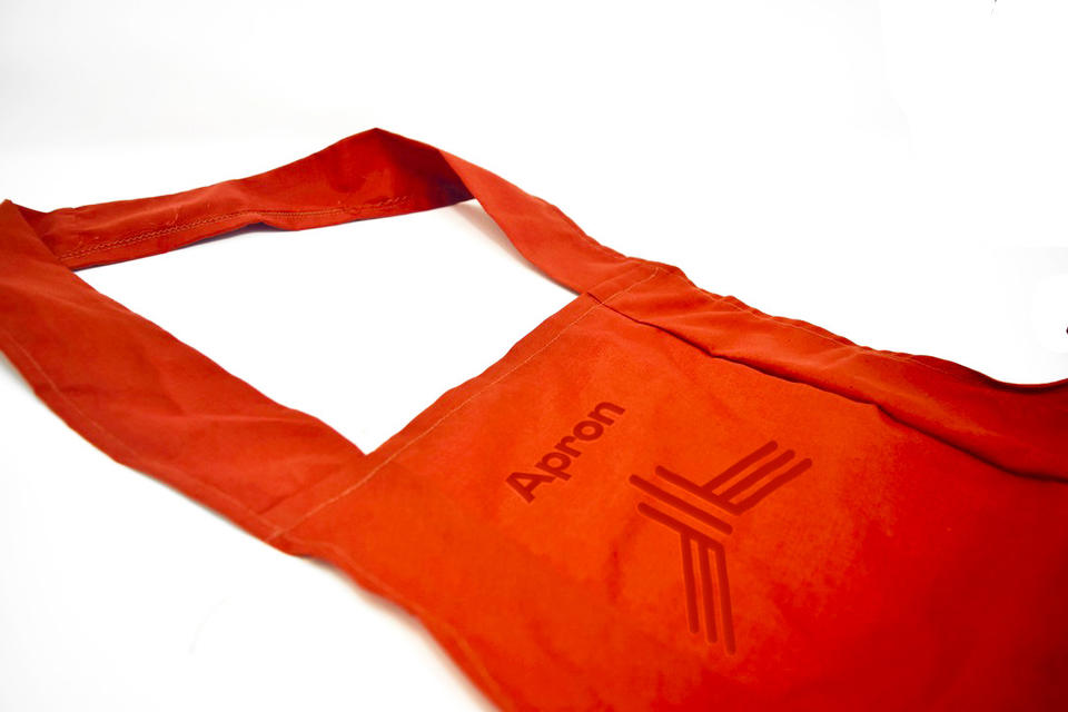
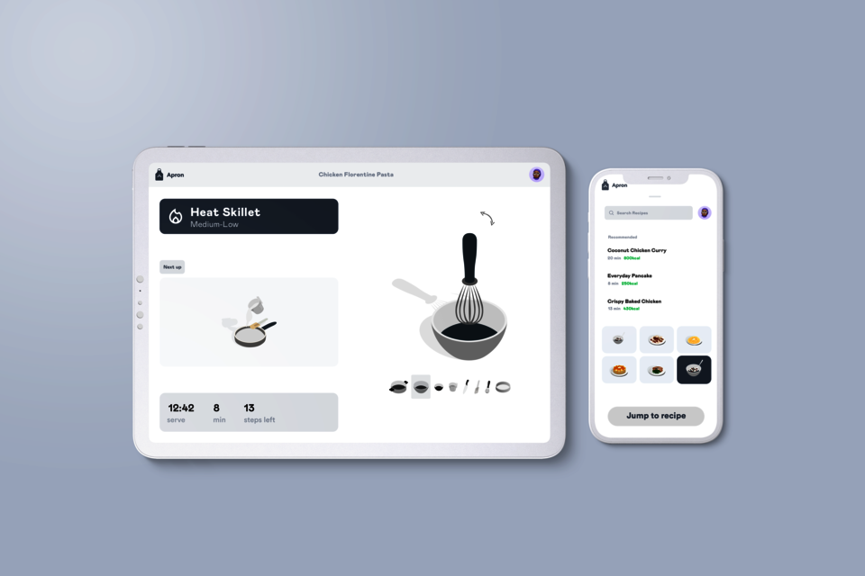
Over four months of design thinking and cutting-edge engineering, we developed apron – the world’s first culinary navigation system that counters these pain points to help one cook anything with ease.
The minimum viable product of the apron ecosystem
Poorly Designed Recipes
A good recipe should be easy to follow and understand. Unfortunately, many recipes are anything but clear. They’re full of jargon and technical terms, and they often skip over important details. As a result, it can make it hard to know what people are supposed to do at any given point when they’re following a recipe, unfortunately contributing to mistakes.
One way to make recipes more comprehensible is to create a recipe template. The template gives structure to recipes and prevents people from pausing during cooking. After parsing through ~8,000 recipes and studying their contents, we were able to conclude that each step in a recipe should describe six key pieces of information. They were technique, quantity, ingredient, utensil, time, and heat.
Using this framework, we rebuilt recipes from the ground up to follow this structure. As a result, this lets you focus only on the important details.
Image
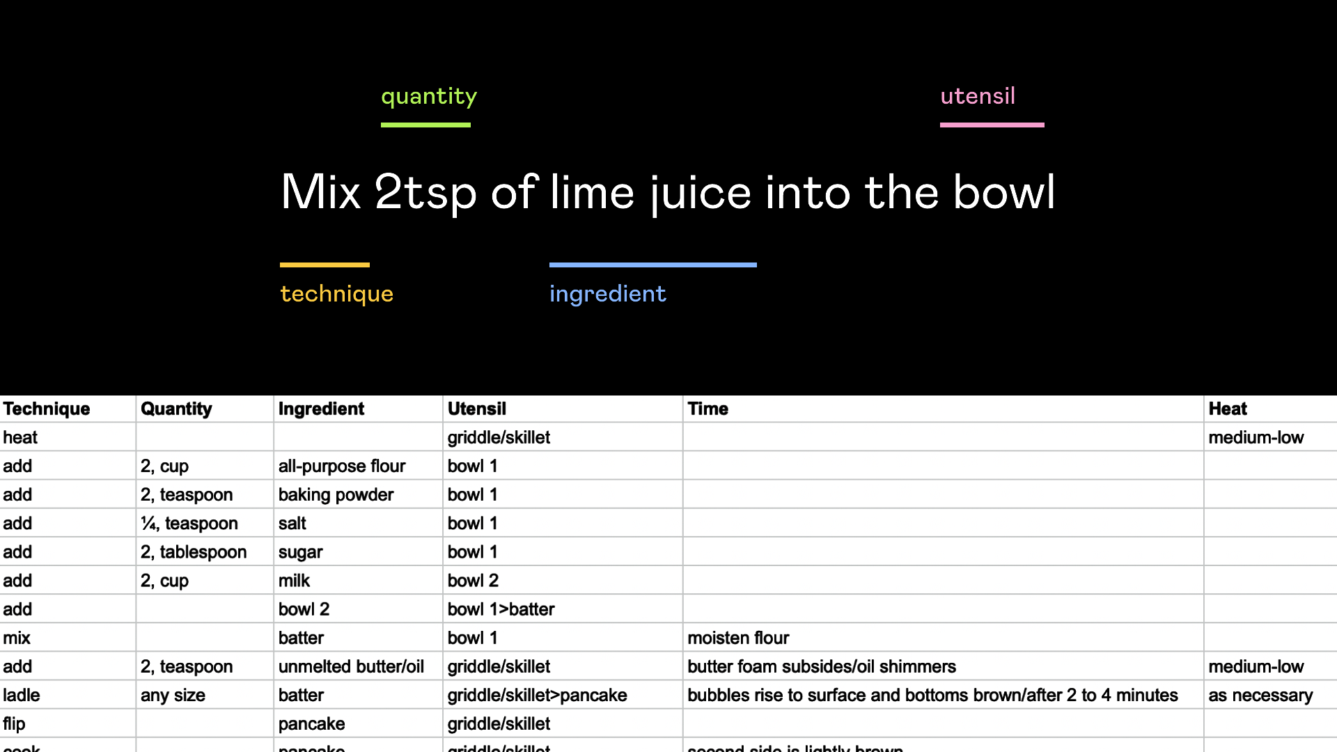
Making the language
Visibility of the Recipes
The average American has access to more than ten connected devices in their household and the personal use of these devices include entertainment, online shopping and banking, home appliances, to name a few. The exponential growth in use of these technologies at home, proved the need to properly use, display, watch and store them. Consequently, there are thousands of designs for tablet/smartphone mounts. The market is vast, considering the different situations in which the devices are used, yet very few mounts designed specifically for the kitchen.
For a couple of years now, the days of paper recipes have started to slowly disappear. The internet is flooded with recipes of all kinds, lengths, difficulty levels and nutritional benefits. The use of the tablet, smartphone and even laptop is starting to be prevalent inside the kitchen. The modern chef is becoming more and more familiar to follow recipes that contain visual elements and sound. Thinking with google marketing strategists insist: “While nearly half of all adults watch food videos on YouTube, millennials (ages 18 to 34) view the most food content, watching 30% more food content on YouTube, on average, than other demographics.” This hunger for guidance in preparation correlates with inconvenient placing of electronic devices in close proximity of fresh ingredients.
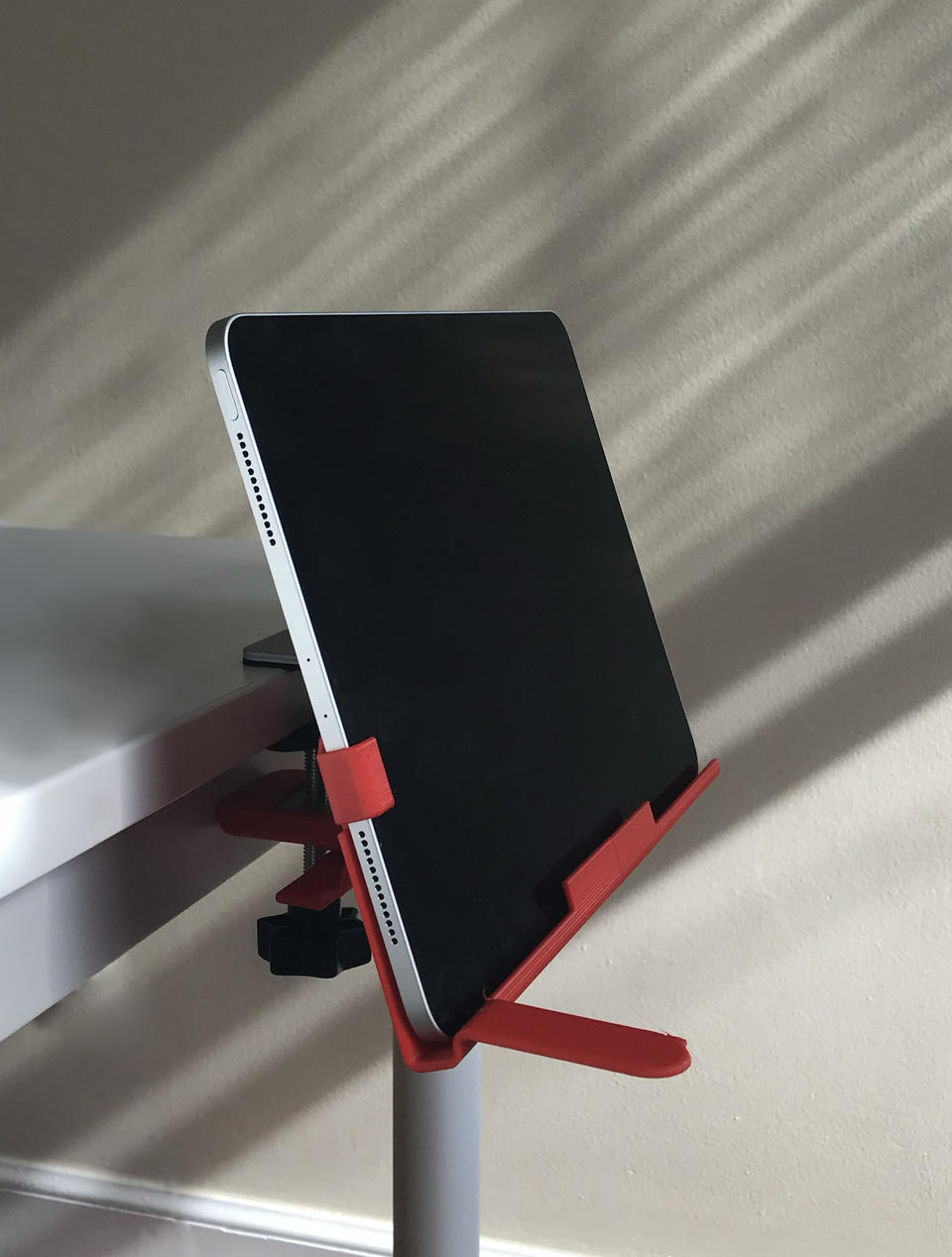
In response to this specific situation, the Apron mount is designed precisely for cooking. It is adjustable to place in a variety of kitchen layouts and has strong compatibility with multiple devices. It rotates on its axis to provide views in different angles and contains a lever that helps with movement while maintaining hands off the interface.
Making the mount
Pacing of Instructions
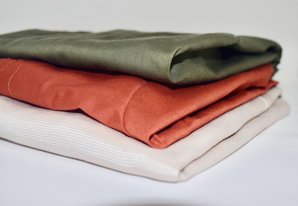
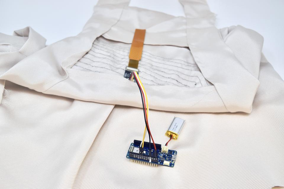
Humans have donned aprons for millennia. We aimed to bring their utilitarian value into the modern era through the design and fabrication of a smart garment that serves three main functions: pace, mess and context. Through our user testing, we determined ideal ergonomic placement for our capacitive touch interaction. The main goal of this gesture is to control the pace of the audio and visual instructions provided to the chef. We wanted to ensure the Apron could still maintain its original function, so we made sure all vulnerable technological components are removable for easy washing. Overall, we believe that putting on an apron provides valuable context that prepares our chefs physically and mentally to succeed in the kitchen.
The Apron has embedded micro-electronics woven into the textiles to receive gestures and communicate back with digital activity. Seamlessly integrated, our technology gives cooking a new layer of interaction. Every preparation step is at the tip of your fingers, without intervening with your smart devices. With a small gesture, one can glide through a new recipe like a master. Access to every step, utensils, quantities and tips to cook properly without even reaching for your phone. For example, with a simple brush of your chest you can get your next direction and navigate through the cooking experience.
Making the apron
Gallery
- Architecture
- Ceramics
- Design Engineering
- Digital + Media
- Furniture Design
- Global Arts and Cultures
- Glass
- Graphic Design
- Industrial Design
- Interior Architecture
- Jewelry + Metalsmithing
- Landscape Architecture
- Nature-Culture-Sustainability Studies
- Painting
- Photography
- Printmaking
- Sculpture
- TLAD
- Textiles
