Image

Ella Knight
An Architect's Toolkit for Color Theory
There's a trend for American architects to wear all black, build all white models, and design buildings all in shades of gray and beige. One of many factors that contributes to an increasingly achromatic discipline is that in American architectural education, color theory is not a required aspect of the design curriculum. In response, this thesis proposes a toolkit for architects with the intent to shed light on biases against color within the discipline, educate designers on color theory and application, and provide tools and frameworks to encourage more intentional use of color throughout a contemporary design process. The toolkit includes a glossary of terms, a catalog of colors, a model of 3D color relationships, an algorithm for polychromes, a library of color-organized materials, and a schedule of drawing conventions.
Image
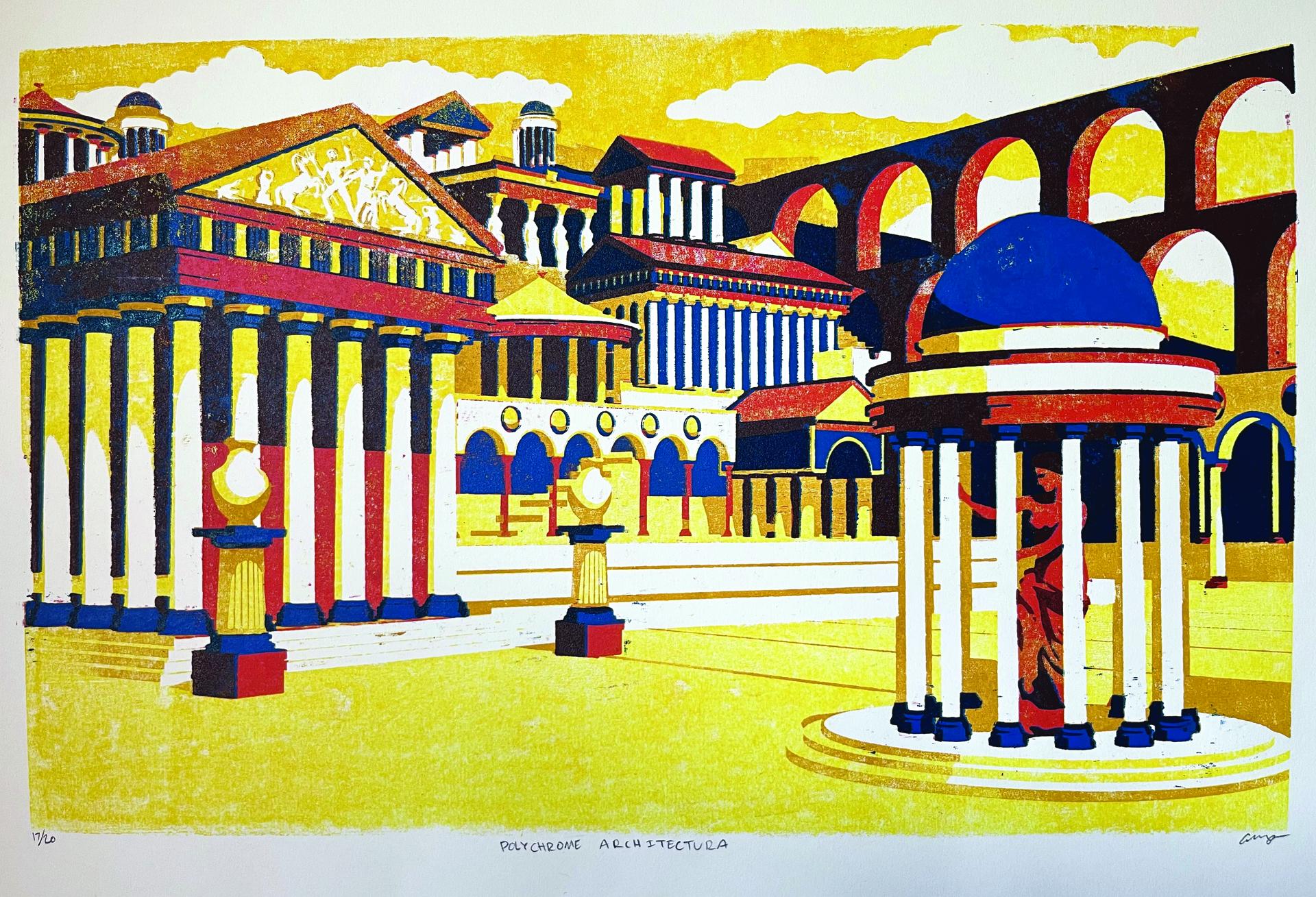
Polychrome Architectura
Woodblock Print
22" x 30"
2022
It’s important to address that many of the notions in this thesis have come from my experiences living in the US, working with American Architects, and attending three different American schools of architecture. From my limited experience on the professional side, I’ve observed how paint colors and material finishes are put at the very end of the process as almost an afterthought. During the design process, we’re all taught to start with modeling white boxes, inherently giving preference to minimalist aesthetics.
Though often portrayed as white throughout art history, classical architecture and sculpture were actually vibrantly painted. This woodblock print was intended to dispel the myth of whiteness in classical design. It is a love letter to colorful architecture, and defines my understanding of a polychrome, Greek for “many colors.” The glossary in this toolkit firmly defines applied paint color as a medium of Architecture (with a capital A).
Image
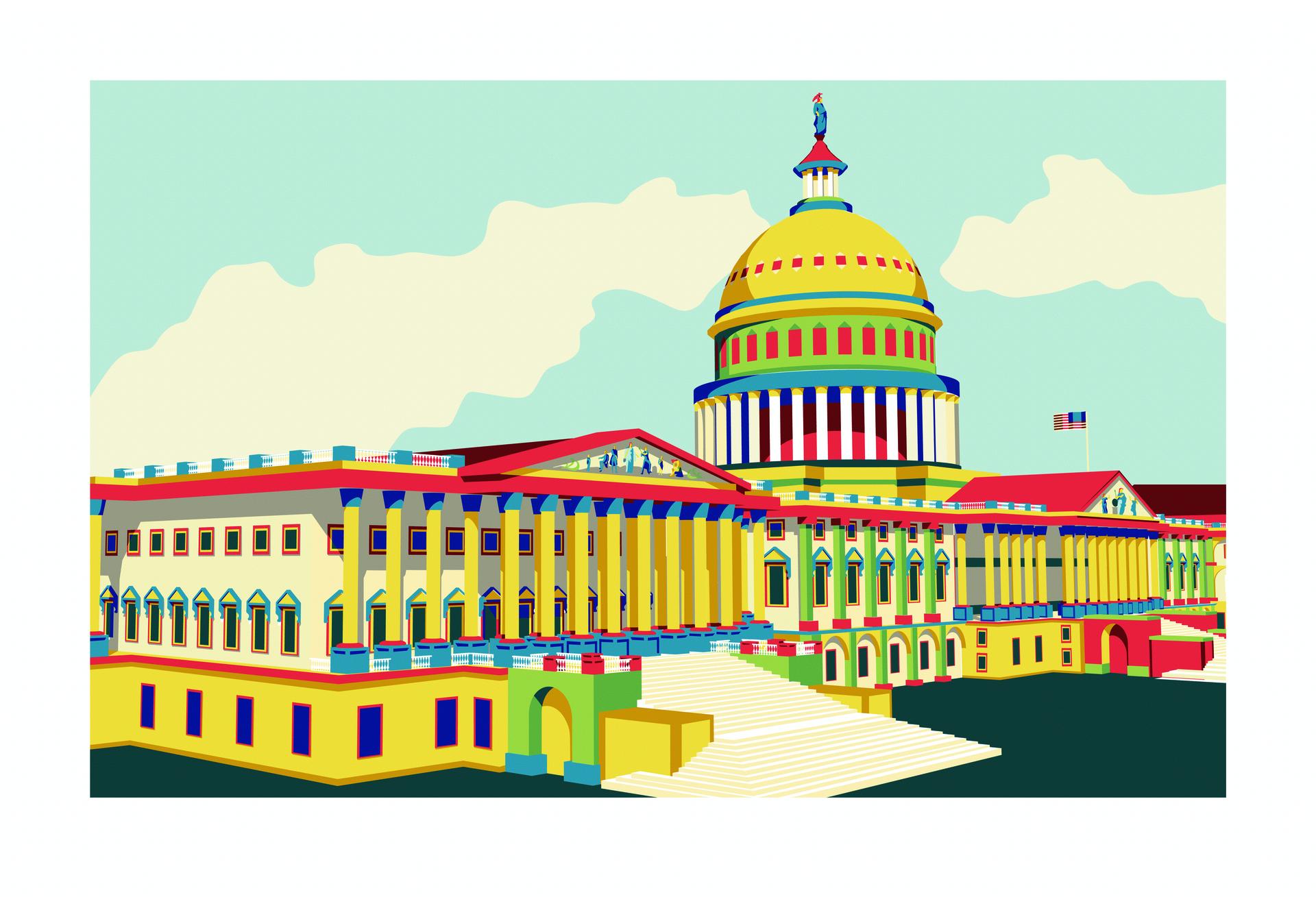
Neo-neo-classical
Digital
2023
The toolkit’s catalog has 16 colors examined through cultural anecdote, linguistics, physical swatches, and architectural examples. I have been able to discuss the design with architects of four of these buildings. Through these conversations I’ve found that architects are very well trained in dealing with value; we use light and shadow to make space. Value is only one component of color though; hue and saturation could use more attention.
I investigate the color white with the United States Capitol, a prime example of Neo-Classical architecture. Using Greco-Roman forms of columns, domes, arches, and triangular pediments it references the aesthetics of the first democratic states. But unlike Greco-Roman architecture, it is entirely white. This drawing imagines a neo-classical building decorated in an actual classical polychrome. This revisionist history is a provoking question. What might the cannon of modern architecture look like if the precedence of revival styles were true to color?
Image
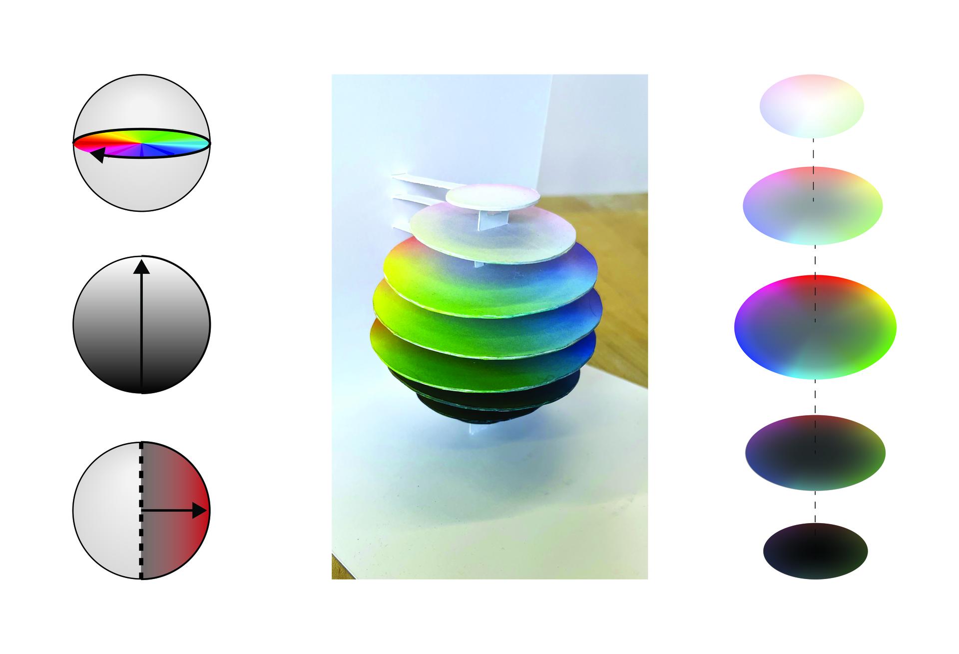
Spatial Color Model
Digital and Paper
6"x6"x6"
2020, 2023
I have had an interest in the complexity of the three-dimensional relationship between colors for a few years now. This started as a design research lab with Roundhouse Platform and I/Thee studios investigating the color identity of a specific place and delving into the scientific means of objectively communicating color. Due to the pandemic we were investigating the new potentials of remote design work and experiencing places without physically being there.
My partner Meagan Willoughby and I worked as an off-site team and came to the conclusion that to more objectively communicate color relationships we had to address the three dimensionality of color. This work was an early exploration of color spaces that I have now fine-tuned as an interactive Rhino model.
Image
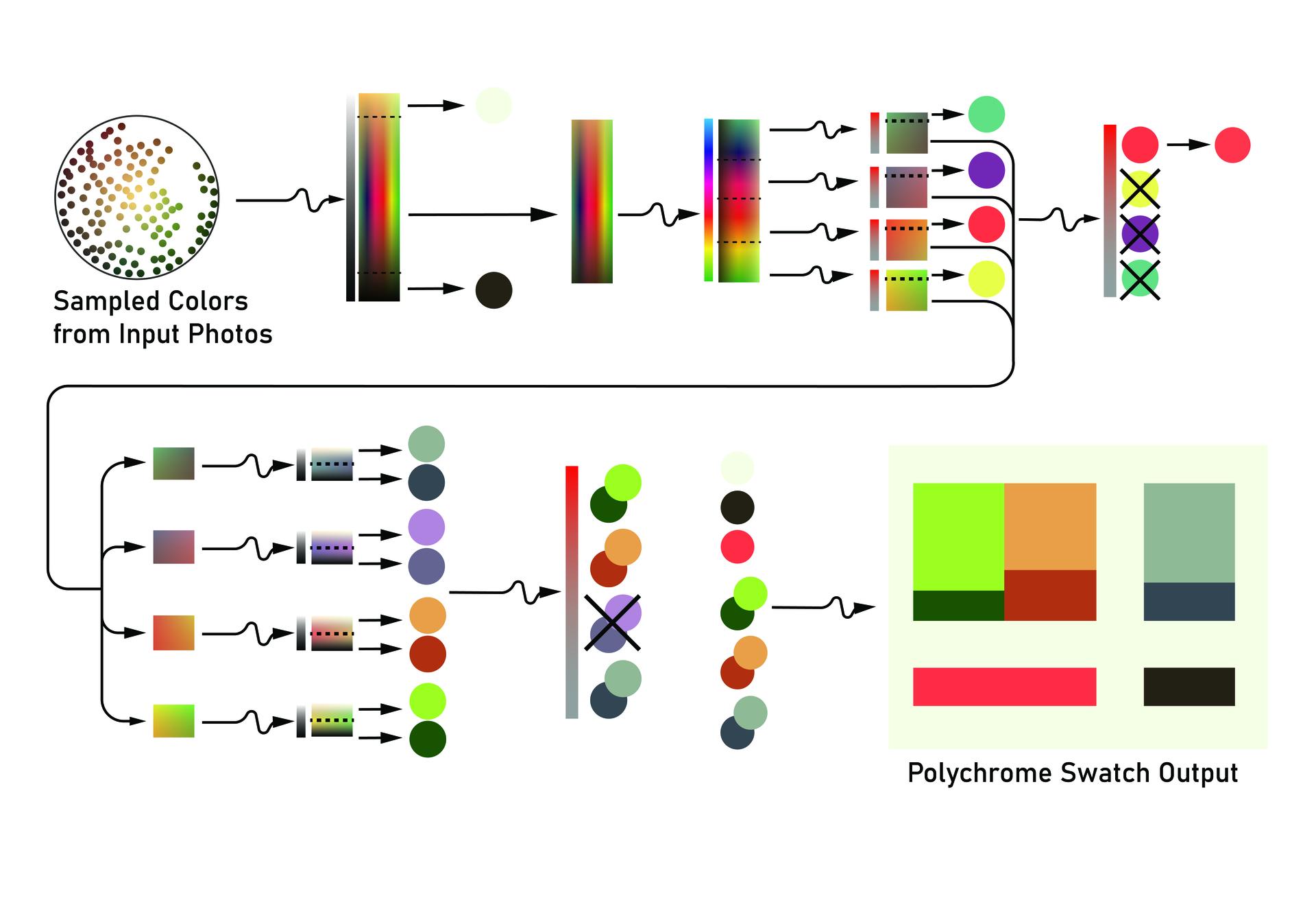
Polychrome Algorithm Process
Digital
2022
This past summer I had an opportunity to pursue my own research at an internship with Newman Architects in New Haven, CT. I decided to continue research on the aforementioned topic through an architectural lens. I ended up scripting an algorithm in Grasshopper that could analyze color data three-dimensionally. The input data came from site photos, leading to an output of complex color schemes intended to coordinate or harmoniously contrast the context of a building.
This diagram illustrates the process of sorting the data set into a coordinating polychrome; the contrast polychromes are then derived by inverting this polychrome at specific ratios in each component of hue, saturation, and value
A Reorganized Material Library
Digital
2023
The toolkit’s library currently exists as a digital interface of material finishes. Architectural offices will commonly have a material library with small physical samples of finishes, each binder containing every color the manufacturer offers for that particular product. The default colorway is what’s up front, and most commonly is a gray or beige or generally neutral color. These options might cost just slightly less since they are produced more often. There is also the reality that extra pigment in a product can add to the cost.
But this library reorganizes materials by color, and deemphasizes default choices. They can be sorted by hue, value, saturation, or variance. Using this material library for early collages and renders in a design process can create more intentional color choices throughout the timeline of the project before having to officially choose finish products.
Image
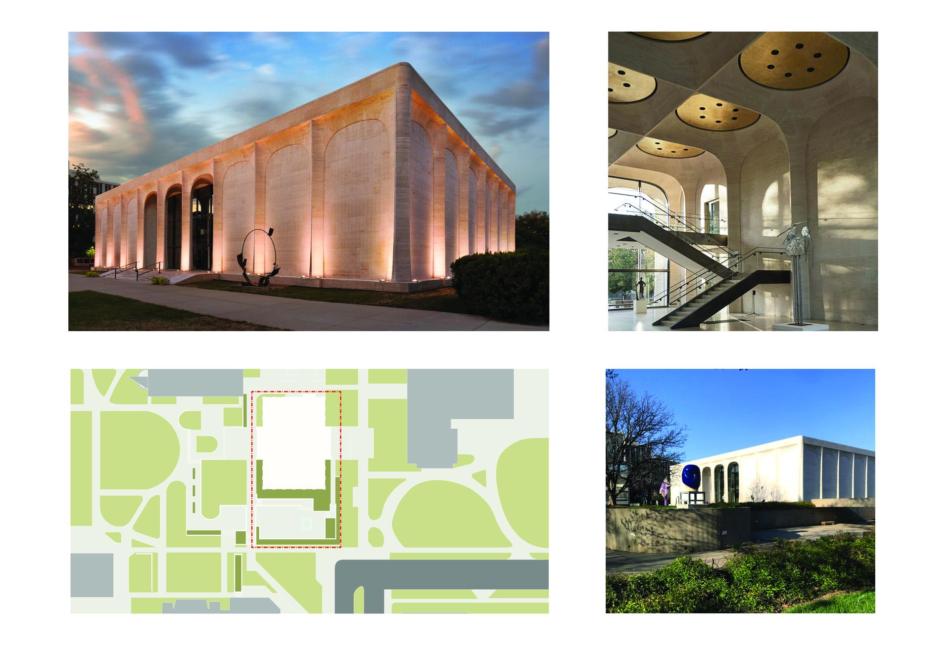
The Sheldon Art Museum
Photos and Digital
2020
The Sheldon Museum of Art was designed by Phillip Johnson with ostentatious materials, gold and travertine. Though on a college campus, it feels too fancy for students to visit often. This case study proposes an addition to create student engagement and suggests a framework for designing with this color toolkit.
Image
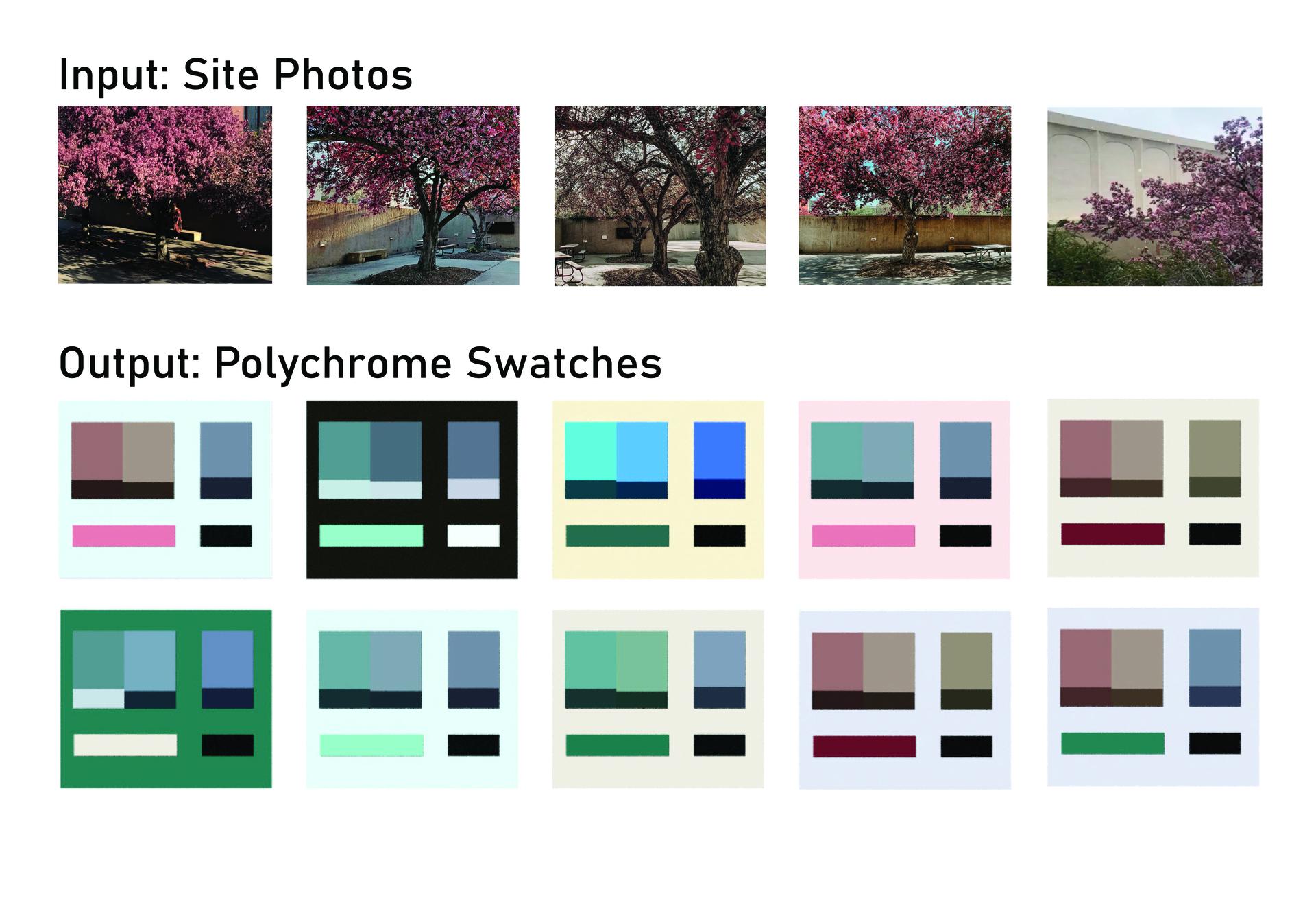
Algorithm in Process
Photo and Digital
2020, 2022
A concrete hardscape on the site is visited two weeks a year when the trees bloom. I used photos of this aspect of the site as an input for the algorithm to produce ten polychromes options for my design. Pink isn’t used in any campus buildings so I found it intriguing for this design charette.
Image
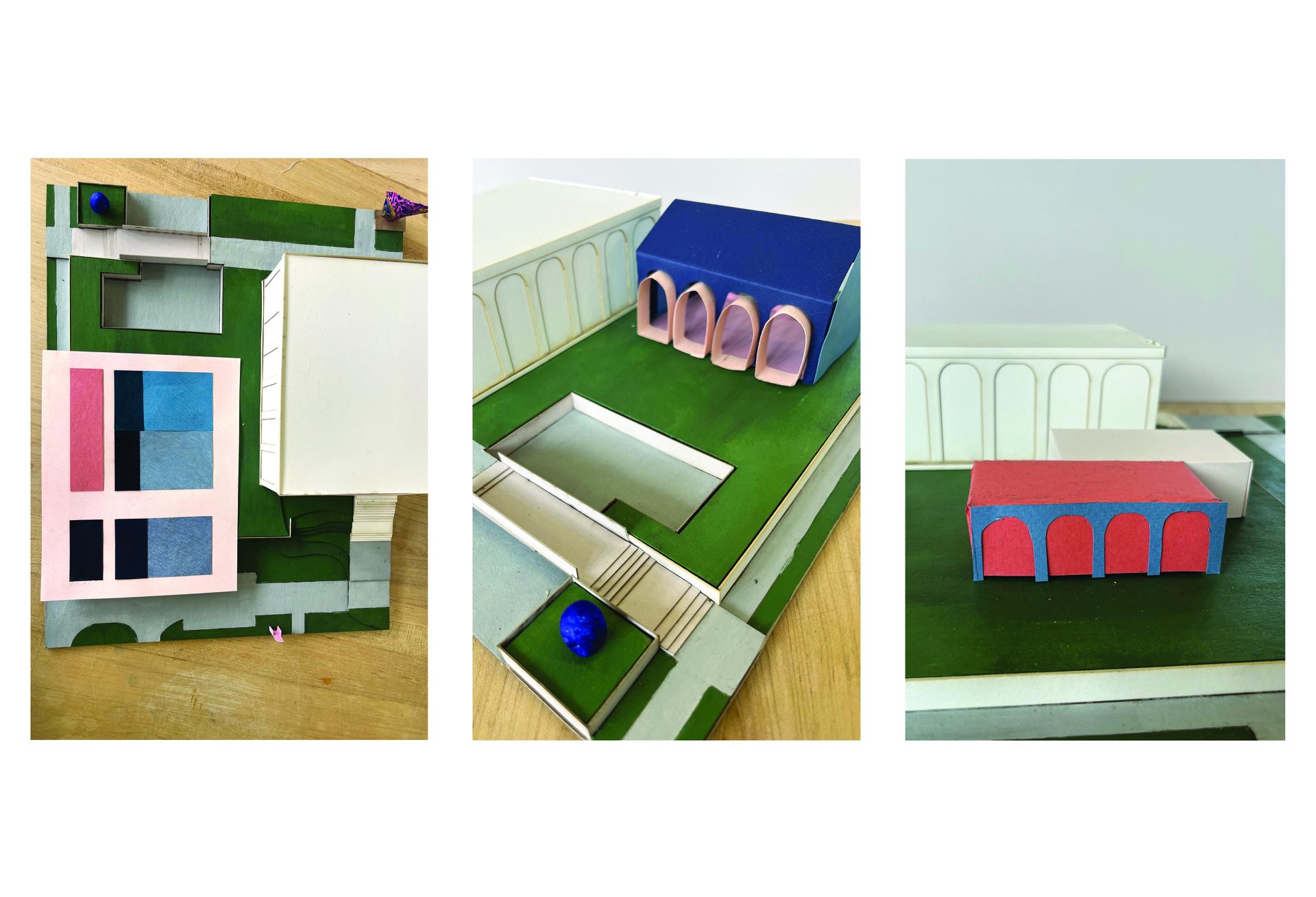
Physical Work Process
Chipboard, Acrylic Paint, Colored Paper
12" x 12" x 5"
2023
I built a small site model representing the vibrant campus greens and iconic, colorful sculptures to start iterating. I created a paper version of the polychrome I decided to continue with, and used the colored paper to play with scale and form.
Image
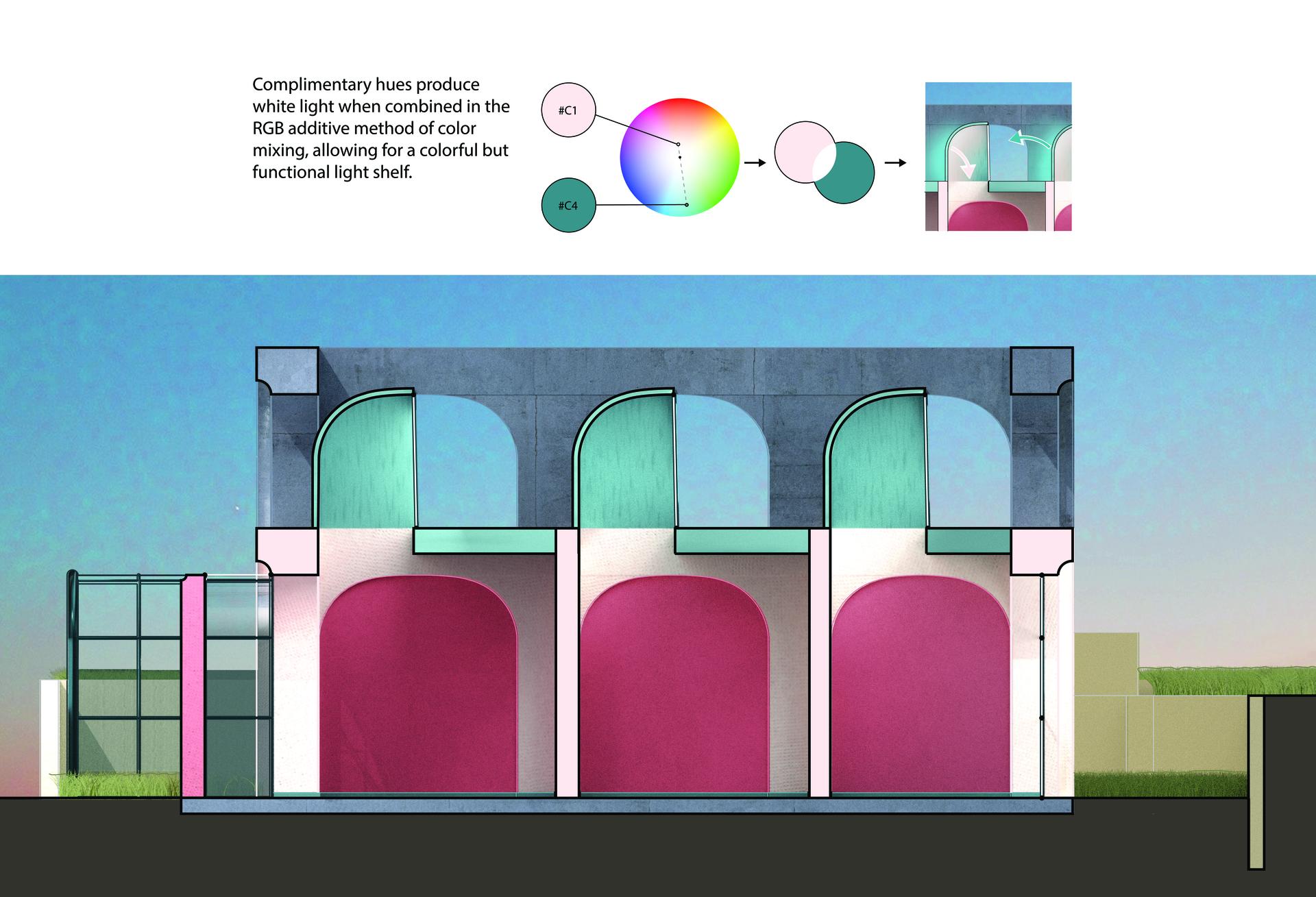
Section of Sheldon Addition
Digital
2023
After deciding on a stopping point for the schematic design, I focused on the implementation of color in a few section details. The polychrome included a complimentary pair of colors, and using an understanding of additive color mixing created a colorful light shelf that still produces white light for functionality.
Image
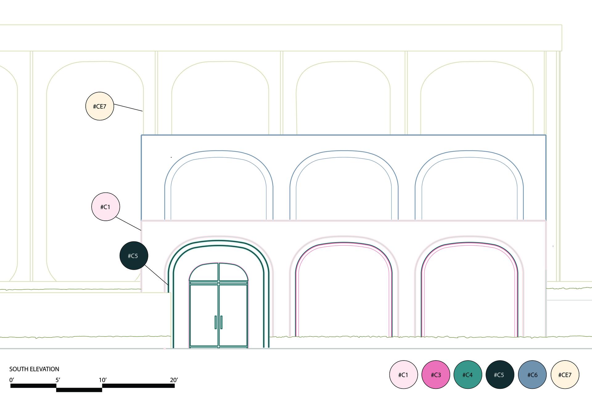
Sheldon Addition Elevation
Digital
2023
Architectural drawings today are black lines on white paper, whichI feel sways designers to more minimal color schemes as we process and imagine a design. In response I created a simple set of graphic conventions to consistently communicate color throughout drawings.