Video file
Karan Sathis Kumar
Press Play
"Press Play" arises from a conviction that a predilection to play is not an infantile diversion; instead, it extends our human ability to magnify, augment and shape reality. This thesis moves through different sites—all metaphorical playgrounds—where cultural repertoires are altered, negotiated, and invented through play. Each playground is a laboratory for innovation and a catalyst for developing a mental aptitude for reimagining ways to occupy familiar structures: the slide, swing, carousel, jungle gym, and bench as navigational spaces. The thesis becomes an experiential landscape through situations, processes, methods, and stylistic movements.
Image

Chicane—Racetrack Typeface
Type Design
2023
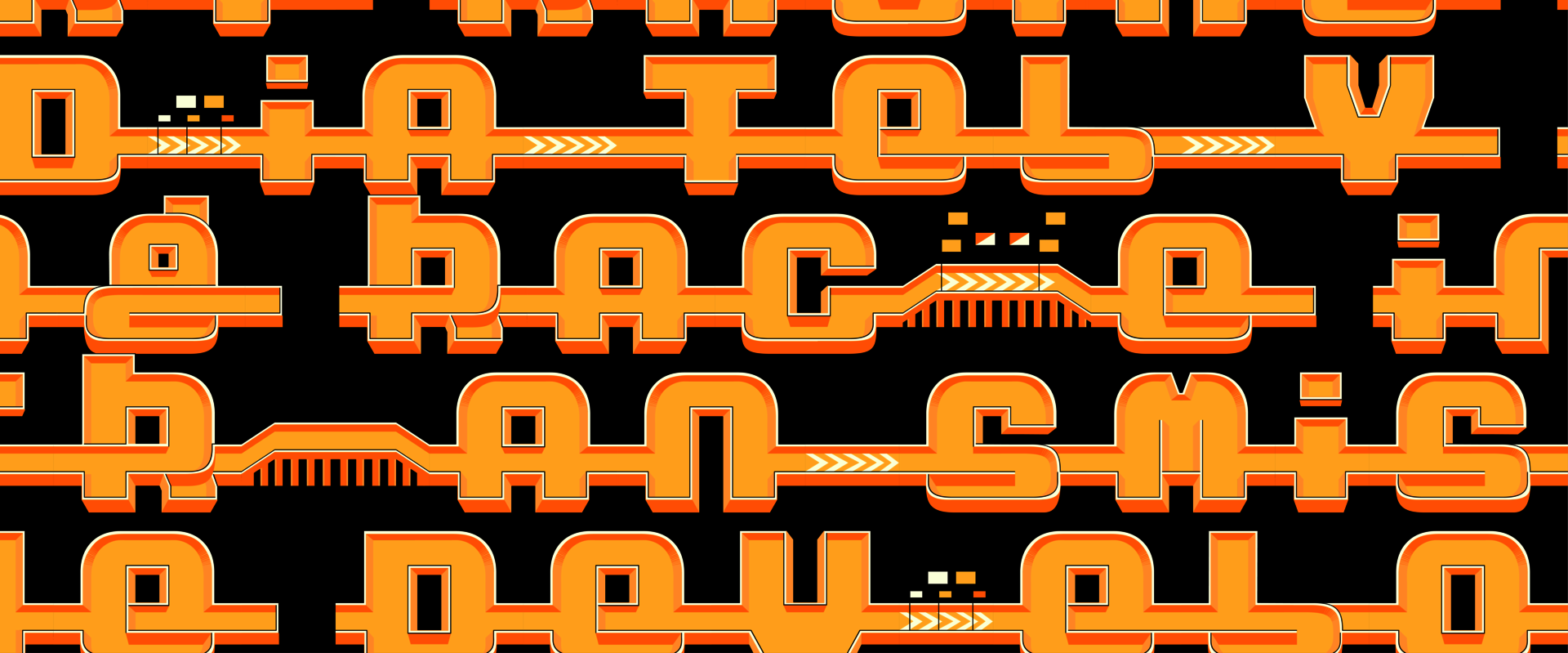
Chicane is a glyphic typeface that enables users to create race track circuits by simply typing. Chicane delivers the promise of introducing twists and turns to the race course best suited to the user's interpretation of speed and thrill. Surprising ligatures, contextual alternates, and various ramps, bridges, and tracks allow for an intuitive experience of control in construction. Chicane is an ascension to the traditional handling of type technology without necessarily creating an uncomfortable environment within conventional design space. Each character has its place and meaning; Words now provide meaning without forcing the otherwise conventional typing methods. Chicane was born out of a love for toy cars and race tracks. It is rooted in meaning (why it is made), consistency (how it is made), and purpose (how it is used). By using it, Chicane invites people to participate and share its wonders.
Image

Chicane—Racetrack Type Specimen
2023
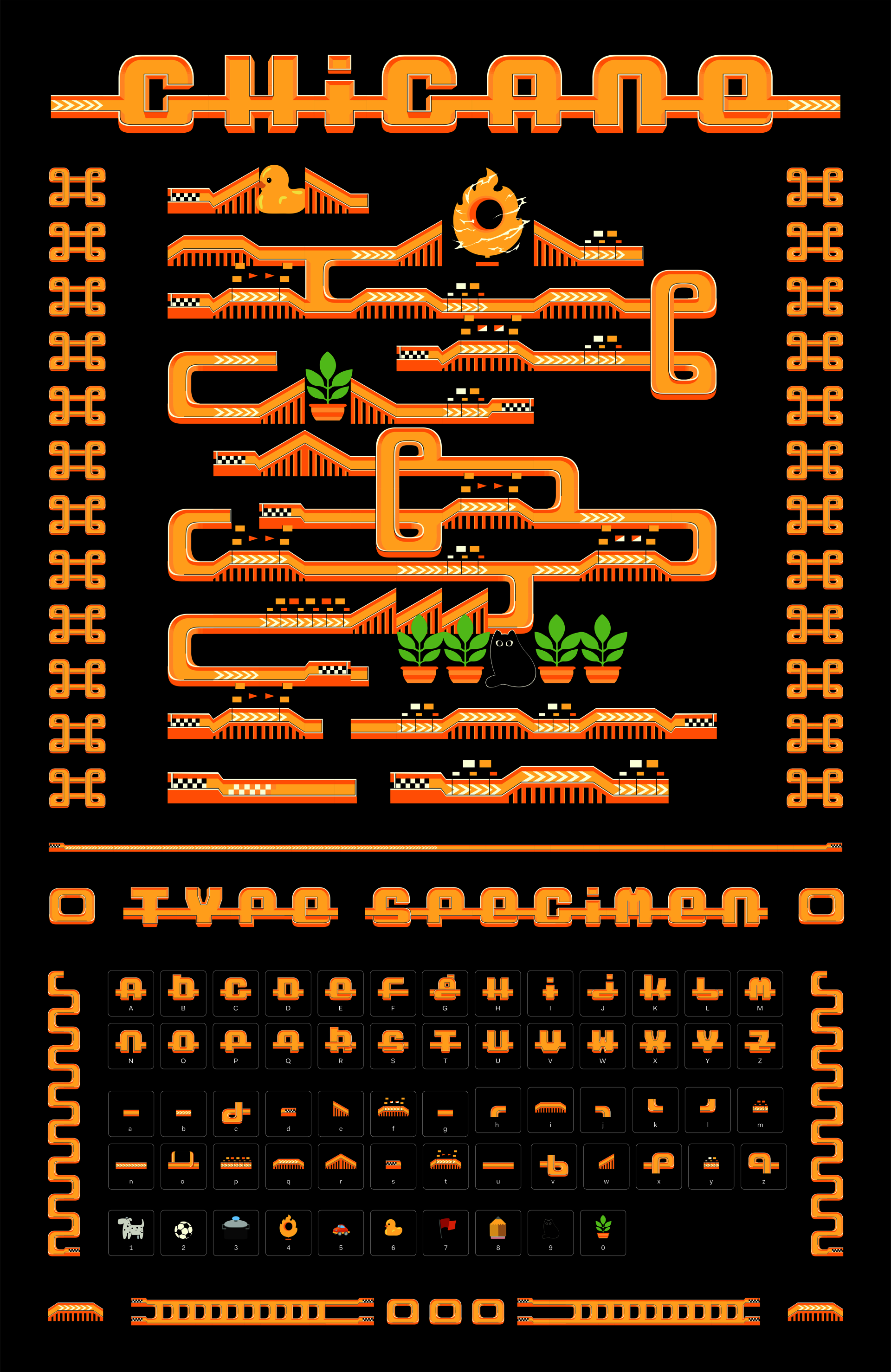
Chicane is a glyphic typeface that enables users to create race track circuits by simply typing. Chicane delivers the promise of introducing twists and turns to the race course best suited to the user's interpretation of speed and thrill. Surprising ligatures, contextual alternates, and various ramps, bridges, and tracks allow for an intuitive experience of control in construction. Chicane is an ascension to the traditional handling of type technology without necessarily creating an uncomfortable environment within conventional design space. Each character has its place and meaning; Words now provide meaning without forcing the otherwise conventional typing methods. Chicane was born out of a love for toy cars and race tracks. It is rooted in meaning (why it is made), consistency (how it is made), and purpose (how it is used). By using it, Chicane invites people to participate and share its wonders.
This-Placed
Web
2022
The concept of stooping, a tradition common in Providence, RI, was alien to me. Through photography, I was consumed by the ubiquitous presence of sidewalk castaways. A red record button was activated the minute I set foot on the pavement, subconsciously filtering through objects on the sidewalk. And so This-placed was born, a digital warehouse that stores an inventory of castaway furniture. Through the browser, the website transports a viewer to a 3-dimensional space built in Mozilla hubs, where a similar walkthrough experience from the streets of Providence is reimagined. Images of the furniture are arranged similarly, mimicking the physical world. This supported the argument that discomfort is only an untamed garden of possibility. It is a subtle machine in need of discipline. This discipline of repetition through documentation commences new spaces for graphic design to flourish.
Image
No Smoking
Poster
2023
I've always been fascinated by the power of design and how it can influence people's behavior. I started noticing the power of smoking signs and knew I wanted to take this concept to the next level. I began redesigning these signs with absurd and humorous instructions such as "No smoking under this rock" or "No smoking while riding a unicycle." I aimed to see how people would react to these unconventional signs and whether they would still effectively convey their message.
Langue
2022
This project explores language as a tool for resistance and empowerment in graphic design. Through creating a unique language system called Langue, this project challenges the dominant narrative and aims to break free from the constraints of traditional languages. The inspiration for Langue arose from a defaced mural, which sparked the creation of a series of symbols and characters that represent the collective spirit of the group. These symbols embody our belief in a future where communication is free and open, and the power of language is shared equally among all people. As a typographic movement, this fictional group takes to the streets at night armed with spray paint and stencils to cover all kinds of typography with Langue. This is not an act of vandalism but a powerful statement of our belief in the language system and the message it conveys.

