Image
Mina Kim
Invisible Systems
We are immersed in an efficiency-and-profit-obsessed world where products are advancing for the sake of updates without meaningful outcomes. The products’ seemingly simple and seamless interfaces bear the marks of deception and promote the world’s obsessions as a norm. My work defines the visual language and methods that hide complex truth within invisible systems. I aim to strike through invisibility for greater transparency and visibility.
I employ techniques that dis-organize the guidelines and components of invisible systems, reframing expectations and opening up new ways of understanding our surroundings. I intend whimsical reconfigurations to act as a mirror, providing a moment to reflect on the current systems in which we operate and opening up a room for visual languages that manifest more meaningful values.
Image

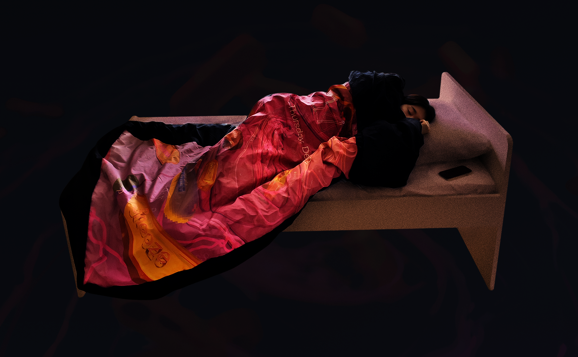
/snooze_maze
fabric
75 x 38"
2022
The smartphone’s alarm interface is almost an exact replica of an analog alarm clock, except that it lets a user set an unlimited number of alarms that can be snoozed indefinitely. With its’ infinite quantity and duration to hold alarms ringing, the digital alarm deceivingly promises that one can delay waking up and hold the time forever. However, the 9-minute sleep guaranteed by snooze buttons is unhealthy. A prolonged snoozing of your alarm confuses your circadian rhythm, disturbing REM (Rapid Eye Movement) sleep, the most restorative of all sleep states.
To reflect this luring and deceiving nature of the alarm interface, I turned the snooze button into a glitch which deconstructs the alarm interface into a three-dimensional maze. Produced as a duvet cover, the snooze maze manifests a scale and materiality that literally covers, wraps, and weighs down a person trying to wake up and puts them back to sleep.
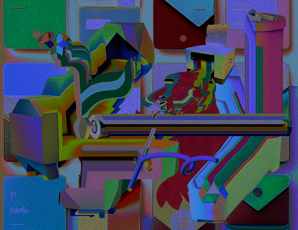
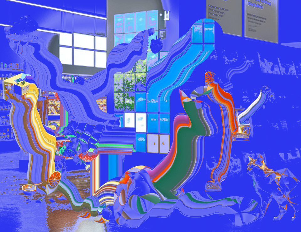
/imagining_with_prompts
collage
8.5 x 11
2023
Prompts are increasingly shaping visual outputs with the advancement of AI. I explored Midjourney, a popular AI image-generator, to distort everyday objects, and I tested how it reacts when the names of design systems like Google's material design and Apple's Human Interface Guidelines become part of the prompt. I collected the outcomes in a bound book to create a non-digital archive of these outcomes, giving the tangibility of a book can offer to the fleeting moments in the digital space. Throughout this exploratory process, I thought about the designer's role becoming more curatorial, in other words, letting the AI image-generators directly manipulate the pixels while designers prompt, frame, select, and collage the outputs.
Image
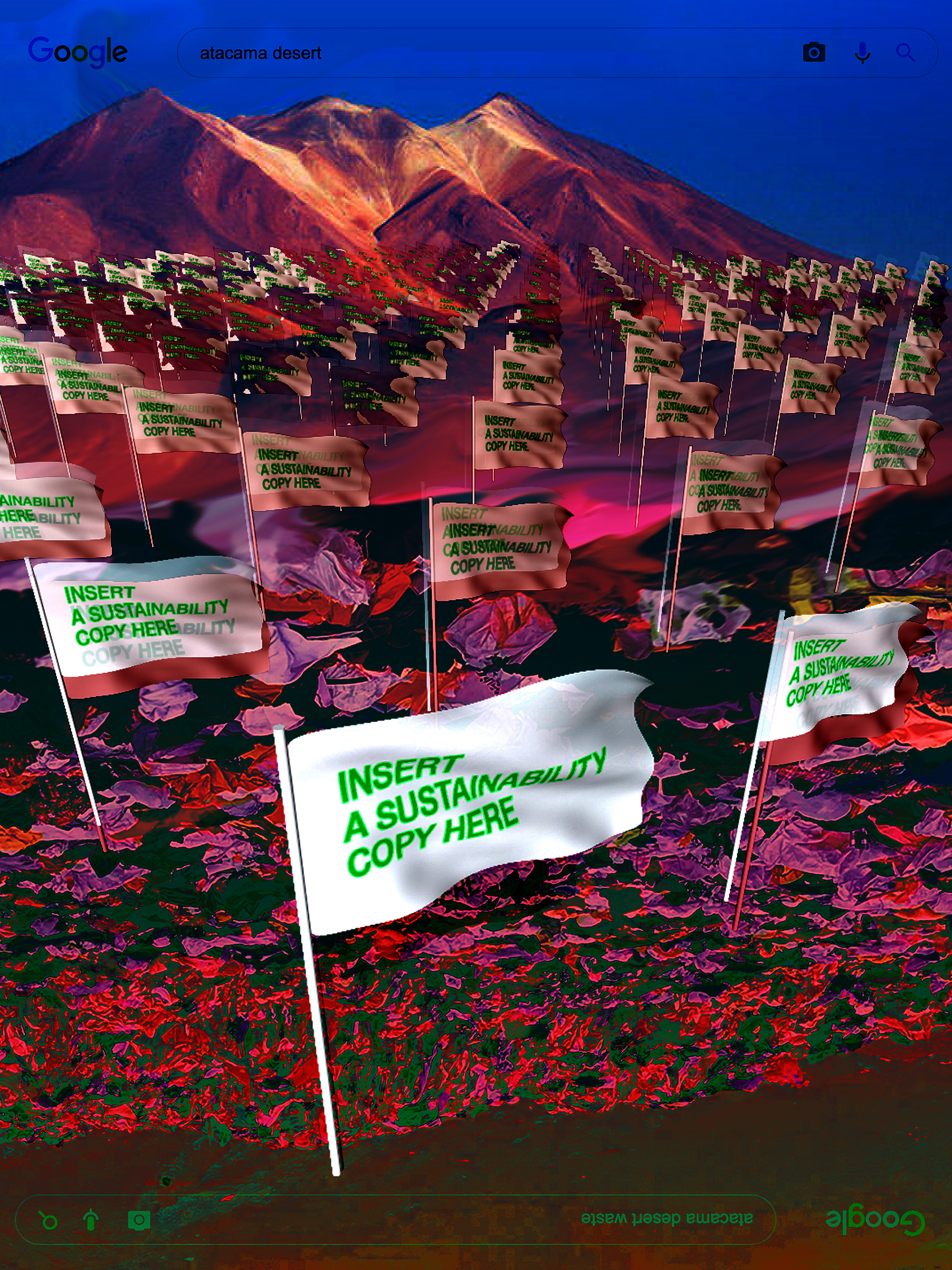
A Way to Colonize Atacama Desert
Poster
48 x 36
2022
A Way to Colonize the Atacama Desert shows the ugly truth of the sustainability campaign. Many fast fashion brands claim that their garments are recyclable, but they rarely are. The disposed of garments get sent to dumpsites like the Atacama Desert. The top of the poster shows the peaceful view of the Atacama Desert in Chile. It's an image you will see when you search Atacama Desert on Google, but the bottom shows the inverted view of a pile of garments taking over the desert. It's an image you can find when you add the word "dumpsite" to "Atacama desert" in a Google image search. Which shows how much your view can change depending on what you know. I used the flag to represent the fast fashion brands physically colonizing the land with clothing waste.
Image
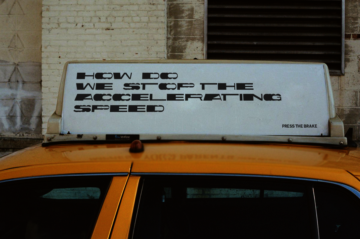
How Do We Stop
Poster
10 x 14
2023
I modified a typeface for road signage called transport and made a more visible display font. Transport is a prime example of a Beatrice Warde’s crystal goblet where the type is so legible that we don’t notice it. Transport, which was originally designed for British road signage in 1950s “performed so efficiently for so long that most people are completely unaware of them.” and it is the blueprint for road signage type design. Turning this into a display font was an act of strike through invisibility, in a playful way. Getting inspiration from where Transport is used-the highway- I treated each letterform as an animation frame and depicted an accelerating motion by distributing the duplicated letterforms in linearly increasing distance.
Image
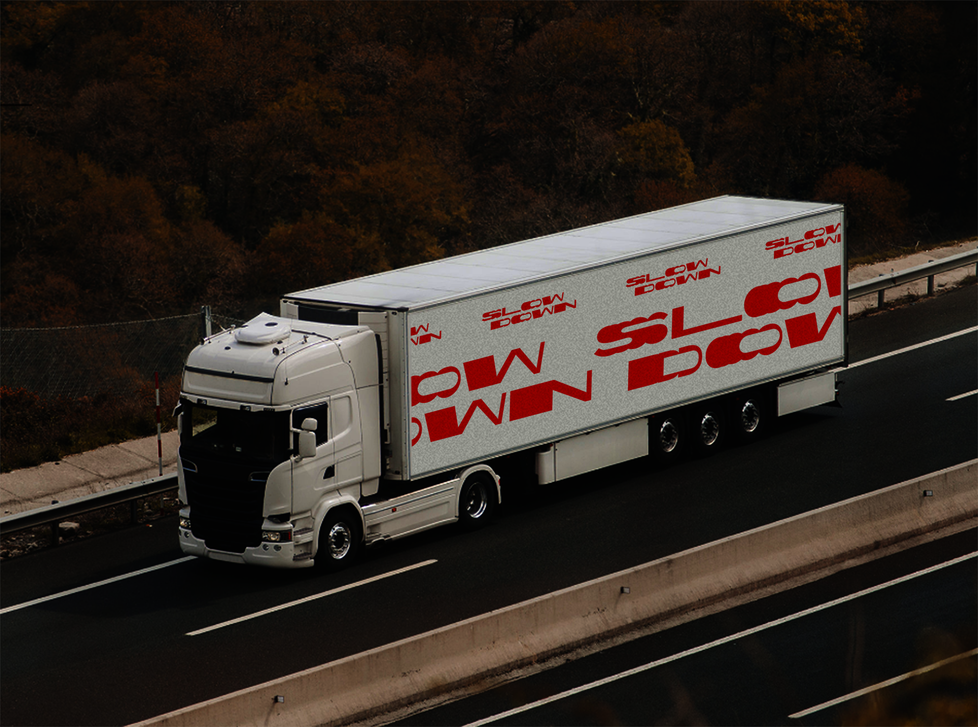
Slow Down
Poster
10 x 14
2023