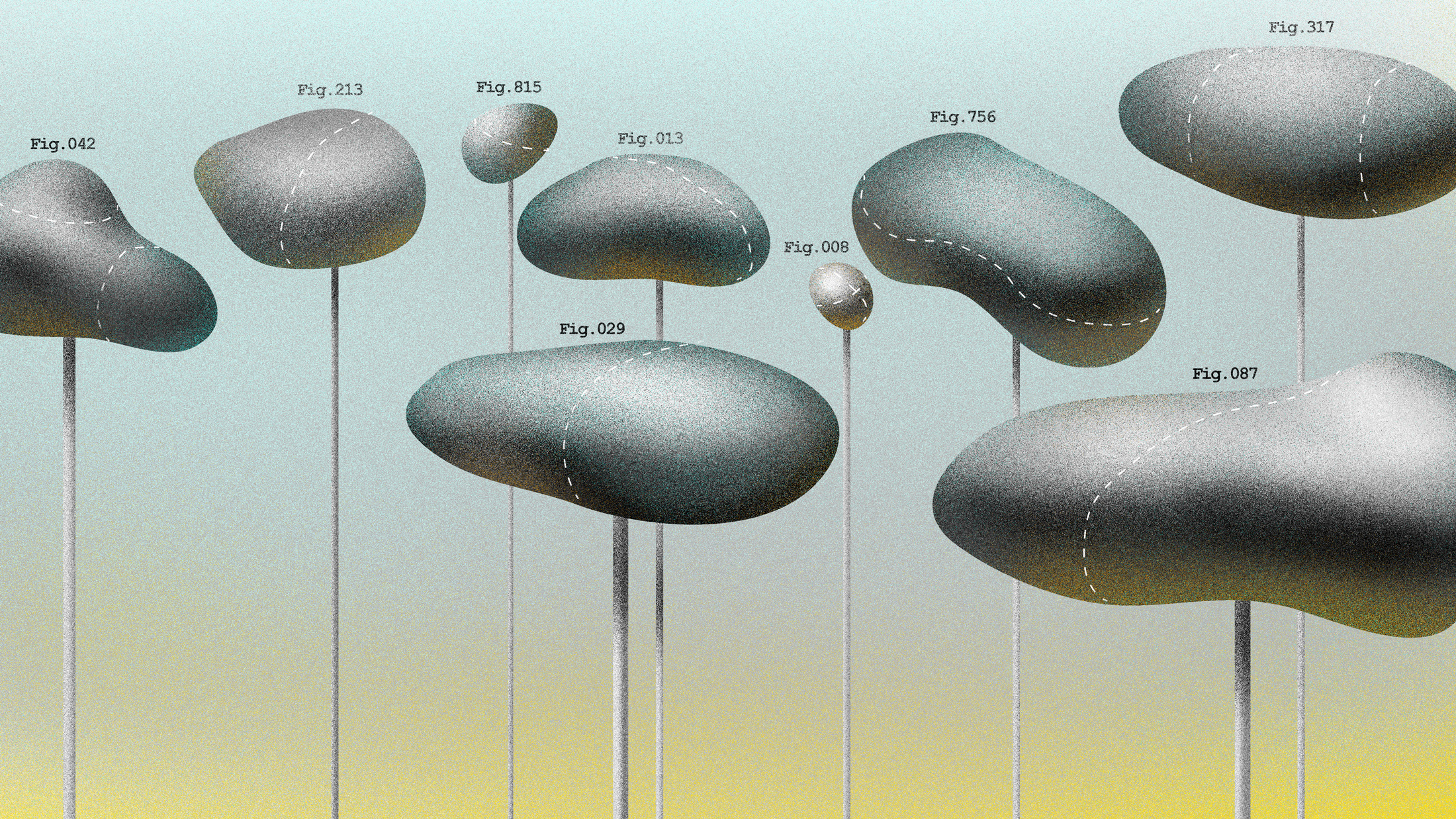
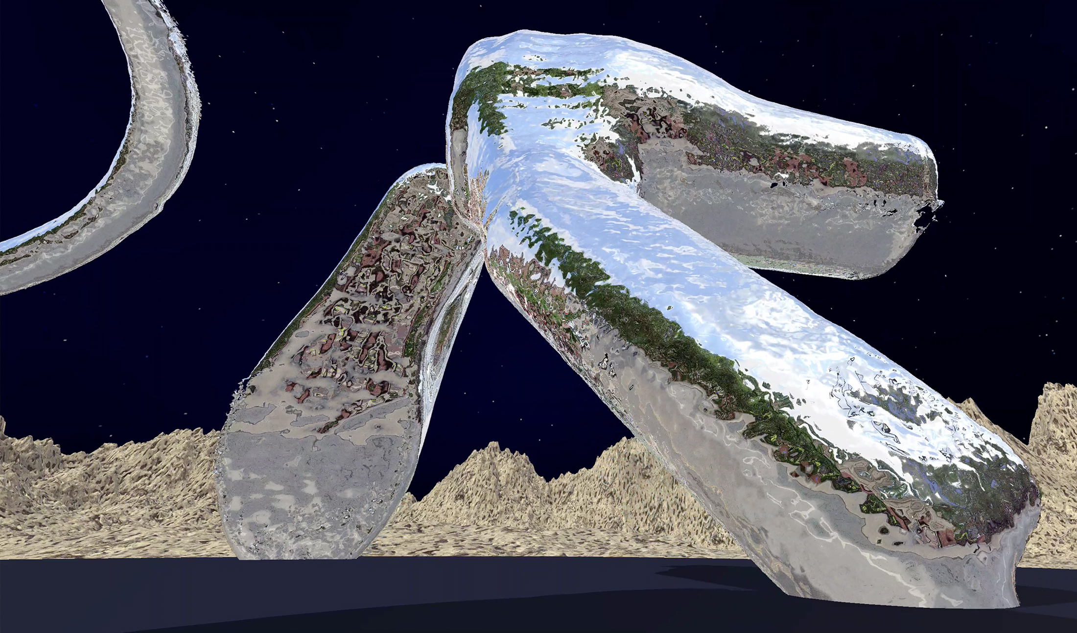
In Proximity
RISD
Graphic Design MFA
→←Class of 2020
Aleks Dawson
Bobby Joe Smith III
Carl-Gustaf Ewerbring
Caroline Robinson Smith
Elena Foraker
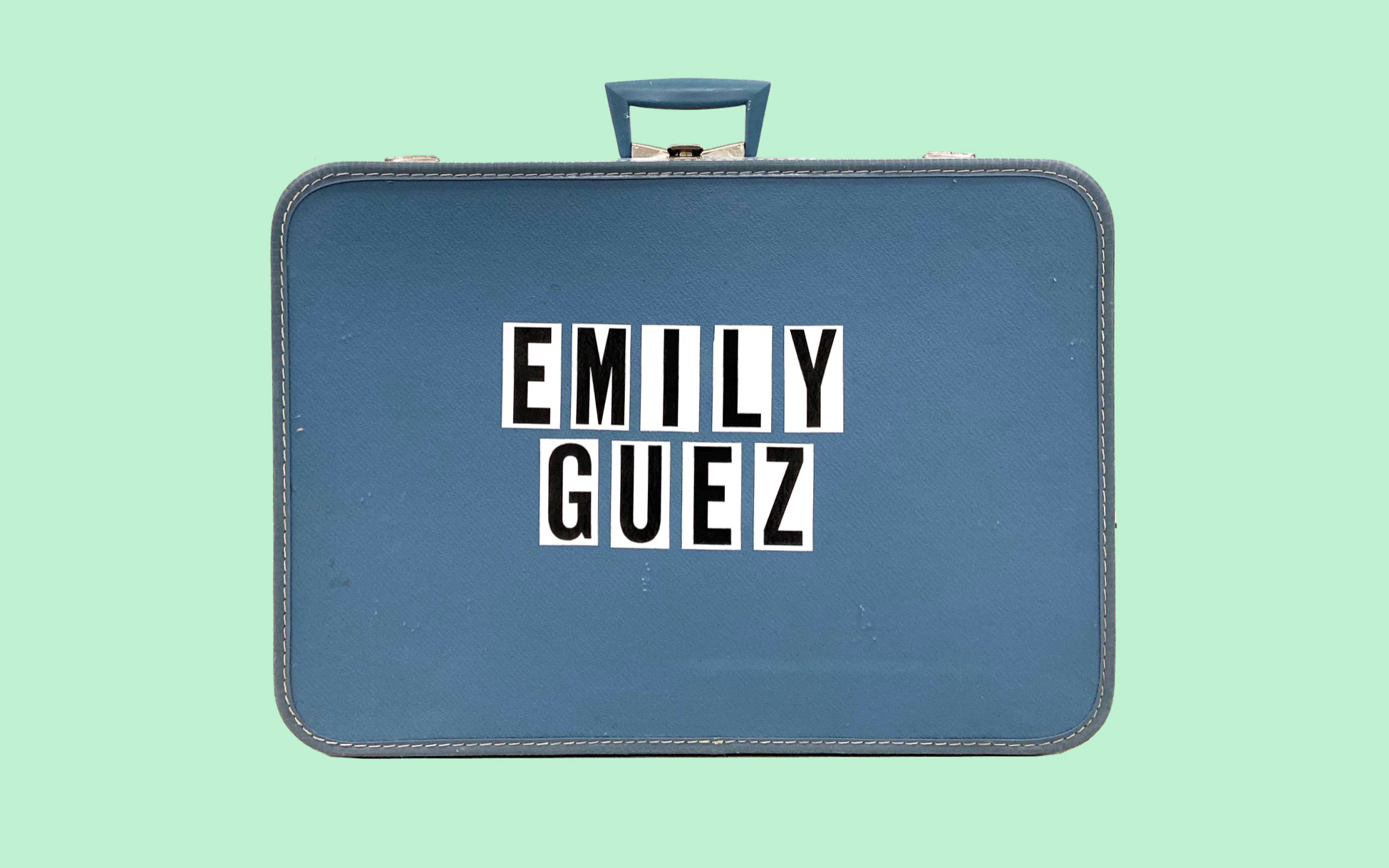
Emily Guez
Fabian Fohrer
Hilary duPont
Lizzie Baur
Mukul Chakravarthi
Seyong Ahn
Sophie Loloi
Vaishnavi Mahendran
Weixi Zeng
Yoonsu Kim
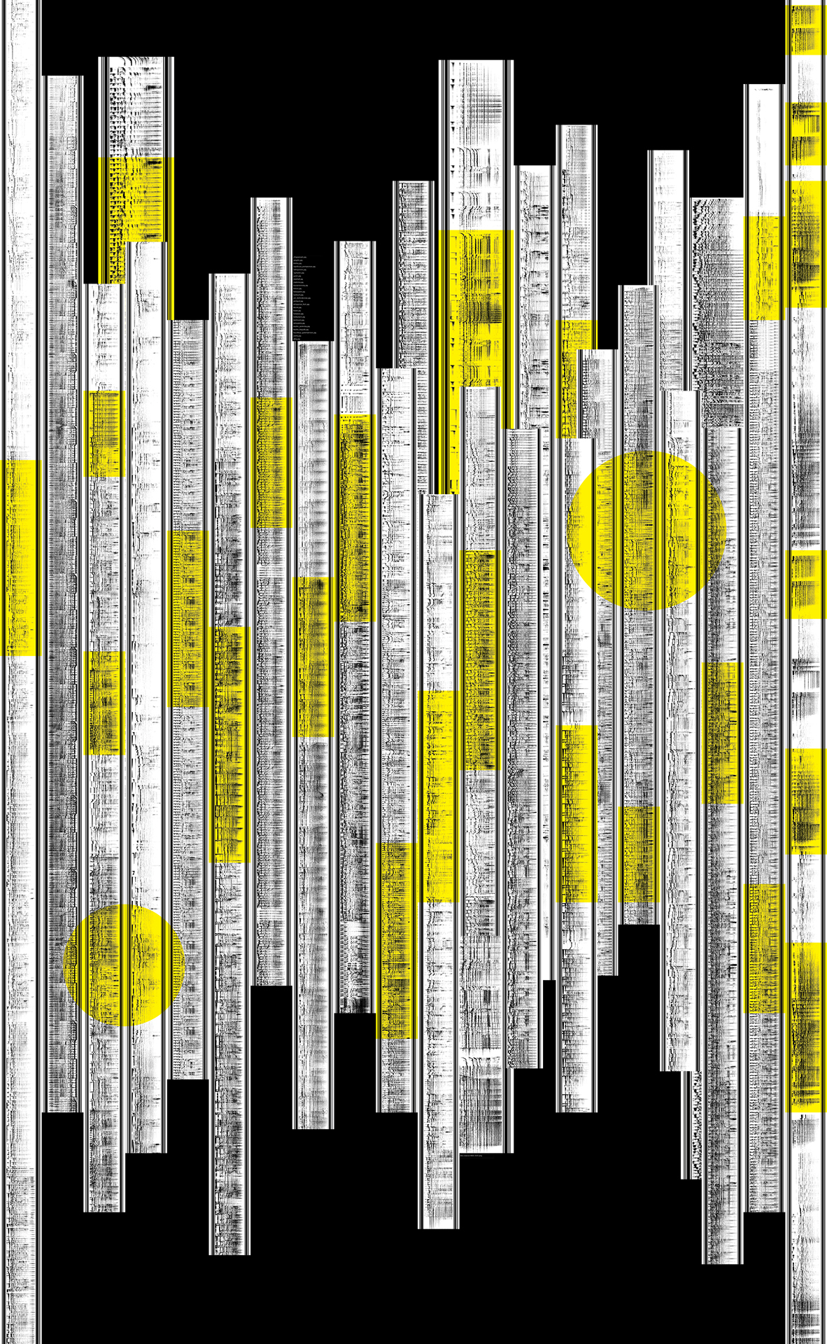
In many ways, our collective studio practice is as powerful as our individual creative territories. The digital exhibition for the Graphic Design MFA Class of 2020 is an attempt to put the work of fifteen students on view from multiple vantage points. It does not meld our individual practices into an approximate whole, but encourages our work to remain In Proximity.
This digital exhibition fosters an attitude of fluidity and exchange, gradually unpacking each body of work by peeling back the layers of research and considerations that make up this collection of theses. It’s flexible curation within an expandable grid reflects a desire to follow each other’s lead and to consider our work as a chain of linked events that are separate bodies but rely on each other for support.
Info
Close
AD
Aleks Dawson
Show StackRe:Ornament
info
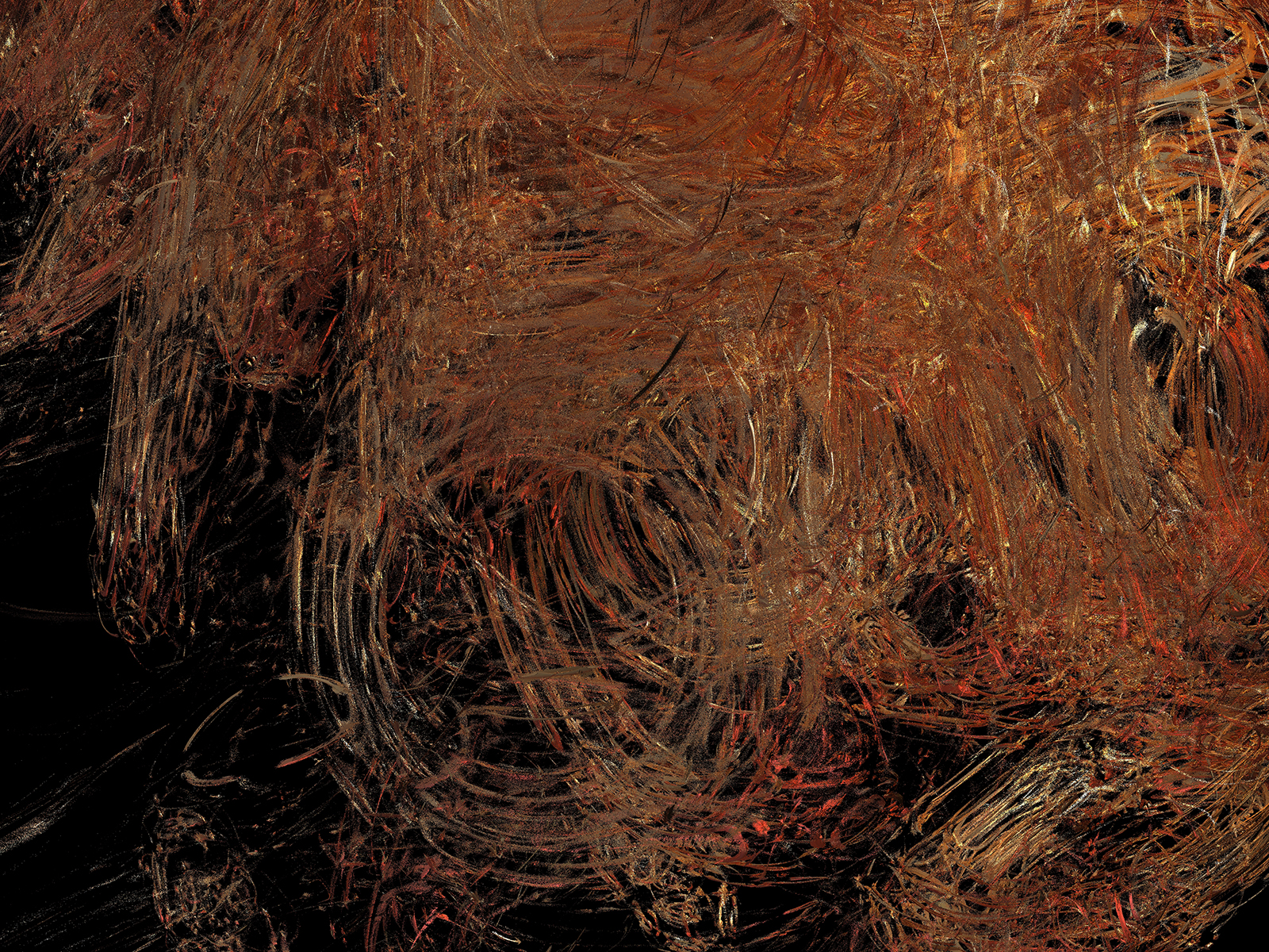
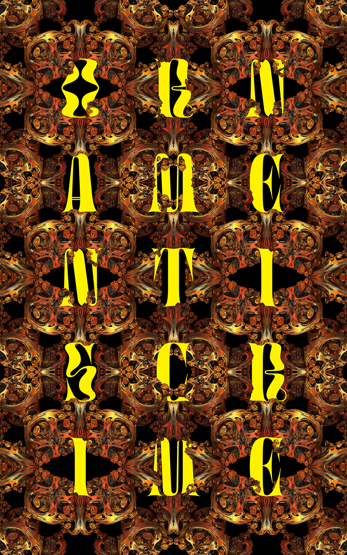
Mandelbulb
2020
Three-dimensional fractal as oil on canvas
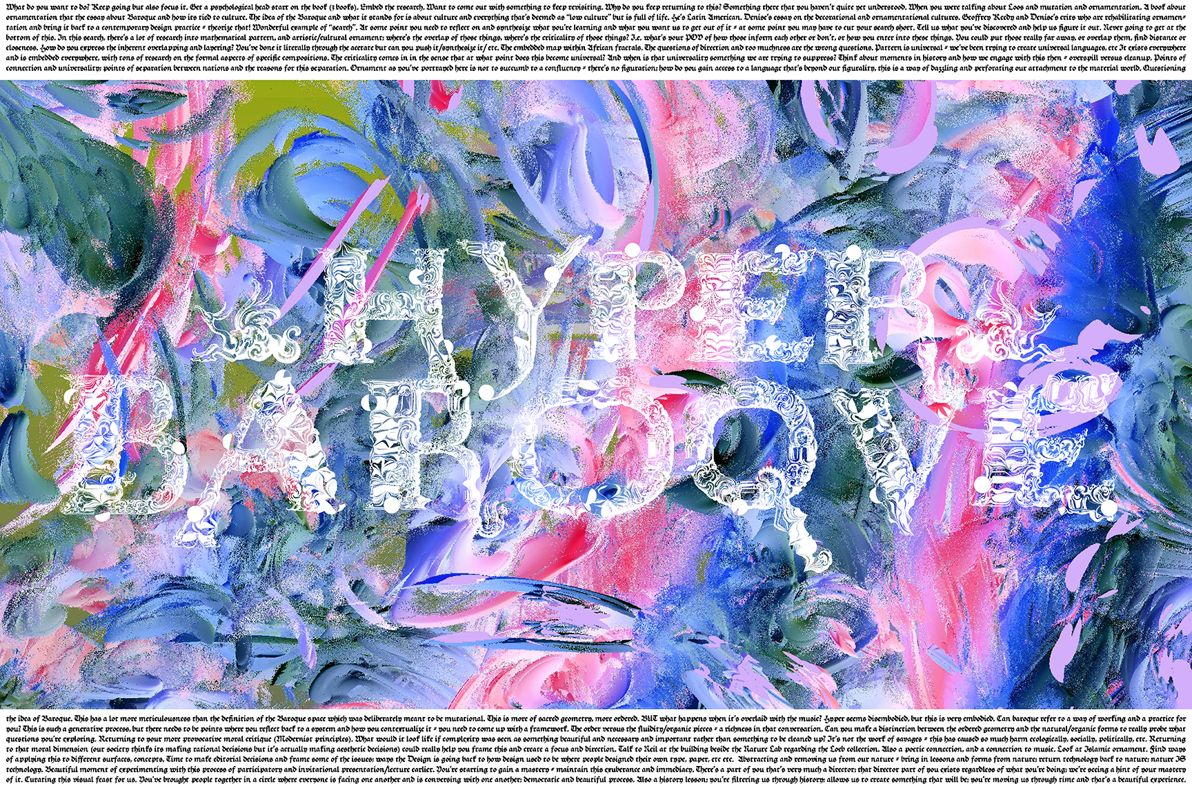
HyperBaroque
2019
Three-dimensional fractal
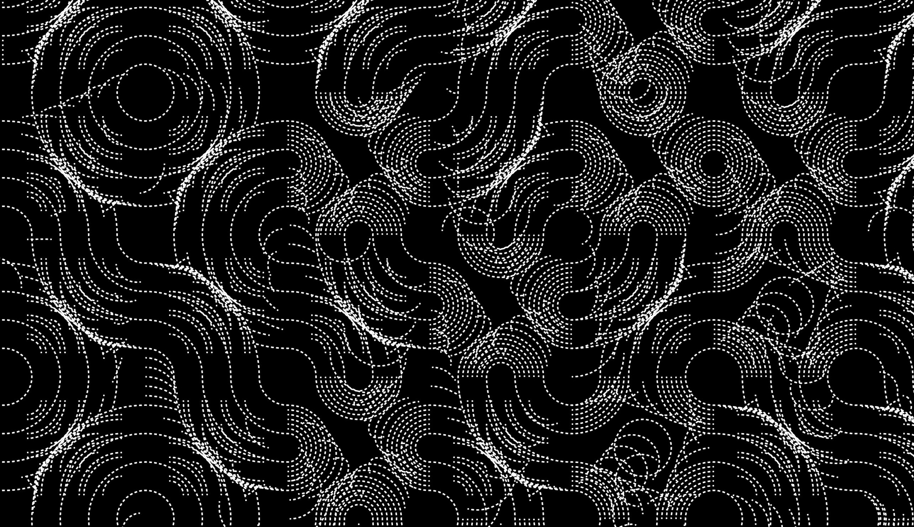
After Truchet
2020
Python-scripted pattern
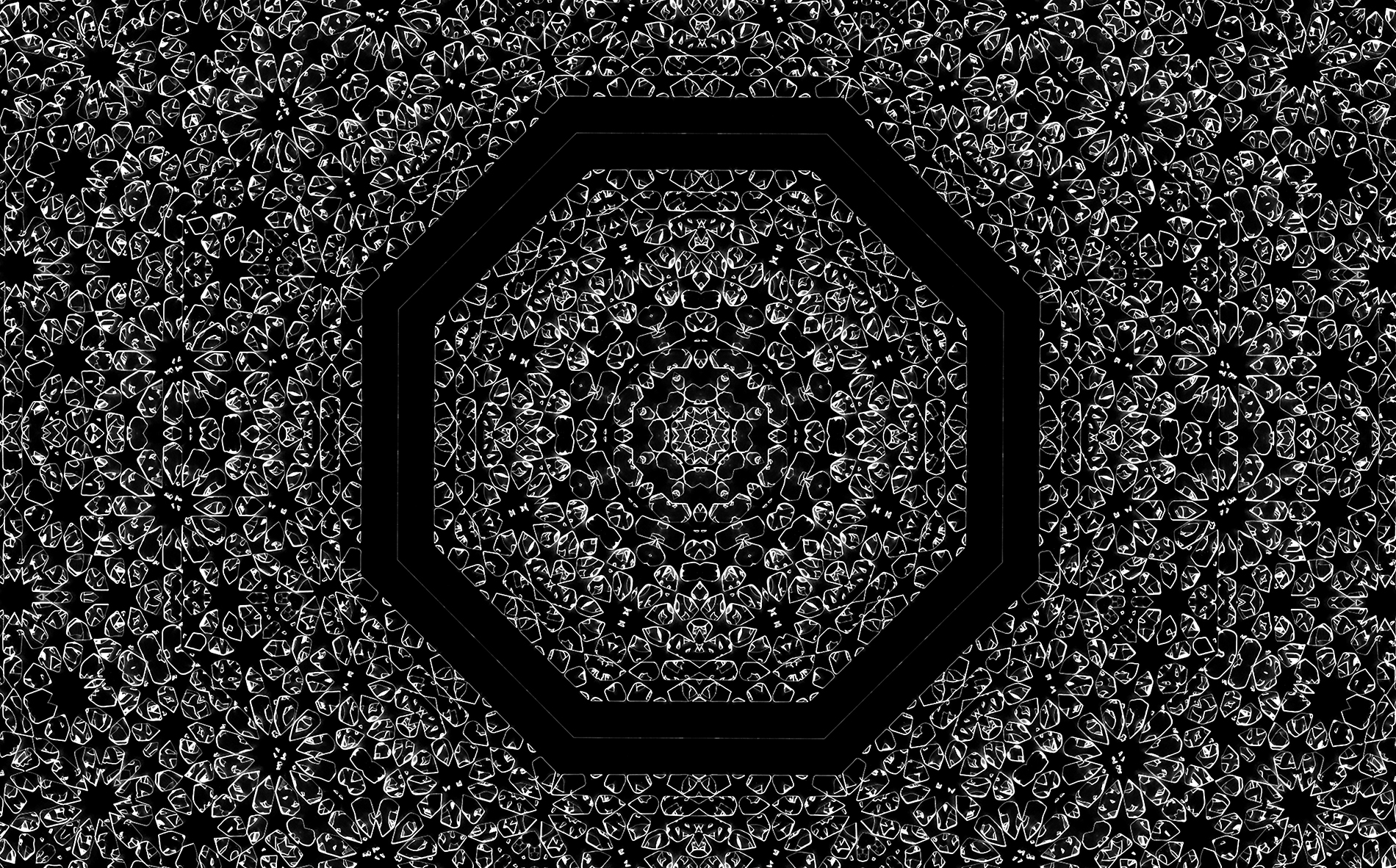
Remixing Owen Jones
2019
Digitally-kaleidoscoped lasercut plates
This Poster Plays Music
2019
Virtual ANS poster, playable with PhonoPaper app
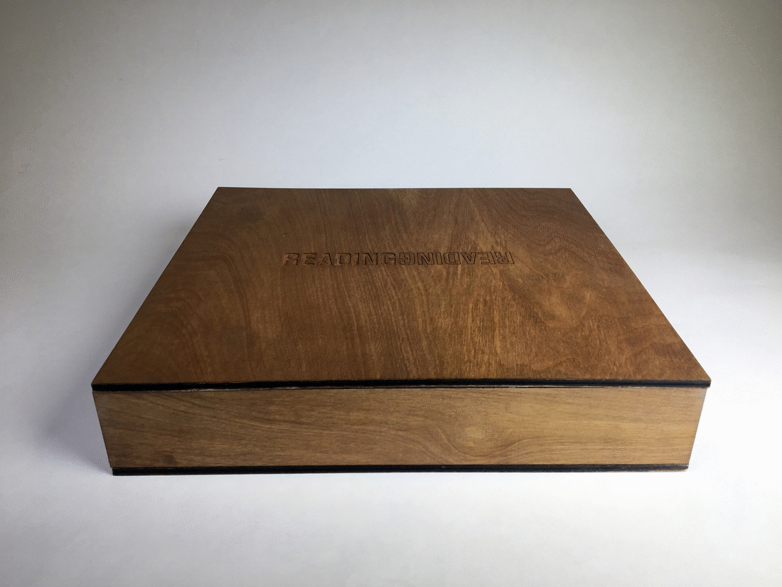
Reading Reading
14”x14” lasercut box, UV-printed papyrus, laser-etched clay, thermal-foiled scroll
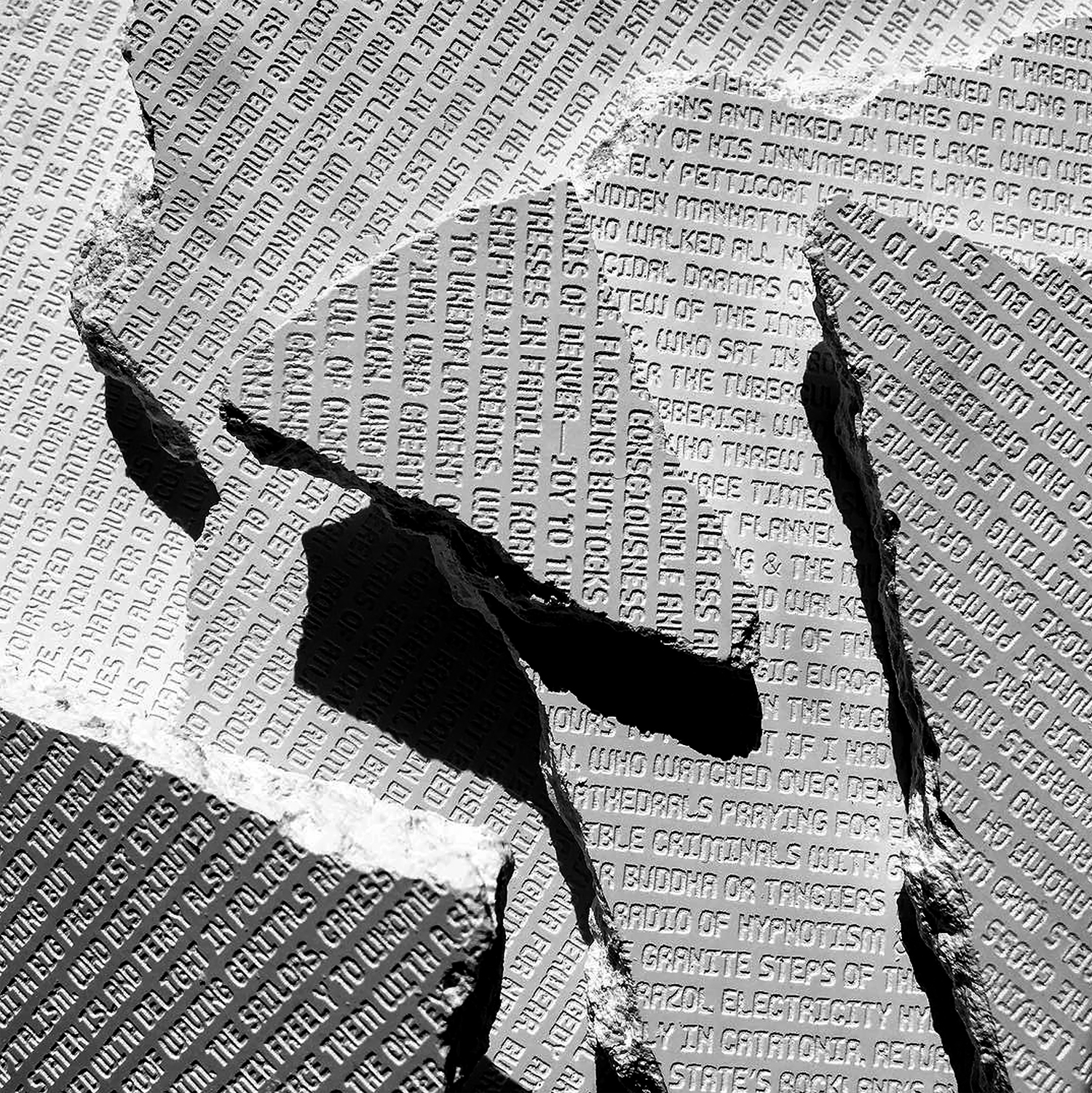
Ginsberg Tablets
2018
Laser-etched plaster
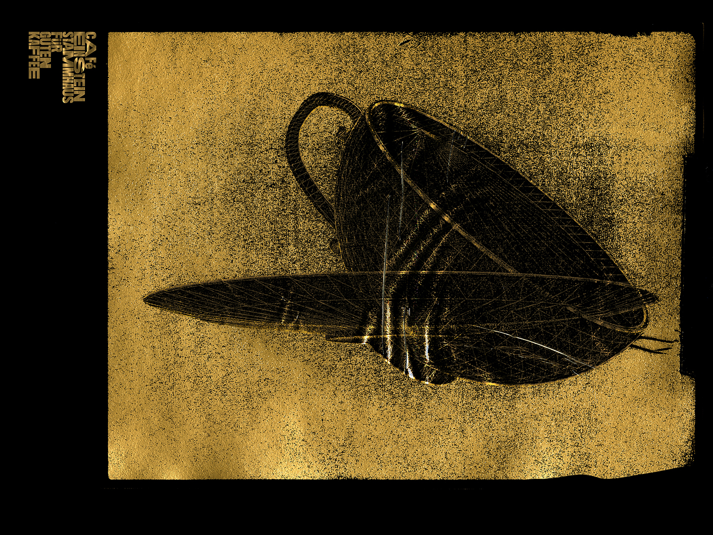
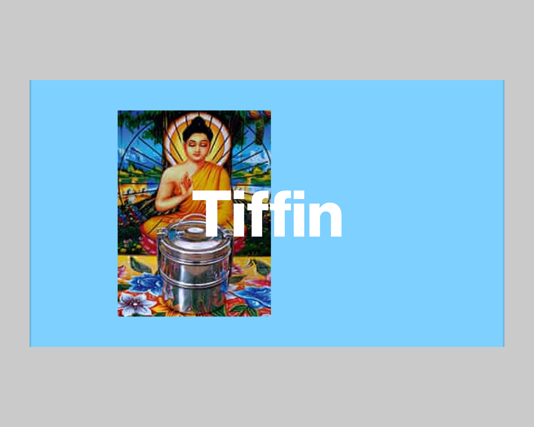
Für Guten Kaffee
2019
Poster
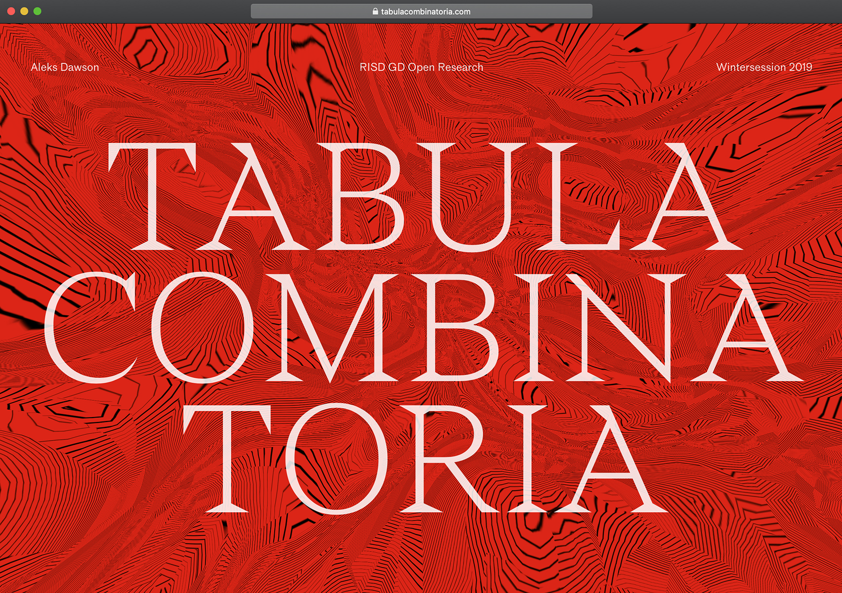
Ornament is Crime
2019
8x5 foot poster
→Abstract
Re:Ornament calls for a rethinking of ornament within the history and practice of design, urging a broad reconsideration of ornament’s value and a complete reimagining of ornament’s future potential. Charting the arc of ornament in the Western tradition, this thesis reexamines the impact of modernism’s rejection of ornament—and, with it, its embedded culture, history, knowledge and craft.
Studying ornament’s structure as a language, I make the case for ornament’s inherent beauty and excess and speculate on how ornament could apply to thinking and making beyond design. Through graphic form, material exploration and pattern thinking, I negotiate these complexities with work that is intrinsically structural, deeply ornamental and often a hybrid of the material and the digital, the hand and the machine. As such, my work is not only a response to—or rebuttal of—modernism, but also a call to action and an invitation to remember, recalibrate and remake our perception and use of ornament today.
→Website
BJS
Bobby Joe Smith III
Show StackU+16E99
info
Atlas
2018
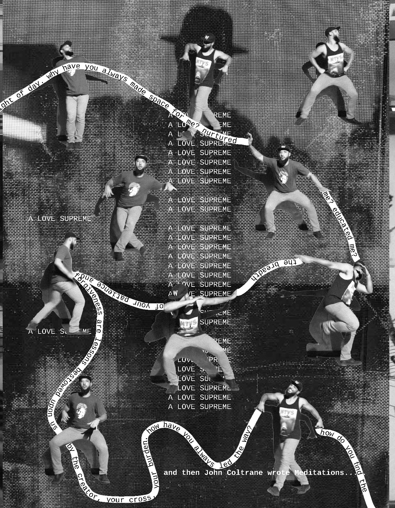
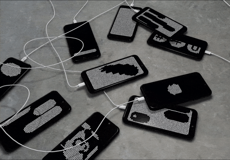
Atlas is a 16 page black and white submission to a larger collaborative publication with the RISD Graphic Design MFA class of 2020. The publication attempts to locate each of our practices through the performance of a series of “labors” located throughout the city of Providence over the course of a week. There are two texts threads that wander through each spread, one written by myself, and the other by the black poet, musician, and activist Gil Scott-Heron whose work had a strong hold over me throughout the making of the project. In the background of each spread are photos I took on my phone from the window of the RIPTA bus I rode across I-95 deep into West Providence—where most of the Black and Latino communities reside. Some photos were also taken on foot during separate excursions into those areas. In the foreground are images from the book Africa Adorned, as well as images of myself learning modern West African dance choreography from youtube. The compositions are cacophonous, with type and image running into, on top of, and through each other. The black and white inkjet prints on cheap paper help flatten and blend the compositions. The work is about the struggle to locate oneself as a black male in new territory and through that struggle expand as a creative and as a person.
Self-Portrait
2019
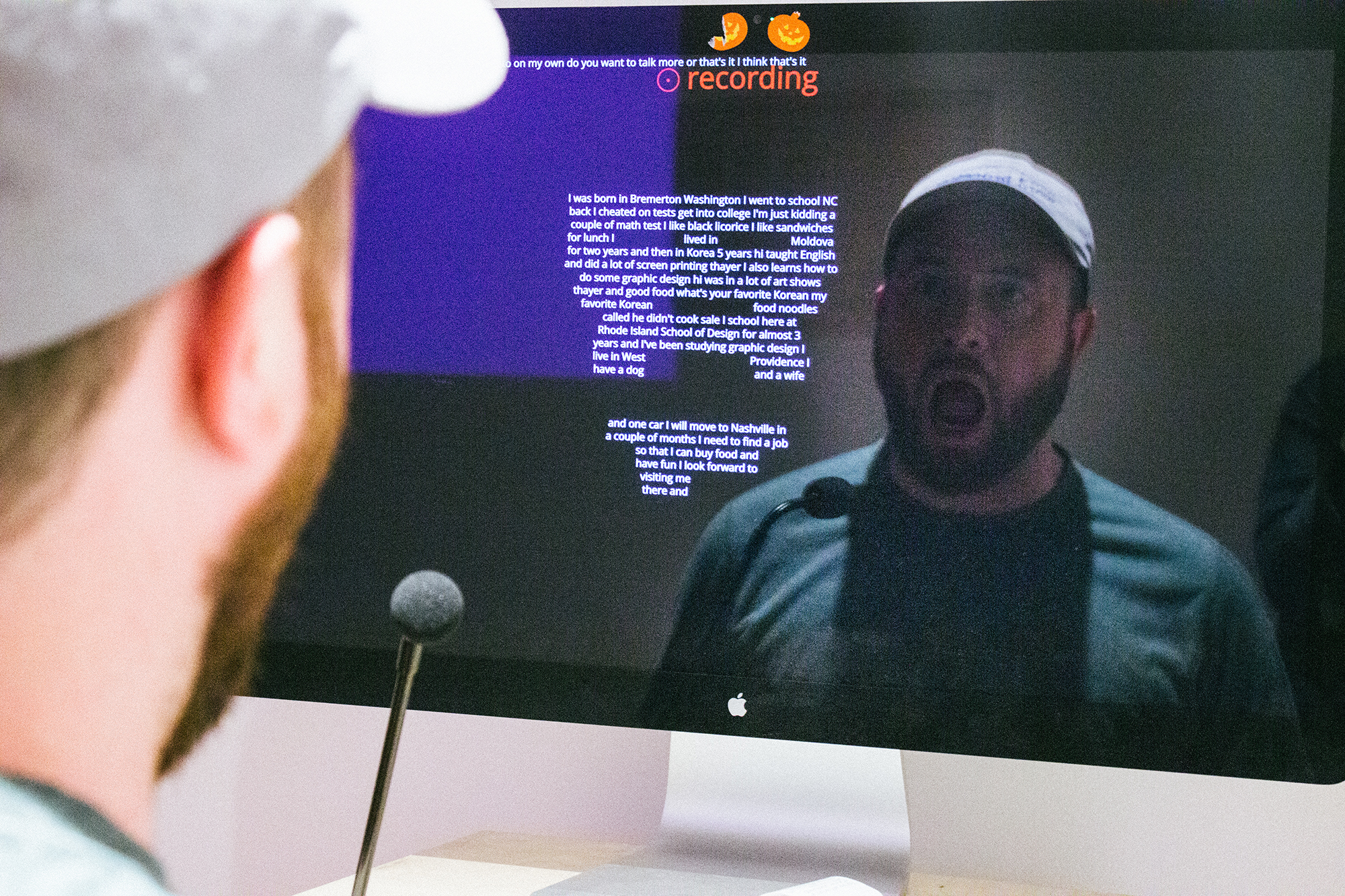
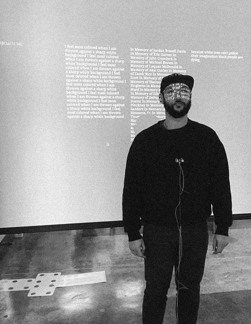
Self-Portrait is an interactive media installation I worked on with Wei-Hao Wang where participants generate self-portraits through the words that they speak. Viewers are prompted to respond to questions asked of them “Tell me a secret,” “Tell me a lie,” etc. As the viewers speak into the microphone fixed to the wooden control panel, their words appear on the screen and become mapped to their face. The more that they share the higher the resolution becomes of their portrait. Once finished, viewers can print their response from a thermal printer in the control panel.
Self-Portrait is comprised of a wooden control panel, microphone, webcam, computer monitor, web browser, microcontroller, and thermal printer. Wei and I used javascript APIs for natural language processing and facial recognition functionality, and a microcontroller to register inputs from the control panel and outputs to the thermal printer. Self-Portrait was selected for the RISD 2019 MFA Graphic Design Biennial, On the Edge of Normal, in the Sol Koffler Gallery.
Decolonial Projection
2017
Decolonial Projection is an interactive, participatory, performance publication. Participants begin the experience situated at a distance across a room from me. They are encouraged to approach me by a prompt projected across my body and the wall behind me. As they approach, an infrared sensor worn around my neck detects the distance between us. The sensor is connected to a microcontroller that processes the data, ports it over to a computer connected to the projector, and then activates a website where the publication lives. The distance between us serves as a mechanism to advance the content of the publication projected over me. The publication contains content I wrote about decolonizing design, data detailing manifestations of colonization, as well as quotes from artists and writers I researched while assessing what decolonizing design meant to me. To read through the entire publication, viewers have to walk up to within a foot of me, at which time I open my arms, presenting them with the choice of whether or not to embrace me.
Color Binary
2018
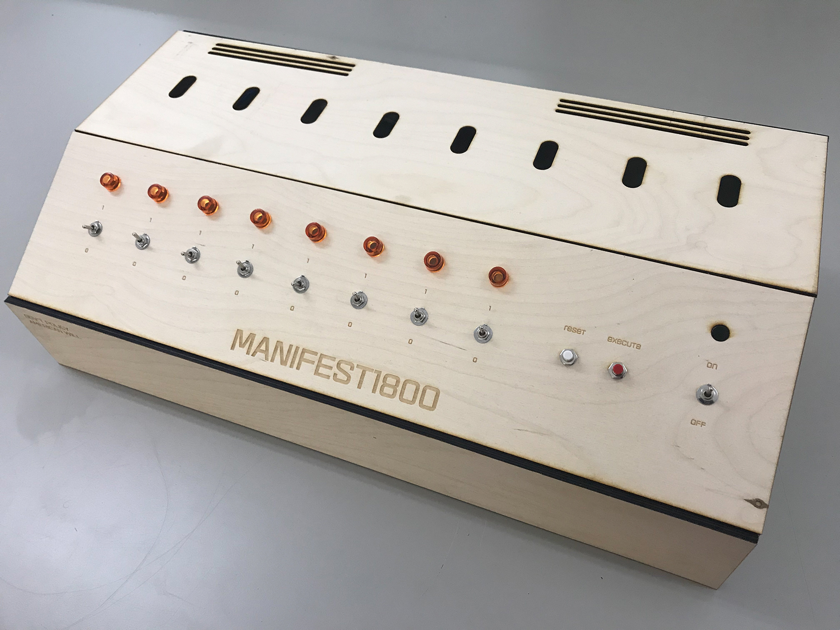
The Color Binary project is still a work in progress. Currently, it consists of a wooden control panel with medal switches, amber LED lights, buttons, laser-cut etching, and an embedded microcontroller; a series of index cards with identification numbers written in binary code; and a projected website that’s operated by the wooden control console. The website—projected in a room with the control panel—at first, displays a natural landscape from North America with an input field for the binary sequence printed index cards near the control panel. When a viewer correctly enters the binary sequence indicated on an index card into the input field using the switches on the wooden control console, the program gets activated. A series of color boxes flash on the screen along with another binary sequence that spells out the word “genocide.” At the end of the sequence, the once natural landscape is converted into an aerial view of a Jeffersonian plot of land. A new window pops up on the screen with a different scenic landscape and input field waiting for a new binary sequence to be fed through the system repeating the process. As participants work through the case of index cards, inputting the binary sequences printed on them, more and more of the screen real estate gets occupied by square boxes depicting Jeffersonian plots of land that were once natural landscapes.
Color Binary is a response to a book published in 1872 by Thomas McKenney—History of the Indian tribes of North America : with biographical sketches and anecdotes of the principal chiefs. Embellished with one hundred portraits from the Indian Gallery in the War Department at Washington. The Providence Public Library owns a copy of this book in its special collections archive. Initially, I was drawn to the book because of the subject matter and the colorful lithographic portraits of indigenous people. Upon further reading, I came to realize the book was created by the US Government’s head of Indian Affairs–Thomas McKenney–as a specimen archive meant to preserve a visual record of the indigenous people facing extinction from the genocidal policies advanced by the government. Manifest destiny, indigenous erasure, and westward expansion are spoken of explicitly. What appeared as a work of art was really evidence of genocide created by a person in a position of power to advance that agenda.
Watch The Rubble
2018
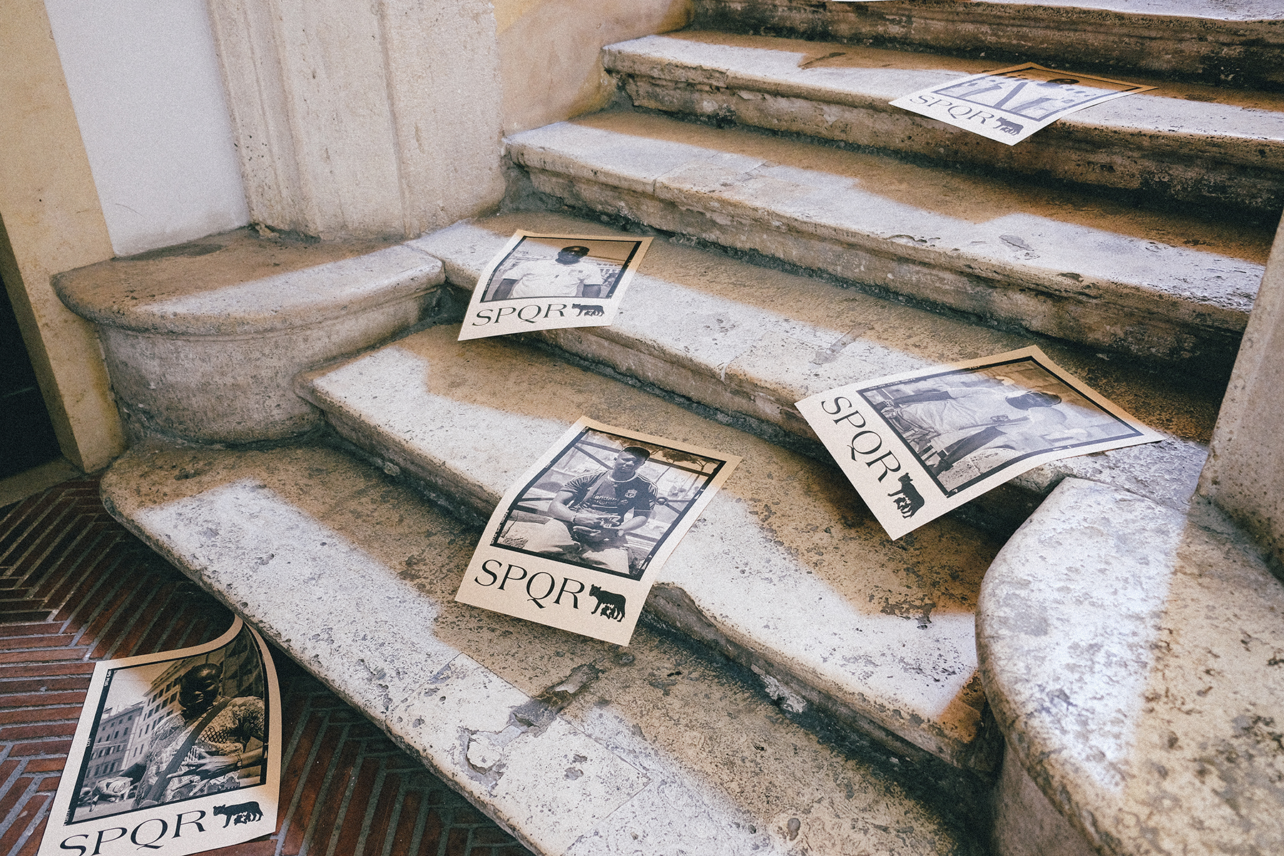
Watch The Rubble is a publication, performance, and photo project conducted in Rome as part of a course on Artistic Practice in Public Space. In it, I attempt to orient my relationship with other subjects of the Black diaspora in an unfamiliar space. In particular, I focus on the African merchants selling items to tourists, such as myself, throughout Rome. I wanted to see how we related to each other and whether another space could be reached outside of the transactional desire they had to sell me an object and I had to utilize their portrait in an art project. The publication includes my writings on the experience, items I purchased from the merchants, and fliers with portraits of the merchants I had conversations with emblazoned with the abbreviation SPQR which is a phrase Romans use to identify themselves. I wanted these fliers to be posted publicly around Rome as a statement in the face of increasing prejudice that the migrant African populations living and working in Rome are also Roman. On the day of the final show, I sat at the entrance and sold the publication using the techniques I had picked up from my interactions with the merchants. I also installed/disseminated the publication on the steps of the Cenci, forcing people going through the exhibition to navigate these fliers—would they step on them, would they be noticed, would they be tolerated, or would they be interacted with in some other way?
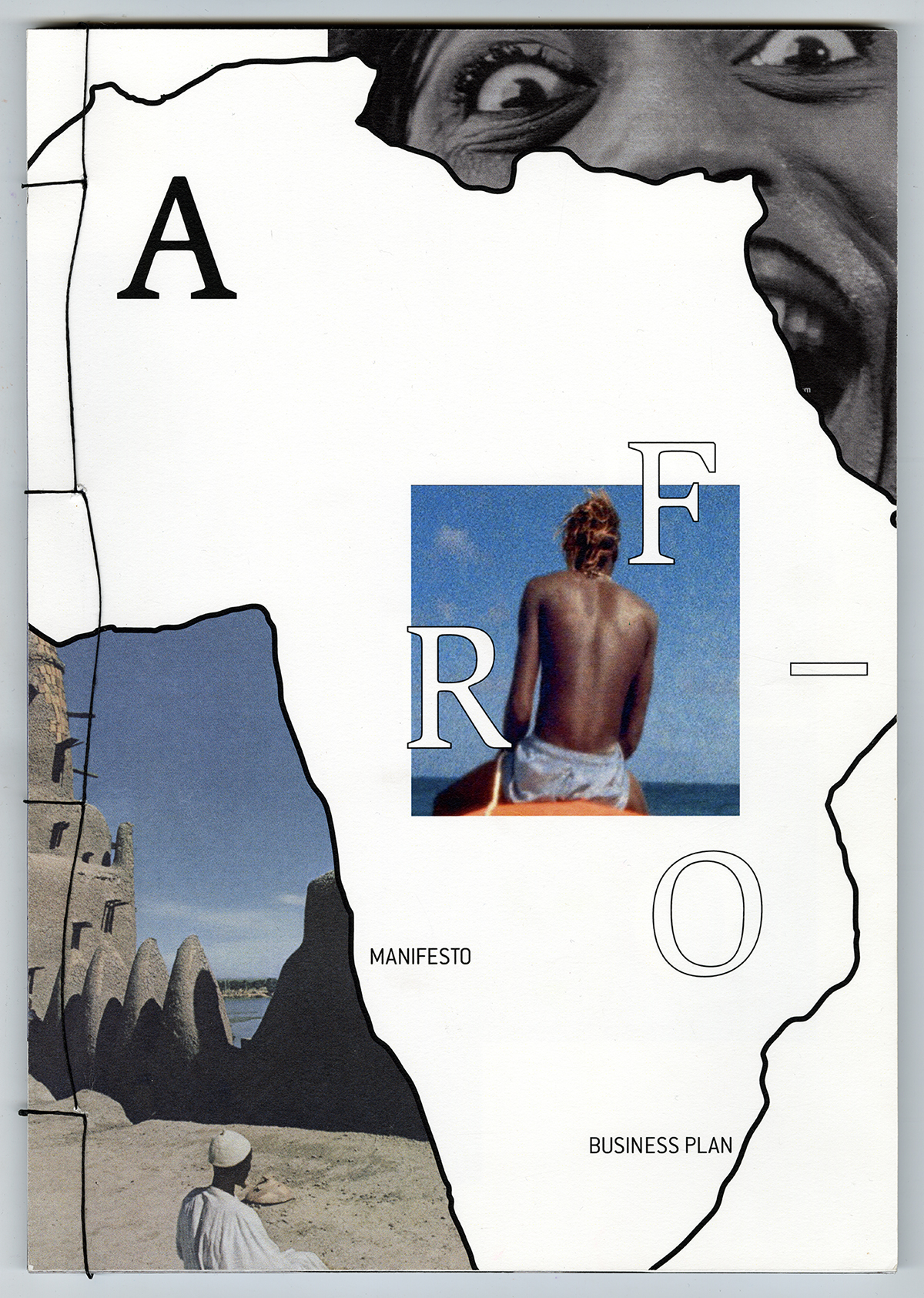
AFRO—
2018
AFRO— is a prototype for a publication I pitched along with the writer and visual artist Bri Pickens focusing on culture and art across the black diaspora. The publication serves as both a business plan and manifesto that uses a visual essay comprised of images from social media and RISD’s picture archive to argue Black People have been pressed out of conversations about the human experience. When we are included, we are expected to fixate on race. Obscure topics are out of range. While the people of the African diaspora are incredibly diverse, there are few platforms that acknowledge our diversity or thread together our experiences. Furthermore, those experiences are rarely represented in an artful way. Our proposal to this problem was to create a platform that:
1) is interested in the human experiences of people in the diaspora;
2) indulges our curiosity about one another;
3) is well crafted and artfully considered.
We envisioned that platform as a publication called AFRO—.
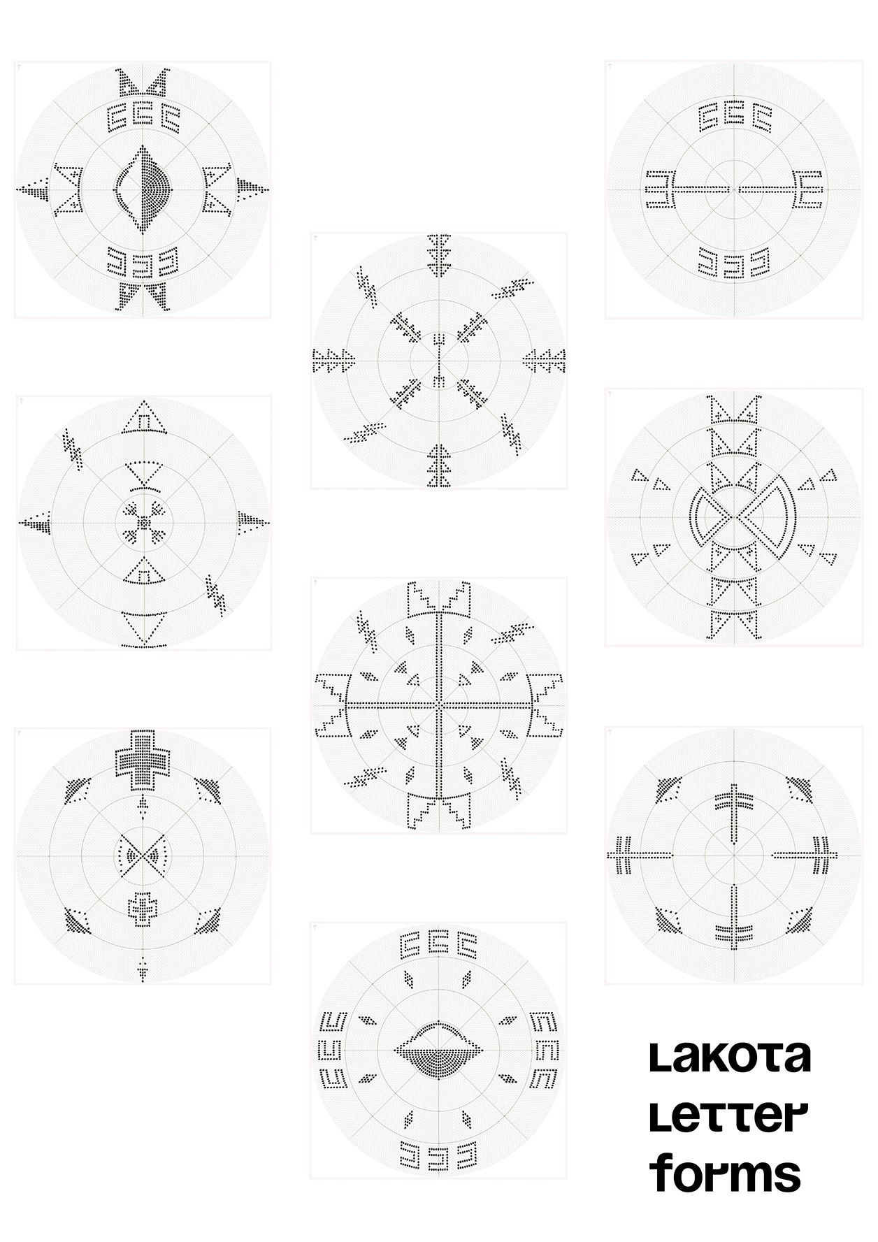
Ancestral Type
2019
Historically, Lakota was an unwritten language. Over the past few decades, native Lakota speakers have contracted and collaborated with linguists to create a standard orthography with which to write, read, and teach Lakota and Dakota. This standardized writing system is rooted in a Latin glyph system, the same system as our colonizer. While there are compelling reasons for this, I have often wondered what it would look like for my tribe to create our own writing system for both modern and traditional mediums. Although Lakota was primarily an oral language, we often employed our own visual vocabulary to communicate and convey meaning across a variety of substrates—bead and quillwork, paint, sign language, and smoke. Ancestral Type is a speculative attempt to generate a new writing system that incorporates Lakota values, visual vocabulary, and mark-making tools for past, present, and emerging communication technologies.
Adiche Lorde Quilts
2018
A designer’s task is often translation—converting an initial expression into new forms, mediums, and configurations for new audiences. The same is true in social movements for liberation and justice. Is there value in saying something differently without saying anything new? In my work Adiche Lorde Quilts I weave into conversation the expressions of black feminists from different eras—Chimamanda Adiche, Audre Lorde, and many generations of black women quilters of Gee’s Bend.
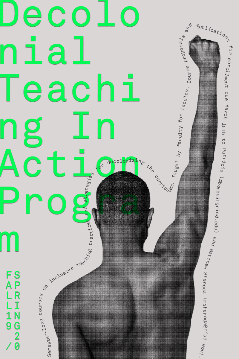
Decolonial Teaching Program Posters
2019
One of many posters and promo-cards I designed for the Social Equity and Inclusion (SEI) department at RISD. SEI is a new administrative department at RISD launched as part of President Somerson’s initiative to improve access and representation for diverse students, faculty, and staff. The posters and promotional cards I was contracted to design were for one of the first programs out of the department—a series of workshops to help faculty decolonize their curriculum. I used portraits I have taken of models of color and pushed the formatting of the typography beyond the methods typically taught to establish order and legibility. The promotional materials were then printed on colored paper using a RISO printer.
(Un)Common Ground
2019
(Un)common ground is a performance and web-publication intended to build a common understanding about where my work is coming from and where it is going. The performance is approximately 15 minutes long. The performance begins with a smudging ceremony using sage picked from my tribal homelands, which is a common practice in Native communities intended to cleanse our spirits, bring our hearts and minds together, invite our ancestors into the room, and send our voices to the Creator. The publication consists of my own writing which I published as a website designed specifically for a tablet and is projected into the space where the performance is taking place. To access the writing, the viewer or performer has to literally re-orient their device. (Un)common Ground has also been published in the Urgency Reader.
→Abstract
The general understanding and professional practice of graphic design have been shaped by the perspectives, needs, and desires of white, cis-gendered, heterosexual men in imperialistic, capitalist societies. The tools, substrates, professional networks, institutions, processes, theories, grammars, and values that have come to define the discipline have been shaped from this position. Consequently, graphic design primarily serves the needs of the settler in settler colonial regimes like the United States. Such a reality has prompted many designers like myself who do not fit neatly into this rubric to question the framework of the discipline and our position in it.
My thesis is rooted within this broader inquiry, which for me, as a Black and Indigenous person, began a few years ago through the emergence of two decolonial movements in my home communities: the BlackLivesMatter movement in Minneapolis, Minnesota, following the live-streamed extrajudicial killing of Philando Castile by a White police officer; and the NoDAPL movement in Standing Rock, North Dakota, which sought to prevent the construction of an oil pipeline across the river my tribe depends upon for water. The inquiries that evolved from the social and political contexts in which I began my formal design education have particular salience now amidst current manifestations colonial oppression: a deadly global pandemic that has disproportionately claimed the lives of Black and Indigenous people due to the violence of structural inequities in the United States; the resurgence of the Keystone XL oil pipeline threatening the sovereignty and ecological well-being of numerous indigenous communities in the Midwest, including my own; and the nationwide uprisings sparked by the extrajudicial killing of George Floyd by Minneapolis police. My background and the urgent socio-political contexts surrounding my design education have forced me to seek out creative and subversive methodologies to bend a design discipline defined for the service of settler colonialism towards ongoing decolonial movements in Black and Indigenous communities. Using design in the service of decolonial movements will require new articulations of tools, substrates, networks, institutions, processes, theories, grammars, and values. Fortunately, there is a long tradition in marginalized communities of repurposing tools not designed for us to meet our own needs.
Decolonization is not a destination along a binary array. Rather, it is a vector traversed through a lifelong practice seeking what lies beyond the decolonial horizon. Design and the product of design is not an end in a decolonial design practice, it is the work that leads to and through the personal, interpersonal, and systemic work that is required. Process is the product. Design is a vehicle for the beyond, one of many possible methods that activate the decolonial moments, gestures, and utterances between people that triangulate new vectors for our collective liberation and help carry us there.
U+16E99 is one articulation of a decolonial design practice uttered through the poetic grammars of Black, Indigenous, Queer, and Feminist thinkers, makers, and organizers. It is an attempt to define a vector for my own creative practice that centers my values, needs, and desires, while navigating the demands, precarities, and limitations of the academic institution and settler colonial context in which this mapping takes place.
→Website
CGE
Carl-Gustaf Ewerbring
Show StackOh wait, is this a loop?
info
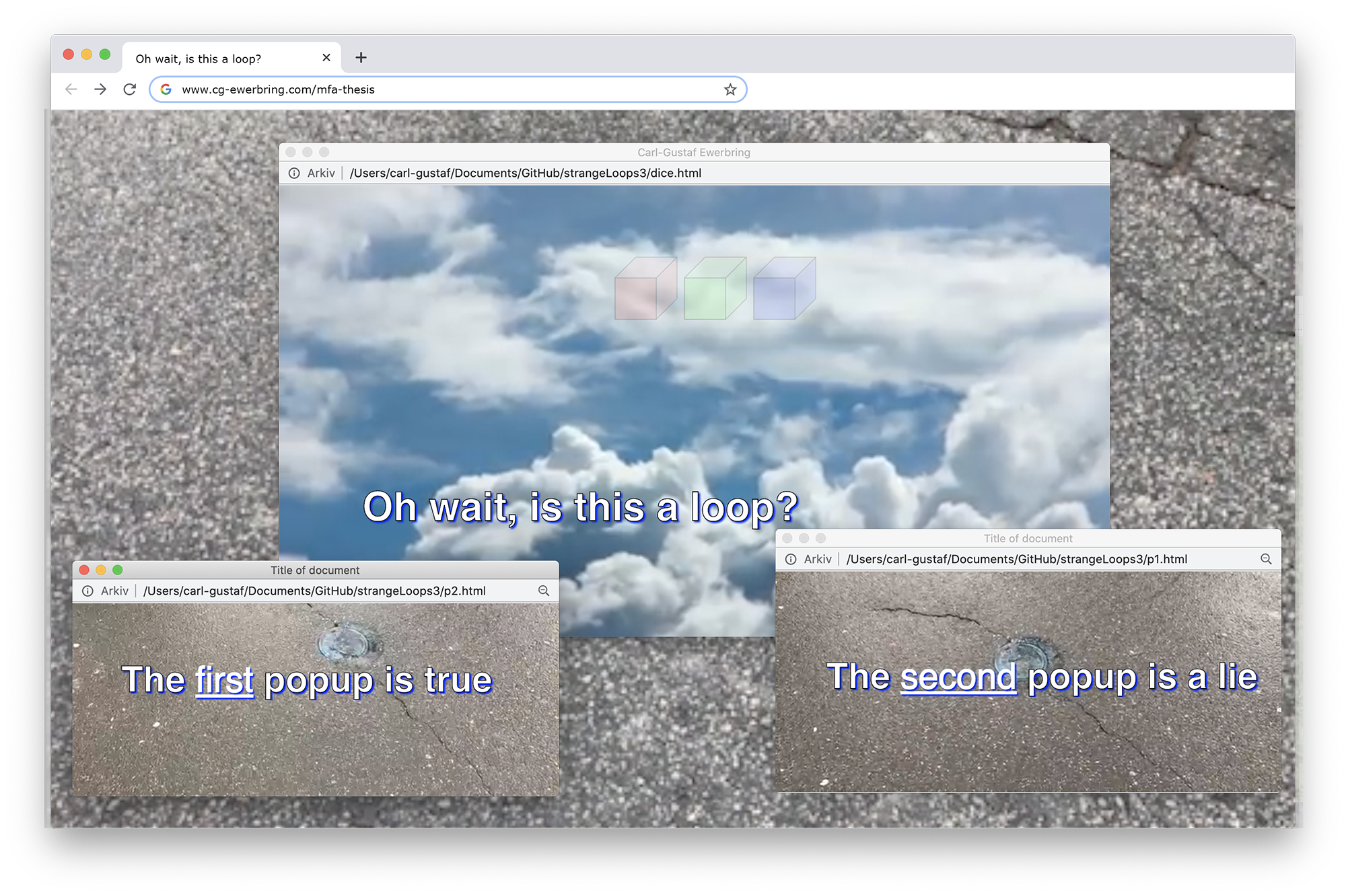
So Strange Loops
2019
I made a website about the very complicated phenomenon “Strange Loops”. The whole webpage loops in the end.
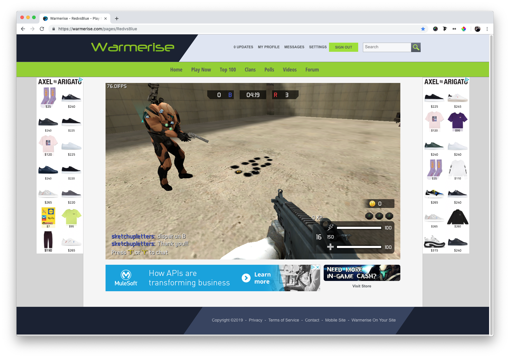
“Can you shoot me an alphabet?”
2019
I asked players in online games not to kill me but to shoot graphic forms for me.
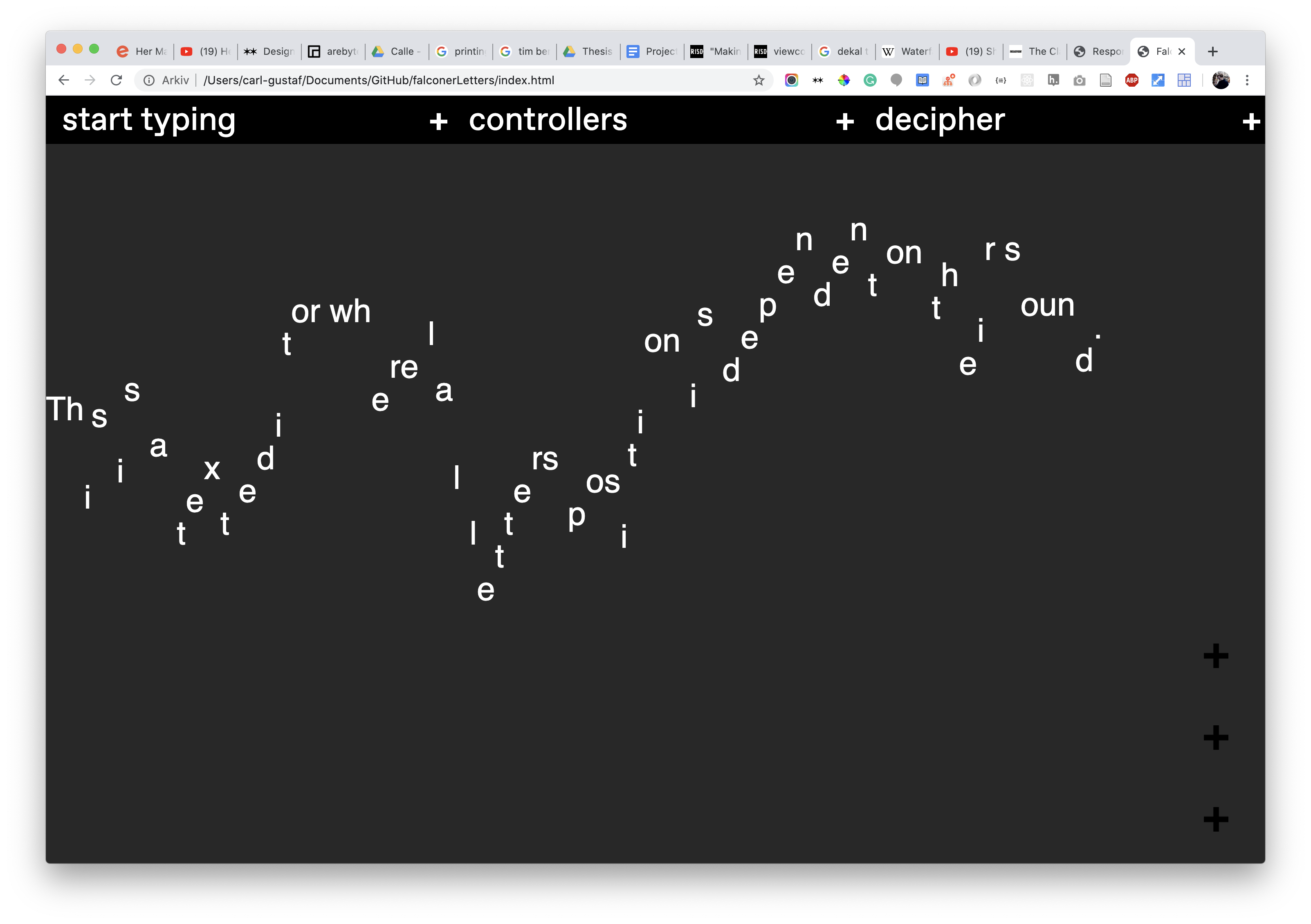
A phonetic text editor
2018
Every letter in this text editor gets a position depending on its phonetic group, meaning that all the letters with a similar sound (A,J,K, etc.) get the same position in relation to the previous letter.
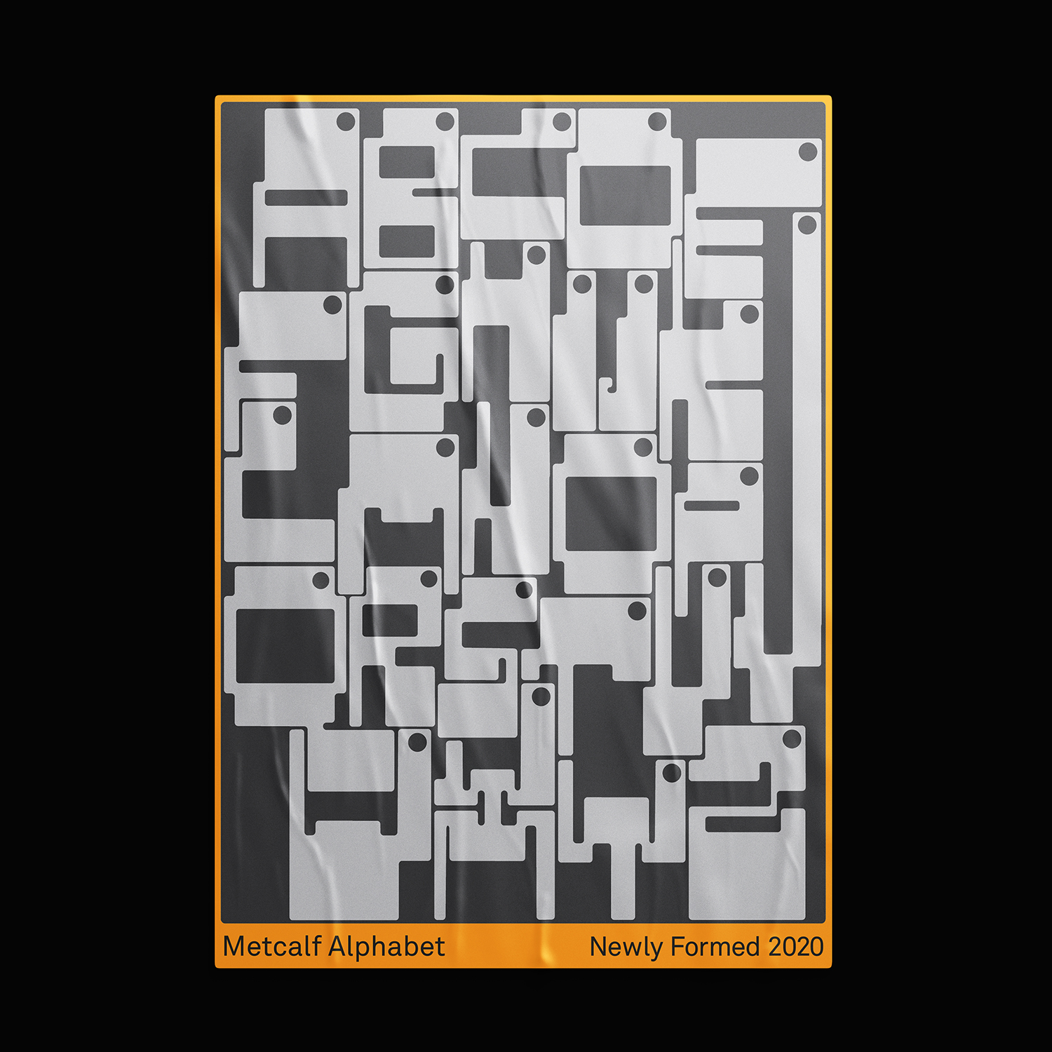
Metcalf Alphabet
2020
An alphabet inspired by windows with ventilation holes in our school.
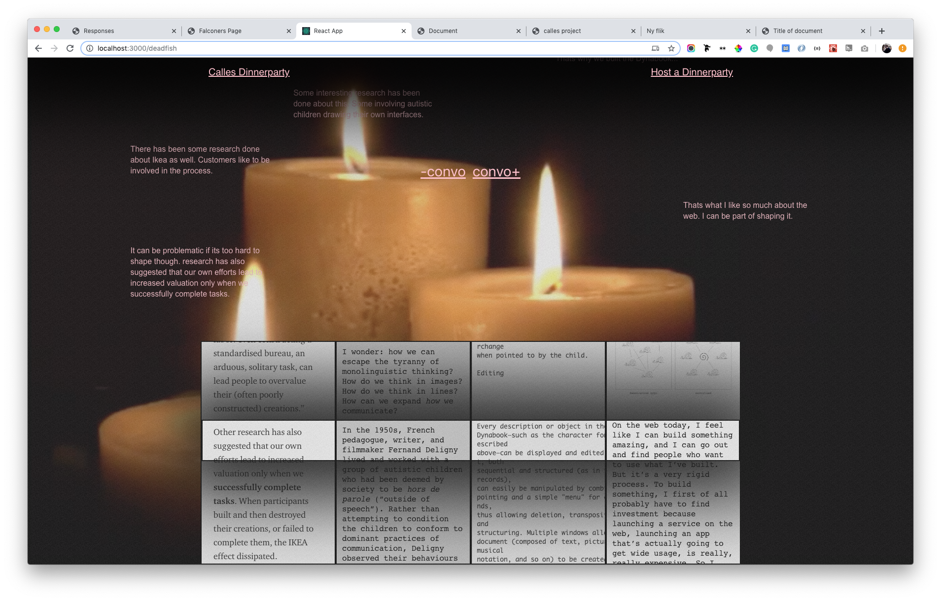
An essay dinner party
2020
Have you ever wondered what would happen if your favorite texts attended a dinner party? Different authors often write about the same things but from different perspectives. On this webpage, the texts talk to each other by being scrolled to where they synchronize.
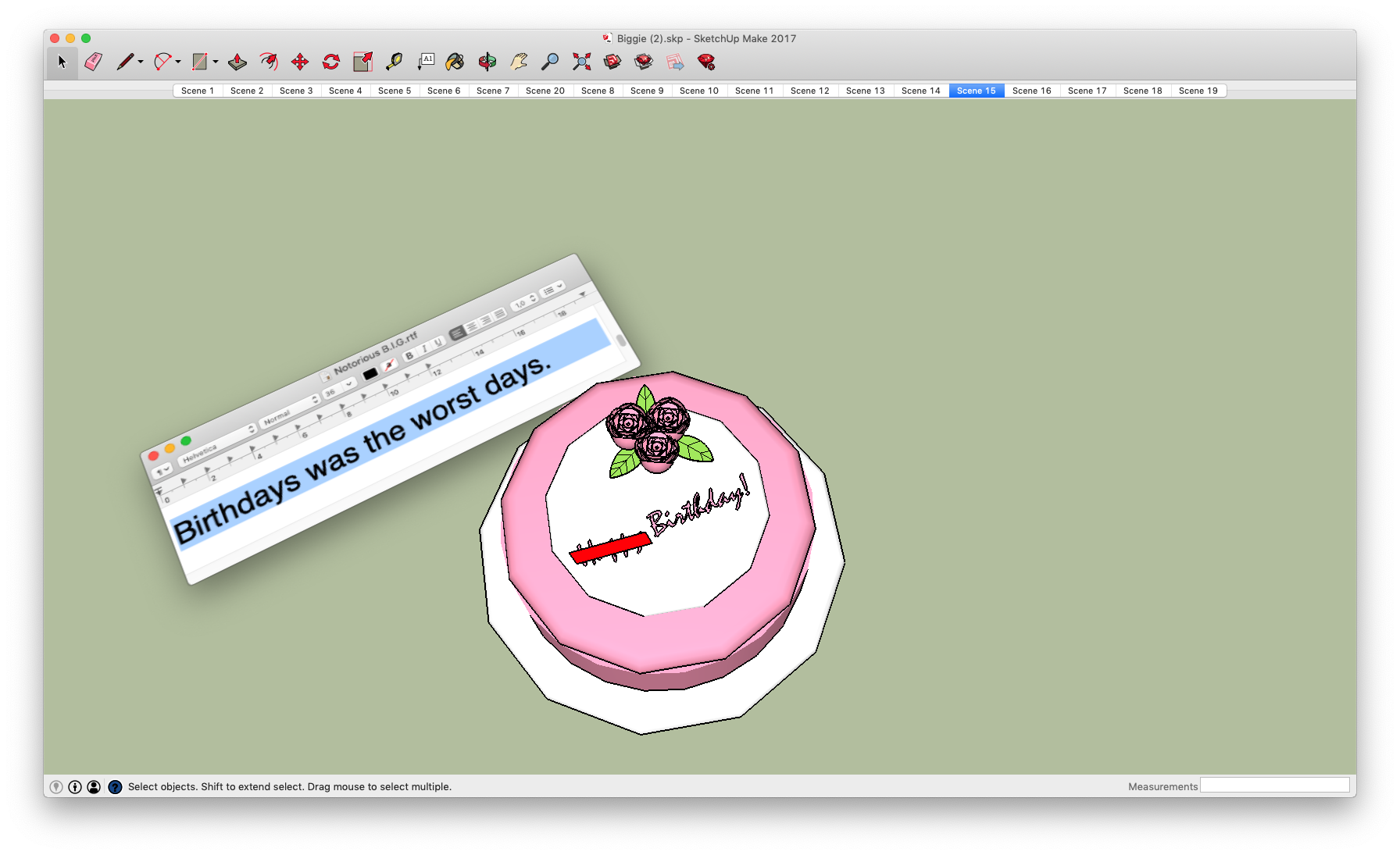
B.I.G in SketchUp
2019
A music video for Notorious B.I.Gs juicy, made in the modeling tool SketchUp. Click through the saved scenes while listening to the song.
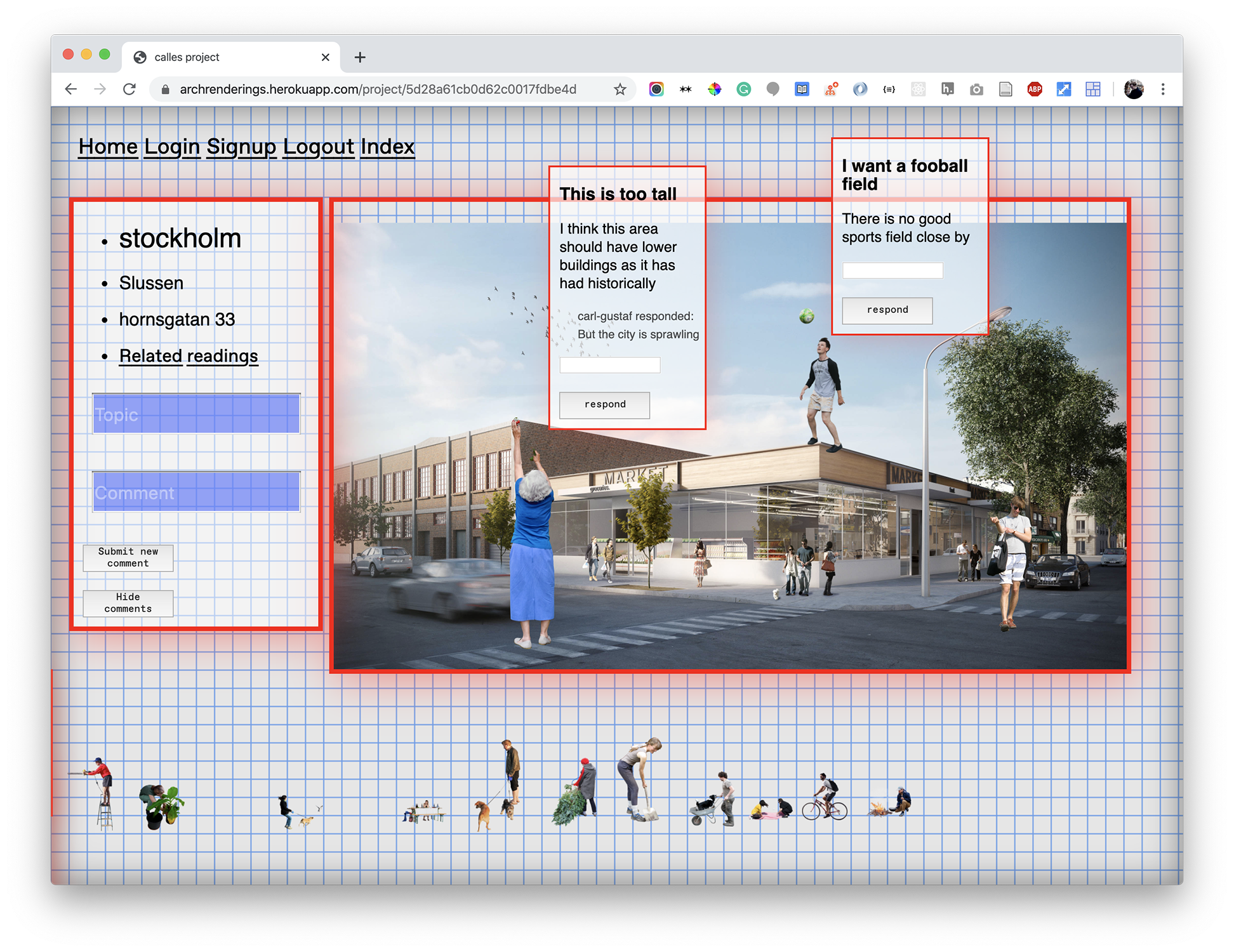
“This should be a park”
2019
A webpage that allows for users to hack architectural renderings by dragging people into the picture and make them say something about it.
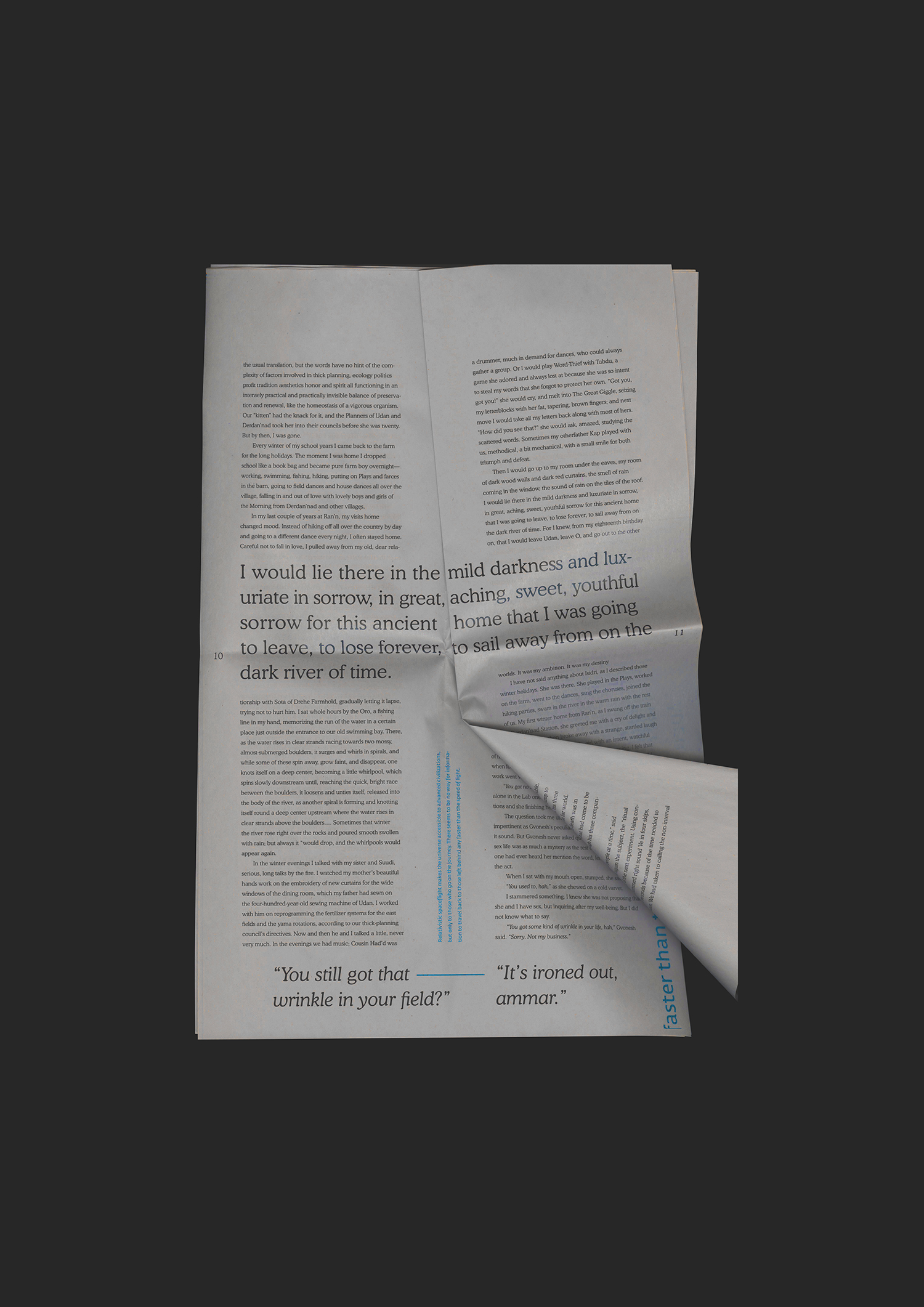
Cosmos book
2018
A book that is combining two texts about time traveling. The book is not bound, so the reader can travel in time by lifting the page.
→Abstract
When Photography as a medium arrived, it changed our world. It caused us to reinvent many things, one of them being the medium of painting. All of a sudden, a realistically painted picture was no longer the best possible way to document and archive visual qualities. New styles of painting evolved, and the medium grew into something bigger than before.
The web arrived a while ago, but what mediums has it revolutionized? Or more important, what mediums should we reinvent because of the web? This thesis book is a system investigating that question.
→Website
CRS
Caroline Robinson Smith
Show StackIn Flux
info
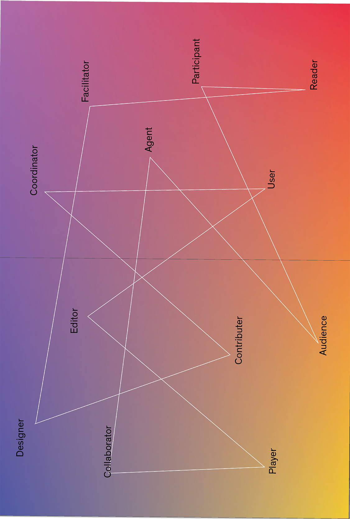
Creative roles I assume in my practice.
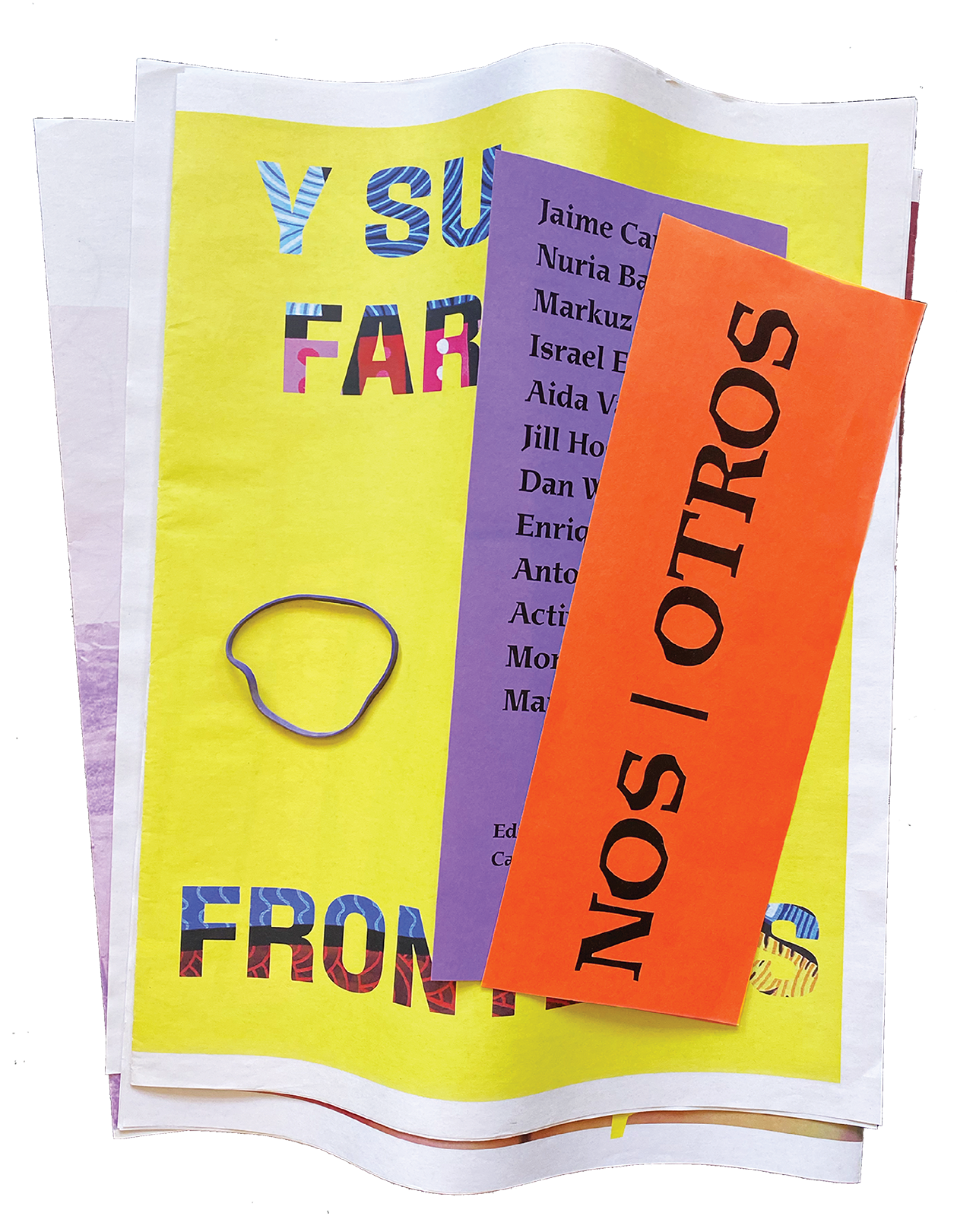
Nos Otros: Collaborative Publication with Artists at the US/MX border
2019
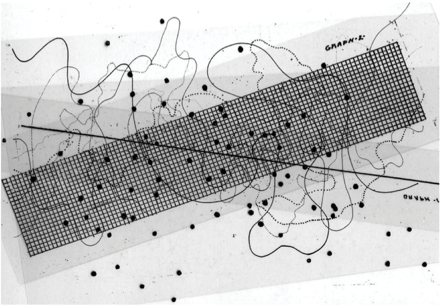
John Cage, Fontana Mix: Improvisational Graphic scores.
Processing Places: Distorted Images of City Centers
2019
Atlas: Crossing Conversations
2018
Modular Type
2018
→Abstract
To incite immersive design experiences requires a reciprocity between designer and participants, between designer and machine and/or between design structure and dynamic potentiality drawn from properties of a particular space. Site-specificity locates the practice on various levels as the designer must give away part of their authorship to third parties, interrelationships and avoiding fixed processes of familiarity. With a commitment to openness and movement, the design practice must be both improvisational and orchestrated without a singular underlying structure to bind it. An exchange is required for a project’s separate moving parts—those being a facilitator, creative participants or environment—to become attuned to each other’s positions and construct grounded footing. If the designer is mediating or facilitating this endeavor, it is not their role to predicate a direct path for the project but to aid its process by giving it gravitational pull. What denotes as gravity under this system, however, may shift as the project’s direction meanders, and a varying measure of structure is required to anchor it’s participants with a productive common ground to build upon as a group. The relationship of elements that permeate my design processes behaves more like a gradient than a hierarchy. Up close, each pixel of a gradient exists as its own individual color. While discrete, they are part of a larger system, becoming visible within a complex matrix of relations. From a distance, all the individual colors in a gradient are still apparent and visible but they still all relate to one another, living together in a state of fluidity, transition and response. These colors are separate from each other yet attuned to their surroundings.
→Website
EF
Elena Foraker
Show StackBinge
info
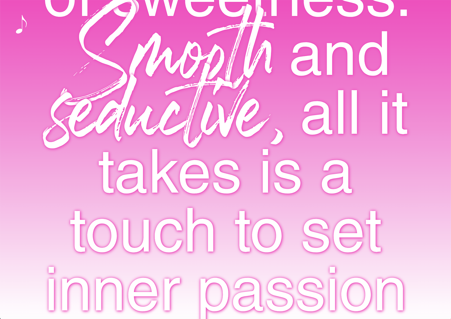
Flirty-sweet-perfect-sensual-funconfident-feminine-fantasy.com
2020
This website is a karaoke-like continuous scroll of 41 descriptions of perfumes released by female pop stars. The descriptions are sourced from a variety of websites and edited for consistency. Each one is also a hyperlink so the user can easily purchase the perfume on Amazon.com. Every adjective on flirty-sweet-perfect-sensual-fun-confident-feminine-fantasy.com is typeset in a script font, in reference to the highly decorative typography found on celebrity perfume packaging. This script font changes with each new perfume description, allowing the user to see where one description ends and then next begins. The user can also click on the music note icon to play the karaoke version of the Britney Spears song, Everytime, while the text scrolls.
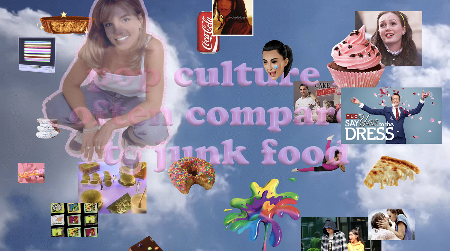
guiltfreepopculture.com
2018
This website playfully proposes that women should not feel guilty about enjoying pop culture. It is designed as a single-page scroll filled with layers of pop culture and junk food floating atop a slowly moving cloudy sky background. Each gif and image is draggable, and the user must sift through these pop culture references in order to read the text beneath. Hovering over the semi-transparent bubblegum type makes it become opaque, signaling a link to an external website.* There are several Britney Spears gifs scattered throughout the page and, when clicked on, her 1999 hit song (You Drive Me) Crazy plays.
Sparkle Emoji
2019
A set of glitter gifs typeset in a font made from Excel icons. Available for download on GIPHY.
Tell Me to Smile
2018
Eye-rolling is widely associated with teenage girls, but psychologists believe that, evolutionarily, women would roll their eyes as a form of indirect aggression in order to survive. For this installation, I shot a closely cropped video of myself rolling my eyes and posted a still image outside the RISD auditorium. The accompanying text was posted next to the installation:
During my day-to-day at RISD, and more generally as a female in public, I find myself eye-rolling a lot: at the random man on the street who tells me to smile & at my dad who says I should appreciate being cat-called & at the male student who repeats verbatim what a female student just said in crit & at another RISD class taught by a cis white male professor & at my graphic design textbooks perpetuating the myth of the creative male genius & at the male student who interrupts and talks over a female student during crit.
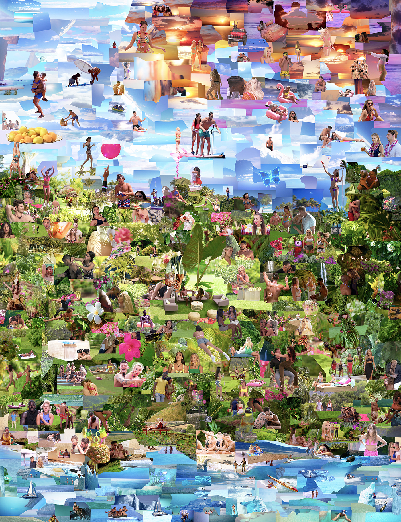
Garden of Reality Delights
2019
Inspired by the central panel of Heronymous Bosch’s The Garden of Earthly Delights, Garden of Reality Delights is a collage of more than 1,000 screenshots I took while binge-watching Love Island (UK), Love Island (USA), Love Island (AUS), Temptation Island, and Paradise Hotel. In the spirit of the stock photo beaches that wallpaper reality TV villas, I printed the collage on a piece of inexpensive silk at wallpaper scale. This material is both sexy and cheap, like reality TV romance.
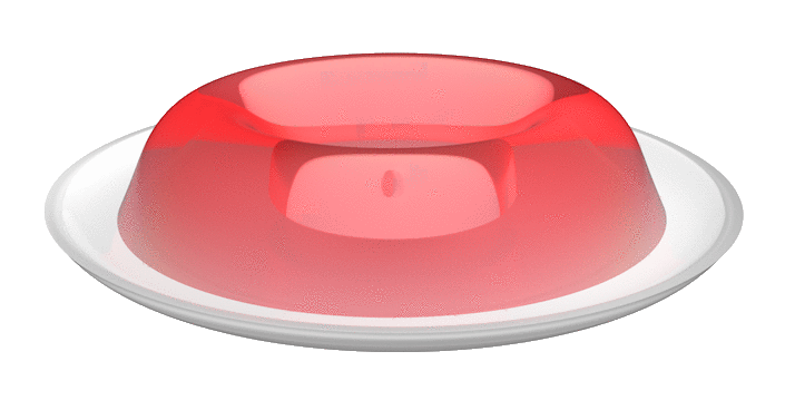
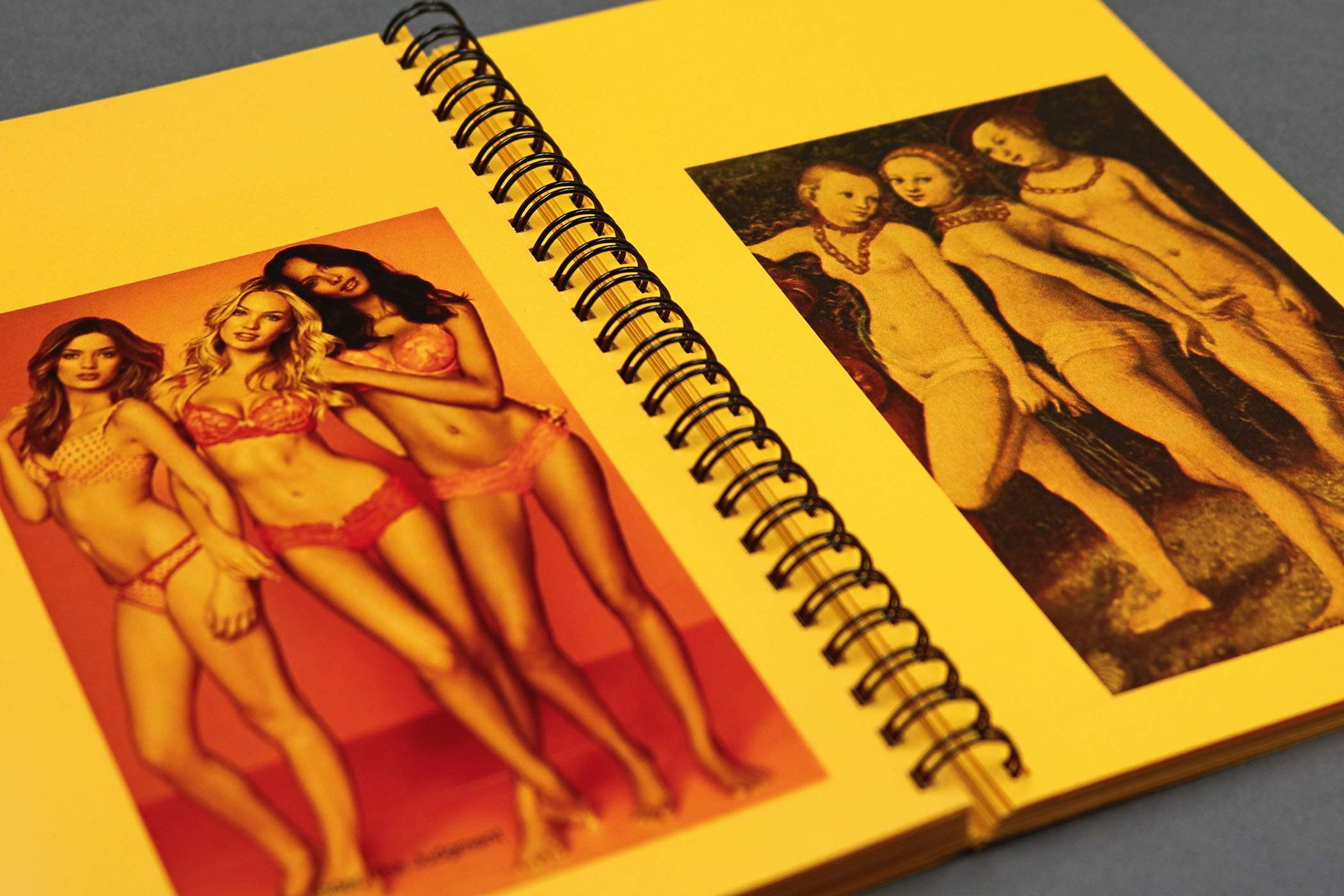
Perfection Salad
2019
Published on February 19, 1963, The Feminine Mystique is widely credited for second-wave feminism in America. In the book, Betty Friedan describes “the problem that has no name” as the unhappiness felt by suburban housewives on account of their inability to live up to the feminine ideal. Mid-century food trends are inherently linked to femininity, as are contemporary beauty trends. Nail polish names are amusing and absurd, but they reflect society’s impossible expectations of women.
The design of this website formally mimics mid-century recipe cards with speculative Jello-O salads wiggling in front of vibrant close-up food textures. The recipe title on each card corresponds to the real nail polish color that the salad is rendered in. With a click, the website animates as if flipping over to reveal the back of the recipe card. Instead of ingredients, it lists names of contemporary nail polish colors. Hovering over a nail polish name changes the text to its hex color.
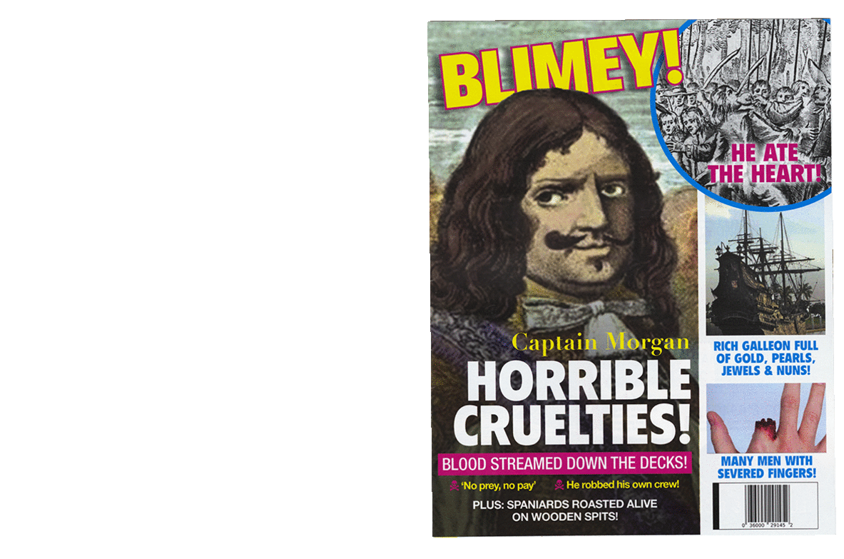
Blimey!
2018
Given the prompt to design using an historical artifact as primary source material in the Providence Public Library special collections, I selected The Buccaneers of America, written in 1678 by Alexandre Exquemelin. Blimey! is a campy gossip magazine for pirates to read and enjoy some schadenfreude. With the exception of the headlines and captions, all text is sourced directly from Exquemelin. The imagery is a combination of stock photos and scans of the book. The magazine includes found advertisements for Neosporin, Captain Morgan rum, and tropical “island escape” cruises.
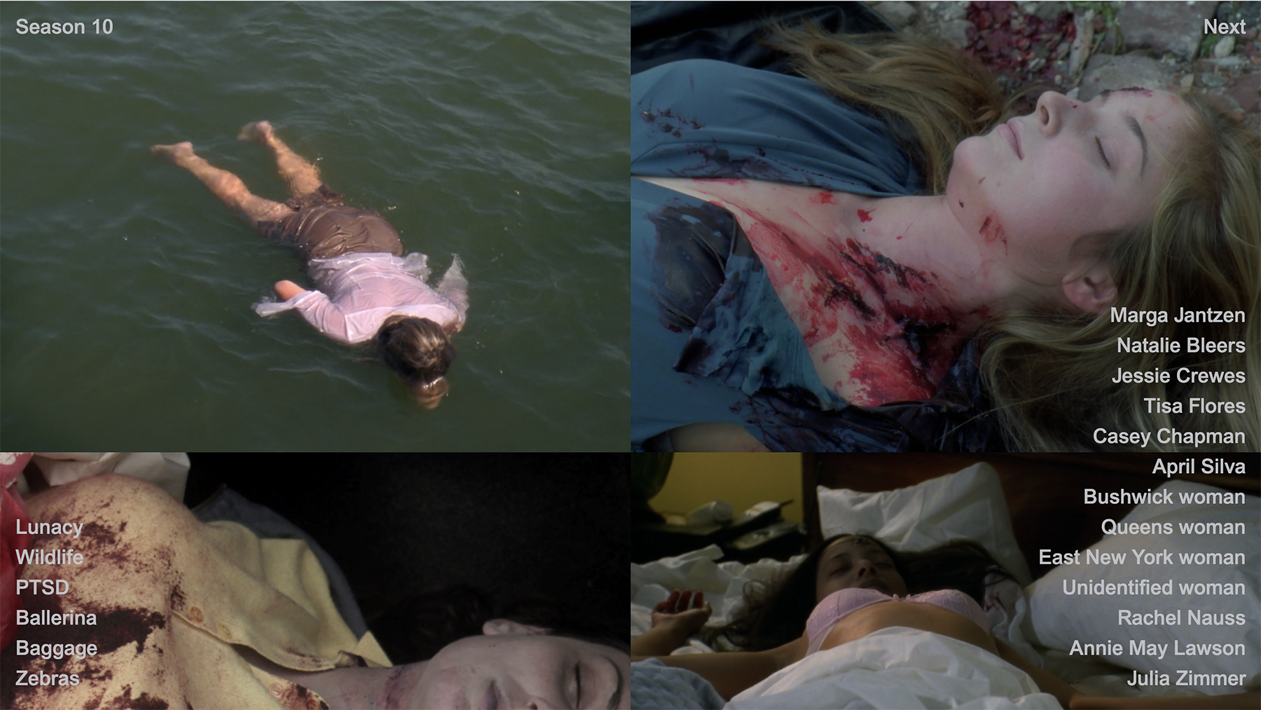
svudeadgirls.com
2019
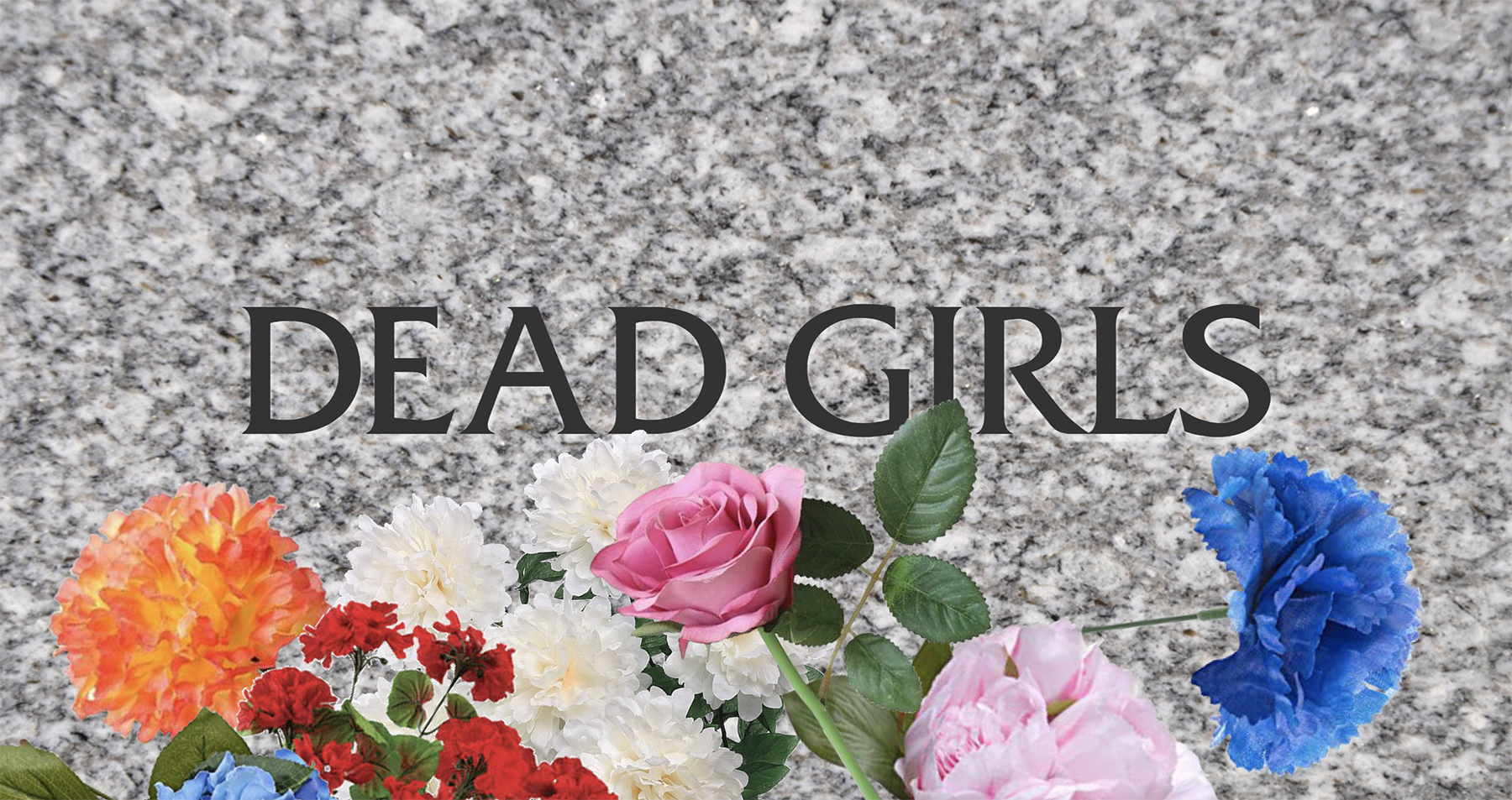
svudeadgirls.com
2019
Svudeadgirls.com is both a memorial to and archive of the 148 women and girls murdered during the first twenty seasons of Law & Order: SVU. The website’s landing page is a gravestone engraved with one of their names at a time. The user must click on the name to advance through all 148 of the murdered women and girls. The SVU opening credits “dun dun” plays with each click. Fake flowers rest at the bottom of the page as well as links to individual SVU season pages. Within each season page are gridded screenshots of the Dead Girls killed during that season as well as their names and the titles of the episodes in which they were killed.
→Abstract
My appreciation for mainstream pop culture is genuine, but I am not a passive consumer. Drawing from both embodied experience and contemporary feminist theory, I design as a participant, cultural surveyor, and critic. From these vantage points, I obsessively watch to discern the tropes of specific media such as reality TV romance and dead girl shows. My data bingeing leads to my process of archiving, de/recoding, and making visible the algorithm structuring pop culture.
“Fantasy” is derived from the Greek phantazein, meaning “to make visible.” In this thesis, I demonstrate that the fantasy-reality relationship is not an either/or. Reality TV challenges this binary directly; despite its moniker, it is more fantasy than reality. The distinction between reality and fantasy is further blurred when real women play fantasy dead girls; The plotline may be fictional but the violence against women is real. Like binge-watching, Binge fully immerses you in my pop culture world through both critique and celebration.
→Website
EG
Emily Guez
Show StackHow to do things with things
info
Strange Gifts
Strange Gifts
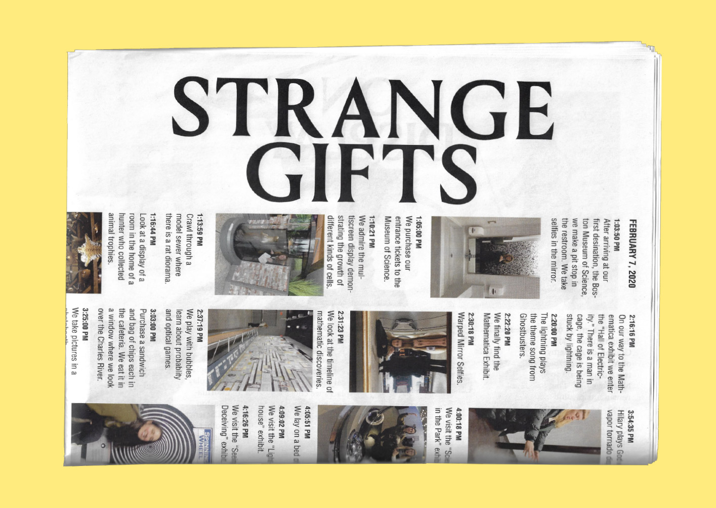
Strange Gifts
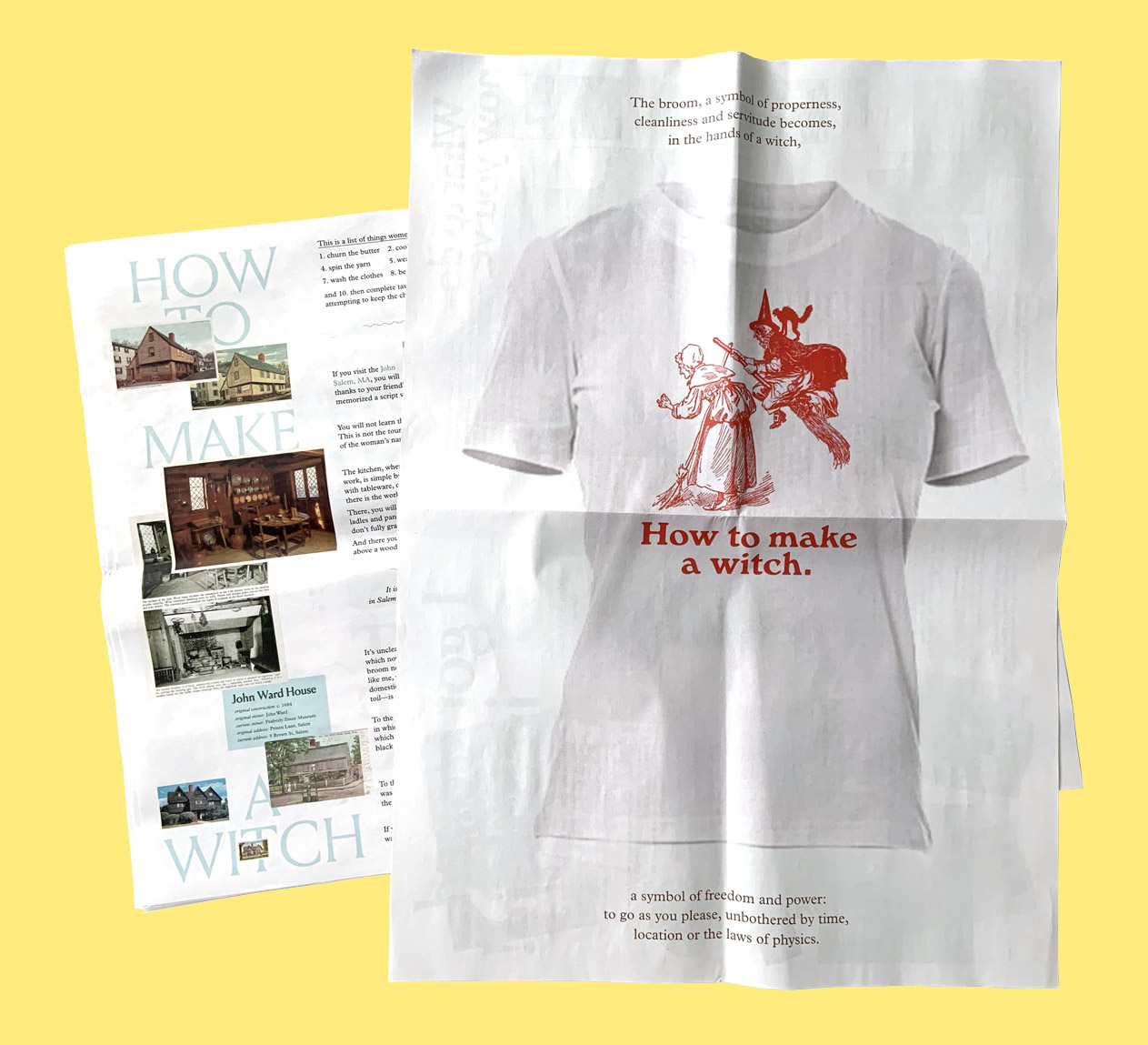
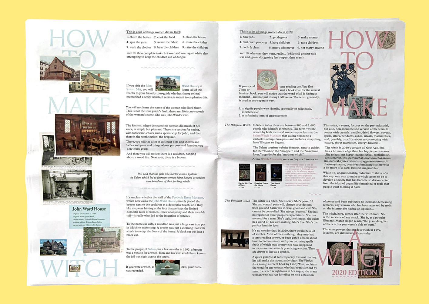
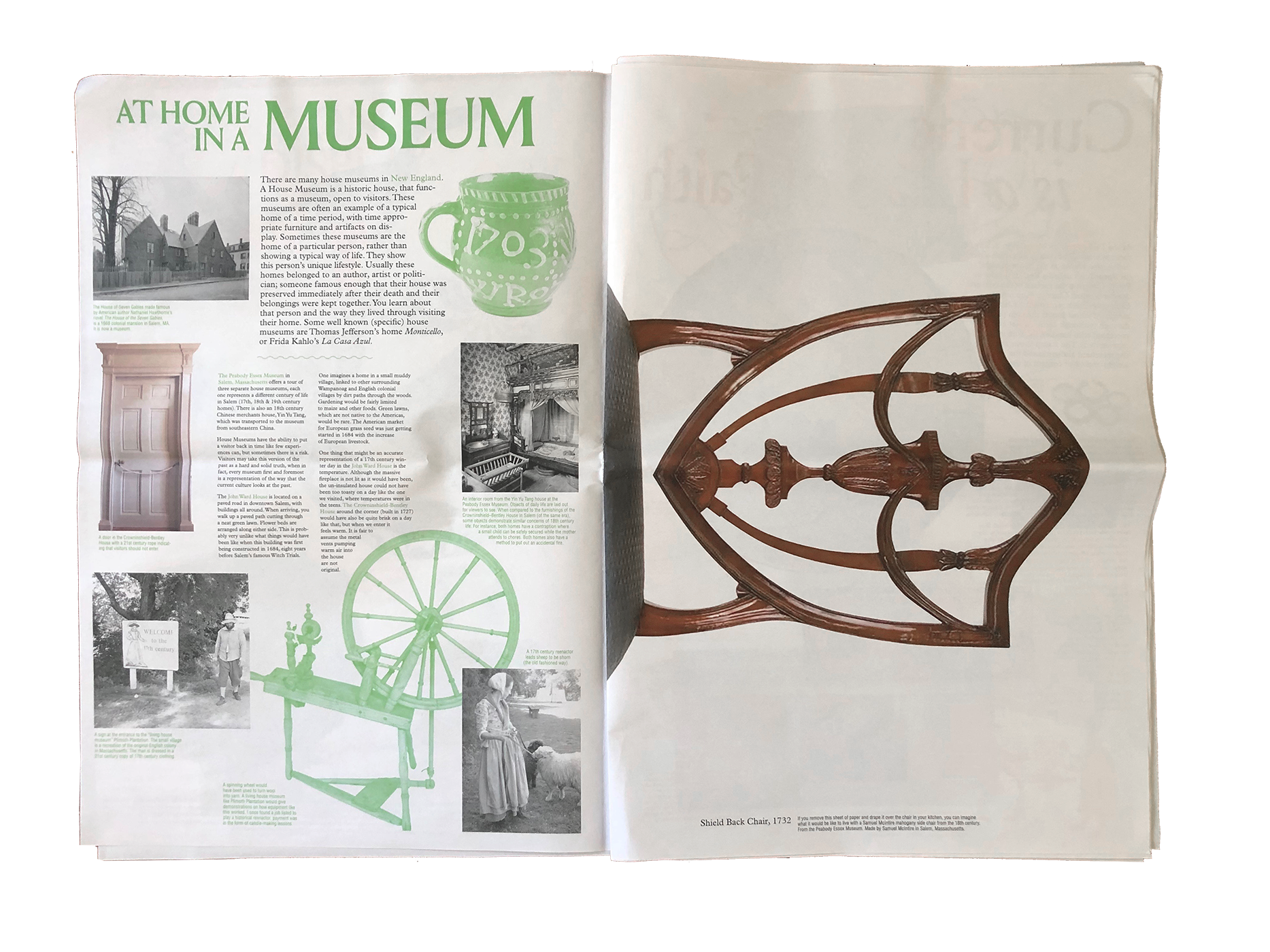
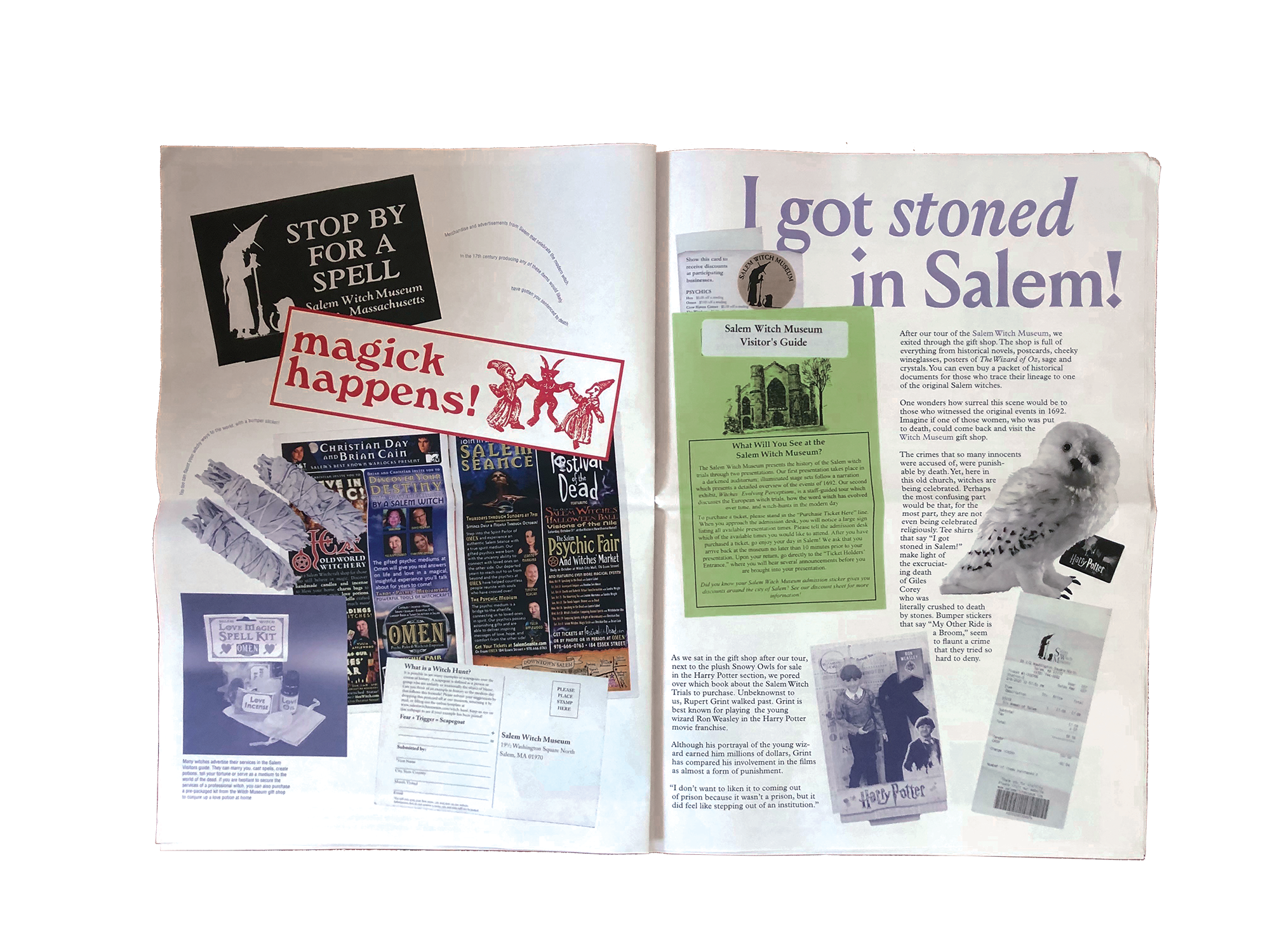
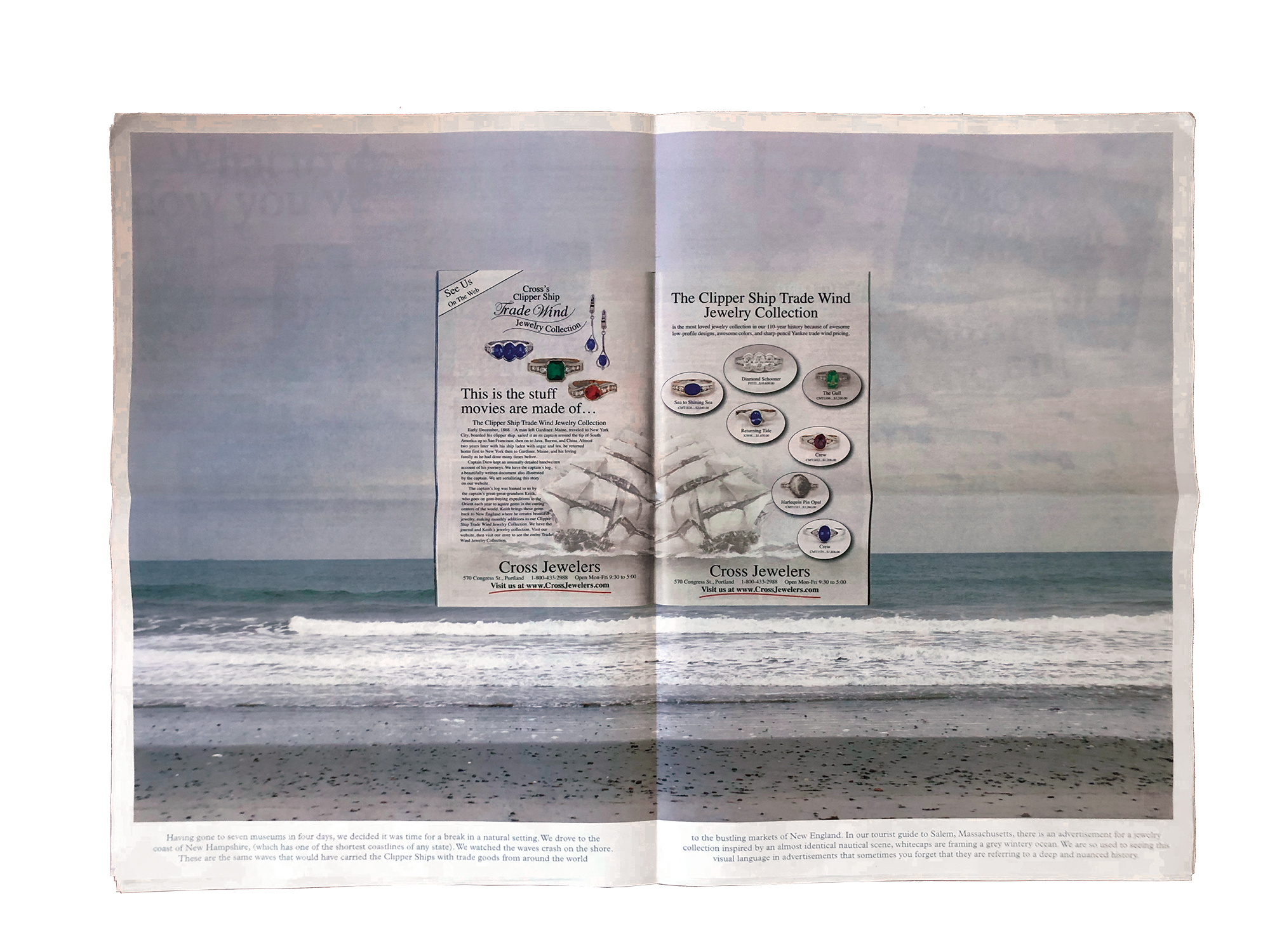
My classmate Hilary du Pont and I went on a roadtrip across New England with the goal of making a publication. As we drove around and went to museums, we let the things we encountered be the prompt for our stories and ideas. We made Strange Gifts, a newspaper that connects the realities of past people and places to our own current reality—but does so through a fun, unexpected lens: looking, for example, at the history of womens’ gendered labor as a “recipe for making a witch”. We also brought the things we saw to life: after seeing countless wallpapers in house museums, for example, we made our own version and printed it as a full spread; if you had multiple copies of the publication, you could paste it up on your own wall.
The publication functions both as a traditional newspaper and, if you pull each spread apart and hang them on the way, as a portable exhibition that can be installed wherever you want.
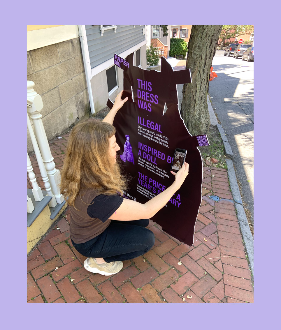
Paper Doll Tabs
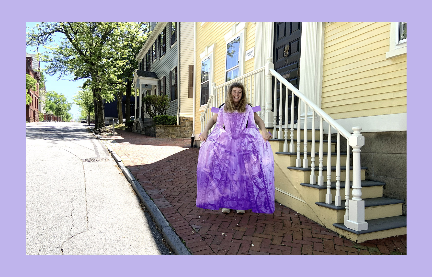
Paper Doll Tabs
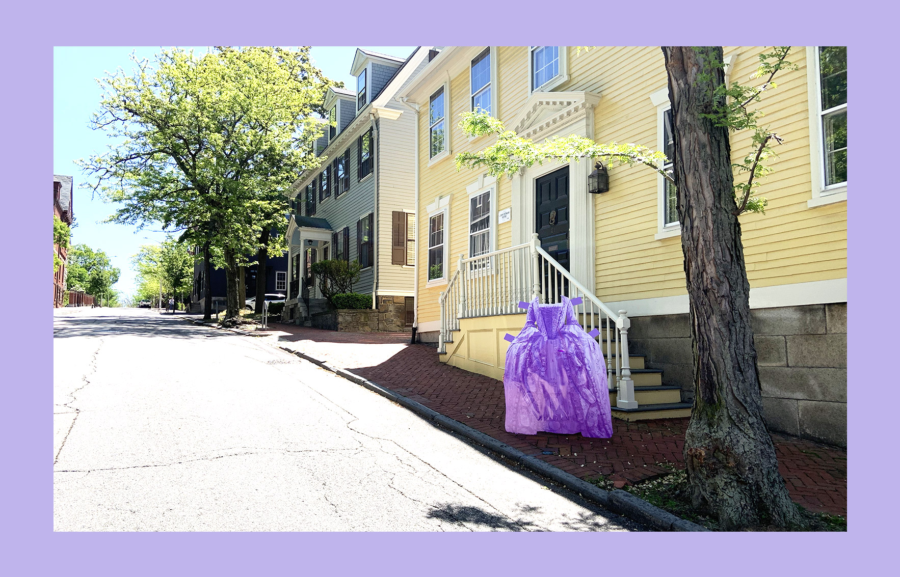
Paper Doll Tabs
Walking around Providence, I started thinking about how people who lived here hundreds of years ago would have walked down the same streets I do now. What were their lives like? I wanted to bridge the gap between me and them. I searched for first person accounts of their lives and delighted in information about small details from their daily lives: what were they wearing and why? Their clothing helped make them feel real rather than abstract.
Paper Doll Tabs a series of human sized paper doll outfits that place women back into the spaces they would have once inhabited. At first glance, the dress is a visual surprise: something fun that you might post about on instagram. When you see the back of the dress, you’ll find some more information—how, in the early colonies, women kept track of the latest fashions back in England by having little dolls imported who were wearing whatever the trend was, and then basing their own clothes off of that, for example. If that weird tidbit makes u curious, you can scan a QR code to be directed to a website and find out more.
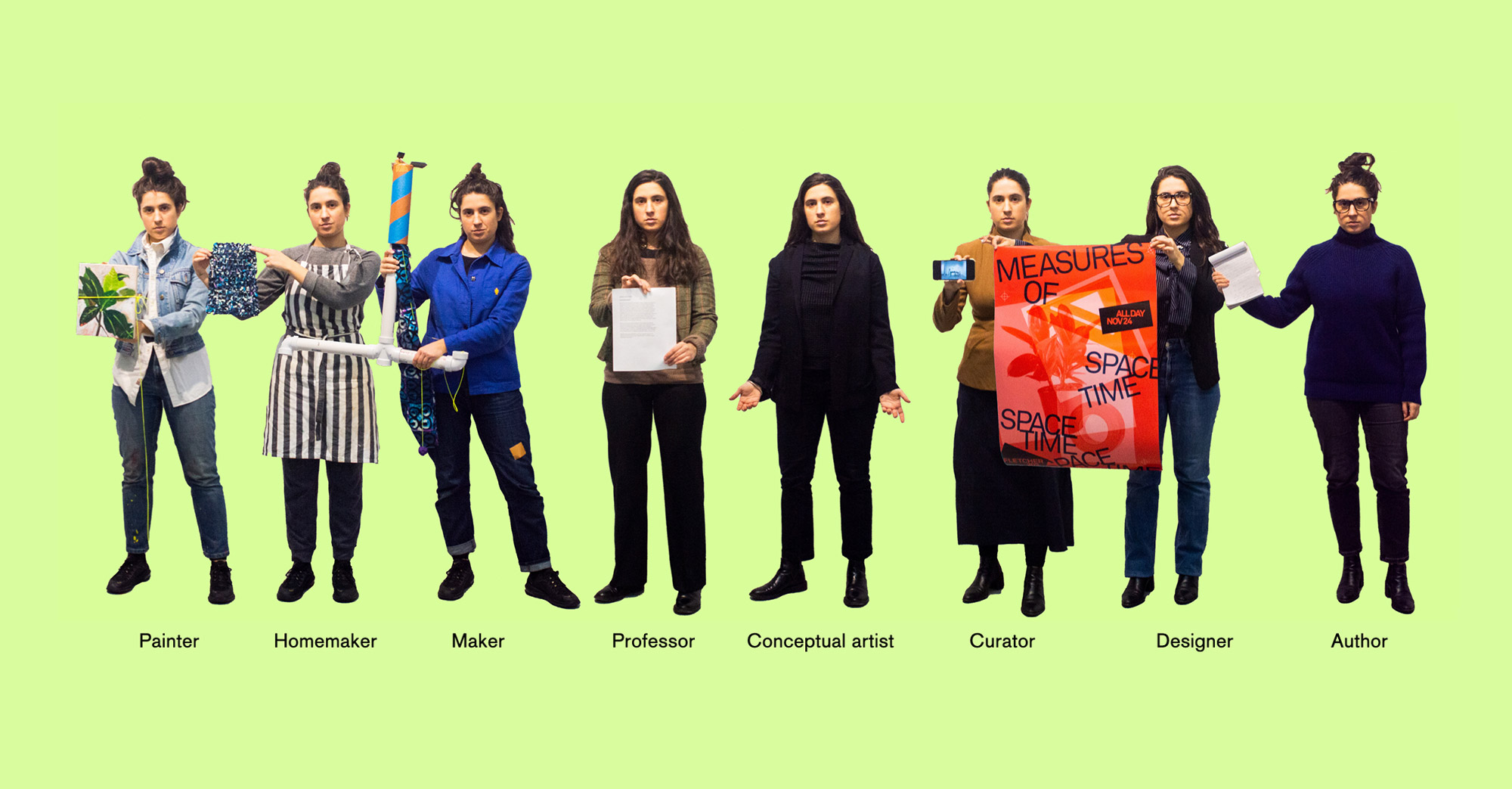
Embodied Creativity Experiment
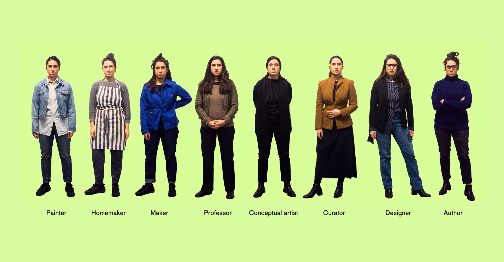
Embodied Creativity Experiment
In 2012 a team a scientist found that, simply by wearing a doctor’s lab coat, your capacity to focus on a task goes up by 25%. They called this “enclothed cognition.” I set up an experiment to test this out for myself, creating 8 different personas and the outfits for each: a painter, a homemaker, a maker, a professor, a conceptual artist, a curator, a designer and an author. I set up a table filled with a wide variety of items that would allow me to make different things depending on who I was embodying.
Over the course of 8 hours, I dressed up as 8 different people and made 8 different things. Clothes—especially ones that are encoded with a certain meaning, are performative—they affect not only the way we are perceived by the world but also how we see and behave within it.
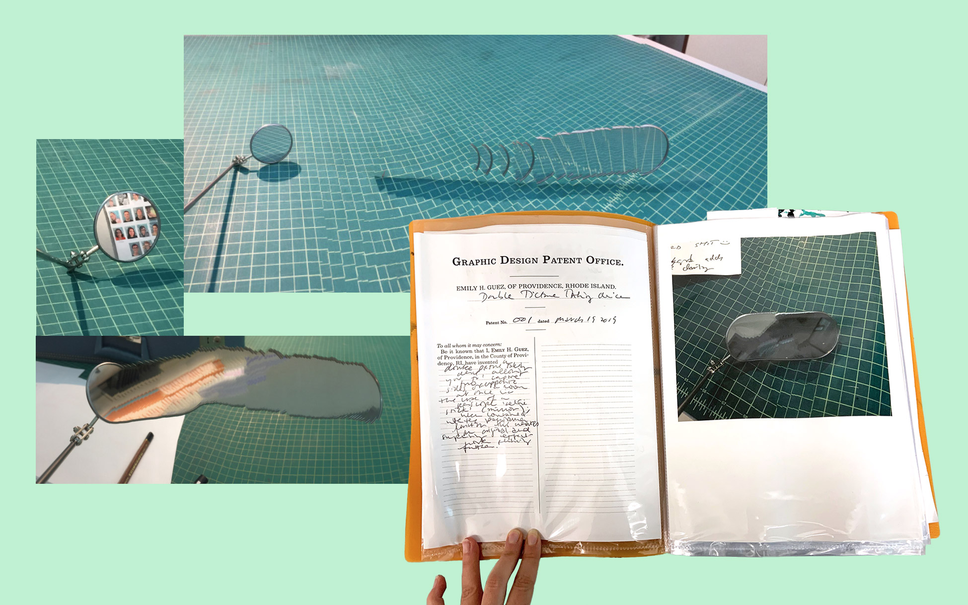
Inventor's Lab
Inventor's Lab
Inventor's Lab
Inventor's Lab
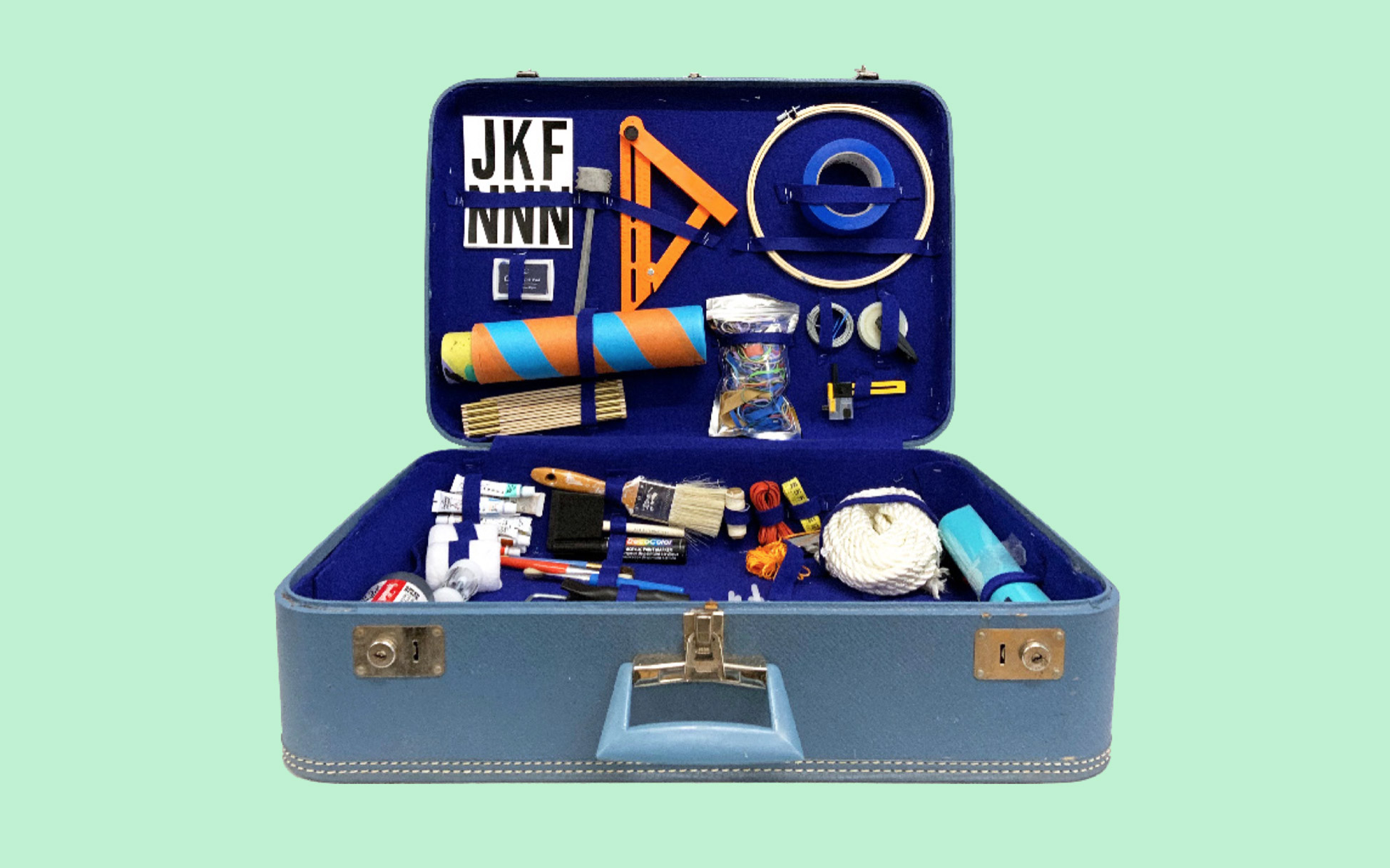
In 2019, I was researching Thomas Edison and became fascinated by the way inventions shape our reality. Edison had 736 U.S. patents —he invented the light bulb, the sonograph, etc.—and he came up with his ideas by having an “inventor’s lab” in which he stored: “eight thousand kinds of chemicals, every kind of screw made, every size of needle, every kind of cord or wire, hair of humans, horses, hogs, cows, rabbits, goats, minx, camels…” The list goes on. I decided to make my own inventor’s lab—a graphic design inventor’s lab. I filled a suitcase with tools from various trades, dressed up in a hazmat suit, and patented 5 “graphic design inventions” over the course of 7 hours.
→Abstract
Humans have always done things with things. It’s at the very origin of who we are as a species: we’ve gone from being bipedal homonins to people who live in complex societies by making rocks into tools. Things can serve a practical function, but they also carry cultural and symbolic meaning: they can tell our personal stories, allow us to connect with each other, and be the outer manifestations of our inner lives. The things we use in our every day lives, by implying a set of actions we can take when interacting with them, participate in shaping our reality: all things contain a set of implied behaviors, rules, customs, morals and beliefs.
How to do things with things is an invitation to look at things as clues with which to investigate reality, and to then go ahead and make new things to invent new realities. If our culture, norms and sense of self are embedded in our things, there’s good news: they are all malleable. We can take things apart and put them back together to look at ourselves from a new perspective. We can (literally) objectify any concept or idea to try it on for size. We can make things that allow people to try entirely new and unexpected behaviors and ideas.
Doing things with things is a practice of performativity; it looks at everything around us—from the clothes we wear, to the tools we use and the spaces we inhabit—as a set of messages, stories, and behaviors. In doing so, it’s an invitation to expe-rience and engage with complex ideas and concepts in a way that is not abstract but, instead, embodied. If we can wrestle with the inter-personal, behavioral, socio-psychological and historical aspects of being human by literally interacting with them, we can actively participate in making new versions of all of them and maybe, in the process, become new more-multidimensional humans.
FF
Fabian Fohrer
Show StackCounter-Formation
info
Newly Formed
2019
+1 (320) 313–1312
2019
Deconstruction/Reconstruction
2019
Unspaced Spaces
2019
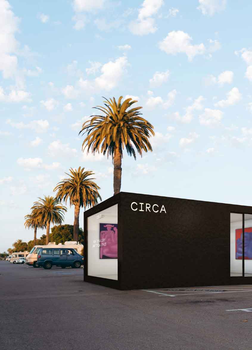
Circa
2020
Positive, Negative, In-Between
2019
→Abstract
Counter-Formation establishes a foundation to envision a more accurate shape and field of interrelations across disciplines and contexts that are not only receptive but appropriative and elaborative. By approaching the space of the counterform, my ambition is to generate a responsive structure and an archive of fragments to build upon—a blank canvas with a variable format to recast vision and action. Counter-Formation places emphasis on the transformative, liminal space that allows one to encounter contexts from within, between, and around to organize or break them in a different fashion.
→Website
HdP
Hilary duPont
Show StackA Very Large Array
info
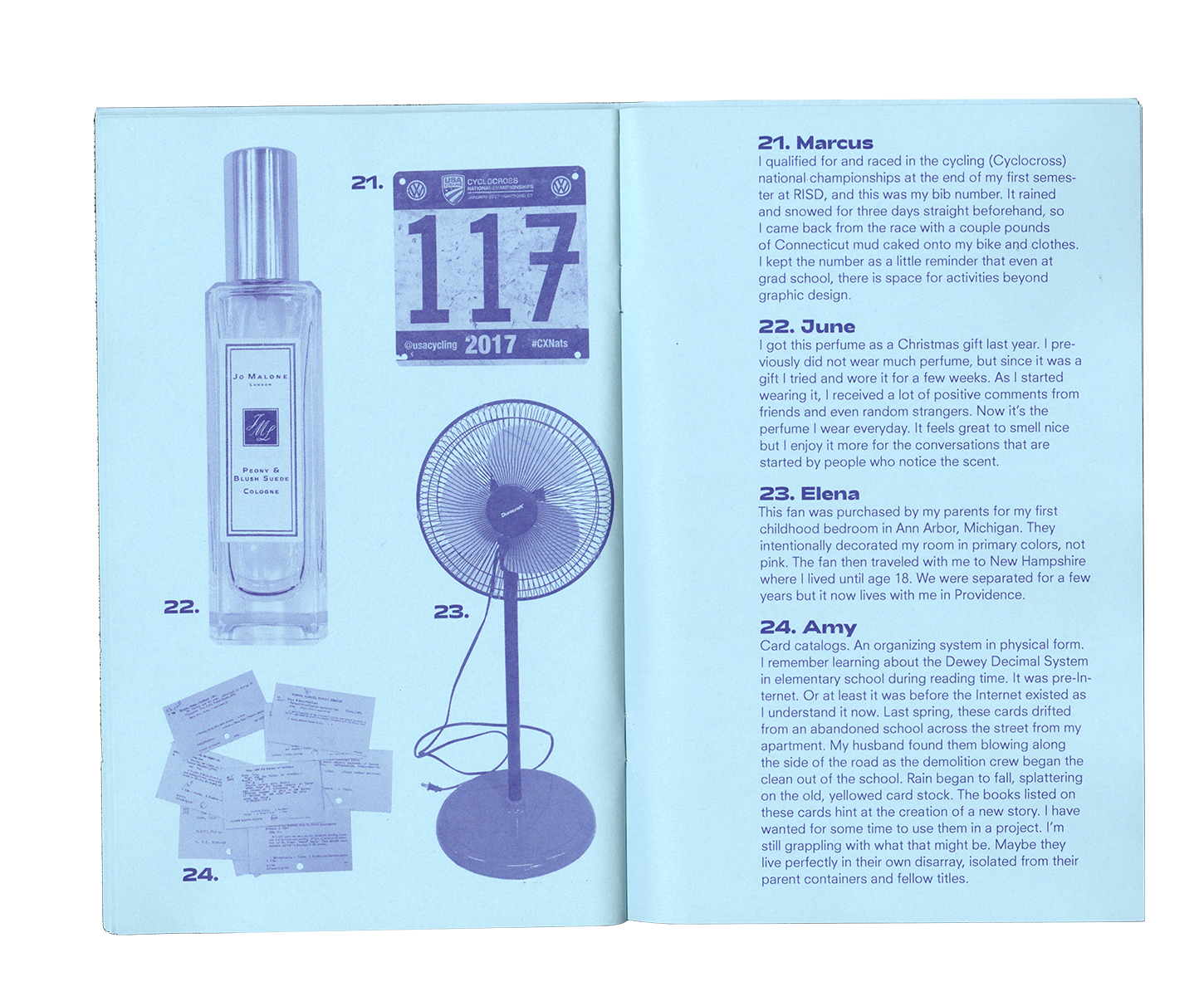
THINGS: Objects & Their Stories
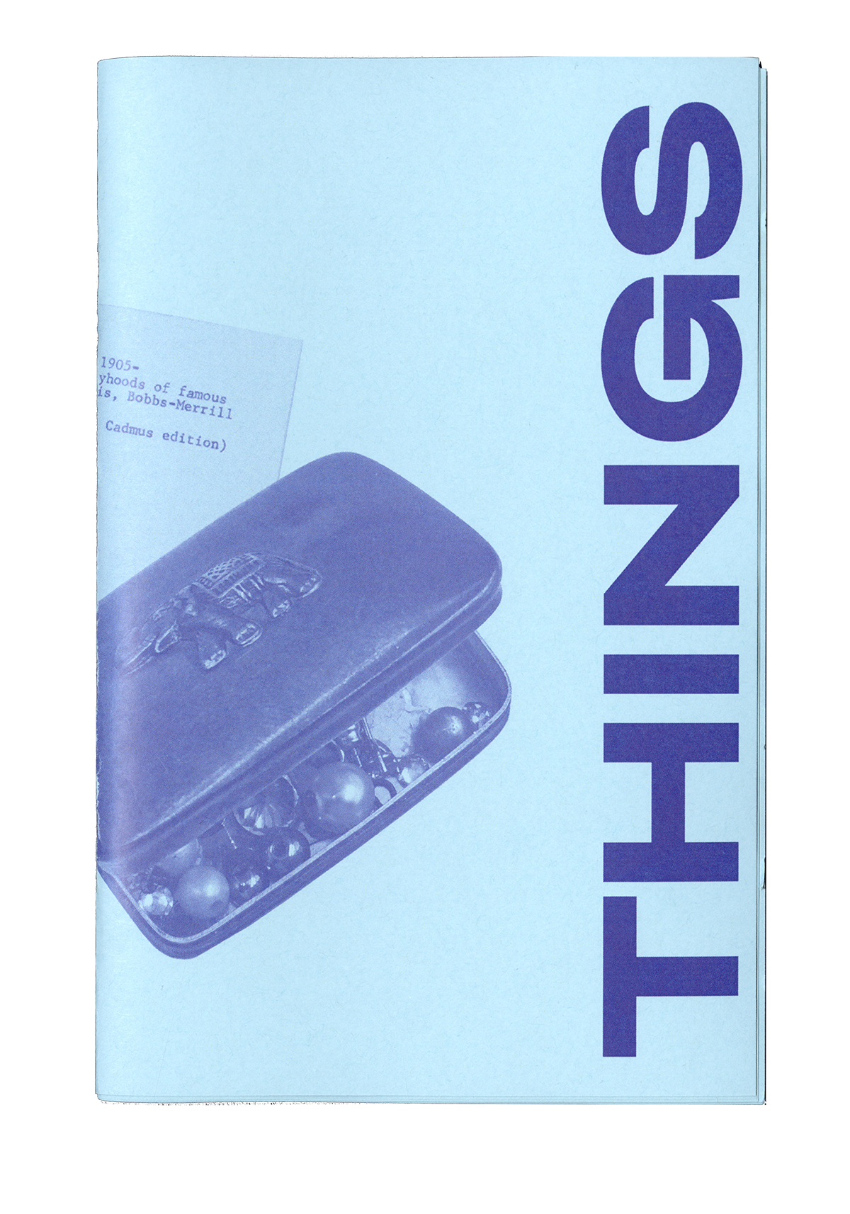
THINGS: Objects & Their Stories
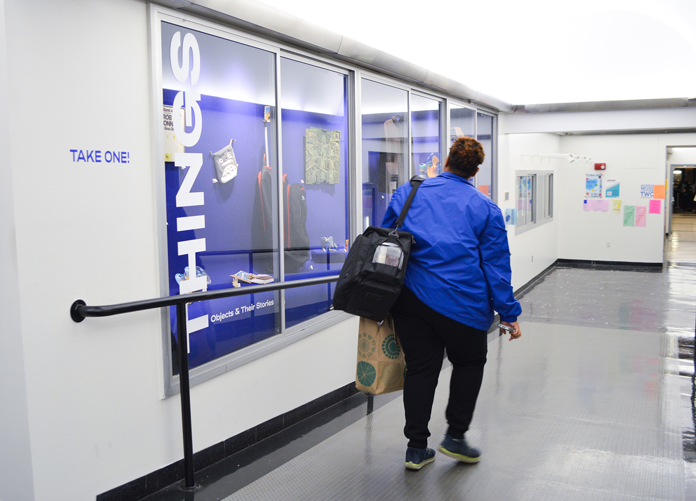
THINGS: Objects & Their Stories
THINGS: Objects & Their Stories is an exhibition I organized in collaboration with Emily Guez. We asked our classmates to share an object of theirs that tells a story, then we displayed the objects. An accompanying booklet was available where viewers could read the stories about the objects on display.
Strange Gifts
Strange Gifts
Strange Gifts
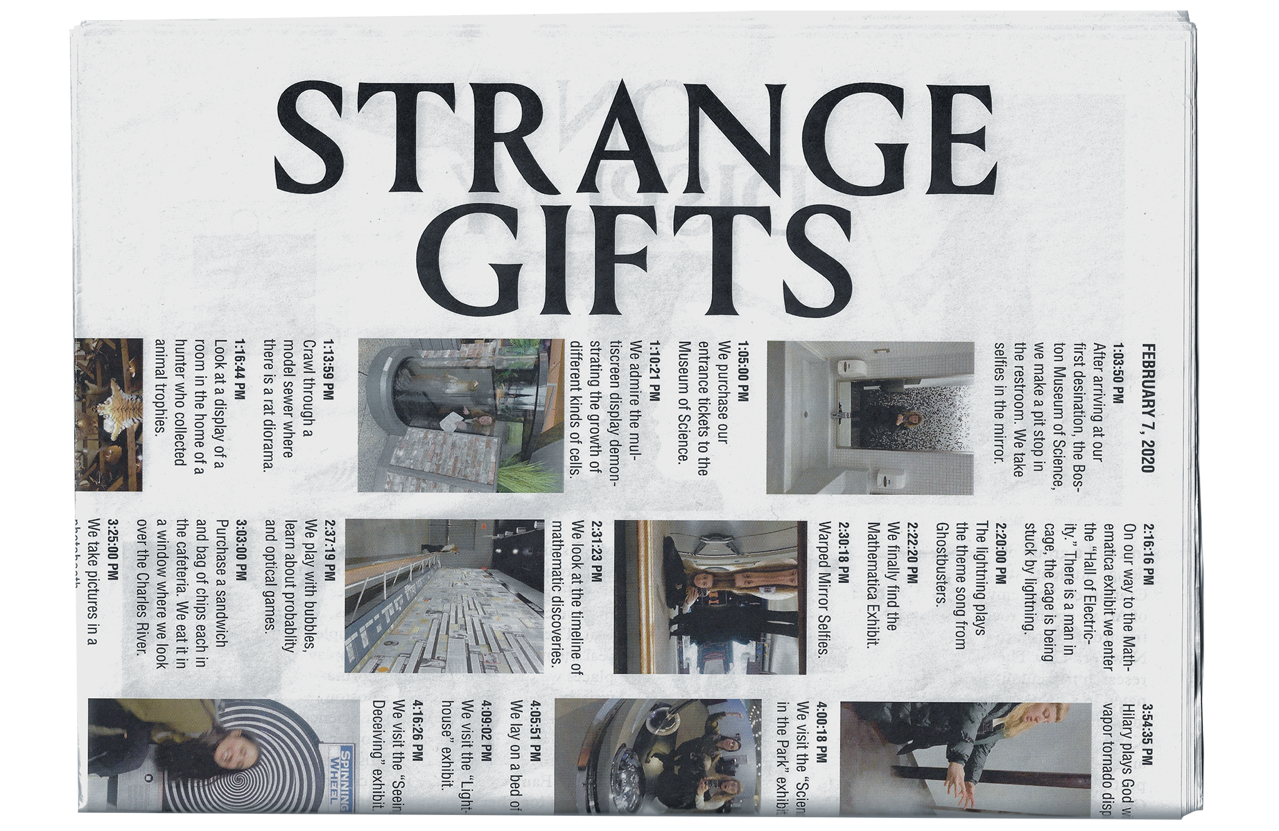
Strange Gifts
In 1973 a group of design students at the Cranbrook Academy of Art went on a roadtrip from Detroit to New York City. The research trip culminated in a poster and glossary compiled by Katherine McCoy and Ed Fella. The resulting poster is titled The Cranbrook design trip, a mobile group of students record a glossary of their opinions and impressions: 10/15—10/23/73.
In February 2020, Emily Guez and I went on our own four-day research trip around New England. We produced a paper about our journey called Strange Gifts.
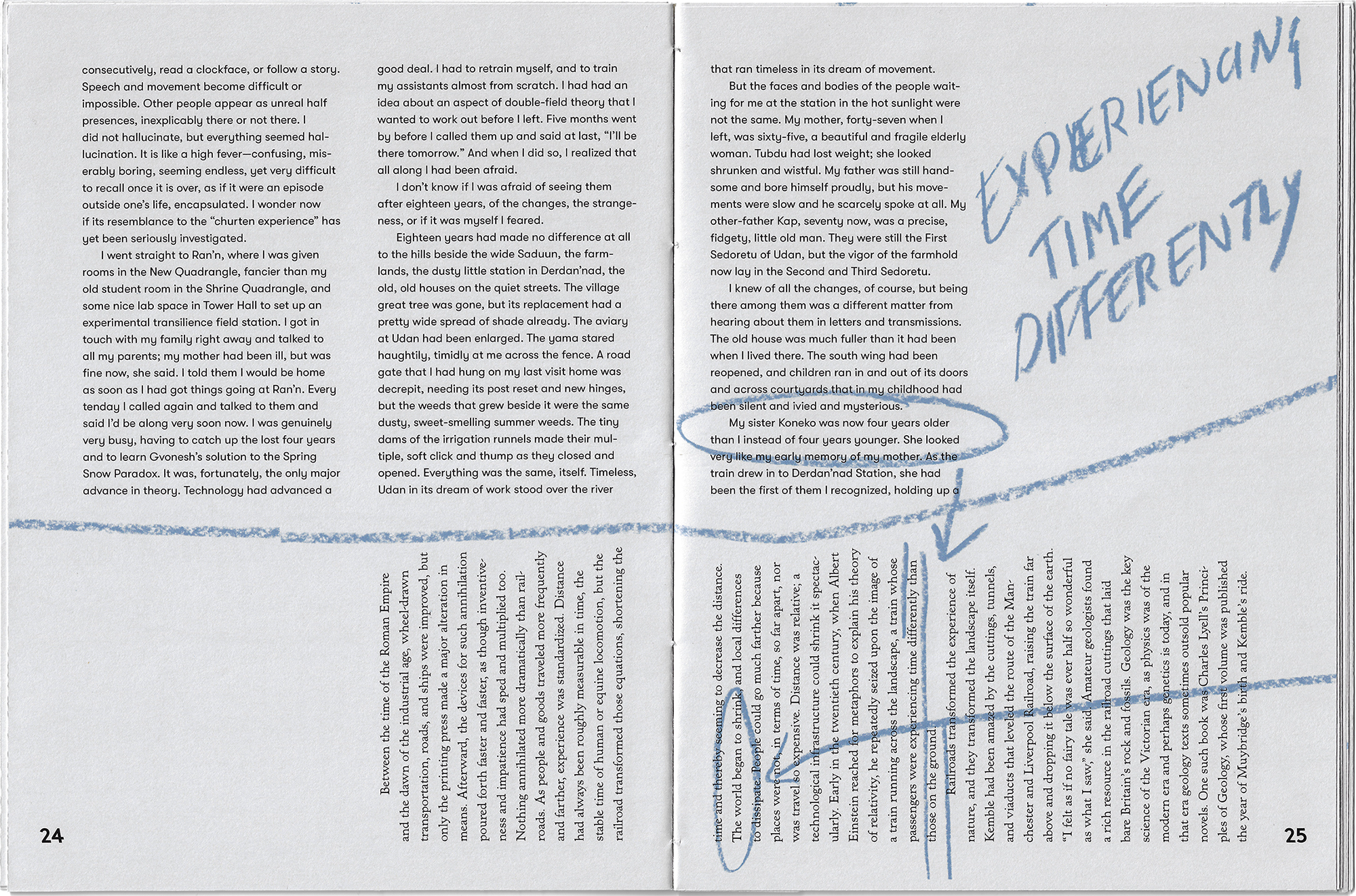
On the River of Time
On the River of Time
Many years ago I read River of Shadows by Rebecca Solnit, a biography of the photographer Eadweard Muybridge. The truth is I don’t even know if I ever finished the book. I certainly don’t remember the details of Muybridge’s complicated life, but what really stuck with me was the introduction essay. In The Annihilation of Time and Space, Solnit talks about the ways in which technology, like photography, changed the way that humans perceive time and distance. In the essay, she quotes a letter written by a girl who rode a train for the first time. She says ‘When I closed my eyes this sensation of flying was quite delightful, and strange beyond description.'
Solnit’s essay was what came to mind years later, when I read The Fisherman of the Inland Sea, by Ursula K. Le Guin. The story begins with the narrator offering the explanation that “story is our only boat for sailing on the river of time.” Le Guin’s story is fictional, but it also deals with the ways that technology shrinks distances, and the complications that come with that.
I combined both of these texts into one book called On The River of Time. The two stories can be read linearly. There is a third voice in the book, mine. This voice is hand written, these notes draw literal lines between passages that talk to one another, and makes observations. The hand drawn lines jump spreads and pass over pages. Following an annotation, you may be going back to a spread where you already were, or ahead to a page that you have not yet read.
Type Treatments
Type Treatments
Type Treatments
I spent a month last Winter in Japan. For nine days I was on Shikoku Island learning how to make Kozo Paper from the bark of a Mulberry tree. The rest of the month we were traveling in southern Japan, visiting Shinto Shrines and Buddhist Temples.
This was the longest time I have spent in a place that did not use the Latin alphabet. I used the trip as an opportunity to study the Japanese typefaces I saw around. Despite being unable to read the characters, I was still able to see styles and patterns, I tried to pick up on the nuances of the typography. I made typographic studies—each inspired by different experiences I had in Japan
Block Book
Block Book
Block Book
I made a book that, with every spread laid out side by side, would be the length of the city block 915–865 Westminster Street in Providence, RI. The block is home to two parking lots, Westminster Eyecare, a RIPTA bus stop, Reliable Pawn and the Classic Cafe.
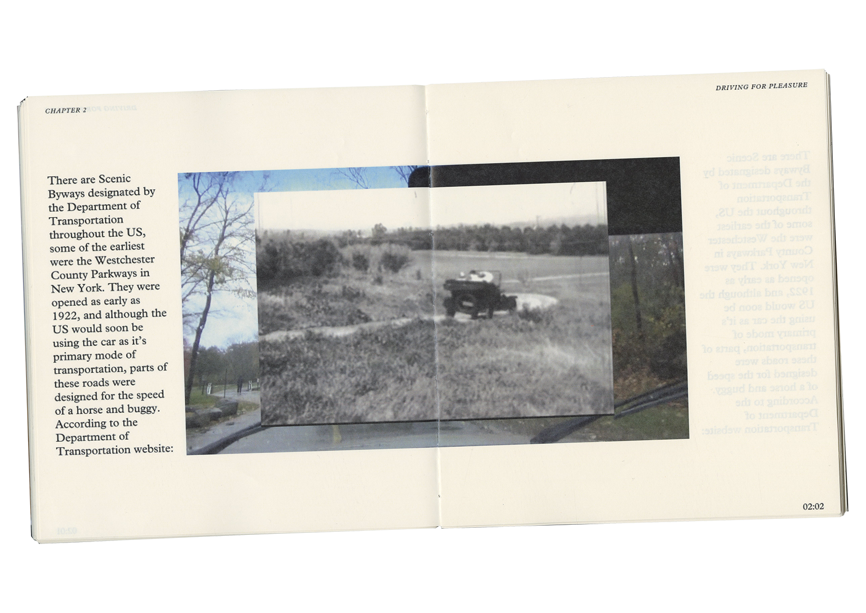
This is a seven minute and thirty-four second drive.
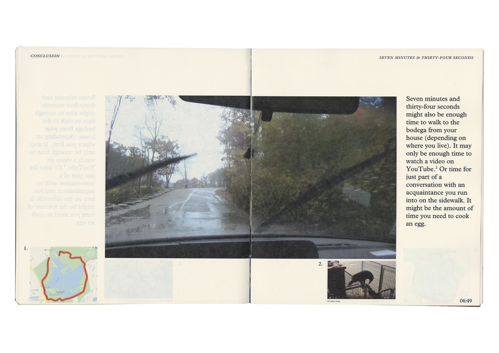
This is a seven minute and thirty-four second drive.
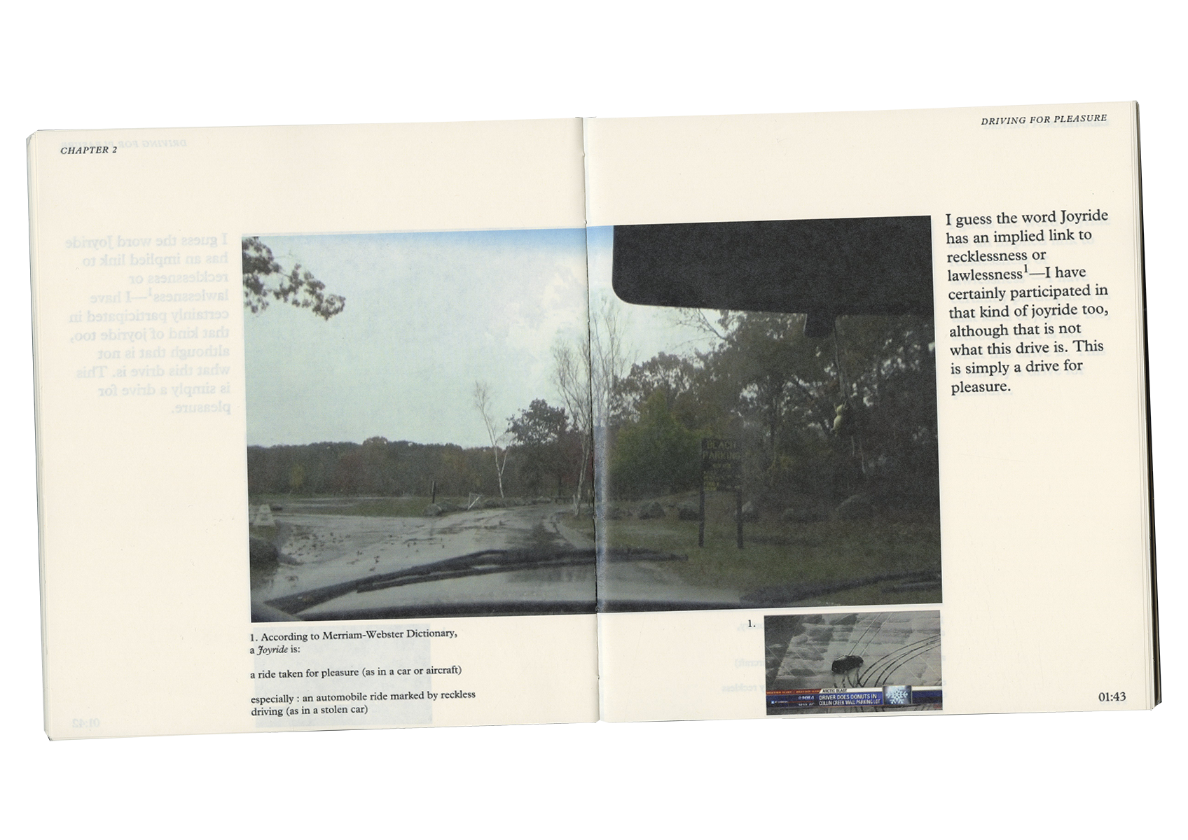
This is a seven minute and thirty-four second drive.
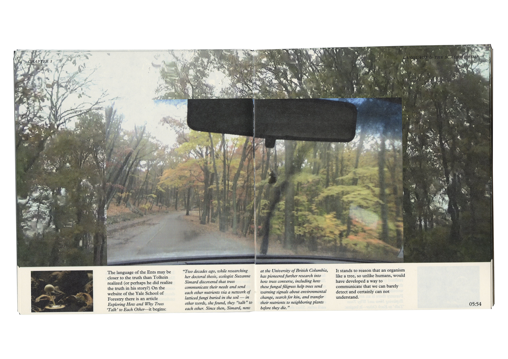
This is a seven minute and thirty-four second drive.
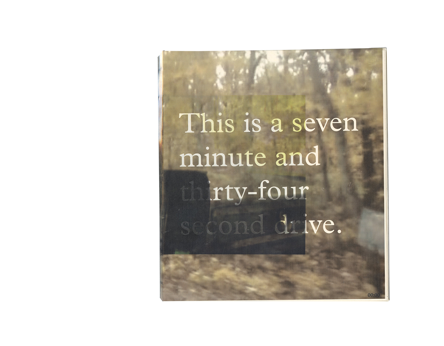
This is a seven minute and thirty-four second drive.
I wondered what it would mean to read a book in ‘real time.’ When you watch a movie or read a novel, time is compressed or expanded as the author sees fit, but in real time, these expansions and contractions can only happen in your mind.
I created a video of a drive. After exporting one frame per second, I turned the video into a book. The movie is a book. The book is seven minutes and thirty-four seconds long.
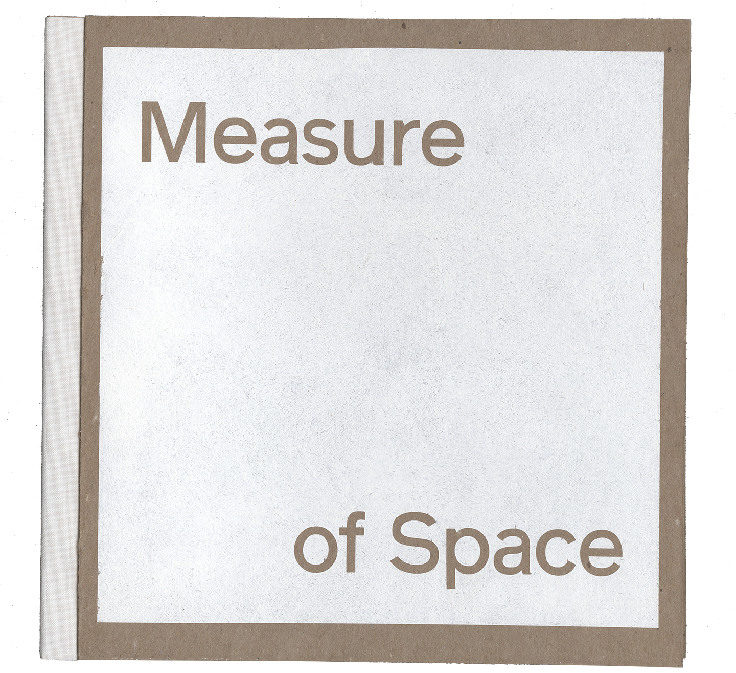
Measure of Space
Measure of Space
Lauretta Vinciarelli was an Italian architect. Originally from Rome, she lived and worked in New York City, Houston and Marfa, Texas. Her designs were influenced by classical Roman architecture, Mexican haciendas and minimalist art. She was fascinated by the courtyards in the homes in Pompeii and Mexico, she worked for years on drawings for the perfect desert home in Marfa based on those ideas. I designed an exhibit about her life’s work.
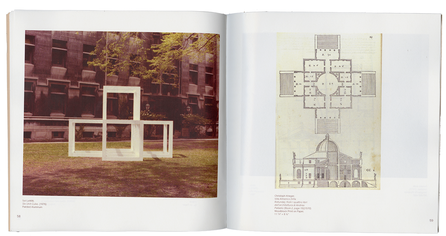
The exhibit is comprised of architectural models, artworks and drawings by Vinciarelli, as well as those who influenced her, and those whom she influenced. This includes many artists and architects, including Donald Judd, Sol LeWitt, and Andrea Palladio.
The catalog that I designed for the exhibit, Measure of Space, arranged images of various works next to each other to highlight the visual relationships between pieces. It may not be obvious that a LeWitt sculpture is related to a Palladian villa until you see the work alongside one another.
→Abstract
The Very Large Array is a radio telescope in a remote area of western New Mexico. An Array is a single telescope made out of multiple satellite dishes. The satellite dishes move in and out on tracks to focus on different distant points in the solar system. These multiple dishes are functioning together to look at one single point, the combined powers of the satellite dishes results in a sharper focus.
This book is an array. The objects included are my observations, interests, experiences and ideas. My thesis is a point in the distance, and I am looking at it using these multiple sources for greater clarity.
→Website
LB
Lizzie Baur
Show StackTemporal Collisions
info
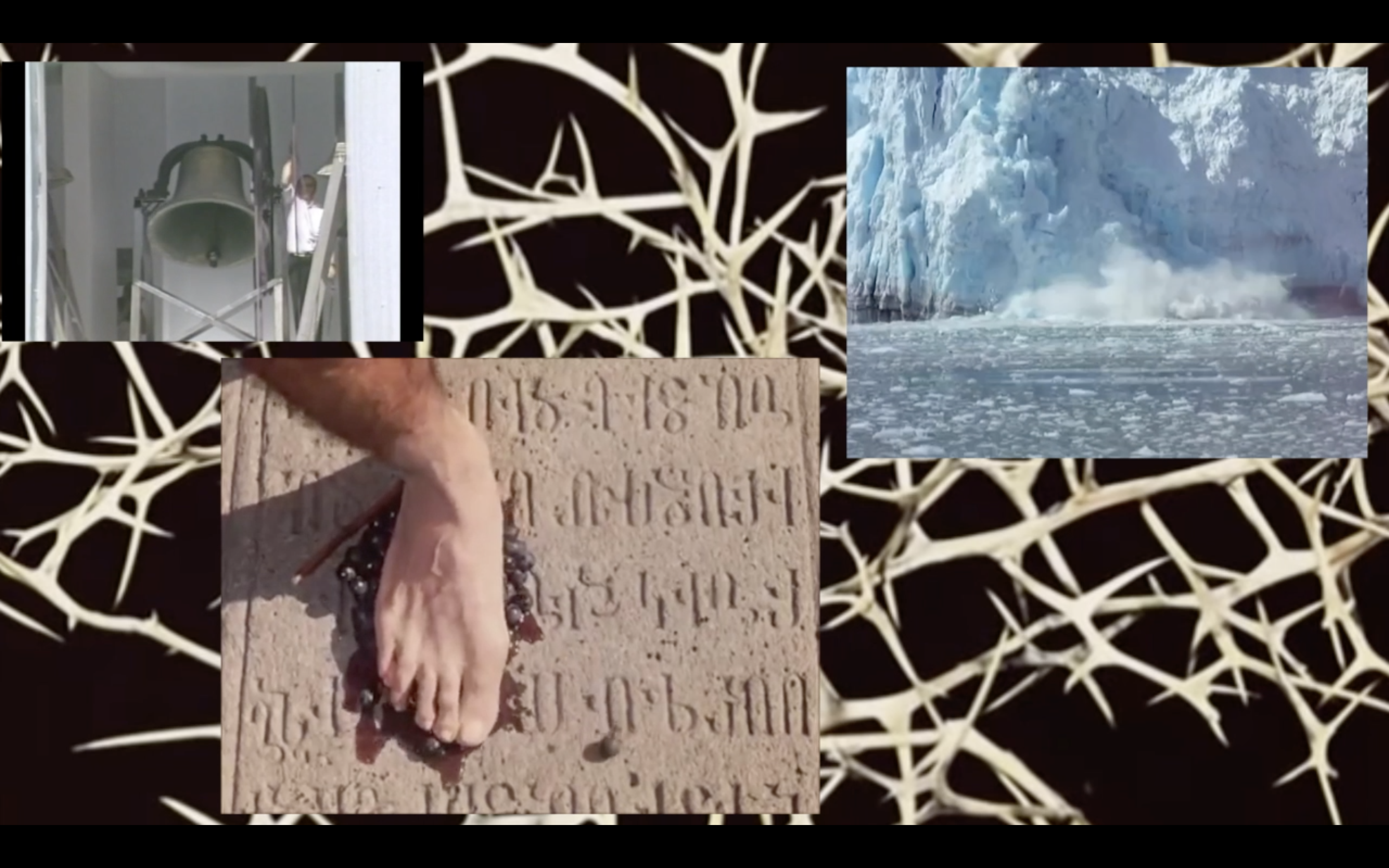
Sympathetic Resonance
2018
Carl Sagan’s 1977 Golden Record was a message containing sounds and images of Earth sent out into space to be intercepted by intelligent extraterrestrial life. Using this model, I began constructing my own message about climate change to the people of Earth. I came across the concept of sympathetic resonance, a harmonic phenomenon where a formerly passive string, or vibratory body, responds to external vibrations to which it has a harmonic likeness. In a multi-channel video using found footage, I leveraged this concept towards inspiring action on climate change.
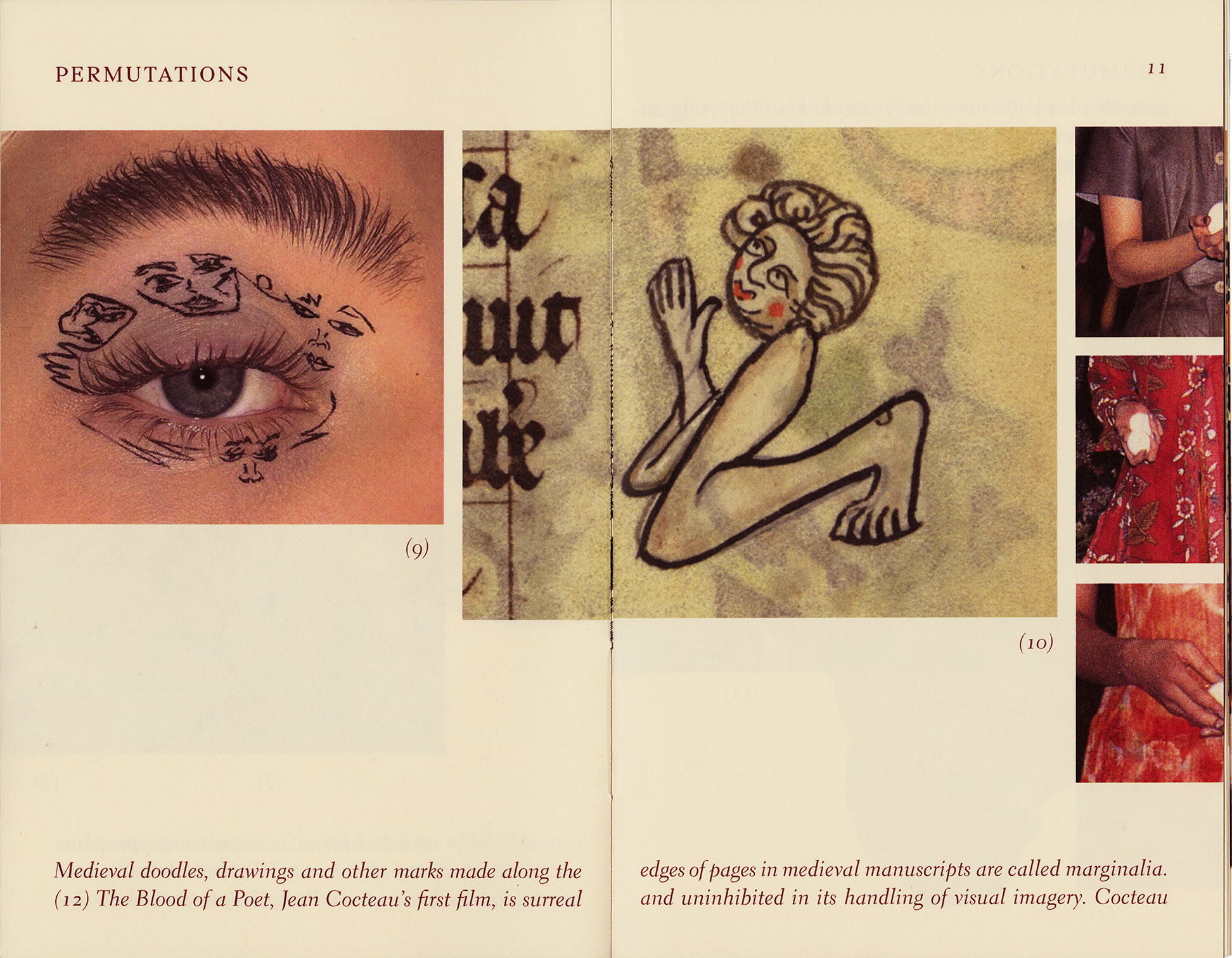
Permutations
2019
There’s a self-discovery that happens when you revisit things you’ve accumulated over a period of time. You look back and begin to recognize patterns in your thinking. I gathered and cataloged a wide range of unrelated objects in my possession. In order to make sense of this collection, I began to join objects through six degrees of separation. The structure of the book attempts to give visible form to my meandering thought patterns. The imagery bleeds from one association to the next with text that flows across the gutter. The reader must stumble around the loose logic of my internal monologue.
Desktop Disaster
2019
What happens when a computer gets confused? An inquiry into the behavior of natural disasters got me thinking about the digital spaces we inhabit and how they might become threatened. Envisioning each icon as a point in a mapped landscape, I orchestrated an environmental disaster on my desktop. The brief animation explores a hybridizing of glitch and interface aesthetics with weather radar maps to draw parallels in their behavior.
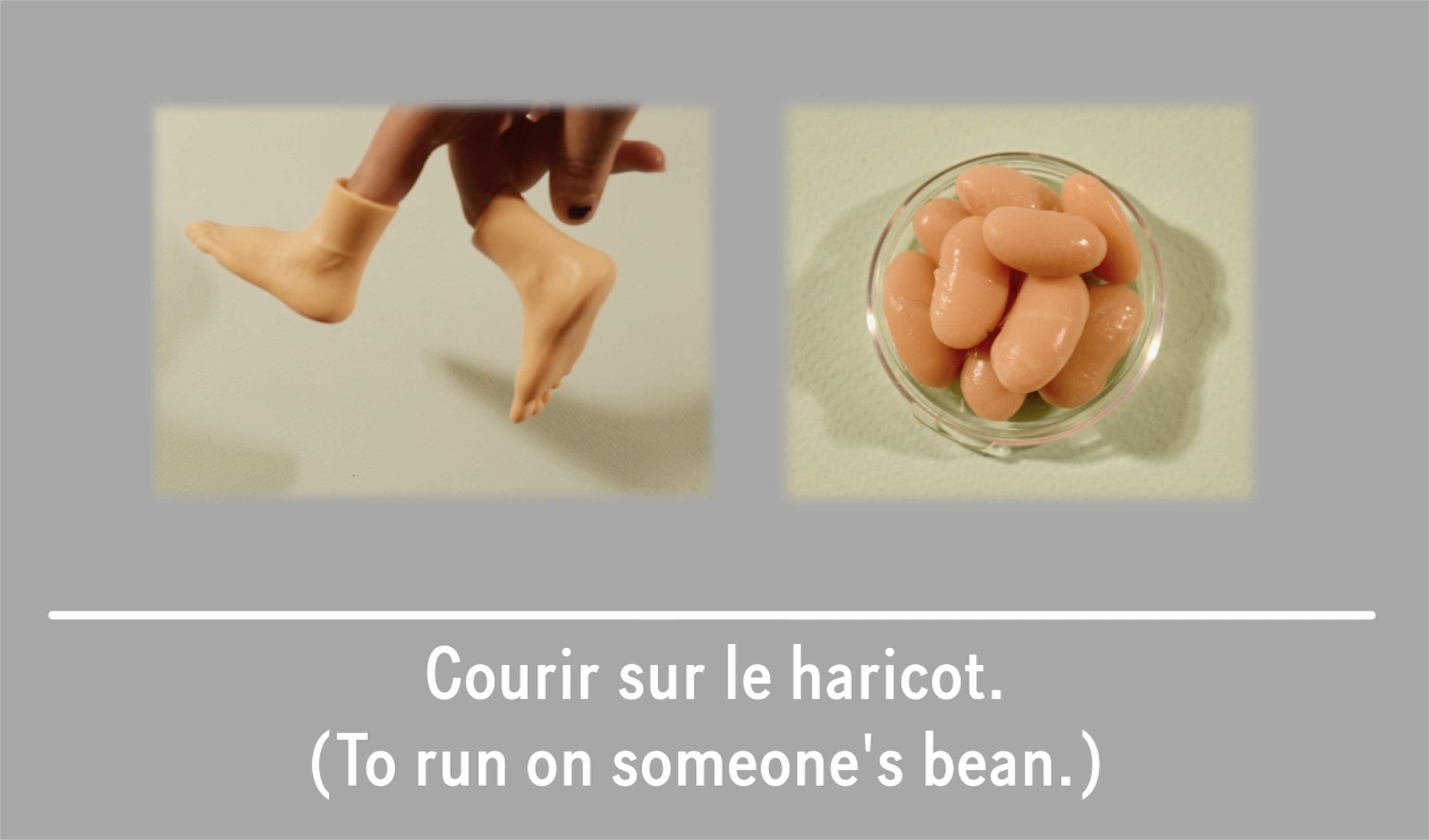
Confounding Idioms
2020
Years ago while studying French in the Loire Valley, I started looking into colloquialisms as a way to help my speech sound less sterile and practiced when communicating with my host family. I began cataloguing idioms and found myself drawn to the irreconcilable differences between the meaning or usage and the literal translation. The gap between the con-text and the words themselves evade expectations and resist logic as a creative alternative to mundane speech, with an emphasis on the absurd. A persistent curiosity of this topic led to a set of instructive videos on multilingual idioms.
Cabinet of Curiosities
2018
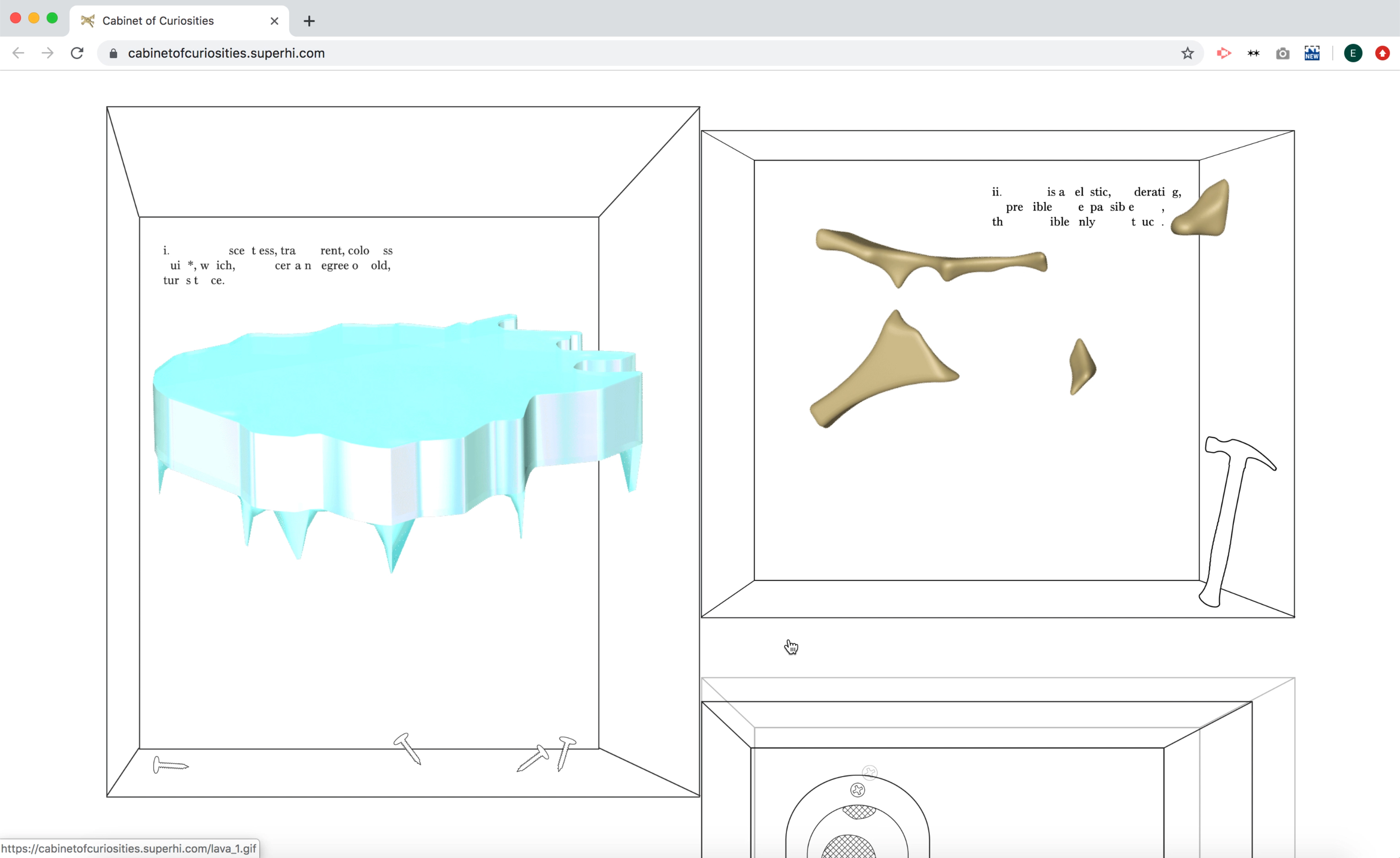
Cabinet of Curiosities
2018
“There are endless possibilities as to what a website could be. What kind of room is a website? Or is a website more like a house? A boat? A cloud? A garden? A puddle? Whatever it is, there’s potential for a self-reflexive feedback loop: when you put energy into a website, in turn the website helps form your own identity.” — Laurel Schwulst
Cabinet of Curiosities models a website after the practice of 16th century origin by the same name. An early form of exhibition that displayed objects belonging to natural history—the term “cabinet” referred to a room, rather than a piece of furniture. Creating a series of cryptic diagrams, pseudo-scientific in nature, my website emulates it’s model by digitally housing these specimens.
Body(type) Specimen
2019
The Modulor is an anthropometric scale of proportions devised by French architect Le Corbusier. In an attempt to bring this concept up to date, I decided to experiment with applying my body measurement index to the construction of letterforms. I began by attempting to force an existing typeface to conform to the measurements of my hand. The project evolved into a (body)type specimen tracing extreme body ideals through history, pairing them with typefaces that bear similar visual traits, in an attempt to expose the absurdity of such ideals.
Activating the Periphery
2019
Activating the Periphery
2019
Activating the Periphery: A Thesis Compendium is a compilation of research, writing, documentation, mapping and forecasts that serve toward defining a direction for the RISD MFA Thesis. This involved refining, cross-referencing and substantiating subject areas previously articulated in my work and presenting them in a comprehensive and thoughtfully-designed format.
→Abstract
We live during a time of smoothly effortless design that encourages instant gratification. In this sea of pre-existing content, most of which we experience through layers of mediation, my practice encourages drifting. As a graphic designer, I try to decondition myself away from reductive thinking. In response, this thesis operates on the fringe, cycling attention to unexpected associations, harnessing temporal collisions and formal play toward diminishing cultural baggage and preconceived notions. I deliberately attune the reader to the labyrinthine, as an experience by which to interrogate common sense and steer the imagination towards moments of uncertainty.
This work engages a kind of dialectical movement, an edging of contact that makes the original more malleable. The familiar, the singular, local events and vernacular languages are my raw materials. I systematically collect and entangle trace elements from cultural, historical, geographical and personal experience. I invite inconsistencies and peculiarities within these new narratives as a challenge to remain open and engaged. Slippery and hard to grasp, this dysfunctional movement, which I’ve framed in this thesis, decenters singular messages and allows new forms of reasoning to emerge.
→Website
MC
Mukul Chakravarthi
Show StackStrata: Lessons in Latency
info
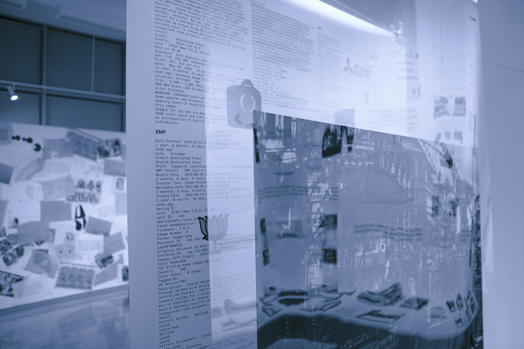
Kashmir, Metadata of a Conflict
2019
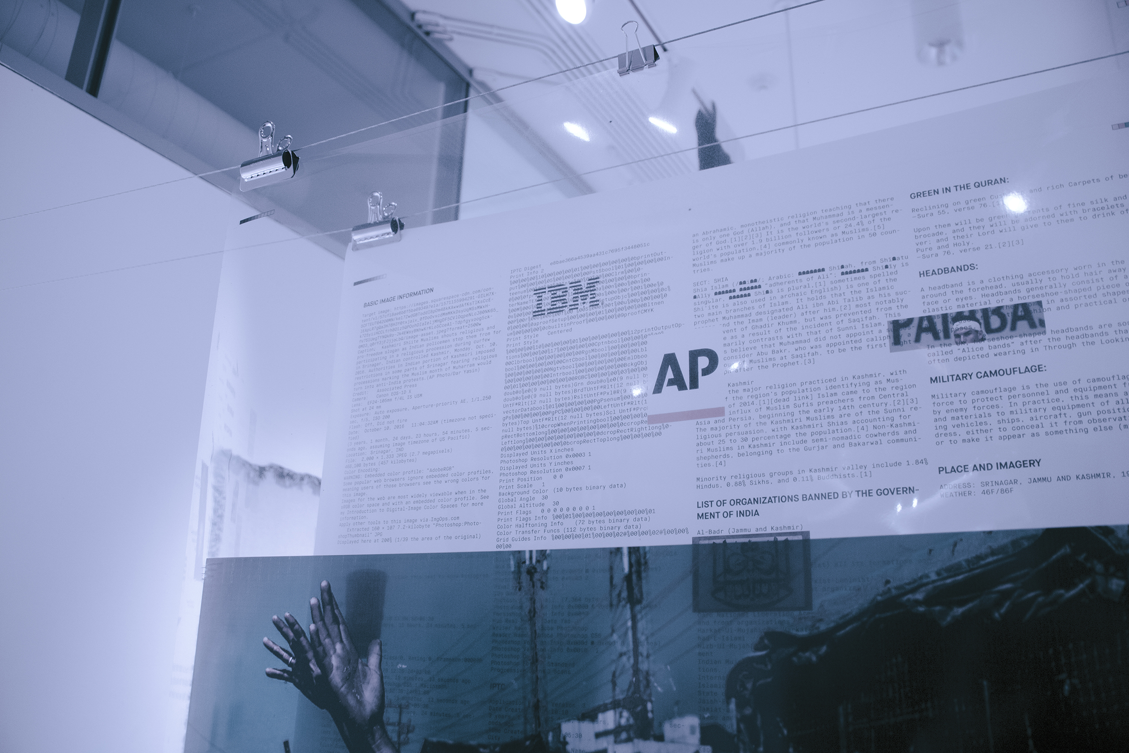
Kashmir, Metadata of a Conflict
2019
An anatomical study investigating the multilayered visuality of the Jammu and Kashmir conflict.
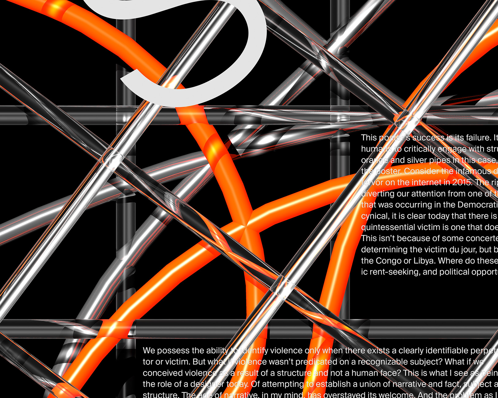
Post Narrative
2019
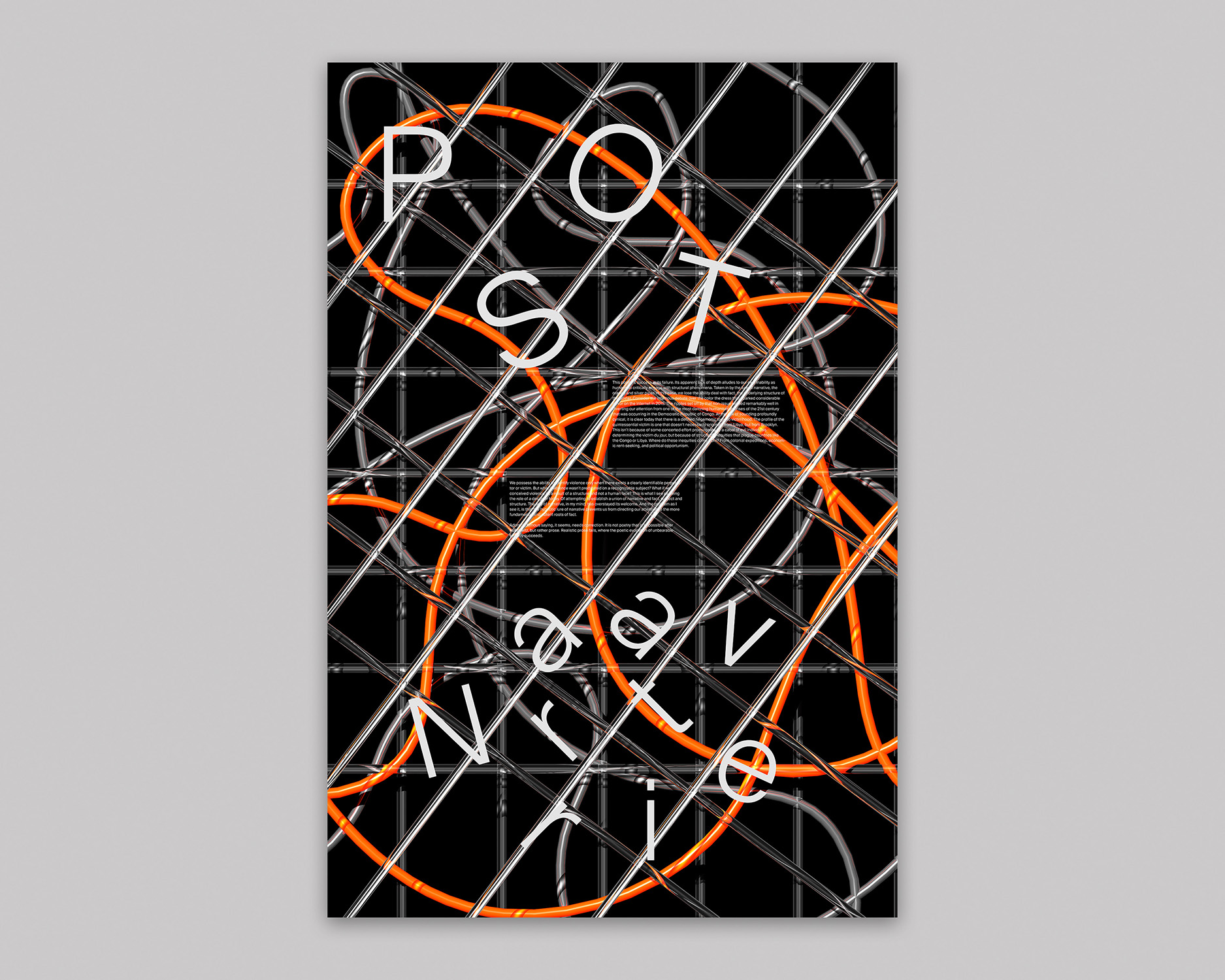
Post Narrative
2019
A quasi manifesto in poster form, calling for a rethinking of the role of narratives in representing reality.
The Reverse Colonial Project
2018
A quasi manifesto in poster form, calling for a rethinking of the role of narratives in representing reality.
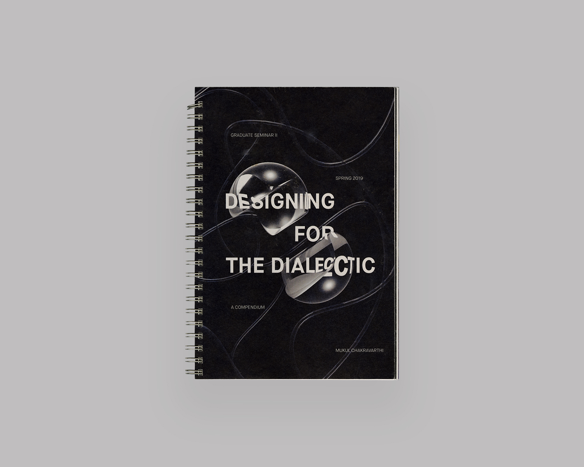
Designing for the Dialectic
2019
A document containing personal recollections, essays, visual work and investigations toward forming a cohesive research plan for the MFA thesis.
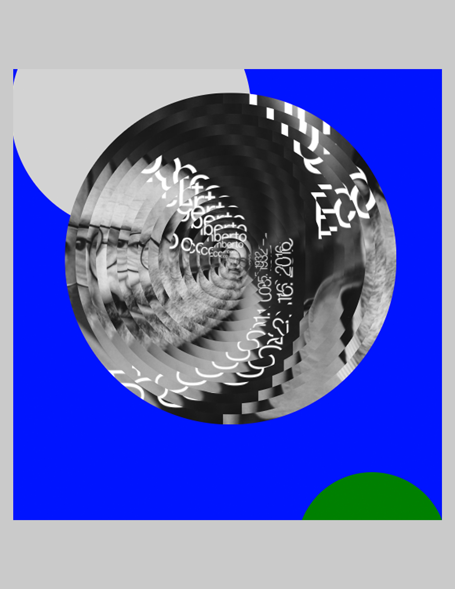
Eco's Chamber
2019
A web-based poster generating tool to celebrate the ideas of the late Italian semiotician, philosopher, and novelist, Umberto Eco.
Reified Realities
2018
A case study in conspicuous consumption, Reified Realities compared displays of wealth by the Rich Kids of Instagram with eighteenth century oil paintings of the European elite.
→Abstract
Every visual artifact, from a street sign to advertising commercials, is an event of culture, a cross-section of time. Crucial to my work as a designer is to build an interpretive understanding of these images as more than surface, more than banal. Embedded in their construction are dense, unseen contextual latencies— social, economic, and political forces — that combine to define a cultural moment.
Every visual artifact, from a street sign to advertising commercials, is an event of culture, a cross-section of time. Crucial to my work as a designer is to build an interpretive understanding of these images as more than surface, more than banal. Embedded in their construction are dense, unseen contextual latencies— social, economic, and political forces — that combine to define a cultural moment.
→Website
SA
Seyong Ahn
Show StackMy Millennial Asian Fetishized American Fantasy
info
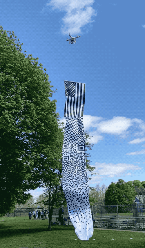
Stars and Stripes and Squares
2019
Fragmenting and reconstructing the American flag, I transformed the “Stars and Stripes” into both a longer textile and a website. A drone was used to raise the 25 × 195 inch flag. The flag has a QR code that directs one to www.flaaaag.com. “Stars and Stripes Forever” scores the website, on which a flag infinitely scrolls upward.
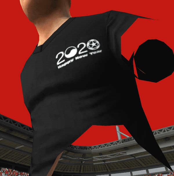
World Cup 2020
2020
Since the FIFA World Cup is held every four years, there will be no championship in 2020. I imagined the World Cup in 2020 with an unrealized World Cup South Korea 2002 logo—which was discarded after the confirmation of co-hosting with Japan. Revisiting this forgotten design, I changed the order of the original numbering “2002” to “2020.”
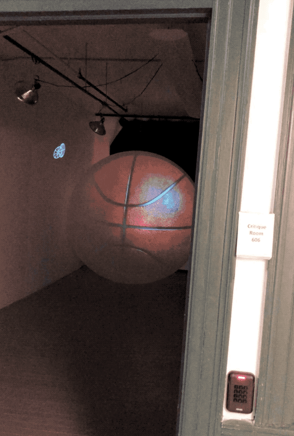
Basketball, Mars
2019
In this exercise, I made a basketball with a weather balloon. To demonstrate its newly-scaled quality, I also projected Mars on a curtain. A crit room in the Fletcher building was used to showcase the installation.
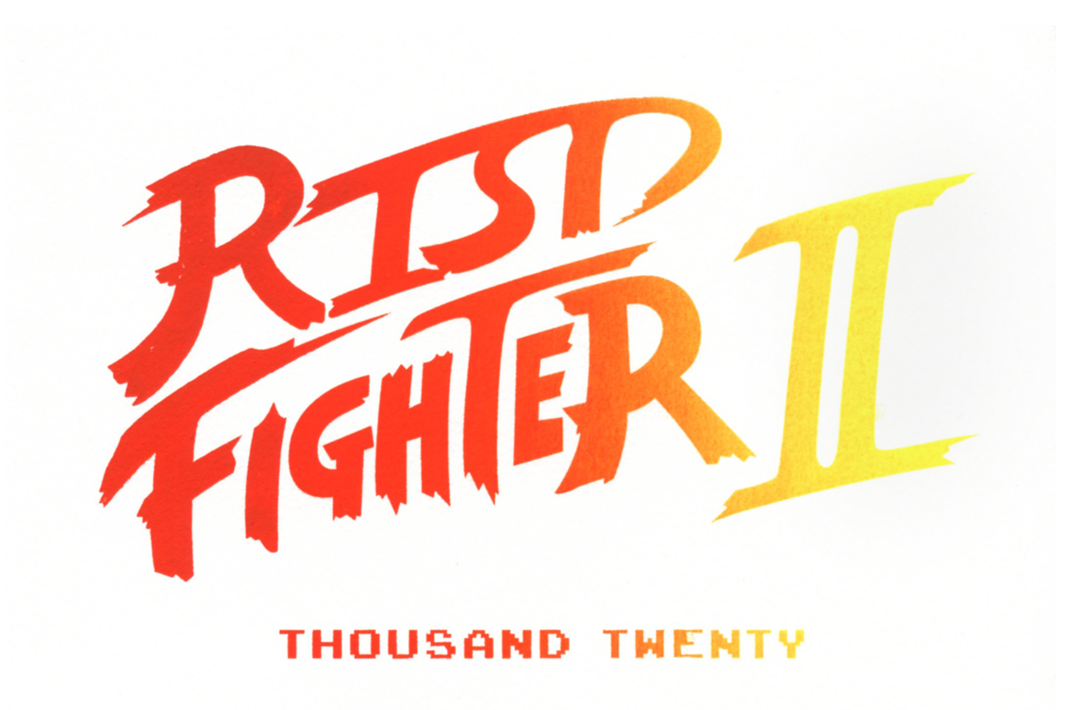
RISD Fighter II
2019
Imitating the title screen for the video game Street Fighter II, I made postcards for my colleagues in the class of 2020. This project was surprisingly unsuccessful because many of them didn’t know the video game.
Position Presentation Invitation
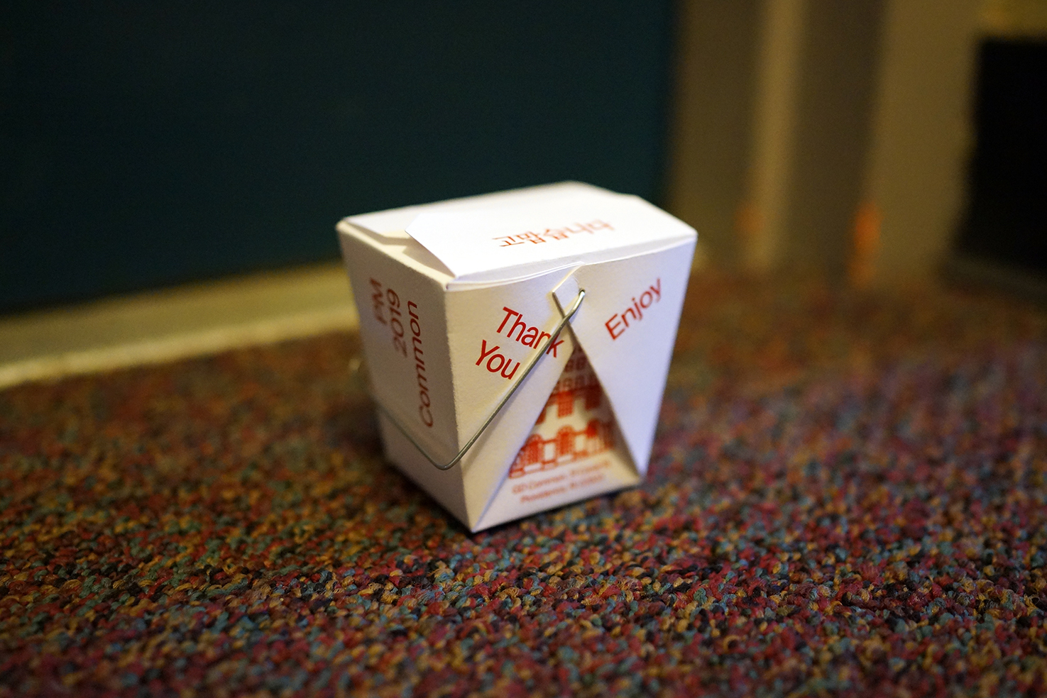
2019
To be delivered to my neighbor’s door—who asked me which Chinese restaurant I work at—I designed an invitation for my presentation at the Graphic Design Commons with an oyster pail (also known as a Chinese food box).
→Abstract
The perspectives that I present throughout My Millennial Asian Fetishized American Fantasy are South Korean-centric, biased, absurd, skewed, unfair, and real. Instead of being nostalgic, the contents introduce questions—ones that persist as I examine my design practice. They open a process of dialogue with the present, while provoking a consideration of the future:
1) If I am a product of capitalism and globalization, how might I better interrogate and define my cultural DNA?
2) What is my approach to the evolving conception of graphic design under new (technological, ethical, ontological) conditions?
3) What interests and concerns truly engage me, such that I can continue to pursue them willingly and freely in my post-graduate practice?
To tackle these questions, I look at the systems and models of authority that influence me. I analyze my generational perspective, my obsession with logos, and my ambition to crossbreed unrelated concepts and images. What emerges is the anxiety of a Millenial-Asian encountering an illusion of utopia. This book catalogues memories, conversations, research, and viewpoints. Accompanying my research and project documentation, I share some personal anecdotes that both reflect my cultural background and interests, serving as a foundation for the included works.
→Website
SL
Sophie Loloi
Show StackAncient Hyper Present
info
Dome of Birds
2020
Virtual Space
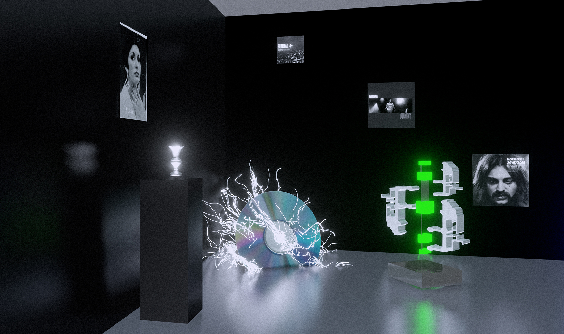
Record Shop
2020
Virtual Space
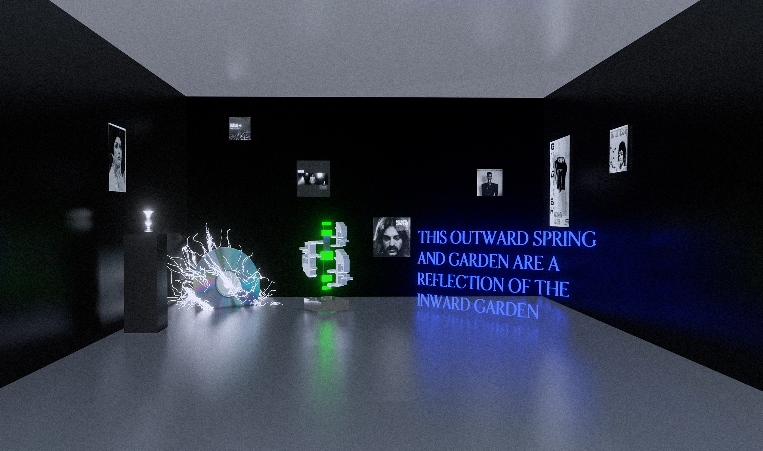
Record Shop
2020
Virtual Space. How can memory become an archive to listen to music that has touched us with affective and sensory qualities? In this virtual space you will hear Iranian music of the 1970's intermixed with sounds of nature in the background. This space was created as your entry way into the garden. Here you will experience the hauntological, the past, present and future at once. The Record Shop is an experiment in sonic imaginaries. The yearning in the voice of Googoosh, you hear the dust of the past, the texture of vinyl seeped with desire. The deep immersion of Trentemoller is dipping your toes into another world, where sonic reverberations echo deeply in your chest. Burial, sounds like the afterglow after a night at a rave, it sounds like bodies resonating with each other at one frequency. Sounds, images, vibrations meld together to create a synchronization of senses.
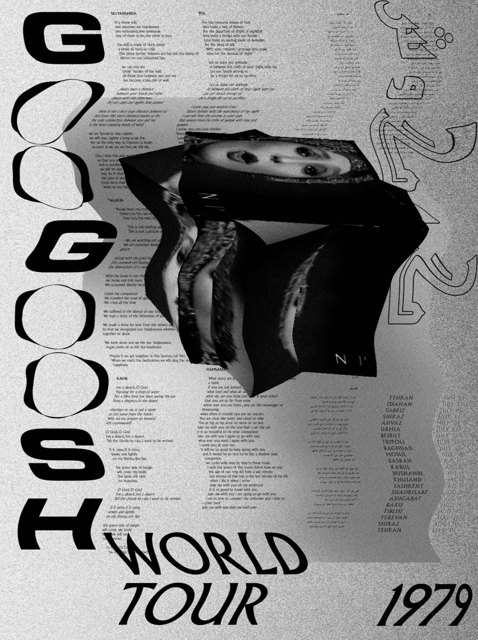
Googoosh Poster
2019
Motion Poster. Googoosh was Iran’s most famous pop singer, until she was silenced following the 1979 revolution, when female singers were labeled “temptresses” and forbidden to release records or perform publicly in the presence of men. This poster, unearthed from a young Iranian woman’s collection of memories and trinkets, looks at an alternate reality or past where Googoosh would have been able to continue to perform in Iran in 1979 had the revolution not happened. This poster was originally presented as a moving poster that functions as a relic of a speculative past.
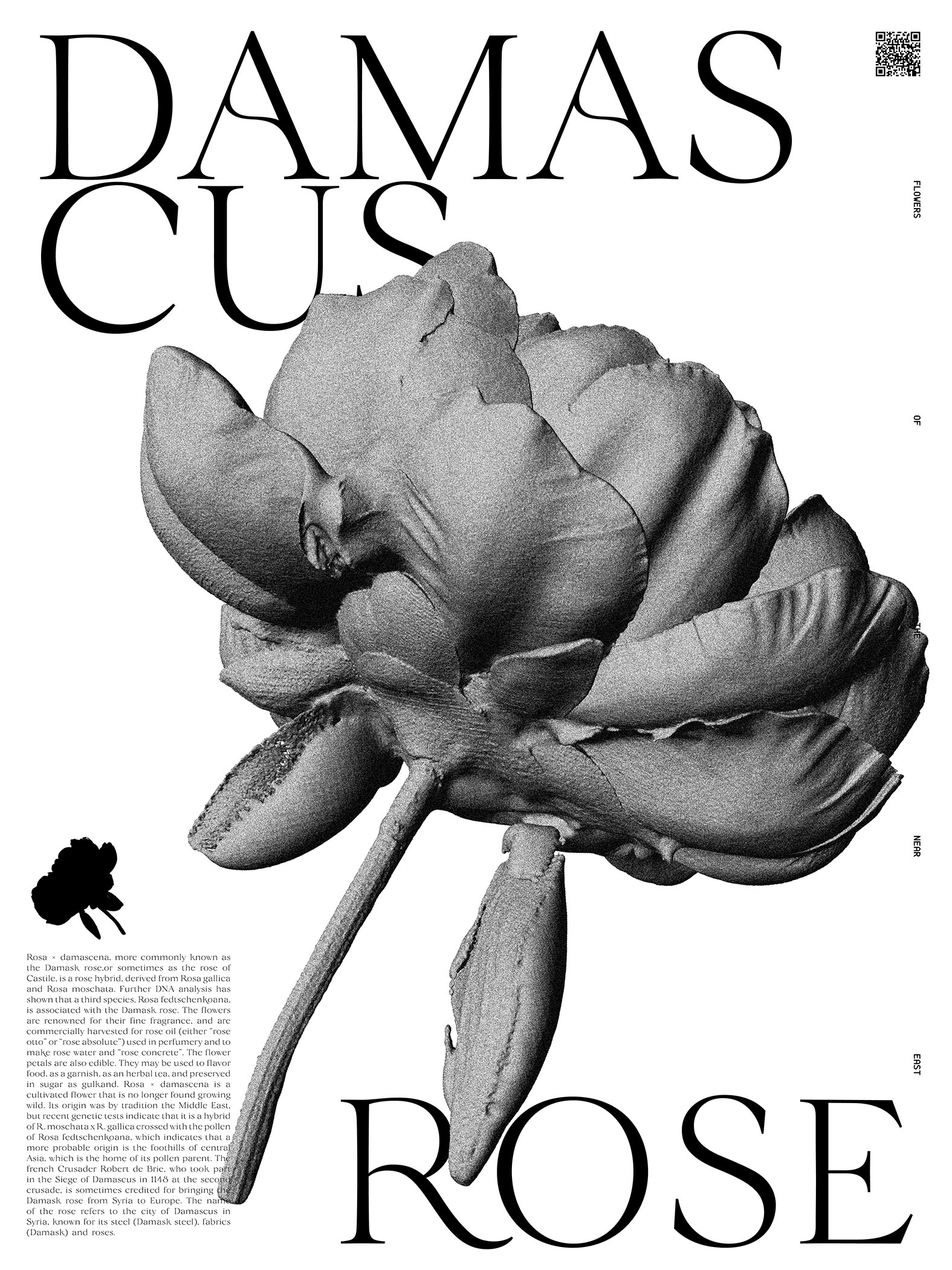
Flowers of the Near East
2019
Poster, publication.
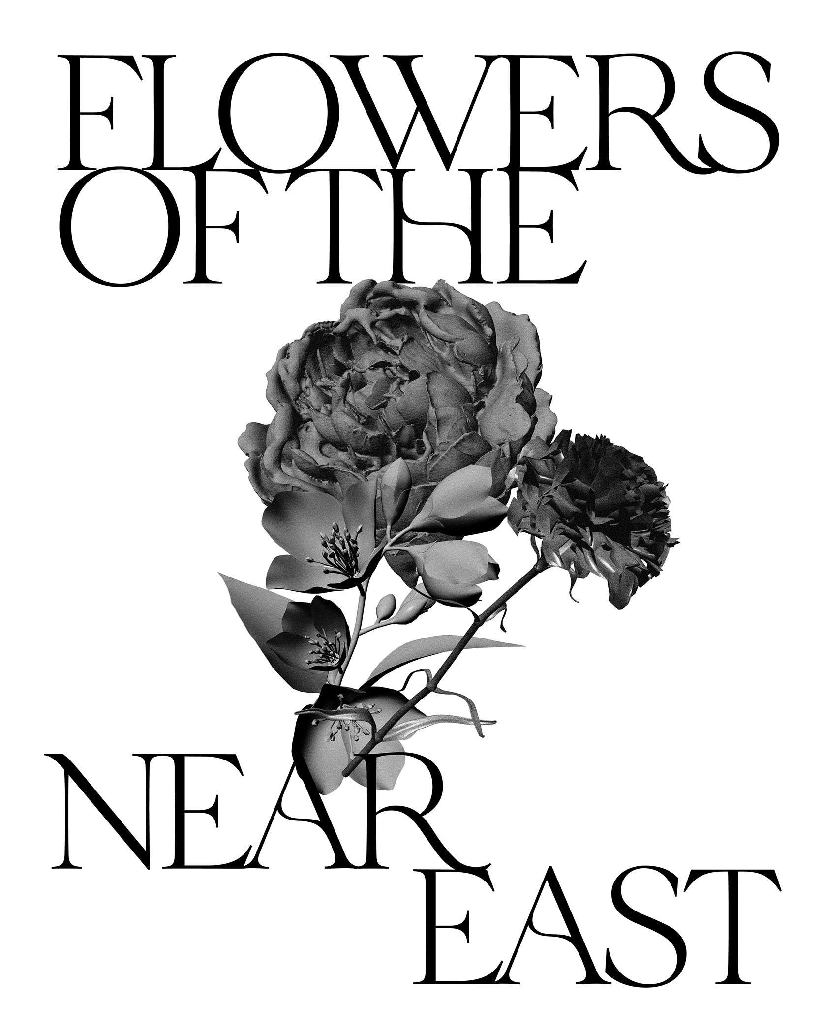
Flowers of the Near East
2019
Poster, publication. In the book Women Who Run With The Wolves by Clarissa Pinkola Estés, the author claims “wildlife and the wild woman are both endangered species.” which led me to think about exile and the female body in exile. This notion brought me to ask the question from my female friends from the middle eastern diaspora, “What flower invokes a sense of nostalgia for you?” All my research and answers were received through social media and conversation, because my questions about memory and nostalgia, could not be found through Google search. I collected the data of nostalgic flowers then took to the process of 3D scanning to scan each individual flower. The shape of a Rose, Carnation, Jasmine and Damascus Rose now archived, exist eternally within the digital space. A second question arose during the time of this research, “which female musician reminds you and your mother of your homeland?” Asking both generations is important with such inquiries.The result of this research is a publication and a poster series of the scanned flowers with QR codes in the top which can be scanned to then take you to links of the music.
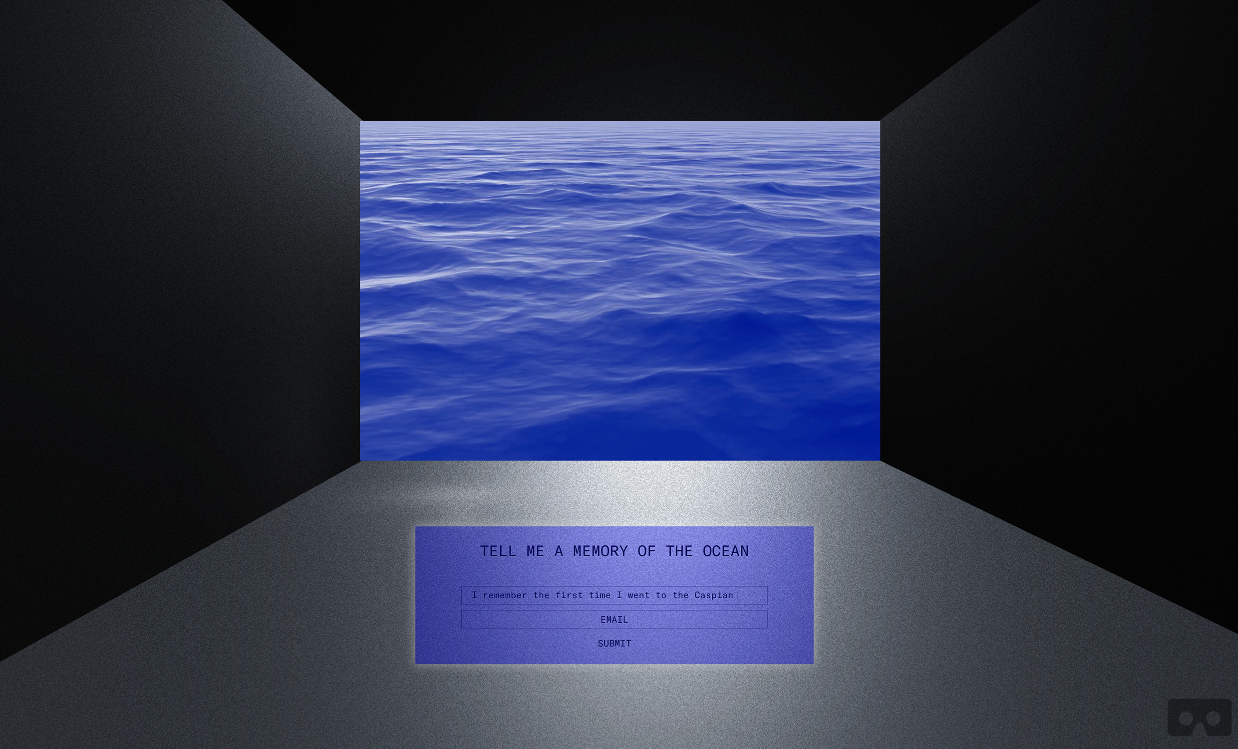
Re-memory Room
2019
VR Website.
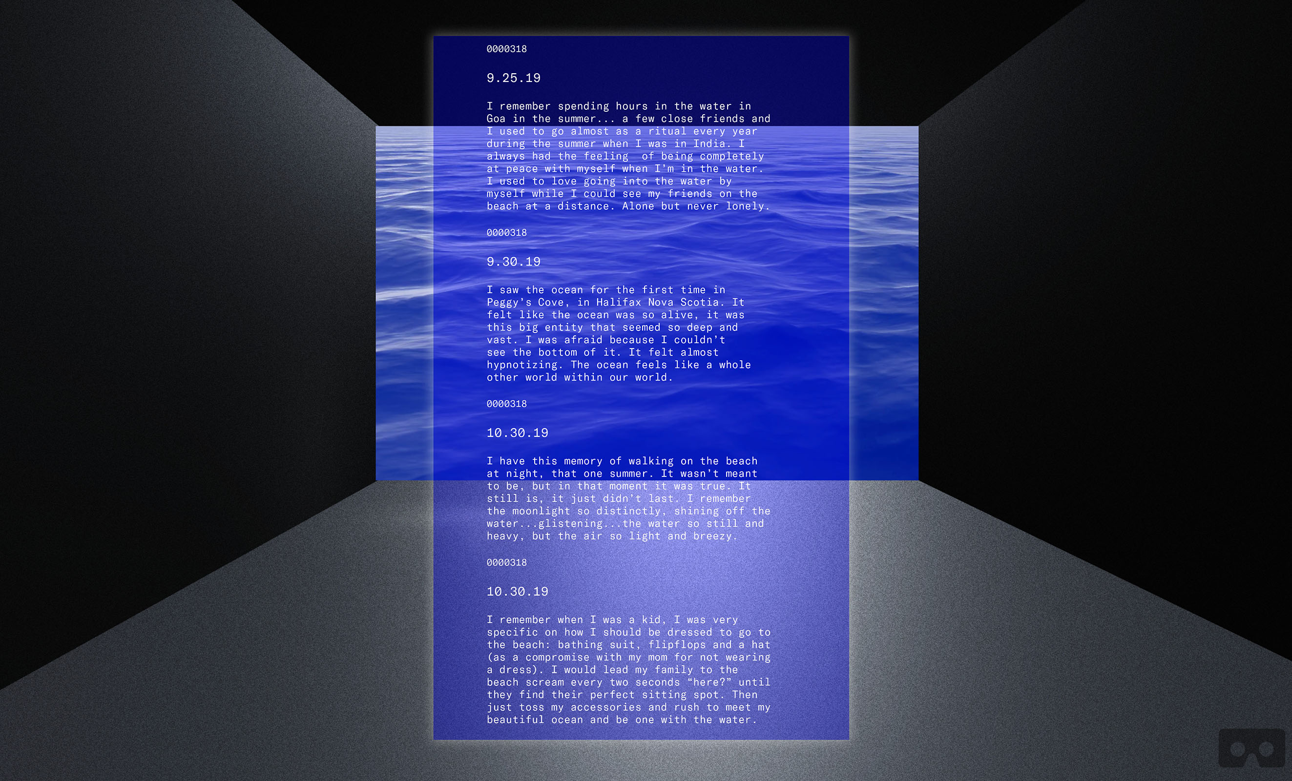
Re-memory Room
2019
VR Website.
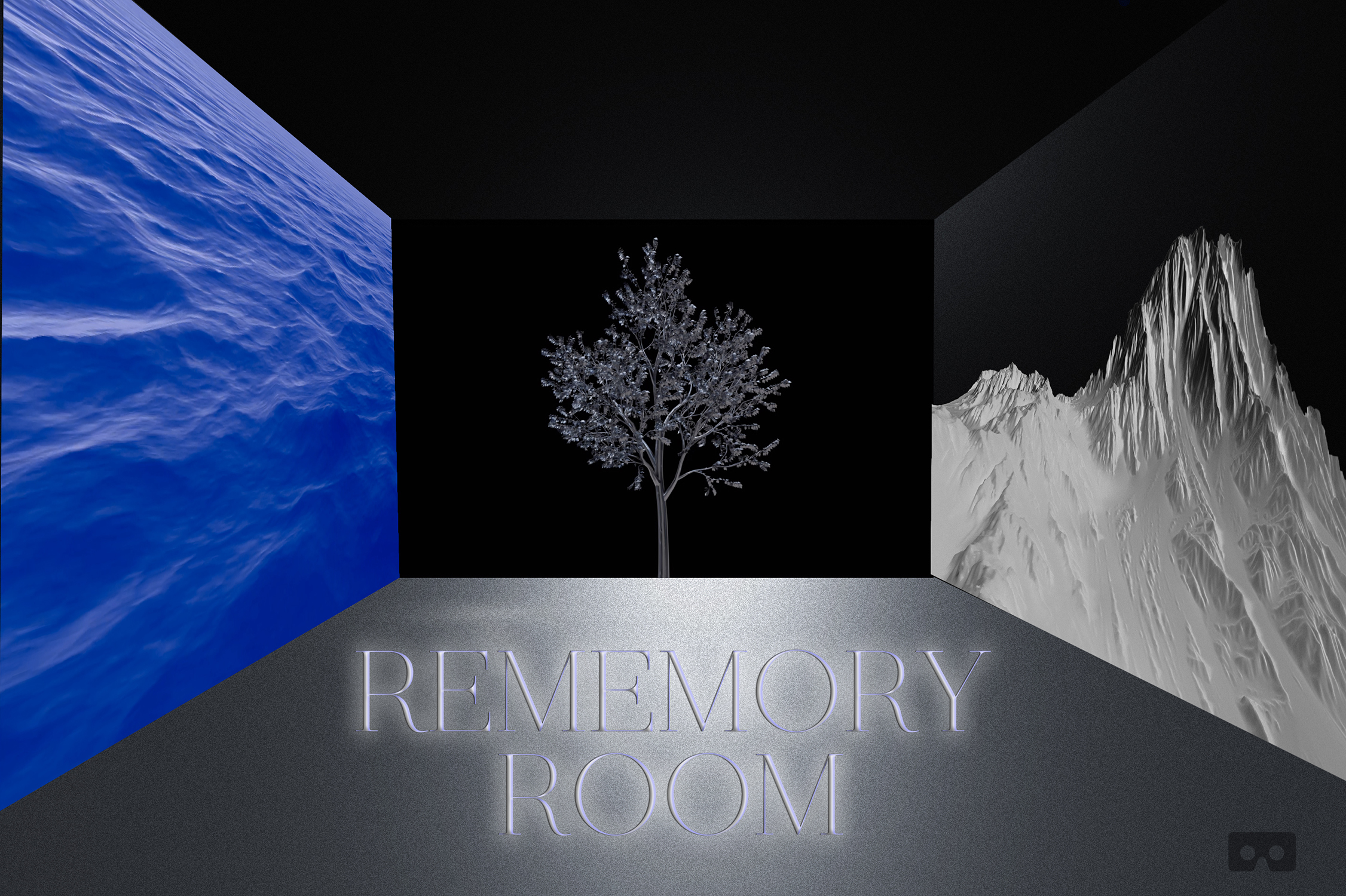
Re-memory Room
2019
VR Website. What is a collective memory of the natural world? What is the sorrowful act of archiving before extinction? I wanted to create an archive of people’s lived experiences with nature and situate them in a virtual space. The result is a website with memory rooms where you can enter to experience the simulation of a tree, the ocean and a glacier. As a result, a speculative archive emerges.
This speculative project exists as a prototype VR website, where users are asked to submit their anonymous memories that then become part of an archive of collective memories of the natural earth. Within the rememory room there are several spaces (pages) where users can enter to experience simulations of a tree, the ocean and rain. An email is also sent to the user of their memory, so that specific memory can live forever within the cloud of their own archives as well.
Ancient Hyper Present
→Abstract
My practice, and especially this virtual garden, is a collage made of media, images, and virtual space across different eras and time signatures. Graphic design can exist in a gallery, in the screen, inside headsets or in the streets. Like a lucid dream, it can be disorienting as it opens up to a more-than physical ground of experience, within the virtual, within shared memory. As critic Mark Fisher notes, this reflective practice arises as a form of ”anachronism.” Before I could arrive at my transdisciplinary practice that considers experiences of exile and diaspora, I had to wrestle with a singular question: what does it mean to visualize and materialize nostalgia for a distant world? In my effort to answer, I learned to identify as both an architect of memory and an archivist of place, and allow my work to exist in a multiverse of fields, rather than in one space. To communicate the literal and transpersonal, Ancient Hyper Present gathers an array of forms: editorial, kinetic, typographic, spatial, and experiential. I call forth a practice of reflection, to go through the process of seeing the unseeable or the unacknowledged.
→Website
VM
Vaishnavi Mahendran
Show StackEthnoGraphemes
info
Sora Speculative Objects
A personal investigation to advance the Sompeng script into the future through a series of sculptural speculative objects. In Sora folklore, the script has a physical and metaphysical presence, that they have kept alive for generations through fables of visions & dreams. These objects are examinations of the materiality of the script, rethinking their form & presence for future narratives.
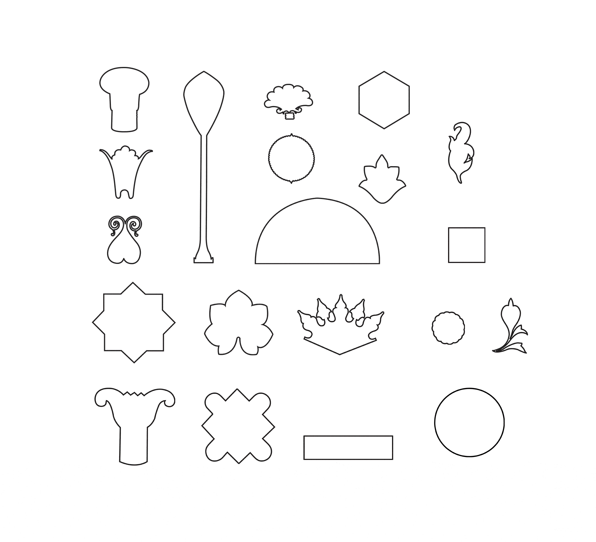
Ornaments
Animated glyph set: process of making the glyph system for ChromaScript
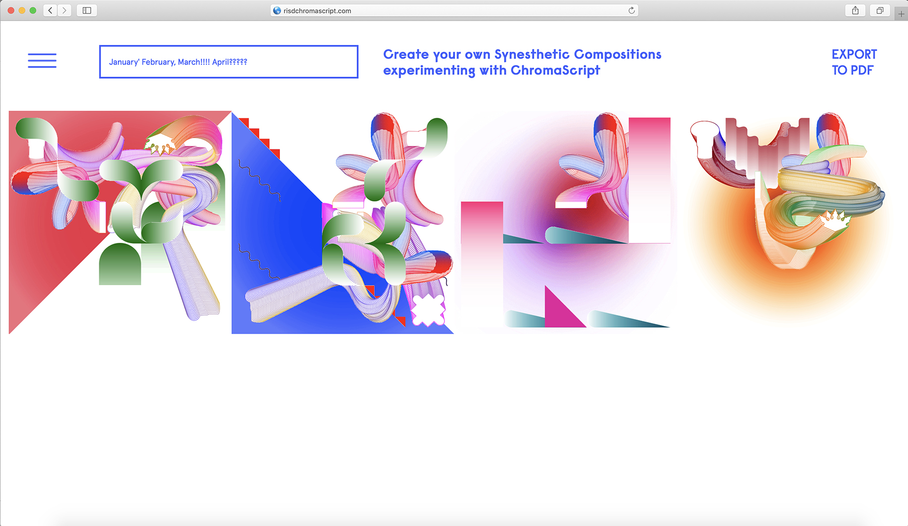
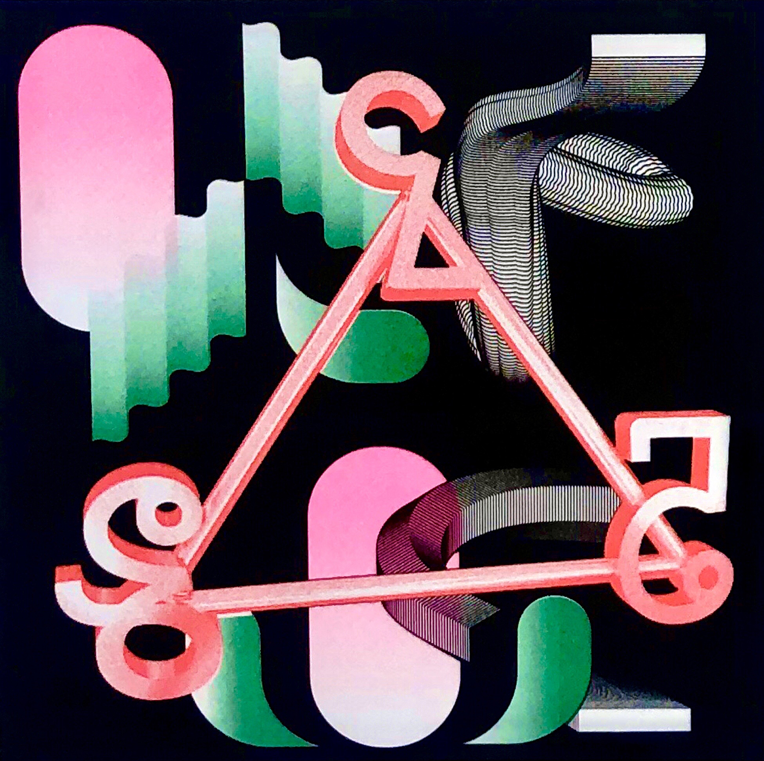
ChromaScript
ChromaScript is a conceptual, ornamental typeface that explores the neurological phenomenon of Grapheme-Color Synesthesia.
Sora Sompeng typeface
Sora Sompeng typeface, Risograph print, 9.25 x 9.25 in.
Lost in Translation
Lost in translation is an augmented reality (AR) public art installation that celebrates linguistic diversity to be installed at the RISD Museum in Fall 2020. The installation consists of a series of five bilingual, AR posters, each displaying a word whose meaning cannot be easily translated across languages. Through typographic abstractions, the posters progress between each word’s native script and its Latin characters, expressing what we often lose in translation: emotions, ways of seeing the world, colors, and memories.

Sora Typeface
This project is an effort to widen the choice of typeface styles available for the endangered script Sora Sompeng and in support of the growing access to technology within the Sora tribe of Orissa, India. Developed under the guidance of Richard Lipton, Sompeng comes in two styles—Monoweight and Calligraphic for text and display purposes. Sora Sompeng has 25 letters and uses Latin and Devanagari glyphs for punctuation. A handful of charts available online became reference material for drawing the letters.
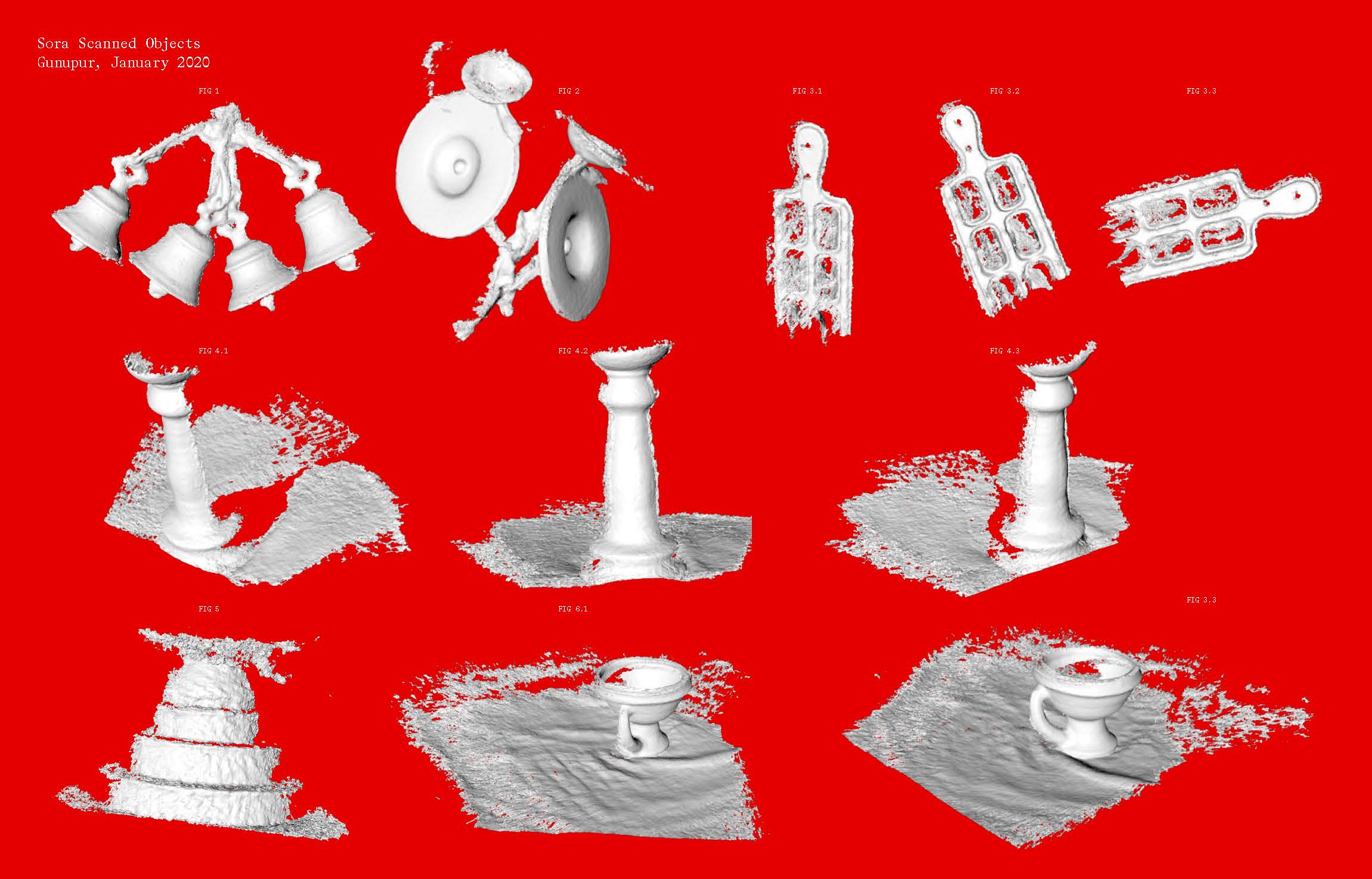
3D scans of Sompeng temple objects from my visit to the Sora tribe, in Gunupur, Orissa.
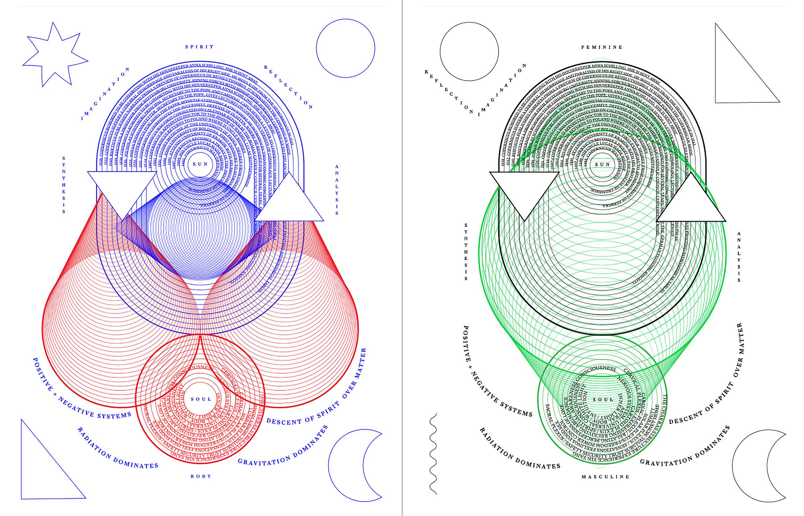
Convergent/Collisions
Convergent/Collisions is a fictional, hybrid philosophy drawing from charts and maps of heliocentric, metaphysical and binary theories, examining their diagrammatic form and syntax structures. The interactive website allows the viewer to discover, hide and reveal parts of the narrative as they move the cursor along each figure.
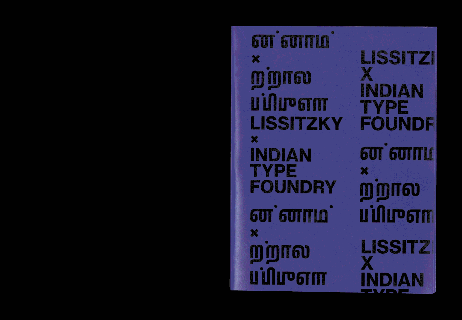
Lissitzky x ITF
Printed publication. Saddle stitch, 15.5×20in. “Language is more than just an acoustic wave motion and the mere means of thought transference. In the same way, typography is more than just an optical wave motion for the same purpose”. This book relates and contrasts two prolific essays from Russian Constructivist typographer El Lissitzky with a curated series of interviews highlighting the processes and considerations of type designers from the Indian Type Foundry (ITF) while creating six new typefaces for northern and southern Indian regional scripts.
→Abstract
Spoken and written languages are living processes. As with our own natural systems, they are born, evolve in stages, yet also face the eventuality of death. Current research indicates that there are 7,111 spoken languages in the world. UNESCO lists a total of 577 languages as critically endangered.
This thesis examines the role of graphic design and its potential contribution to the preservation of endangered and under resourced languages and writing systems of indigenous communities. My interest lies in exploring possibilities of the script serving as a vessel to share and celebrate deeper stories of each of these communities’ heritage.
Through my practice, I experiment with new media tools to explore: the linguistic frameworks and visual arrangements of underrepresented languages, to create narratives that can speculate on how we can signify timelessness — bridging past, present & future. I intend to support communities in their efforts to reclaim their histories through cultural dialogue and collaboration to create meaningful future identities. This thesis details my collaborative process of revitalizing the Sora Sompeng script in support of the Sora forest tribe in Orissa, India.
EthnoGraphemes offers an initial methodology, framework and reference guide for future work in engaging graphic design towards socio-cultural conservation, encouraging human diversity, while celebrating cultural identity and pride among indigenous communities by looking into the future, while honoring one’s past.
→Website
WZ
Weixi Zeng
Show StackSomething to See Here
info

On the Edge of Normal
April 2019
Identity System Design for 2019 RISD MFA Graphic Design Biennial
Digital Tools in Real Life
February 2019
Are we still really the master of our tools?
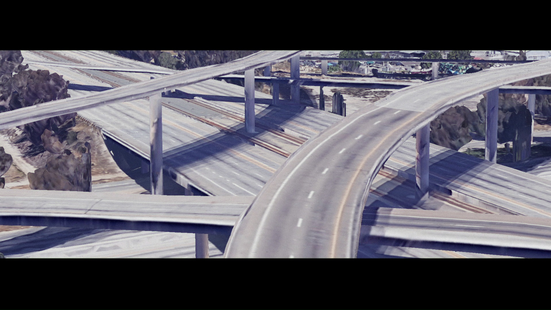
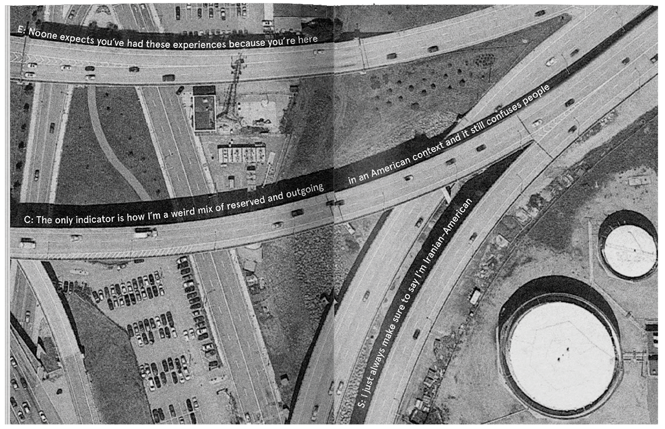
The Great empty American Freeways
March 2020
Google Earth’s virtual reality devoid of cars
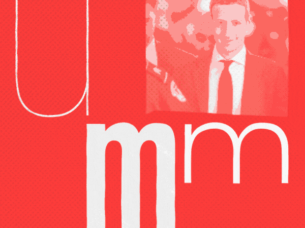
All the “hmms” That’s Fit to Print
December 2019
A reconstructed, animated episode from the Daily Podcast.
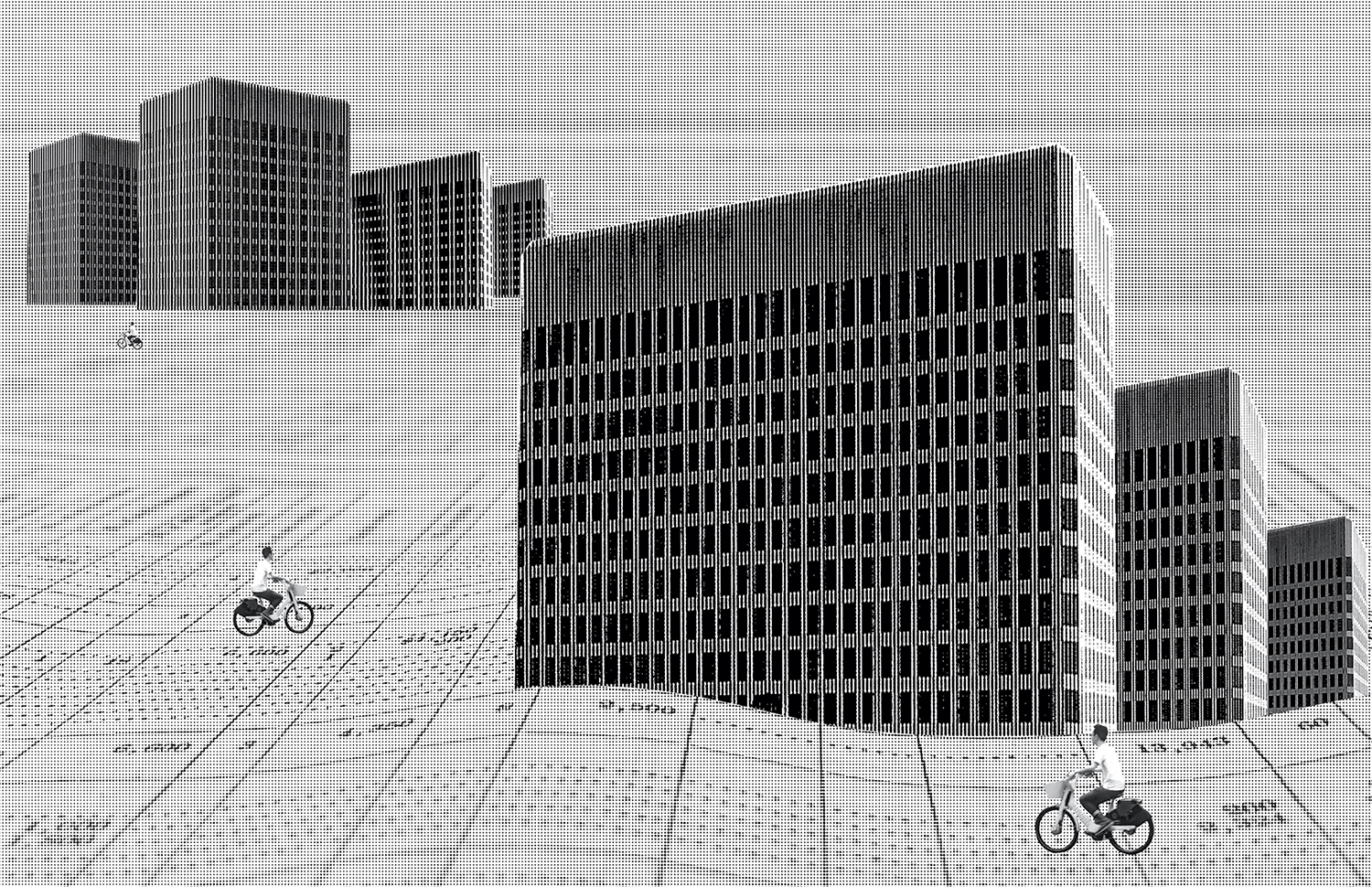
Atlas of Imaginary Places
September 2018
Cinematic book spreads of fictional constructs
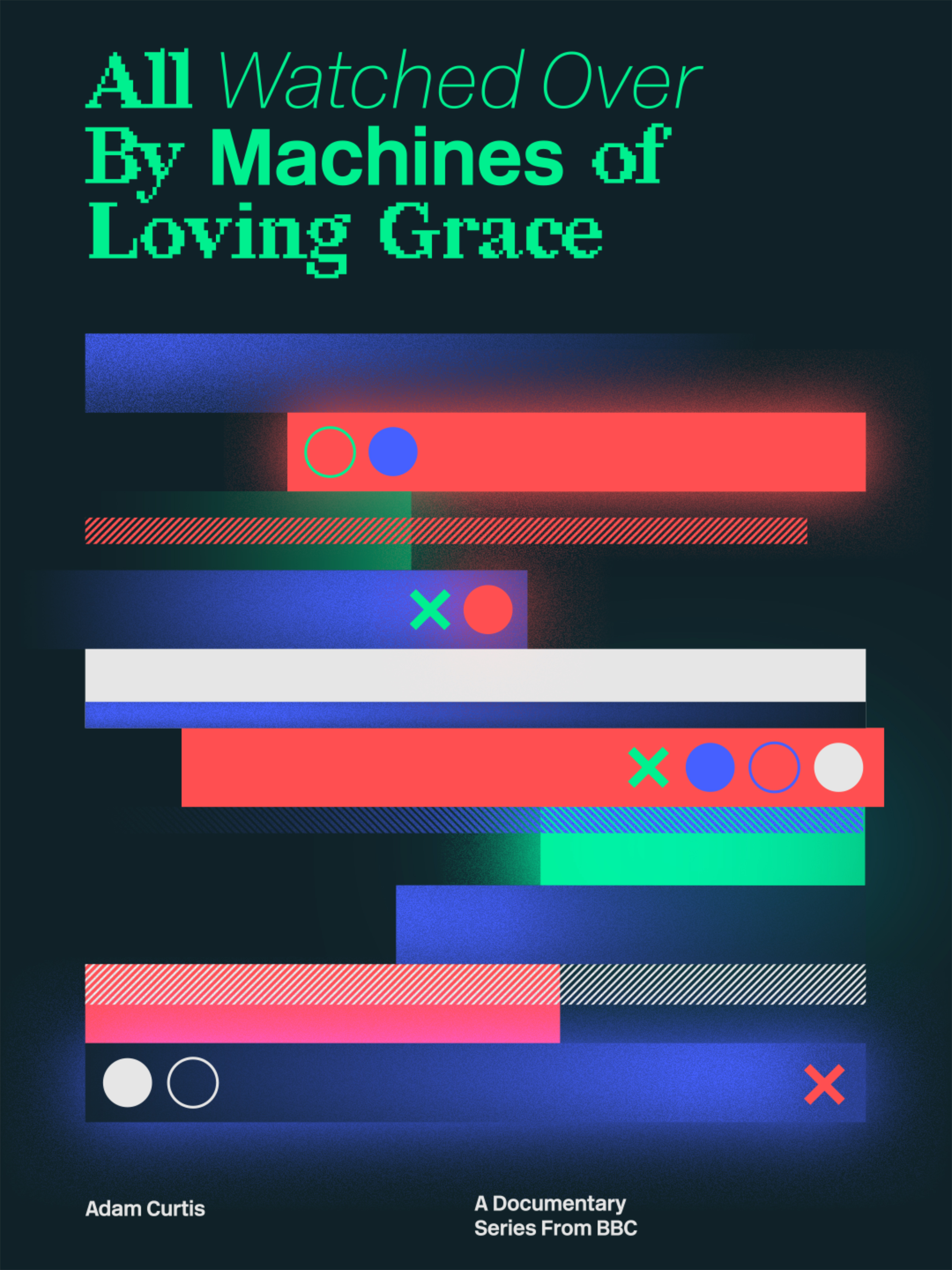
All Watched Over By Machines of Loving Grace
March 2020
A motion poster for Adam Curtis’ documentary series
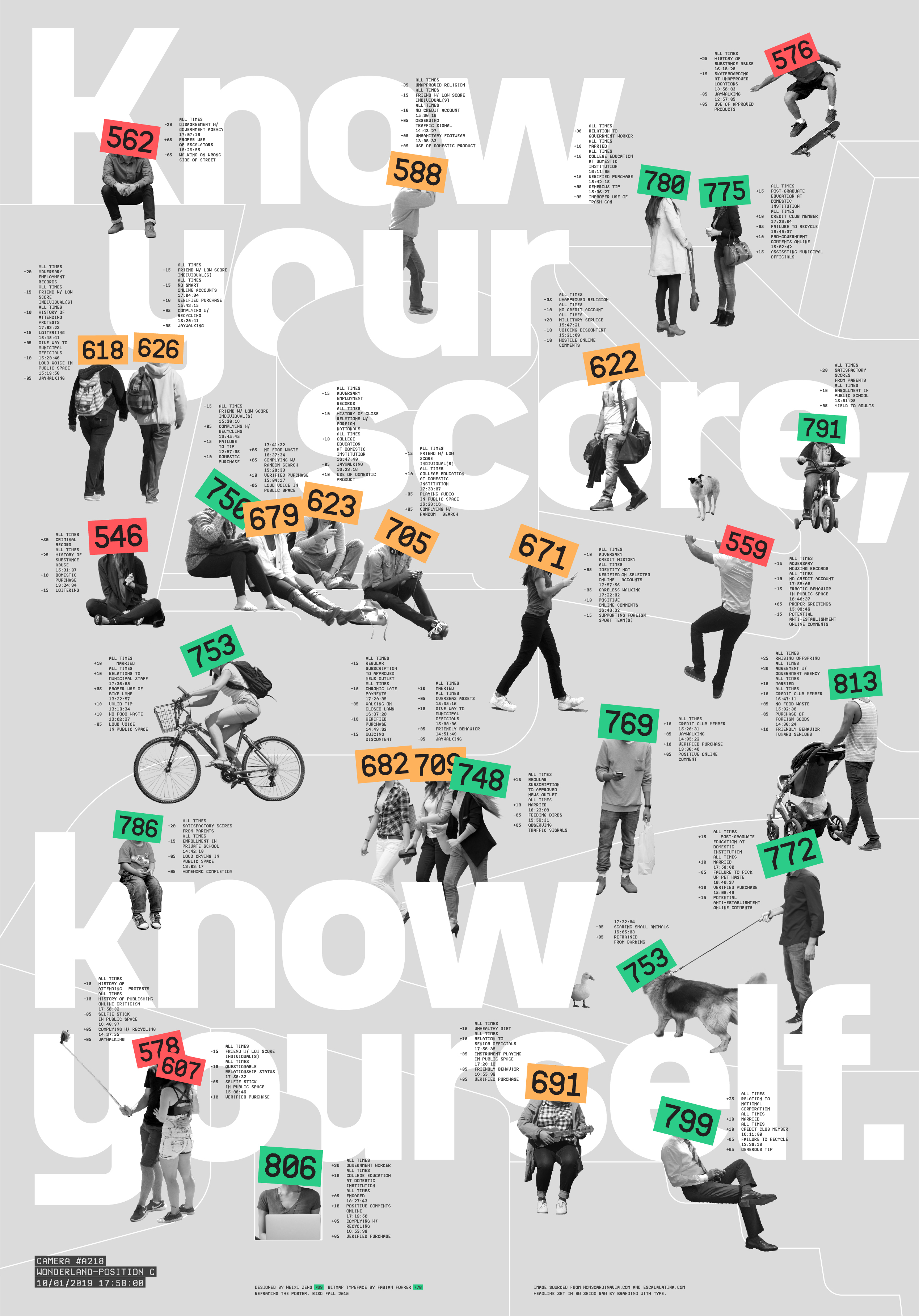
Know Your Score, Know Yourself
September 2019
A poster depicting when your social credit score determines your social status
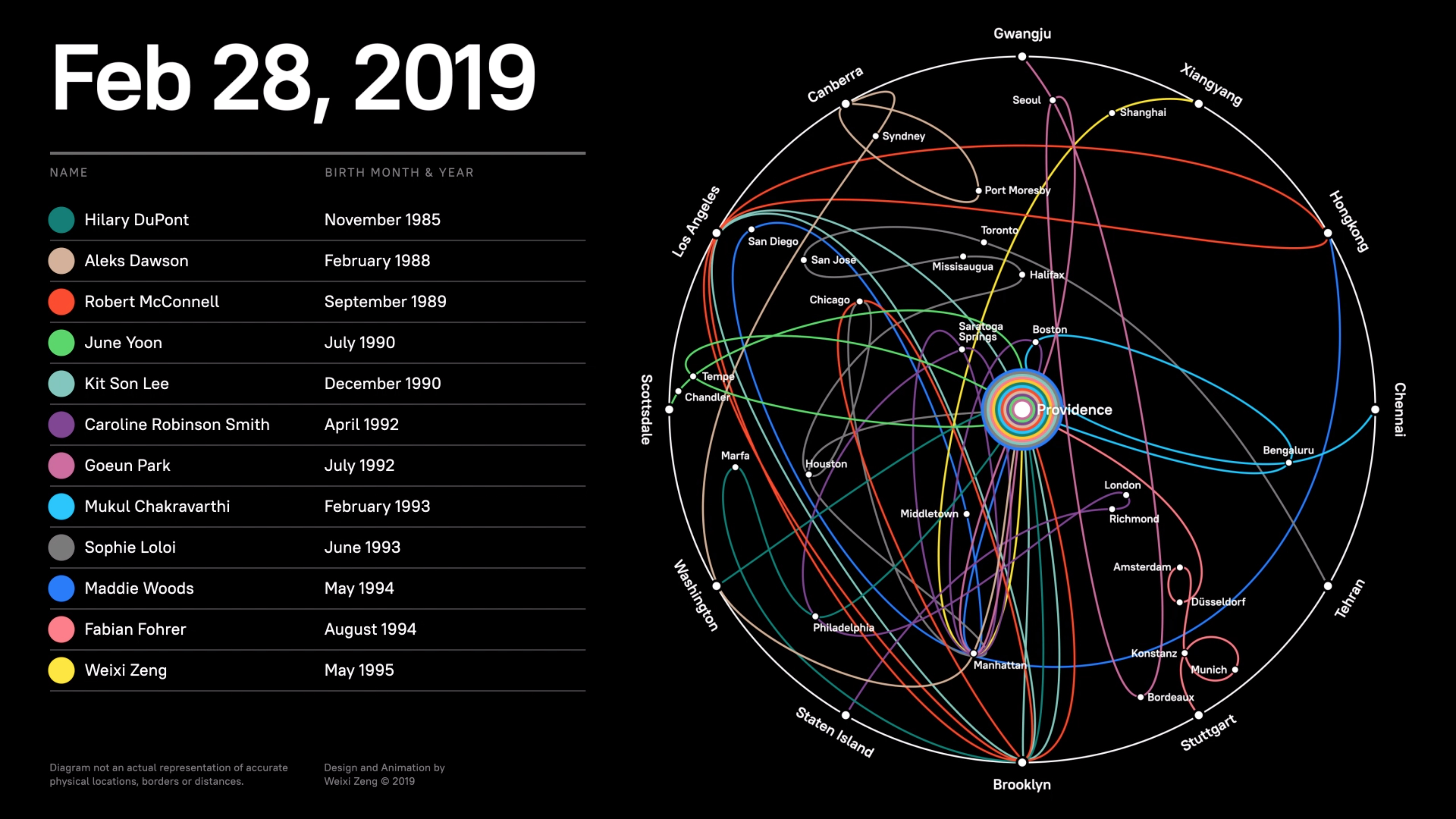
12 Tracks to Providence
March 2019
An animated diagram chronicling 12 people’s movements in time
→Abstract
“Nothing to see here” is a suspicious phrase.
Whenever we hear it, we pause and become alerted. Something is most likely indeed happening, and worth noting — mishaps ranging from either an embarrassing coffee spill, unfair abuses of privacy, or insidious early signs of a pandemic.
Historically, states and national entities have always valued the power of information to allow them to see more, and see better — all the while obstructing the path to clarity for ordinary citizens. Systems and infrastructure have become expressions of authority, rife with distortion and deception. Familiar systems are commandeered to surveil us, yet most of us fail to notice them.
I encourage us to rethink and scrutinize our interactions with modes of communication. As a graphic designer, I make information visible through compelling narratives — gaining an overhead view while unearthing critical data. My practice is an attempt in protecting information’s integrity and resolution.
This thesis scrutinizes the built environment, questions power imbalances, and reclaims potent mediums. Something to see here transforms and reframes a cliché into a call for awareness, and an everlasting quest for alternative perspectives.
→Website
YK
Yoonsu Kim
Show StackSkew-morphic Dream
info
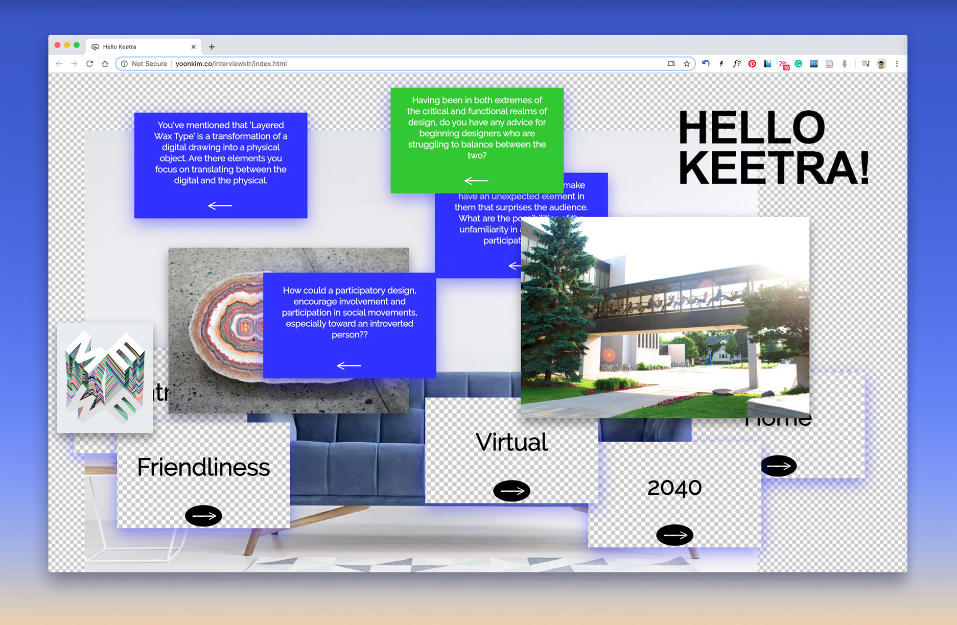
Interview with Keetra Dixon
A website was created for an interview with Keetra Dixon. On the website, cards that contain a keyword in the front and a question in the back are provided. A link to the site was sent as the interview began. By giving the interviewee control over the order of the question, the interview’s narrative and logic is co-curated.
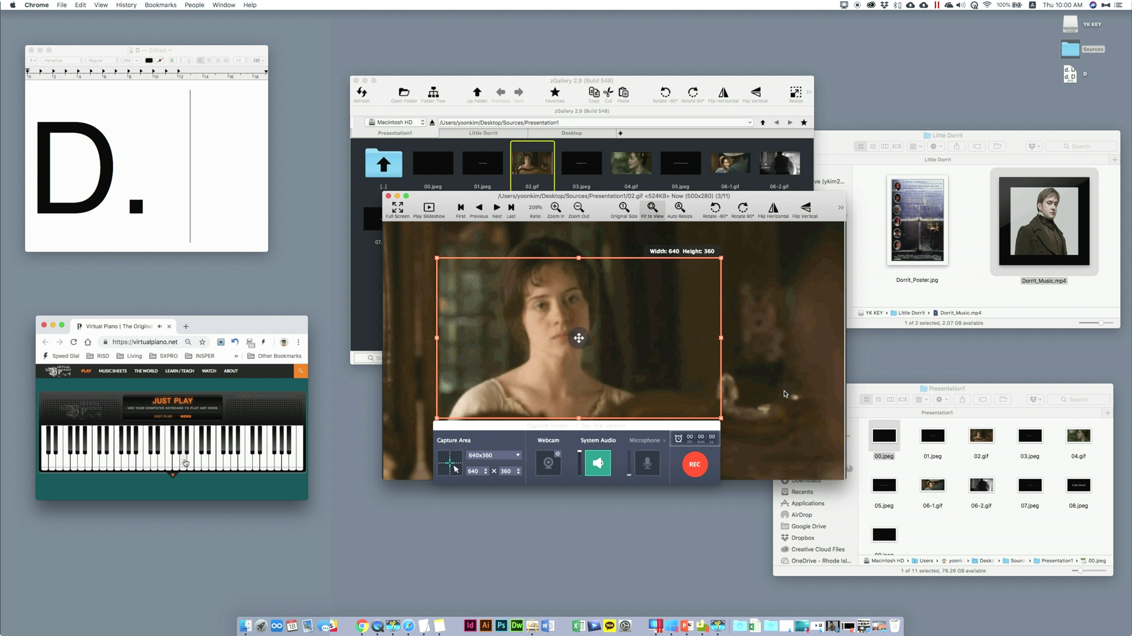
Making Little Dorrit
Making Little Dorrit captures my production efforts to create a movie trailer for the serialized novel Little Dorrit by Charles Dickens. By utilizing the desktop as a stage, various applications work in concert to design the speculative video. By emphasizing the process over the final product, Making Little Dorrit aims to expose the real-time labor behind a serialized novel.
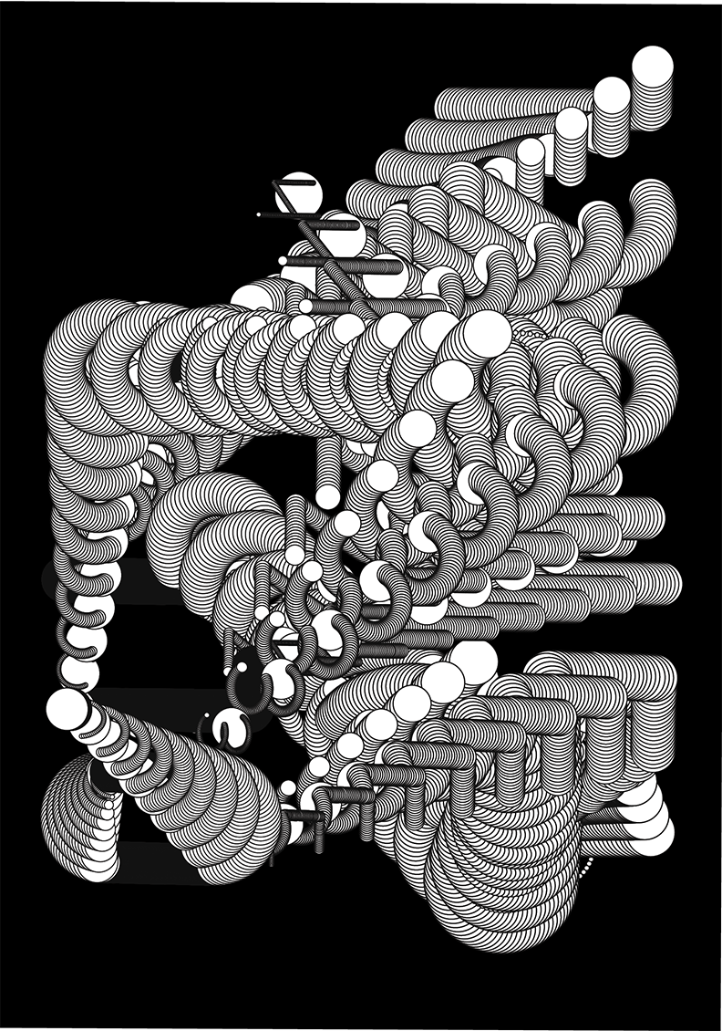
Sublime Diagram
Sublime Diagram visualizes my emotions as a landscape of diagrams and flowcharts. Rather than operating as mere scenery, this project attempts to transform a logical approach towards abstraction into a visceral expression.
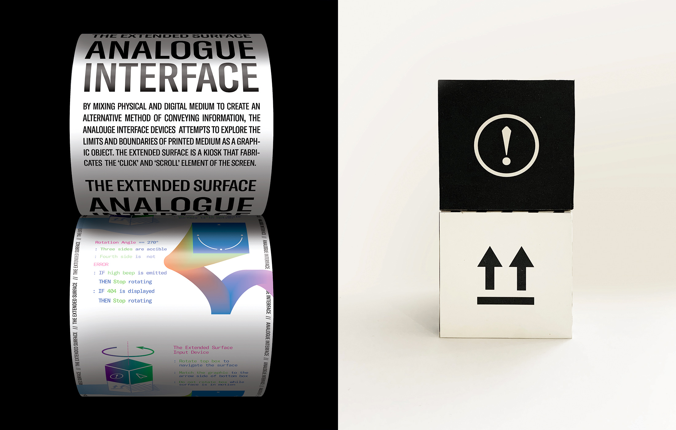
Extended Surface
Extended Surface is a proof of concept prototype for an interactive installation that explores the limits and boundaries of the print medium. It mimics the scroll-able aspect of the digital interface by rotating a giant scroll through a wireless controller. This project integrates the tactile elements of a physical interface with the merits of a screen-based interface.
A Window
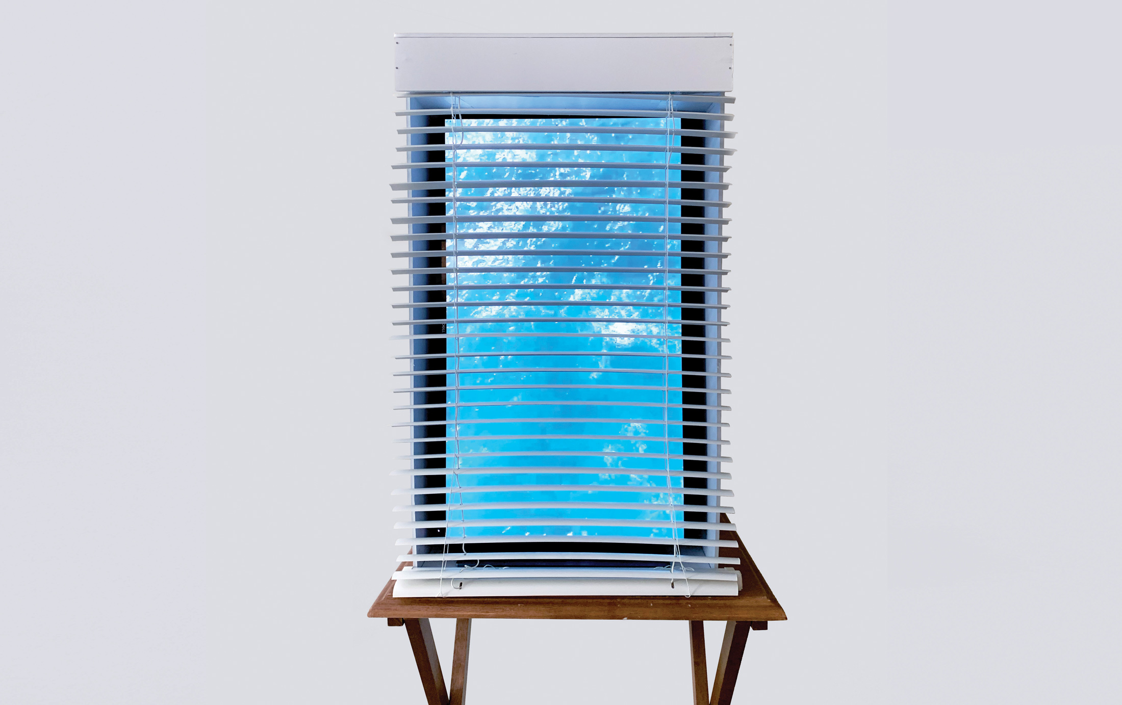
A Window is a meditation device which immerses the user into a state of mindfulness through progressive repetition. By translating a web browser into a physical interface, ‘A Window’ opens a portal,a figurative hyperlink, that transports the user into a virtual space.
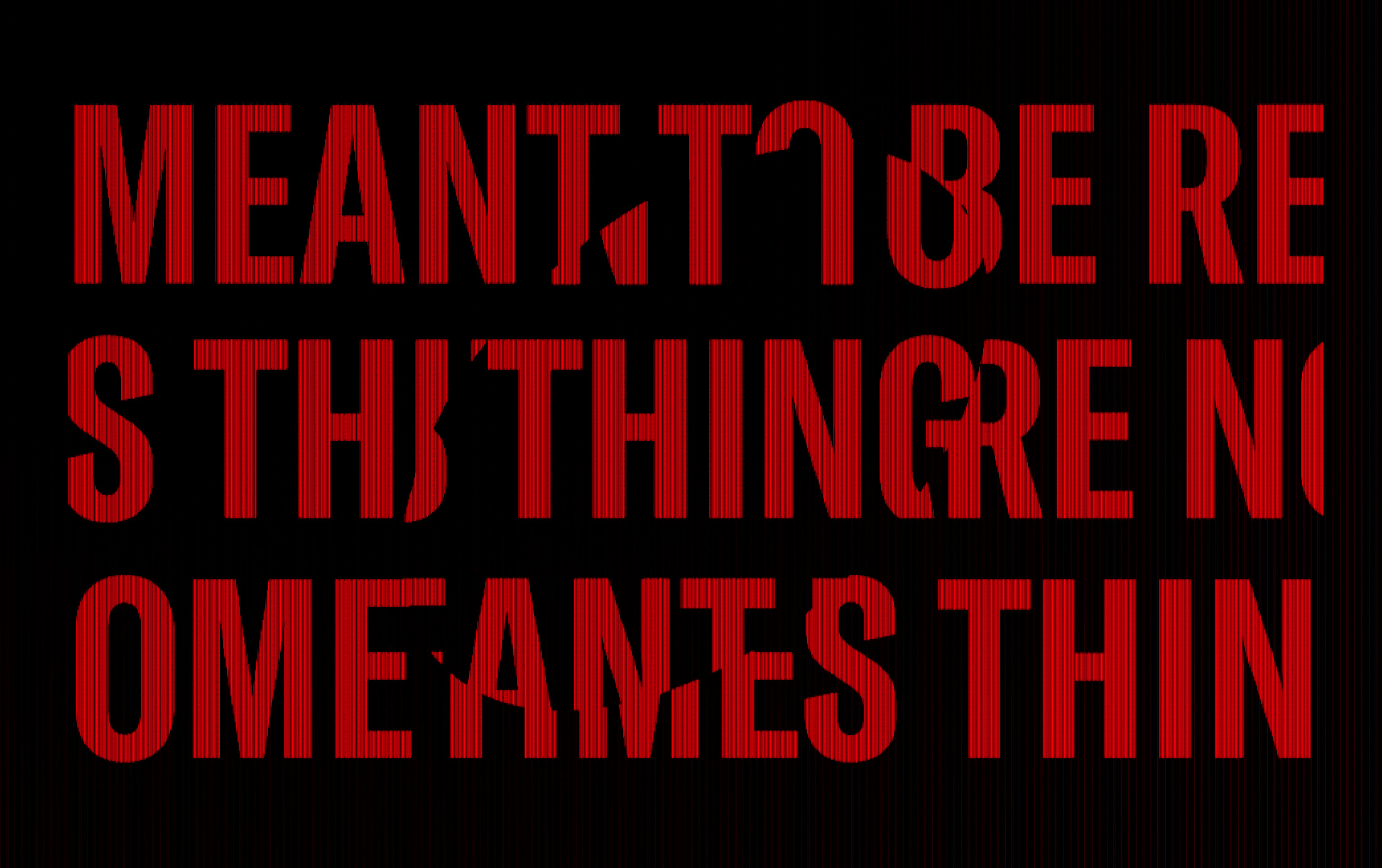
Reading Between The Lines
Reading Between The Lines is a two-part interactive projection that requires the user to change their location in order to read the text. By default, the projected texts are only partially legible. When a viewer comes closer to the projection, the layout reacts accordingly. To read the full text, the viewer must assume different angles of view. The message is framed to encourage flexible thinking.
Archive of Temporary Extinction
Archive of Temporary Extinction is a collection of objects that became obsolete due to the self quarantine in mid 2020. The virtual space was developed as a game played via PC or VR.
Home is Where the Heart Is
Home is Where the Heart Is is a different interpretation of what a home is. Visualized as both a print and motion poster, this project approaches the concept through a virtual lens. To a digital nomad, a home no longer refers to a physical location but to an intangible space where one feels secure and stores their most valuable memories.
→Abstract
Skew-morphic Dream explores various design approaches in creating a shift of viewpoint by agitating the familiar through a daydream. The doubling disjoint of the familiar creates an 'unreal real' world. This world is a skewed view of the function-driven interface design represented in skeuomorphism. Strategies of defamiliarization are implicated in creating a perceptual halt. Within these odd spaces arises an opportunity to think differently about perception, tools, and ideas of the interface.
This thesis catalogs three methods used to create Skew-morphic dreams: utilizing familiar tools with inverted functions, opening portals to defamiliarized landscapes, and developing platforms that require the audience to behave in unfamiliar ways.