Page Building Basics
How to add and edit content.
1.
Sections
All pages are made up of Sections. To make one, click “+ Add Section” (directly on your page). To edit, click “Configure section” in the upper left corner of the section.
Since “sections” make up your page, they help determine your page structure. When adding a new section you will select the number of columns (between 1 and 3), and how wide you want the columns to be. You can also control a section's background color, add padding and margins, and add features, such as "hero" and "sticky." (More on those two later.)
Blocks
Blocks are what go into these sections—they populate the sections with content. To make one, click “+ Add Block.” To edit, click the small pencil icon that appears when you move your mouse to the top right corner of any block. A dropdown menu will appear. To change block content, click ”Configure.” To style the block, click ”Add Style.”
Blocks of content are what you will be putting into this 1 column, 2 column, or 3 column section. You’ll select a type of block that suits the type of content you’ll be putting into it.
2.
Block types
To add, click “+ Add Block” inside a section. This will bring up a side menu called “Choose a block.” Generally, you will click the first option, “+ Create a Custom Block.” You will then select the type of content block you’d like to add:
-
Audio
For audio files: MP3, WAV, ACC. 256 MB limit.
You can add a title, a background image or background color, and toggle the player controls to be black or white.
-
Basic block
Generally for text, but this is also how you will add video (as Vimeo embeds).
You can also add images to basic blocks, but this is an advanced practice. If you opt to do this, images can be added to basic blocks in two ways: as background images from the media library, or as inline images that are added to the source code, which enables you to add CSS styles them.
-
Carousel
Enables you to build a carousel composed of images and/or videos.
-
Hero
Heroes can be images or videos.
They auto scale and auto crop to fill the viewport (the user's visible area of a web page, which varies based on device). They come with a bouncing arrow to indicate that there is content below, and you should keep scrolling. You can style this arrow to be black or white.
-
Image
For images: JPEG, PNG, GIF. 256 MB limit.
This is how you place images that you have uploaded to the media library. If you have not already uploaded your image, this block also allows you to upload directly into the media library.
-
Image grid
Image grids allow for a group of images, each which produce a modal (a pop up window containing the image and supporting text) when clicked
-
Video
*Generally videos should be added to BASIC BLOCKS via vimeo embed*, to avoid server strain. Only use this block if you have a very small video that you have uploaded to the media library.
-
Endnotes
This block is found in the main block menu, not in ”Create Custom Block.” This block creates clickable endnotes. Endnote text is entered on the "Edit" page, and will auto-populate in this block.
3.
Basic Blocks & Text Editing
Basic blocks allow you to edit text (and sometimes other content) using a WYSIWYG editor. That stands for ”What You See Is What You Get.” You’ve probably seen one when you’ve written an email. This means that you apply styles to text that you've entered by highlighting that text, and then clicking buttons or making selections from a dropdown menu.
4.
Image Uploads
To use images in the platform, you will need to upload them to the Media Library. This can be done by accessing the Media Library directly through this link, or by uploading to the Media Library in an Image Block. To learn more, watch the accompanying video.
Access the Media Library through this link: http://publications.risdmuseum.org/admin/content/media
Things to remember:
1. Use the recommended naming convention, lest chaos ensue: DepartmentAbbreviation_lastnamefirstname_image1
2. The alternative text field is very important! This ensures that screen readers can read images as well as text on a page. Please fill it out.
3. You can go back and edit an image’s Modal text, or replace an image file once you have an asset in the Media Library. You CANNOT edit or delete other people's images. (Nor should you try to in the first place!?) Any edits you make to an asset in the Media Library will automatically update on your page. (Unless the image is placed through code in a Basic Block.)
4. If you are doing something advanced and placing an image through a Basic Block, you still need to host the image in the Media Library.
5. If you are uploading an image while in an Image Block, you will not be able to enter Modal text. This must be done in the Media Library.
Image Handling
The function of Image Blocks (and Grid and Carousel Blocks) is quite basic. They simply allow you to select an image, either one that you’ve already uploaded to the Media Library, or one that you upload while creating the block. All other actions will be applied through Styles. See Section 8 below for styling options.
Note: Centering images within an Image Block can sometimes be tricky, especially if you image is portrait-oriented, narrow, or small. For more on centering images, refer to Section 9 (option with less code involved) or Section 11 (slightly more code involved.)
5.
Heroes
- A tiny bit of padding gets added to the sides of a block UNLESS you use a hero block.
- The advantage of a hero block is that it auto scales and auto crops your image or video to fill the viewport. But this can also be a drawback. If you have strong feelings about how images are cropped, or have important visual information in an image that you don't want cropped, don't use a hero block. Use an image block instead.
- Generally, you will want to use a hero block in a hero section (ie, have ”Hero” selected in your section settings.) This seems redundant, I know. But a if you don't have that option checked, it won't appear correctly. Same goes for if you make a hero section but use an image block in it. You'll notice pretty quickly.
- If you have the section background mode set to default light, the bouncing arrow contained in the hero will appear black; if you have it set to default dark, the arrow will appear white. (But you won't actually see the background color outside of Layout view.)
- Hero blocks also allow you to overlay text. You can control the horizontal alignment of the text, but note that the vertical alignment will always be centered.
6.
Audio
- You will upload audio files into the Media Library, just as you would an image. See Section 4 to learn about uploading to the Media Library.
- Like a hero block, you can choose "light or dark" mode, but in this case it’s at the block level. This setting can be adjusted in the Style Settings.
- You can also add a background image or background color to an audio block.
7.
Video
Most of the time, you will be placing videos in Basic Blocks with an embed code. Place your video file(s) into the folder provided to you by Grad Studies. (More info here.) This video will be uploaded to RISD’s Vimeo account on your behalf. You will then receive embed code that you will place into the Basic Block's WYSIWYG editor.
To place embed code into the WYSIWYG editor, turn on ”Full HTML” in the dropdown menu under ”Text format” beneath the WYSIWYG editor. Then click the <>Source button. Paste the code you received into the WYSIWYG editor. (It should appear now in a typewriter font.) Make sure you click <>Source again to save the code and return to normal view.
If you want to have a video that auto plays and loops, you will need to add some special code: &autoplay=1&loop=1&autopause=1&background=1. Paste this code after portrait=0, but within the quote marks. Note that internet browsers don't support audio on autoplay videos.
Image
Image
8.
Style Options
In addition to Configuration options, every block has Style options. These can be found by clicking on the pencil icon in the upper right corner of a block, and selecting ”Style Settings” from the dropdown menu. Style options will vary depending on the type of block. You may apply multiple Style options to any block, and return to the ”Style Settings” menu at any time to edit or delete styles you have applied. All styles except Component Custom Class are dropdown menus.
All Blocks
- Component Background Color
Choose a background color for your block. (As opposed to the section.) For example, you can choose the section background color to be None, while having a basic block with black text have a white background.
- Component Spacing
Sets margins for a block, from ”None” to ”Extra Large.” ”Normal” is the default on any block. Advantages: these values will scale to fit mobile views. Disadvantages: spacing will always be applied to all four sides of the block. For more control, you will need to use Bootstrap code in the Custom Class style. See Section 9, Padding and Margins.
- Component Animation
Apply animation to your block. Choose from the options in the dropdown menu.
- Component Custom Class
Apply Bootstrap code to a block. Unlike other styles, this is not a dropdown menu, but a field that allows you to enter code, which means this is a more advanced function. You will probably use this style for more granular control of padding and margins. It also allows you to dictate different padding and margin values for different viewport sizes. See Section 9, Padding and Margins, and Section 3 on the FAQ & Tips page for more information about Bootstrap.
Audio Blocks
- Component Media Player Theme
Control whether the text and controls of the Media Player display in black (default) or white.
Basic Blocks
- Component Background Attach
This controls how background media appears within a basic block. ”Contain Background” will shrink the image so it will appear in its entirety in the block. ”Cover Background” will auto crop and auto scale the image to fill the background of the block.
- Component Column Count
Choose between one (default) and five columns of text. The text will autoflow to create columns of equal length. (This would not be the case if you built columns at the section level.) Like columns in sections, these columns will automatically restack into a single column when in mobile view.
Image Blocks
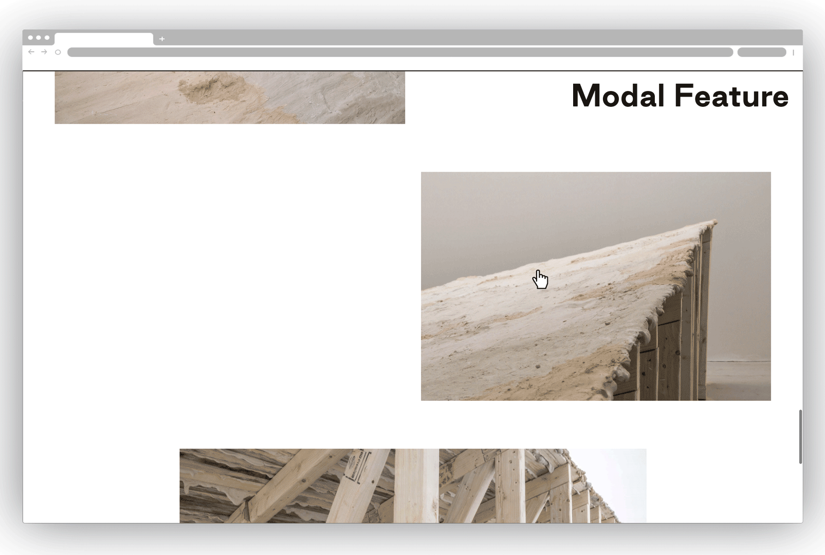
- Component Modal
Turn on Modal view and text for an image. Modal text is entered into the WYSIWYG editor under your image asset in the Media Library. When you turn on Modal view on an image, your Image Block becomes clickable, revealing a box that contains both your image, and the modal text you have entered.
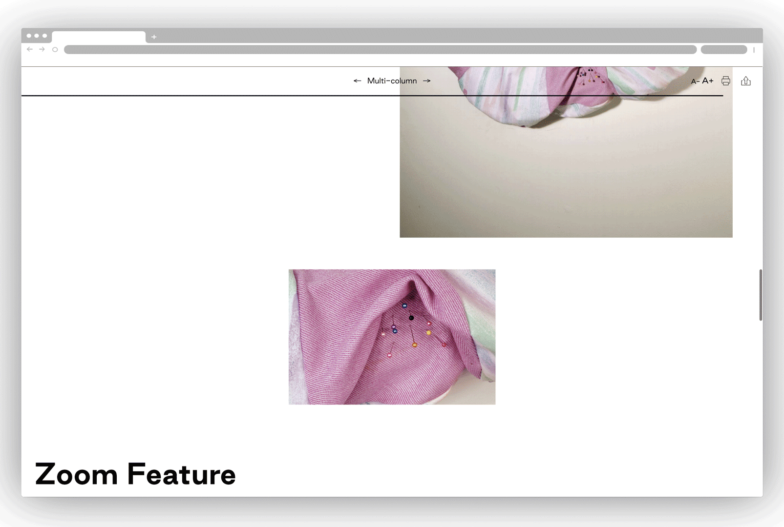
- Component Zoom
Turn on Zoom, and your image will zoom in on mouseover.
9.
Advanced: Padding, Margins, & Sizing
You can control padding, margins, and sizing at a more granular level by adding Bootstrap code in the Custom Class field. Padding and margins can be controlled on a section level (in ”Configure Section”), and also on a block level (in ”Style Settings”). You can control how much spacing, where the spacing goes, and even apply different spacings for different viewport sizes. (If you want to really go all out.) You can read more about Bootstrap spacing language here, but we’ll cover the basics below. Sizing can be controlled on a block level. You can read more about Bootstrap sizing language here, but we’ll cover the basics below.
Padding v. Margins
Padding adds more background color, Margins do not. This will make a difference if you have a background color applied to either your section or block.
Bootstrap Basics for Spacing
Once you know the spacing vocabulary, writing Bootstrap is quite easy. You will designate the property you wish to control (margin or padding), which sides you want to apply the spacing to, and what amount of spacing you want to add. Each of these is written with either a single letter or a number. Those are listed below. Note that these are pre-assigned values, and not pixel values.
Here is the basic formula: [Property Letter][Side Letter]-[Size Number] You can add as many of these as you want, separated by a space. (Not a comma or semi-colon!)
For example, if I wanted extra large padding on the top and bottom of my block, I'd write that as py-5 .
Property
margin: m
padding: p
Sides
top: m
bottom: p
left: l
right: r
top and bottom: y
left and right: x
all sides: [leave this part blank]
Size
none: 0
extra small: 1
small: 2
medium: 3
large: 4
extra large: 5
Bootstrap Sizing Controls
You can also use Bootstrap to control the width and height of images. As with Spacing, you will be controlling this pre-determined numerical values, and not pixel values. If you want precise pixel values for an image width or height, you will need to use inline code. (See Section 11.)
Here is the basic formula: [Property Letter]-[Size Number]
For example, if I my image block to display at 50% of its original width, I'd write that as w-50 . Note that this 50% is based on how big the image is, as you uploaded it to the Media Library. If you uploaded a very large image, it might already be displaying at 50% in your block.
Property
width: w
height: h
Size
100%: 100
75%: 75
50%: 50
25%: 25
Centering An Image with Bootstrap
Centering an image can sometimes be tricky, particularly if it is a small or narrow image. The easiest way to center a troublesome image is with Bootstrap. You will do this by assigning the image a width, and then setting the margins to auto.
Here is the basic formula: w-[Size Number that is not 100] m-auto
Unfortunately, you must shrink the image—this won't work if you set the image width to 100. Depending on the size of the image, you will need to shrink the image to different values. Sometimes the image will not visibly change in size. Huzzah! But sometimes it gets too small, or it doesn't quite hit the center mark. If this is the case, you will need to embed the image with inline code. (See Section 11.) Alternatively, you can make your image more pixels wide in the Image Settings or Canvas Settings in Photoshop, and then replace the image file the Media Table.
10.
Advanced: CSS Inline Styles
If you want to get real fancy, you can view and edit the code of blocks with WYSIWYG editors. Note that sometimes code you add by hand will be in conflict with the overall structure on the page, so not everything will work quite right. However, many small style adjustments are quite easy and very possible.
To view the source code of a block, with a WYSIWYG editor (like a Basic Block,) click the ”<>Source” button. This will reveal the HTML code for anything that you have added in the WYSIWYG editor field, and any styles you have applied with the WYSIWYG editor buttons.
To edit the source code of that block, you must change the Text format from ”Basic HTML” to ”Full HTML.” (This is located below where you enter text in the WYSIWYG editor.) Then click the ”<> Source” button. To save any adjustments you made, make sure to click ”<> Source” again to toggle back to standard view.
Because we're working with a CMS (content management system), you will be adding CSS styles as inline CSS. Writing inline CSS has a basic formula. Choose the HTML selector to which you want to apply the style. (In this case, it will usually be p or span.) Within the start tag, you will write this: style="[property]:[value]" . You can add multiple styles within the quote marks if you add a semicolon after the value.
For example, if I want to add a shadow to a paragraph, I'd add this into the <p> tag: style="text-shadow: 4px 4px"
For more about CSS properties, investigate here. Text spacing can be particularly useful; read more here.
11.
Advanced: Images with Code
There are two main reasons to embed an image in a Basic Block, rather than in an Image Block. First, if you're having trouble centering an image. Second, if you want to apply code to your image, either adding CSS styles (like a drop shadow), or making the image a link.
There are some disadvantages to doing this. It’s a little bit more work, and requires code. But mostly, you will be using a link generated from the Media Library. If you go back and replace this image in the Media Library, this link will change. In an Image Block, it will auto update. In a Basic Block, you will have to manually update the link.
Here is how to add an image with code:
- Your image must be in the Media Library.
- Create a Basic Block. Turn on ”Full HTML” under ”Text format.” Click ”<>Source.”
- Add an image tag wrapped in a paragraph selector: <p><img alt=" src="[this is your image link]" /></p>
- Add your image link into the src field. This link comes from the Media Library. Your image file name will appear as a hyperlink. Right click and copy that link. Paste into your Basic Block as indicated.
For example, <p>< img alt=" src="http://risdpublications.prod.acquia-sites.com/sites/default/files/2020-…" /></p>
- Click ”<>Source” again.
To center that image:
- When you have returned to standard view, the image should appear.
- Click the image, and then click the ”text align center” button. This should center the image.